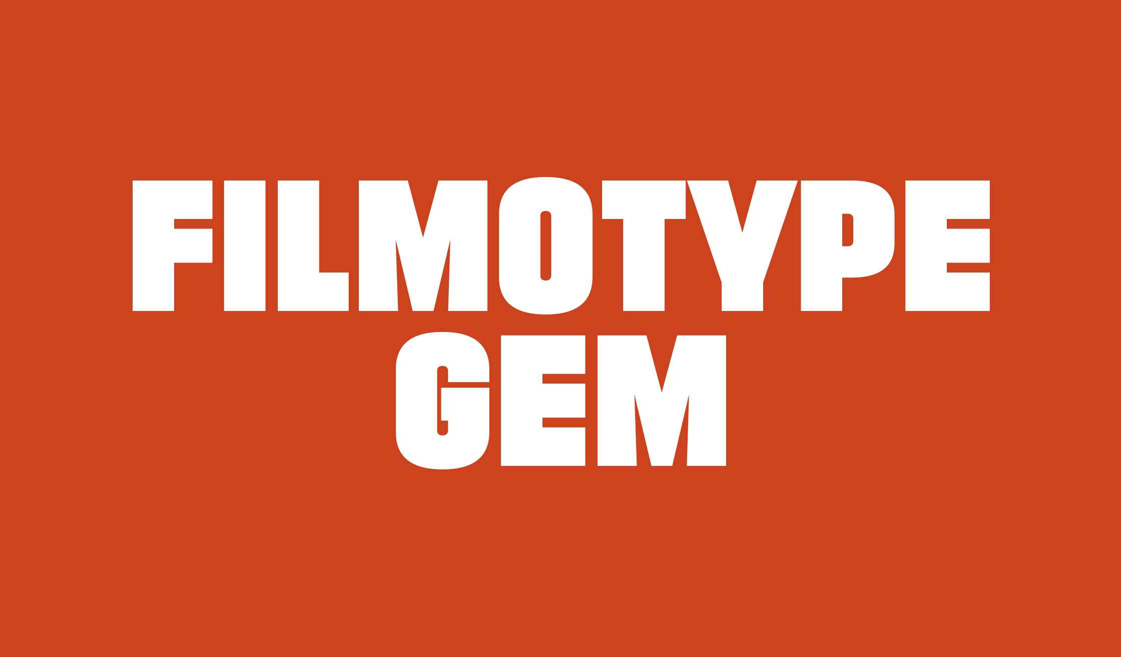
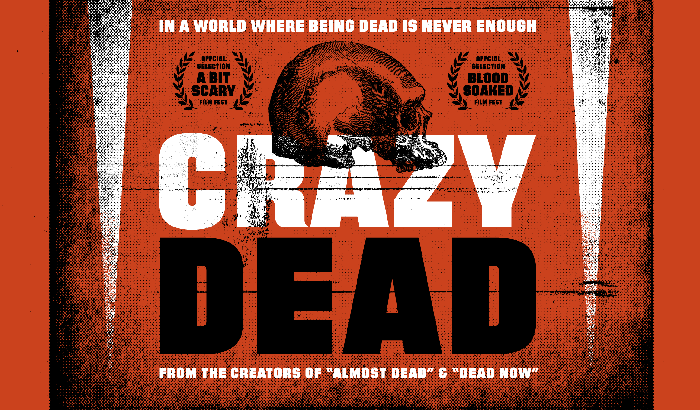
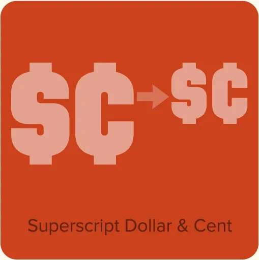
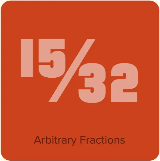
Filmotype Gem (2011, for Filmotype) was originally designed and released in the 1950s. It is an “all caps” design. Filmotype Gem is part of a range of compact sans serif fonts whose names begin with the letter “G” (a Filmotype convention) that have much in common with Futura—the one-story a, the round dots, the simplified t and u. If there were such a thing as Futura Compressed, it would look a lot like this. Gem has its own unique characteristics, such as the prominent whiplash spine on the S and its subtle hand-lettered feel.
Licensing note: Filmotype Gem is owned by Font Diner and uses the Font Diner end user license, not mine. You can view the license here. There is also an FAQ about it here.
