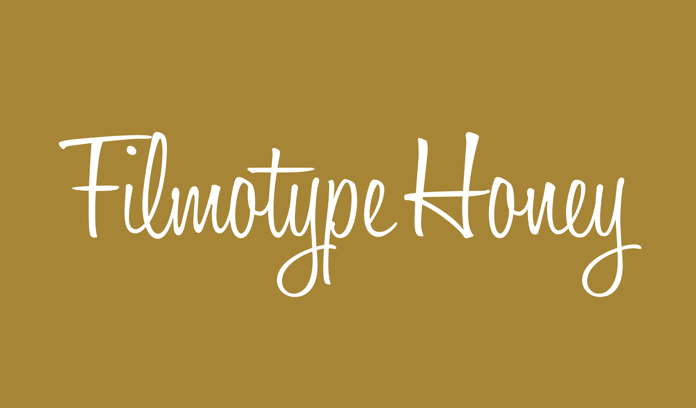
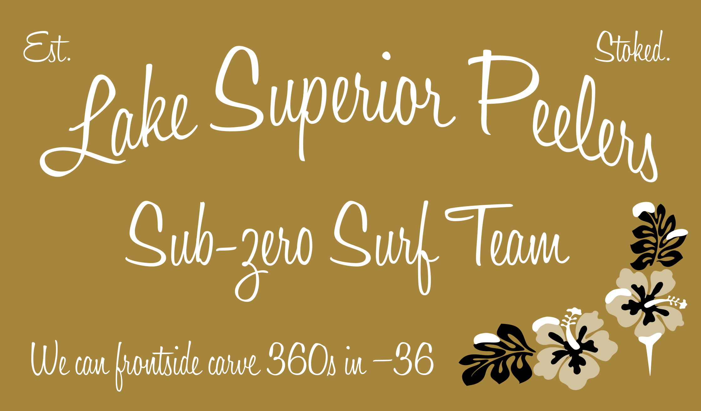
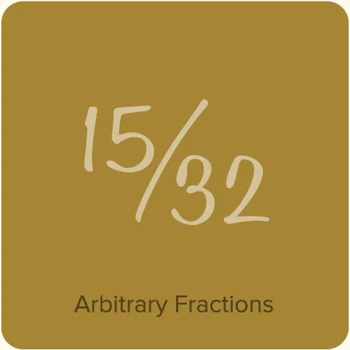
Filmotype Honey (2010, for Filmotype) was designed in the 1950s. It’s a casual brush script typical of that era. It’s urbane, energetic, and casual all at the same time. You half expect it to offer you a cigarette and a drink. The lowercase letters have multiple variations, designed to link up properly with whatever is around them. The Filmotype operator had to deal with all this manually, but if you’re working in an OpenType-savvy program, it all happens automatically. And without the hangover and nicotine stains.
Licensing note: Filmotype Honey is owned by Font Diner and uses the Font Diner end user license, not mine. You can view the license here. There is also an FAQ about it here.
