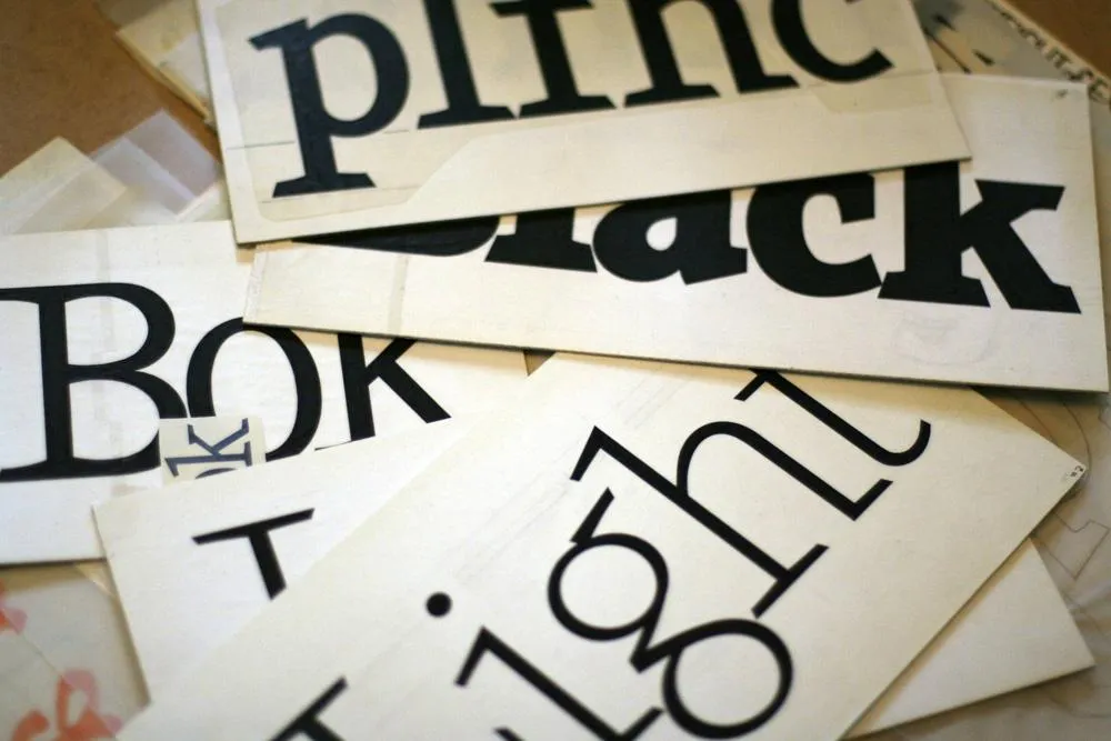
Viroqua’s ancestor, Excalibur, hand inked.
I released Kandal in 1994. It’s one of my earliest typeface designs, going all the way back to an earlier design in 1978, which I submitted it to International Typeface Corporation (ITC) under the name “Excalibur”. It went through a couple of iterations before the one I submitted, variously influenced by the work of Hermann Zapf and Jim Parkinson. I honestly had very little idea what I was doing—a case of overestimating what I knew and underestimating how much was left to know. By a large margin. Excalibur was understandably rejected by ITC. It had lots of problems and I resolved to improve my knowledge and skills before trying to submit something to them again.

Fast-forward to 1990. I never did submit any more typefaces to ITC, but I did have lots of ideas and sketches and practice drawing letters. I also got a Mac in 1984 and Fontographer in 1987 and started trying to make PostScript fonts. One of my ideas was to revisit Excalibur, simplifying the design and addressing its many flaws. This became Kandal. I was also working on Proxima Sans, the predecessor to Proxima Nova, around the same time, and a few other ideas, some of which are still on the drawing board.
Kandal has never been one of my popular typefaces. It’s not surprising, given that it was such an early design, made when I had very little experience making fonts. I probably should have pulled it from my library, but I kept thinking I would come back to it and fix it, like I did with Proxima Sans.
Thirty years later, it’s finally happened. The new version is reworked from the ground up, so I decided to give it a completely different name, instead of something like Kandal Nova. “Kandal” was my paternal grandmother’s maiden name and the town in Norway her family was from. The new name, “Viroqua”, is the town in Southwestern Wisconsin where she was born and raised.

Viroqua is an improvement over Kandal in every way I could think of, while retaining its core design concept: A hybrid combining modern proportions, Jenson-like details, and a bit of slab serif DNA. Nearly every character has been reworked or refined. The original italic especially suffered from my lack of experience as a type designer. I basically started over. I’ve got three more decades of experience and I hope it shows.

Viroqua also has a wider range of weights, seven in all, going from Thin to Black.

Viroqua features many typographical niceties missing from Kandal, such as small caps, old style and lining figures (both proportional and tabular), superscript and subscript figures, fractions, and dingbats. Viroqua also supports most Latin-based Western and Eastern European languages, plus Vietnamese.
Viroqua is available now. More information here.
I’m known as a type designer—and fonts are pretty much what it’s all about here on my website, and in my life in general. But I haven’t always been making fonts. At various points of my career (which goes back to 1976) I’ve been a graphic designer, art director, web designer, package designer, product designer, lettering artist, and—very early on—illustrator.
Learning to Do Caricatures
My most active period as an illustrator was for Metropolis, a weekly newspaper in Minneapolis (1976-77). Patrick JB Flynn was the art director. Fairly soon after I started working for them, he asked if I could do caricatures. Caricature was something I dabbled in going back to middle school, mostly in a simple cartoon style. My inspiration came mainly from artists like Mort Drucker (Mad) and Rick Meyerowitz (National Lampoon). But I’d never done a full caricature before. Not really. But, I thought, how hard could it be?
And so I started doing caricatures for Metropolis. I wasn’t that good at first, but I got better. I was actually kind of surprised I could pull it off. Caricature is not the easiest skill—even when you can draw well. And some of my caricatures were better than others.
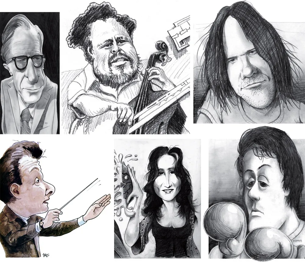
Above, some of my early caricature work. Clockwise f**rom the top left: economist John Kenneth Galbraith, Jr.; jazz bassist Charles Mingus; a “stoned out” Neil Young; Sylvester Stallone as Rocky with “puppy-dog eyes.”; singer Bonnie Raitt; and orchestra conductor Sir Neville Mariner.
After Metropolis, I kind of stopped doing it. I’d also dropped the idea of being an illustrator. It was easier to be an art director, think up the concepts, and let someone else do the drawing. Plus, I didn’t think my caricature style was “in.” It wasn’t the sort of thing I was seeing in the illustration annuals. I associated it with “kid’s stuff” (Mad especially) and felt almost embarrassed by it.
Getting Back Into It
Earlier this year, I made an effort to get back into drawing and other creative pursuits, and get away from staring at a computer screen all day (see my “1979” post from February). I filled up several sketchbooks over the next few months, drawing nearly every day. And then in July, I started doing daily drawings in Procreate on my 12.9” iPad Pro—quick caricature sketches of people I saw on YouTube while watching videos.
Drawing digitally—that is, drawing on a tablet or screen with a stylus—has always been problematic for me, in spite of all the money I’ve spent on Wacom tablets and Cintiqs and iPads over the years. For some reason, I just never took to it, no matter how much I wanted to. It didn’t feel as fluid and natural to me as drawing on paper. So I never did much but doodle, rarely doing a full drawing.
But I had a breakthrough while doing these quick studies. I figured out a technique for doing full caricatures that works for me, like the ones I used to do for Metropolis. In fact, it works even better.
The trick is to keep things really simple. I use the 6B Pencil brush for the line work on one layer, and the Tamar brush—sort of like painting with a sponge—for shading (and color) on a second layer. I’m careful not to change the size of the pencil brush (~60%). I try to draw at actual size as much as possible and stay loose. It all finally clicked for me.
And of course, working digitally is great for drawing caricatures compared to drawing on paper. It’s so easy to fix problems, like when proportions are off or positions of the features aren’t quite right. I’m able to work very quickly, knowing that if I make a mistake, I can immediately fix it. (Although, I might try redoing some of these using analog media now that I’ve worked out the likeness and everything digitally.)
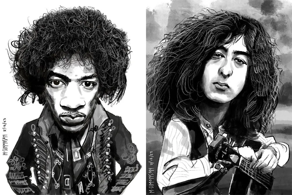
Jimi Hendrix and Jimmy Page.
It takes me anywhere from an hour to three hours to do one of these. I’m working in both black and white and color, depending on the source photo. And, yes, these are based on specific photos, or several photos in some cases. Some of them may be recognizable—even iconic.
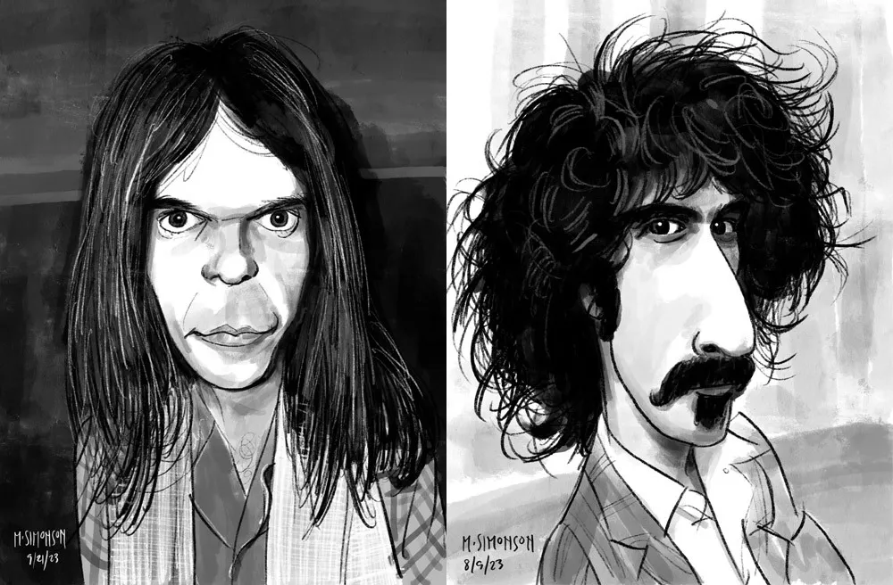
Neil Young and Frank Zappa.
By the end of July, I was doing a full caricature every day. This went on for almost two weeks. Since then, I’ve been doing several a week. I’ve done almost 30 of them now. Mostly rock musicians so far, but I have a long list of possible subjects in other areas, too.
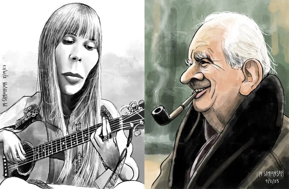
Joni Mitchell and J.R.R. Tolkien.
Rediscovering Myself
I can’t believe how good it feels to reconnect with this. As an artist, knowing that you’re capable of doing something yet not doing it for years—decades even—is painful. It feels like a waste. Of course, I’m doing other things, like making fonts, which is also creatively fulfilling. In fact, I’ve often wondered if getting so busy making fonts was the reason I wasn’t drawing as much. Apparently not.
In my “1979” article, I cast a dim eye on the digital world—the world of screens and pixels—and advocated a return to doing physical things, like drawing on paper. And I have been doing that. But, ironically, getting back into drawing on paper—specifically the habit of drawing daily—led directly to finally getting some use out of my iPad Pro and Apple Pencil. In hindsight, it was all about getting back to drawing, regardless of whether it’s on a screen or not.
Anyway, all of this is a roundabout way of saying that I’m going to start sharing my caricature work online. To be clear: I’m just doing this because I enjoy doing it. It’s a side project. I’m not looking to start a new career or anything like that. Fonts are still my main gig. I just want to share something else I enjoy doing, and I hope others will enjoy seeing it.
If you’re interested, I’ll be posting the work on my secondary Instagram account (not my regular Mark Simonson Studio account, which is for official, font-related stuff). Update: I’ve also created a new website to showcase my non-type-related work: marksimonson.art.
Before digital type and desktop publishing took over the world in the late 1980s, there was metal type and phototype. But if you were on a tight budget, you could set type yourself using various “dry transfer” products, Letraset being the most famous. But Letraset wasn’t the only one.
I used Formatt sheets a lot in the late 70s and early 80s. I’ve still got a few catalogs (No. 7 from 1981, No. 8 from 1986, and pages from what I believe is No. 6 from 1976) and a few sheets of type.
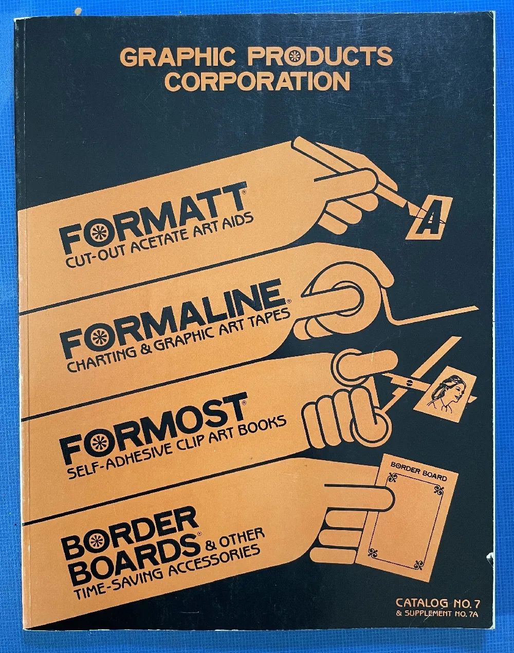
Unlike Letraset and other “rub down” type products, Formatt was printed on a thin, translucent acetate sheet with low-tack adhesive backing on a paper carrier sheet. To use it, you cut out the letters with a razor blade or X-acto knife and positioned them on a suitable surface and then burnished it down. I usually used illustration board and then made a photostat for paste up, but you could put it right on the mechanical if you wanted.
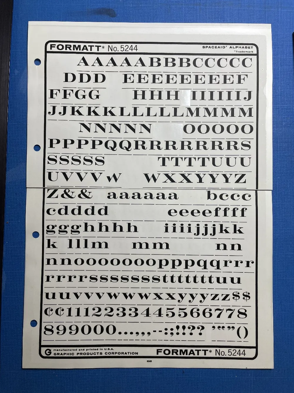
The sheets had guides below each character to aid in spacing and alignment. Although I always spaced it by eye, the guides were essential to keep the characters aligned to each other. I would draw a line for positioning the guidelines using a non-repro pen or pencil before setting the characters down and trim away the guidelines after.
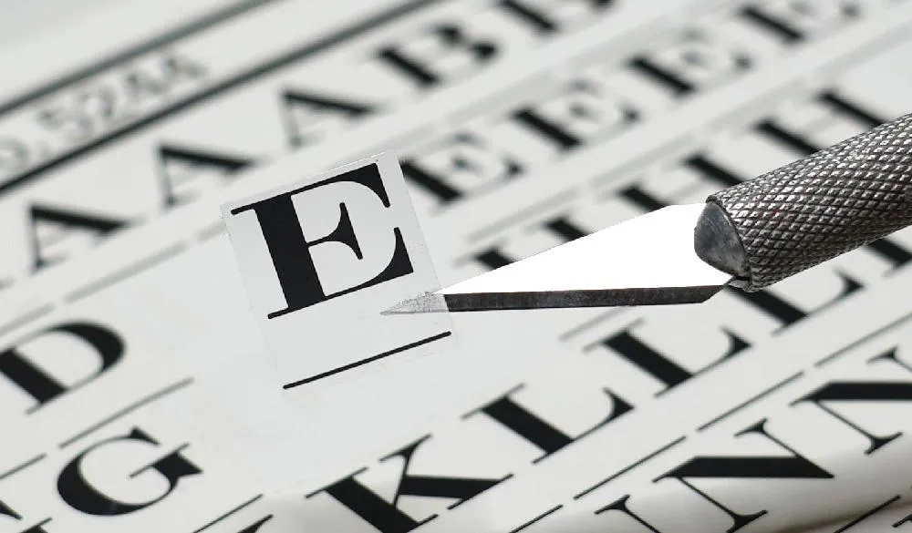
Formatt was not as high in quality as Letraset, but it was cheaper and offered typefaces—especially older metal typefaces—not available from any similar product. But they also carried more recent faces, such as those from ITC. They carried about 250 different typefaces in the catalogs I have. I only bought Formatt type sheets in order to get certain typefaces that weren’t available elsewhere (other than from typesetting houses, which were not in my budget at the time).
In addition to type sheets, they also produced a whole range of pattern sheets, rule and border sheets and tape, color sheets, decorative material, etc. A lot of the graphic material seems to have come from old metal foundry sources. Besides the type sheets, I used their border sheets and tapes a lot, too.
I also made my own “Formatt” sheets sometimes back in the early 80s. I had access to a process camera, which could make high-quality photographic copies of black and white originals, colloquially known as “photostats” or “stats.” Normally you would use white RC (resin-coated) photographic paper with it, but it was possible to get clear acetate photostat material that had a peel-off adhesive backing. Using this, I made copies of pages from old metal type specimens, allowing me to set display type using otherwise unavailable typefaces.
One of the ideas on my back burner for a long time has been to add wide styles to Proxima Nova. Condensed and Extra Condensed have been there since the very beginning, but it was missing styles wider than the normal width. It was an obvious thing to add and would make the family even more versatile.
I did some rough preliminary work in 2012 and 2015, but didn’t put serious effort into it until last September, after I finished Dreamboat. The good thing about setting a typeface aside is that, when you come back to it, you can see the problems much more clearly. One of the things I learned when I was a graphic design student is that it’s easier to redesign something than to design something, and that was definitely the case with Proxima Nova Wide.
One of the things I changed was to make it even wider so that I could add two wider widths—Wide and Extra Wide, just as there are two narrower widths. Including the italics, this adds 32 new styles to Proxima Nova (16 for each width).

Naturally, the new styles include all the features and characters of the existing styles of Proxima Nova. I’ve also made a few improvements and tweaks to the existing styles. All of this amounts to a major release: Proxima Nova 4.0. It’s currently available for sale here or for activation in Adobe Fonts.
You can find more info, test and license the fonts, and download PDF specimens on the Proxima Nova page.
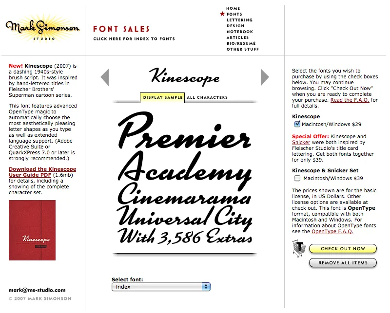
Party like it’s 2007. Note the shopping cart on the right side.
At one time, early in the history of Mark Simonson Studio, I sold fonts directly from my website. This was back in the early 2000s when there weren’t a lot of options.
I started selling fonts on the web in 2000 using third-party sites, first through Makambo (which closed its doors not long after I signed up), followed by MyFonts (2001), FontHaus (2001), Agfa/Monotype (2004), FontShop (2005), and Veer (2005).
In 2004, I decided to also sell fonts directly, using a service called DigiBuy, letting me get a bigger part of the retail font price, but also to simplify the purchasing experience for customers.
It was good while it lasted. Quite often, my site brought in more income than my best distributors for a given month. But in 2007, DigiBuy was shut down. The alternative they offered was tailored for selling shareware software, and was a poor fit for selling fonts. At the time, my distributors were doing well enough for me, so I made the hard decision to stop selling fonts directly and sell only through third parties.
Fortunately, my distributors soon took up the slack. And, to be honest, I was glad to have the burden lifted from my shoulders. When you sell direct, that means doing customer support. As a one-person business, this was taking a lot of my time. The new arrangement let me spend more time working on fonts. It was a fair trade-off.
Fast forward to 2021, and Mark Simonson Studio is now part of The Type Founders. TTF has the resources to bring direct sales back, and that’s just what they’ve done. If you have a favorite vendor, by all means use them. But if you want to get your fonts direct from the source, now you have that option.
The way it works is, each font page has various “buy” buttons. Click on any of these and a slide-over will appear that lets you select license types, term or other options (if applicable), and which fonts you wish to purchase. Note: Click on the styles to add them. Once you’ve made your selection, click on the “Add to cart” button. You can check out immediately or close the slide-over if you want to select other fonts before checking out. Once you’re ready to check out, just follow the instructions.
If you’re not sure what kind of license to choose, this page should help. My standard licenses for desktop, web, and apps can be seen here.
And if the kind of license you want is not one of these standard ones, drop an email to info@marksimonson.com.
Pretty simple. (Well, as simple as it can be.)
But that’s not all: Remember the static style previews I’ve had on my site for the last ten years? Gone, replaced with live, editable font previews for each style. This makes it easy to see if a font will work for, say, a company name or a headline.
Note: A few of the typefaces listed on my site are not available for direct sales, because I did them for another type foundry who own the fonts. These include Diane Script (Fonthaus), the Filmotype fonts, and HWT Konop (Hamilton Wood Type/P22). Links to where you can purchase are provided. And of course, you can’t buy Anonymous Pro because it’s free to use.
Finally, the list of fonts is now in alphabetical order, instead of newest releases first, which should make it easier to find the fonts you’re looking for.
I’ve been using a Mac for all my design, illustration, lettering, and type design work since the mid-1980s. I embraced it fully and enthusiastically, before it was really even ready sometimes. It made so many things easier and faster. Why would you ever go back once you had experienced the power of “undo”?
I grew up in the analog world, the time before ordinary people had access to computers and digital technology. The most high-tech things in my life were television and the space program (which I saw mainly on television).
The kid who could draw
When I was young, I drew a lot. I had my first piece in a public art show when I was in kindergarten. Sometimes, my first-grade teacher would let me stay inside and draw instead of going outside for recess. When I was in 4th grade, all five of my entries in a Post Cereal drawing contest won prizes. That year, I also started taking oil painting lessons. By the time I was in high school, I was very good at drawing, cartooning, and painting. I consistently got A’s in art class, won awards, and was clearly heading for some kind of career in art.
I majored in art and graphic design in college and initially had ambitions to become a commercial illustrator, given my talent for drawing. But graphic design, lettering—and even type design—also appealed to me. In my first job out of college, I was hired as a graphic designer at a small advertising art studio. I also did illustration jobs on the side for local magazines and newspapers in Minneapolis. My career soon veered into magazine art direction, where I hired illustrators, and my illustration career never really took off.
The digital world
After I bought a Macintosh in 1984 and started using it for creative work, I found myself using the analog tools I grew up with less and less. All the tricks and techniques I’d learned as a young artist were becoming obsolete very quickly. I was drawing less, painting less, and, without realizing it, taking those skills for granted. I could still do it if I wanted to, I told myself.
I tried using graphic tablets, attempting to transfer some of those skills into making art on a computer. Whatever the reason was, drawing on a tablet has never felt the same to me. The immense flexibility and power of computer graphics software has always has felt impoverished and ephemeral next to the richness of physical art tools and media.
Even so, I turned my back on the old ways and embraced the digital.
Admittedly, this has worked out very well for me. I wouldn’t have succeeded as a type designer any other way.
But, as time went by, not just my work, but more and more of my life (and almost everyone’s life) became centered on the digital world, especially with the rise of the internet, and the always-on internet. And with the iPhone, the always-with-you internet. And now they want to put it right in your field of vision with VR/AR, and ultimately a chip in your head. The digital world seems hell-bent on supplanting the physical world.
This used to sound “cool” to me. It seemed like the logical path in human-computer interaction. But I’m not so sure anymore.
We’ve been accepting all this, little by little, because of the convenience. Each step of the way, it’s “so much easier” than the old way. Everything in the world at your fingertips. All the music, all the movies, all the shows, all the art, all the time. Make a mistake? Undo! Change your mind? Redo! Dropped your laptop in the lake? No problem. It’s in the cloud!
But at what price?
I’ve become increasingly skeptical of the digital world as a healthy or desirable place to spend time. Not to mention all the tracking and surveillance that has crept in, the psychological damage of social media, and the rise of “subscription” models where you have to pay for an app indefinitely to maintain access to your documents.
I’ve also grown wary of how much time I spend sitting in front of a computer screen, even for doing creative, useful things (as opposed to YouTube, social media, or other time-wasters). As I get older, time is getting more precious to me. Do I really want to spend it sitting and staring at a screen?
Reconnecting
Getting back into drawing has been on my to-do list for a while. Maybe 20 years. I felt like I was letting my drawing talent waste away, rarely using it anymore. I was spending more time watching videos or reading books about drawing than actually drawing. I tried different things over the years (including joining a group that gets together once a month to draw cartoons), but nothing seemed to work in any sustained way. It’s almost like I’d given up, but didn’t want to admit it to myself.
But recently, I heard about a book called *The Artist’s Way,*by Julia Cameron. One of the things she recommends is to write “morning pages” first thing every day. Most of the rest of the book didn’t really seem to apply to my situation, but this “morning pages” thing got to be a habit, and got me thinking more deeply (through the writing) on improving my relationship with “screens” and getting back to drawing regularly.
1979
One of these insights revolved around the year 1979. In my mind, that year signifies the twilight of the analog world, just before the dawn of the digital era. Things in my 1979 world were entirely analog.
I was 23 years old. The tools of my craft were T-squares, rubber cement, ink, Zip-a-Tone, technical pens, X-acto knives, ellipse templates, markers, illustration board, dividers, Letraset, photostat cameras, and phototypesetting. I listened to music on a Pioneer turntable and a JVC AM/FM receiver. I watched TV on a 13” Panasonic. Cable TV and VCRs weren’t really a thing yet. My telephone was connected to the wall. If I was away from my apartment, I was unreachable. My apartment was filled with inexpensive furniture I’d made myself (thanks to the books Instant Furniture and Nomadic Furniture) I designed and built my own desk/drawing table. I had a 35mm camera and a Polaroid SX-70. I had books and magazines to educate and entertain myself. And a guitar. If I need a photo reference in order to draw something, I’d go down to the picture section at the Minneapolis Public Library.
It might sound terrible to someone who has never known life without the internet, but I miss it. I miss not being surrounded by things trying to get my attention. I miss the simplicity of the way things used to work. You learned to find your way around. You didn’t need GPS. Doing art was a physical, direct, visceral experience—even commercial art.
Don’t get me wrong, I wouldn’t actually want to live that way now. I love technology and gadgets, and all the things they can do for me. But thinking about what things were like in 1979 reminds me that life is perfectly possible without all our modern “conveniences” and their hidden costs and unseen consequences. For instance, my old drawings and artwork could be lost in a fire or flood. But they may well still be around hundreds of years from now, and they won’t need any special device or software to be seen. Whereas my PageMaker files from 1995 are already virtually inaccessible (I have ways, but you get the point). Not to mention degradation of digital media over time, rendering the contents of disks, hard drives, and SSDs unreadable sooner or later.
I’ve come to realize the value of making physical things, the richness of analog art vs. the weightless, scaleless, ephemeral nature of digital art. I’m obviously not the first person to think this. There are books about it. But the trade-offs of the digital world have been growing larger in my mind.
Drawing again
Another insight from my “morning pages” has been discovering a way to trick myself into drawing again. I have a habit of listening to podcasts or videos. Basically, draw at the same time—piggyback on that habit. It’s so simple, I don’t know why it never occurred to me before. I guess I had in my mind that I needed to devote time to do draw, and only draw. And I could never quite make the time. Something else would always seem more important or easier.
But it worked, and now I’m drawing again every day. The old confidence is back (which I didn’t even realize had gone) and it’s been very satisfying. Lack of undo actually increases the enjoyment. Things are at stake. Getting to the end of a drawing without undo is immensely rewarding.
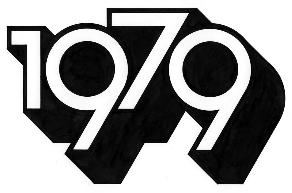
And I’m spending less time staring at screens. In fact, I thought of a way to remind myself to get into “1979 mode.” During my drawing session the other day, I designed and lettered the year “1979” in a style similar to lettering I was doing back around 1979. And I did it only using tools that were available to me in 1979 (yes, I still have them): pencils (for the sketch and the under-drawing), erasers, illustration board, masking tape to hold the board down, circle template, dividers, ruler, triangles, Ulano Glide-Liner (like a T-square, but attached to the table), Higgins Black Magic ink, a Koh-I-Noor Rapidograph, a fine sable brush, and a bit of white water color paint to fix some mistakes.
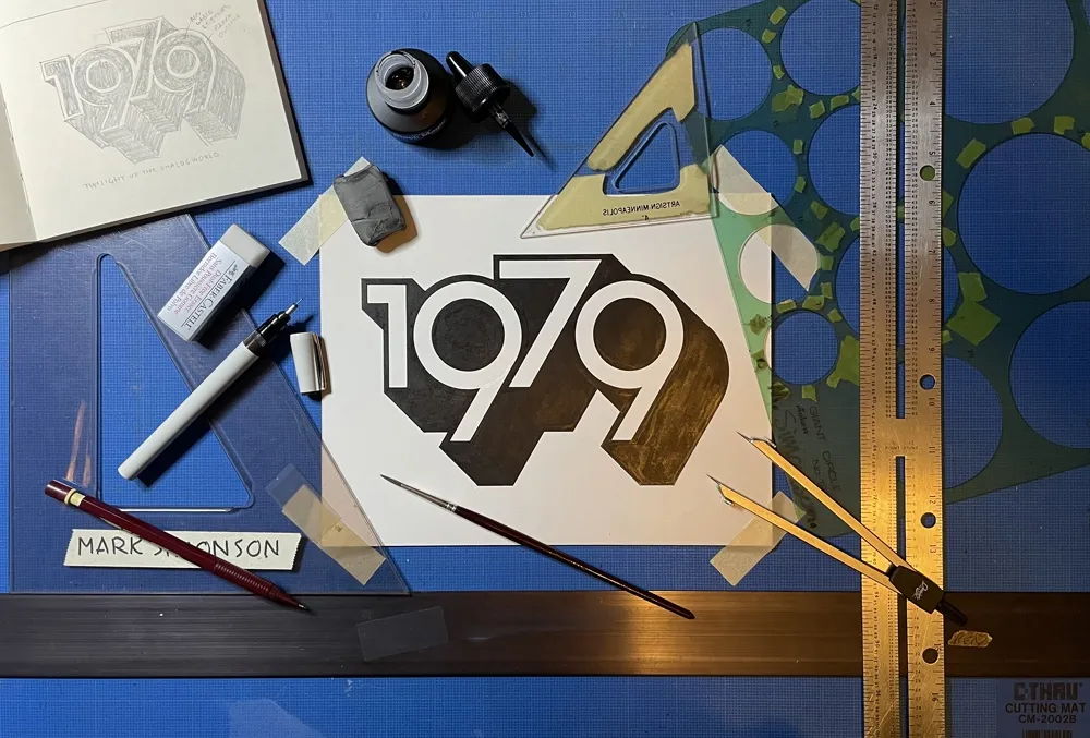
It took about two hours in all—10 minutes to do the sketch and the rest to render it. On my Mac, I could have done the whole thing in a couple of minutes—and with no mistakes. But it would have been much less satisfying when I was finished. And I’d be tempted to fiddle with it endlessly.
So, now I have this little bit of lettering tacked up on my wall to remind me to keep things real, to get my head out of cyberspace once in a while and connect with reality. To remind me I don’t need a computer to draw a picture. I just need some paper and a pencil.
The digital world has its place. You can do amazing things in it (like publishing a blog post). But don’t spend all your time there. It’s not the real world.
