After years without a proper newsletter, I decided it might be a good idea to send out occasional updates. With a bunch of new fonts coming down the pipeline, these emails will keep you up to date with announcements you may have missed on social media.
I don’t plan to send it out very often—no more than about 6 times a year. It’s mostly to announce new font releases. If that’s still too much for you, you can unsubscribe anytime.
The first issue will be out on Tuesday, September 4. A regular feature of Font News will be sneak peeks of the fonts I’m working on next.
You can subscribe here. If you know anyone who might also like to get the newsletter, feel free to send them to the signup page.
September 6, 2018 Note: I originally called this Letter News. Turns out, Jill Bell (lettering artist, type designer, and long-time friend) has been doing an email newsletter also called Letter News for the last ten years. Oops! Sorry about that, Jill! It’s now called Font News.
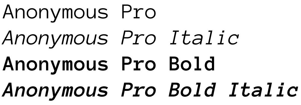
I’m pleased to announce the release of Anonymous Pro Version 1.001. This version contains mostly user-requested tweaks and fixes, including:
- The comma and the comma part of the semicolon have been moved down about a pixel (depending on the size) to improve clarity.
- The design of the “quotesinglbase” and “quotedblbase” match the look of the “straight” quotes (the earlier designs didn’t match anything).
- The periods and other “dot” punctuation elements are a bit bigger in some bitmap sizes/styles.
- Fixed the hinting problem that caused the tops of the caps to vary in height a certain sizes on Windows (hard to figure out the reason, but easy to fix once I knew).
- Corrected the 13ppem bitmap glyph for the Greek character “omicrontonos” (which, embarrassingly, sported an umlaut).
And last, but not least:
- I dropped my old DIY license and switched to the SIL Open Font License, which should make a lot of users in the open source community happy.
Small note to Windows users: I haven’t updated the sample that shows what Anonymous Pro looks like in text sizes on Windows with ClearType enabled. It looks better than that now. I’ll update it soon.
I announced back in April that a new version of my popular free font Anonymous™ would be available soon. That would be today.
My new Bookmania fonts are now available at my own site, and Fontspring. More vendors will be added to this list as they are ready. Update: Bookmania is now available at nearly all my distributors. For a complete list, see the Bookmania page, under Where to Buy.

This has been in the works for a while now. I released the current version of Anonymous in 2001, with a few tweaks and updates since, but nothing you could call a major new feature.
In fact, there have been numerous requests for features from users, and many of these have been incorporated into Anonymous Pro, such as:
-
Bold and italics, making it a complete four-style family
-
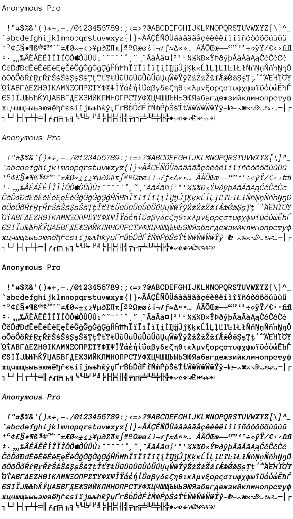
Expanded character set, covering most Latin-based languages, as well as Greek and Cyrillic
-
Metrics adjusted to make it more similar in size to other fonts
-
Several characters redesigned for better readability and clarity
-
Many small improvements to the overall design of the characters
-
Box-drawing characters—you never know when you might need them
I’m still in final testing, but I expect to release Anonymous Pro soon. [Update: Anonymous Pro is available now.] And, like the current version, it will be free. Here is a sneak peek:
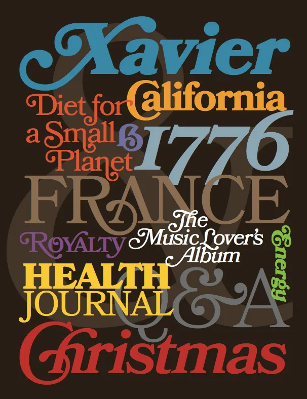
For the last four years, I’ve been working on a revival of the classic ATF Bookman Oldstyle and the Bookmans of the 1960s. But it’s not a slavish replica. It’s my own idea of what Bookman could be. It’s the revival I always wished someone would do.
I thought about doing a cursive italic, like others have tried, but in the end I decided that the original slanted roman should be preserved. Bookman has always been known for its swashes, so I also made a superset of the dozens of swash characters that have been added to Bookman over the years.
I wanted to go beyond its past and make something new. I added things that Bookman never had like small caps, old style figures, alternate characters, ligatures, stylistic sets, extensive language support, and more.
The family is composed of five weights—Light, Regular, Semibold, Bold, and Black, plus italics.
It’s my love letter to the classic Bookman: Bookmania.
Coming soon to all the places you can get my fonts.
Follow @marksimonson on Twitter for updates on availability.
Update: Now available at Fontspring. Other distributors to follow.
I’ve also updated my website and added a page for Bookmania here where you can download a PDF specimen booklet.
