Nelson & Bainbridge picture framing products have been sporting Proxima Sans on their logo for a while now (with custom diamond-shaped “i” dots).
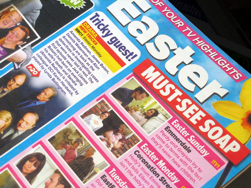
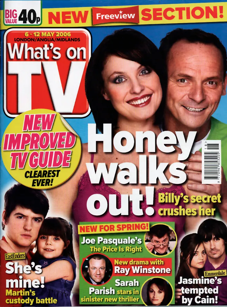
The 42 members of the Proxima Nova family get a real workout in What’s On TV, the best-selling magazine in the UK. Virtually all the type in the magazine is set in Proxima Nova, from the headlines on the cover to the tiny, densely-packed text in the radio and TV listings section. It’s all part of a recent redesign of the magazine, and, according to one of the designers, the reaction from readers has been positive. The magazine also requested a new weight—halfway between Regular and Semibold—which I may release to the public at some point.
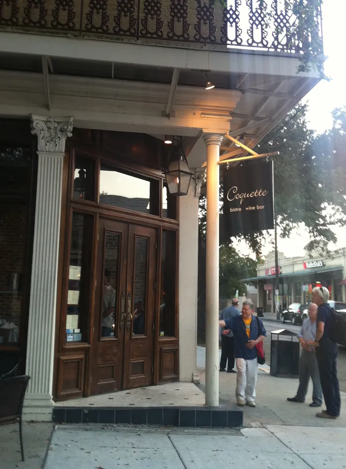
I had one of those moments that only a type designer can have last summer during TypeCon 2011 in New Orleans. After attending a gallery reception at Mystic Blue Signs, a group of us headed on foot in search of a particular recommended restaurant that was about six blocks away. When we were almost there we spotted this:
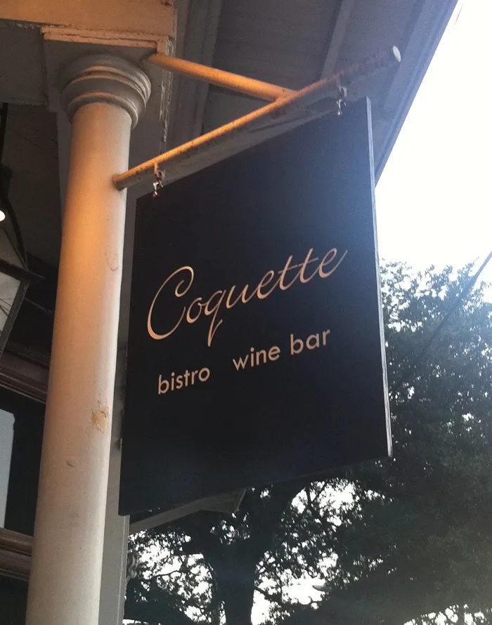
John Downer, who was with us, immediately went inside and got us a table. Normally, we would need a reservation, but apparently the idea that the designer of the typeface Coquette had stumbled onto upon the Coquette Bistro Wine Bar amused them as much as it did us.
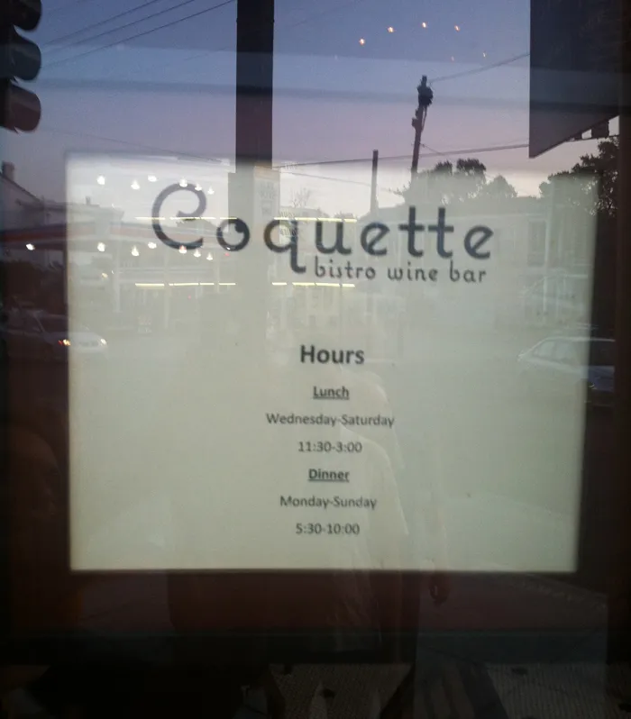
The other diners (besides John) were Petr van Blokland, Roger Black, Delve Withrington, Ronald Arnholm, and William Berkson. The meal was excellent, which shouldn’t have surprised us. We learned later that it was one of the top-rated restaurants in New Orleans. Anyway, it made my day.
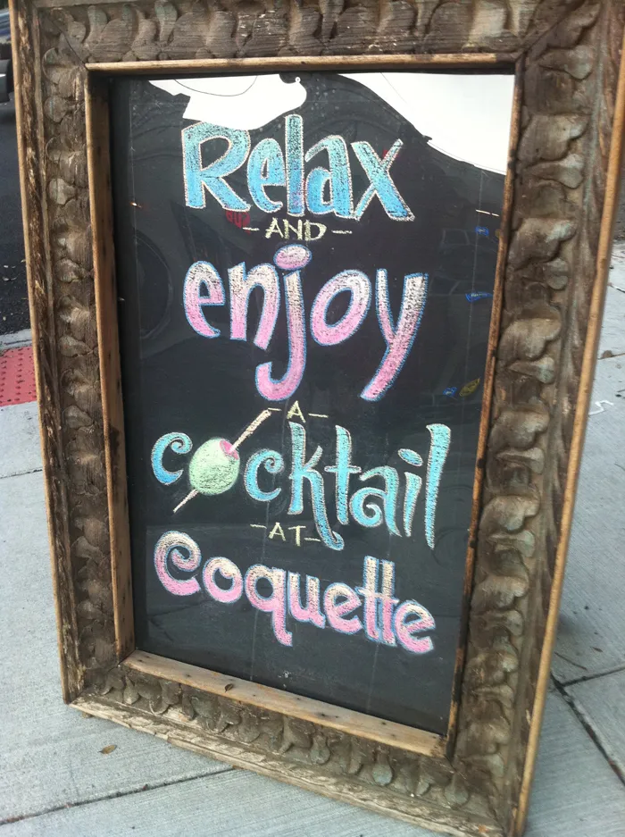
This hand-drawn chalk sign outside was cool:
Okay, I was originally going to post one or two more detailed reports about the conference. But it’s kind of old news now. Suffice it to say, I had a blast and met lots of interesting type people I hadn’t met before—Chester (Thirst & Village), Yves Peters (Typographer.org, etc.), Steve Jackaman (International Type Founders), David Berlow (The Font Bureau), Akira Kobayashi (Linotype), Mario Feliciano (a very talented type designer from Portugal), Peter Bain (Incipit), Gerry Leonidas (Reading/UK), Stephan Hattenbach (MAC Rhino Fonts, Sweden), Carol Wahl, (Type Directors Club), Rodrigo X Cavazos (Psy Ops), Dan Reynolds (Linotype), and too many others to mention—as well as catching up with previous acquaintances again.
Several cool things happened that I have to mention:
The weekend before TypeCon started, I was mentioned in an article about small type foundries in the Sunday New York Times Magazine. I knew this article was coming out because, of course, the reporter talked to me a few weeks before. There wasn’t much about me in the article, but I think I gave the writer some good leads.
My new Proxima Nova was reviewed in a “keepsake” limited edition booklet put together by Typographer.org. (More about it here.)
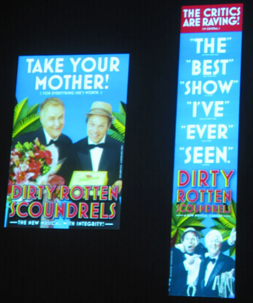
Finally, on Friday morning there was a presentation by SpotCo, a design/advertising studio in New York that does nothing but Broadway publicity work. I hadn’t heard of them before, but recognized some of their work (most famous of which is probably their campaign for “Rent” in the mid-90s). All very nice work. But I did a double-take in the middle of it when they showed the slide shown at right. Mostra Bold on Broadway. How cool is that? I’m not the only one: They used Eric Olson’s Bryant for the Lennon show.
So, that’s it for TypeCon2005. Now back to our regular programming…
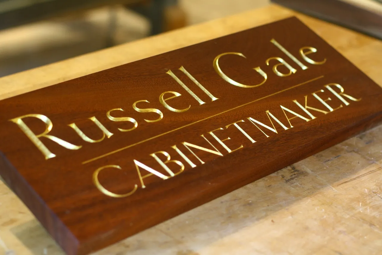
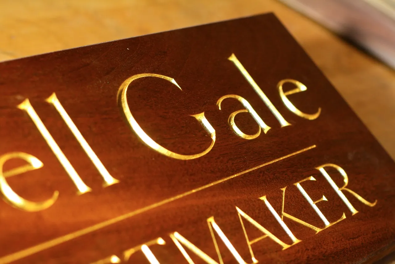
Clark Kellogg, a furniture maker and letter carver in Houston, recently completed a commission for a sign for a friend and fellow cabinetmaker. He writes, “I was excited to do it, as it finally gave me a chance to carve something with your epic Goldenbook font. The client flipped out when he saw the sign, and liked the font so much he ended up using it for his business cards.”
Very nicely done!
(Photos by Clark Kellogg.)
