I was interviewed a couple of months ago for a podcast called Cedar Cathedral, which focusses on “artistry, craftsmanship, and the creative life in the Great Lakes” region. Somehow, I missed that they posted it in mid-July.
Steve and Claire Hendershot, the hosts, did a wonderful job. Total pros, not slackers. They actually came all the way from Chicago to my house with a digital audio recorder, professional mic, and everything—none of this Skype nonsense. I think it’s one of the best interviews I’ve done. Definitely the best sounding.
Update: Unfortunately, this podcast is no longer available.

I’m really honored to have my Lakeside and Filmotype Zanzibar among the 40 typefaces chosen in Typographica’s “Our Favorite Typefaces of 2008”. Thanks so much, Dyana and J.F.
I participate in this annual tradition from the other side of the fence as well. I chose Nick Shinn’s Modern Suite, which blew me away when I saw the specimen book for it at last year’s TypeCon in Buffalo.
[ ]
]
Just a note to say, this Friday afternoon, I’ll be pitting my type chops against (with?) fellow type designer Peter Bruhn for a “exhibition” game of Layer Tennis. I expect this to be a friendly match, more improvisational than competitive. But we’ll see.


I’m a long time fan of the work of Winsor McCay, including his hand-lettered titles. Blogger “Morpheus” has posted a big collection of title panels from McCay’s Little Nemo comics on his “Meeting McCay” blog. Amazing stuff. (Via Boing Boing)
Cheshire Dave’s Mastication Is Normal is home of the famous Behind the Typeface: Cooper Black, a clever spoof of VH1’s Behind the Music series. Cheshire’s latest production, Etched In Stone, is a murder mystery revolving around the typeface Trajan. It was premiered at TypeCon 2004 in San Francisco and, hopefully, will be viewable online soon. **Update:**Chesh called it quits on his site, but Etched In Stone can be seen on Vimeo.
Jon Coltz is a statistics guy who discovered type at some point and has been writing about it on daidala. [Update: The site no longer exists.] Jon has absorbed a massive amount of knowledge about the subject for someone who is not in the design profession (he won the type trivia contest at TypeCon this year). He is also a very entertaining and engaging writer. Be sure to check out the interviews.
David Earl’s UK-based Typographer.org has gone through several incarnations over the years. When I first discovered it, it was an online magazine with articles about type and featured several writers. Then it changed into a type news blog for a while. A couple of years ago, it changed again and David has scaled back to posting an in-depth article every now and then.

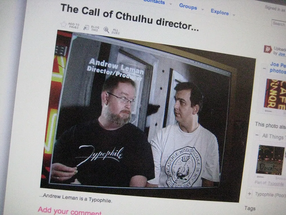
Today I found a photo on Flickr taken by Joe Pemberton, one of the founders of Typophile.com, of his computer monitor displaying a freeze frame from the making-of section of the DVD “The Call of Cthulhu” showing director/producer Andrew Leman, who also makes typographic props and contacted me years ago in response to my Typecasting article, wearing my winning design from the 2002 Typophile t-shirt contest.
