What’s more nerdy: Attending a performance of A Christmas Carol performed entirely in Klingon, or appearing in it? Whatever, it was a load of fun, and only three blocks away at the University of Minnesota St. Paul Campus Student Center. How could I not go?
So, you might well ask: WTF? Imagine if you will, Charles Dickens’ classic translated and interpreted by the Klingon Imperial Theater Company, hosted by a representative from the Vulcan Institute of Cultural Anthropology, and you’ll get some idea. If you’re still not with me, imagine a parody of the Christmas classic seen through the eyes of Trekkies. (Not that I would call myself a Trekkie.) (And not that Trekkies call themselves “Trekkies.”)
The production, put on by Commedia Beauregard, was cleverly written and very entertaining. The audience, not too surprisingly dominated by Star Trek fans, was in stitches most of the time. While the performance was entirely in the made-up Klingon language (except for occasional commentary by the Vulcan), English subtitles were projected on a screen next to the stage.
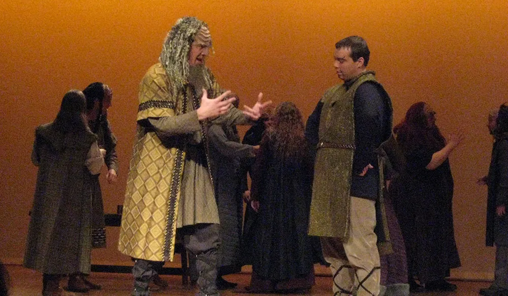
I managed to sneak a few (flashless) photos of the performance. Here is the scene in which SQuja’ (Scrooge), on the left, is visited by Kahless Past (Christmas Past). Notice that the ghost is the “old style” Klingon:
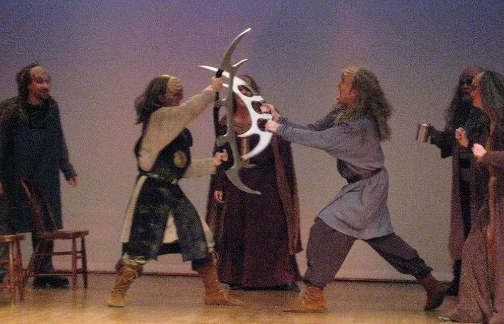
Here is a scene of happier times from SQuja’s youth, in which everyone is having a grand old time trying to kill each other:
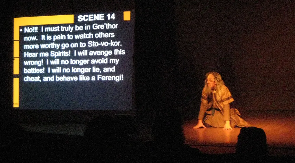
Like the Dickens original, SQuja’ sees what a fool he has been, for seeking gold rather than honor in battle, and vows to change his ways:
A funny coincidence: The part of SQuja’ was played by Michael Ooms, son of Richard Ooms who for years played Scrooge in the Guthrie Theater production of A Christmas Carol.
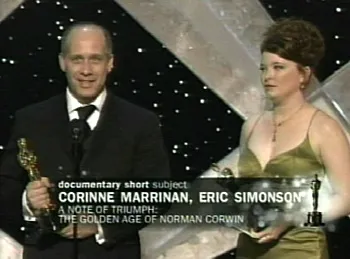
Well, none of my fonts showed up on the Academy Awards show this year unlike last year, but my cousin Eric Simonson did. He and his co-producer Corinne Marrinan snagged an Oscar (Best Documentary Short) for their film “A Note of Triumph: The Golden Age of Norman Corwin.” Eric was nominated once before for another documentary short, “On Tiptoe: Gentle Steps to Freedom” (2000), and our whole family was excited to hear that he had been nominated again. Only this time he got the statue. Way to go, Eric! (And Corinne! though I don’t know you.)
I confess that I probably wouldn’t know Norman Corwin from Irwin Corey if I hadn’t worked on a package design for a collection of his radio broadcasts back in the nineties. I also confess I don’t know much about Eric’s documentary. All the years I have watched the Oscars, I have always wondered, where the heck can you see these short films? I saw his earlier nominated film at a family reunion. As luck would have it, “The Golden Age of Norman Corwin” will be screened this week at the Plaza Maplewood Theater in nearby Maplewood, Minnesota. I’m planning to go.
Congratulations, Eric!
I’m known as a type designer—and fonts are pretty much what it’s all about here on my website, and in my life in general. But I haven’t always been making fonts. At various points of my career (which goes back to 1976) I’ve been a graphic designer, art director, web designer, package designer, product designer, lettering artist, and—very early on—illustrator.
Learning to Do Caricatures
My most active period as an illustrator was for Metropolis, a weekly newspaper in Minneapolis (1976-77). Patrick JB Flynn was the art director. Fairly soon after I started working for them, he asked if I could do caricatures. Caricature was something I dabbled in going back to middle school, mostly in a simple cartoon style. My inspiration came mainly from artists like Mort Drucker (Mad) and Rick Meyerowitz (National Lampoon). But I’d never done a full caricature before. Not really. But, I thought, how hard could it be?
And so I started doing caricatures for Metropolis. I wasn’t that good at first, but I got better. I was actually kind of surprised I could pull it off. Caricature is not the easiest skill—even when you can draw well. And some of my caricatures were better than others.
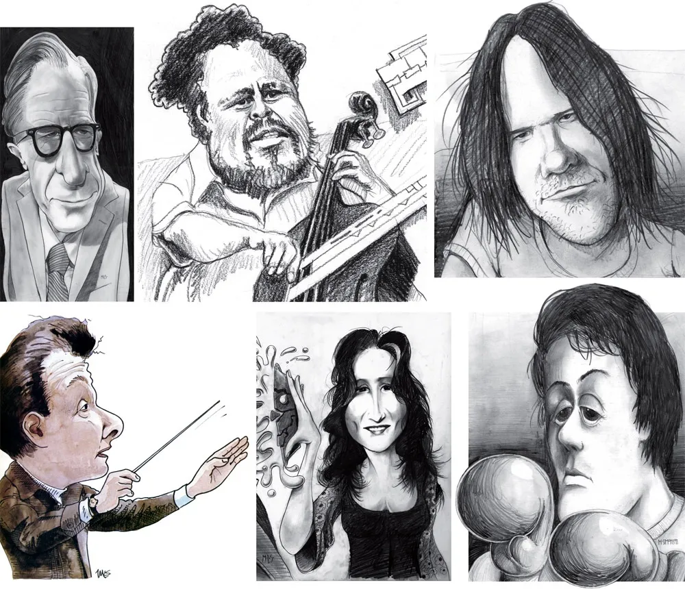
Above, some of my early caricature work. Clockwise f**rom the top left: economist John Kenneth Galbraith, Jr.; jazz bassist Charles Mingus; a “stoned out” Neil Young; Sylvester Stallone as Rocky with “puppy-dog eyes.”; singer Bonnie Raitt; and orchestra conductor Sir Neville Mariner.
After Metropolis, I kind of stopped doing it. I’d also dropped the idea of being an illustrator. It was easier to be an art director, think up the concepts, and let someone else do the drawing. Plus, I didn’t think my caricature style was “in.” It wasn’t the sort of thing I was seeing in the illustration annuals. I associated it with “kid’s stuff” (Mad especially) and felt almost embarrassed by it.
Getting Back Into It
Earlier this year, I made an effort to get back into drawing and other creative pursuits, and get away from staring at a computer screen all day (see my “1979” post from February). I filled up several sketchbooks over the next few months, drawing nearly every day. And then in July, I started doing daily drawings in Procreate on my 12.9” iPad Pro—quick caricature sketches of people I saw on YouTube while watching videos.
Drawing digitally—that is, drawing on a tablet or screen with a stylus—has always been problematic for me, in spite of all the money I’ve spent on Wacom tablets and Cintiqs and iPads over the years. For some reason, I just never took to it, no matter how much I wanted to. It didn’t feel as fluid and natural to me as drawing on paper. So I never did much but doodle, rarely doing a full drawing.
But I had a breakthrough while doing these quick studies. I figured out a technique for doing full caricatures that works for me, like the ones I used to do for Metropolis. In fact, it works even better.
The trick is to keep things really simple. I use the 6B Pencil brush for the line work on one layer, and the Tamar brush—sort of like painting with a sponge—for shading (and color) on a second layer. I’m careful not to change the size of the pencil brush (~60%). I try to draw at actual size as much as possible and stay loose. It all finally clicked for me.
And of course, working digitally is great for drawing caricatures compared to drawing on paper. It’s so easy to fix problems, like when proportions are off or positions of the features aren’t quite right. I’m able to work very quickly, knowing that if I make a mistake, I can immediately fix it. (Although, I might try redoing some of these using analog media now that I’ve worked out the likeness and everything digitally.)
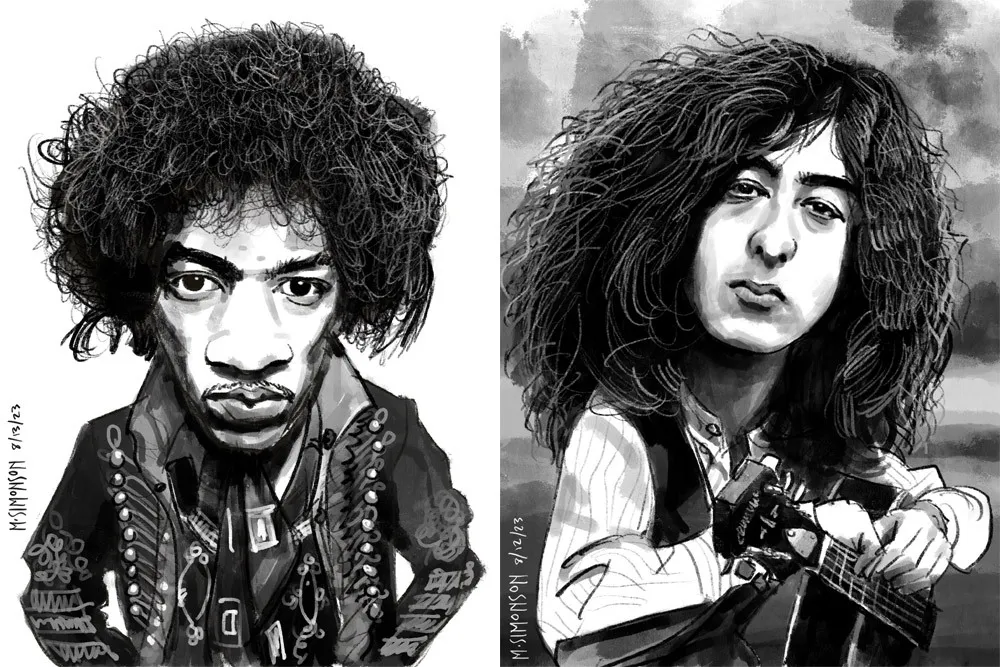
Jimi Hendrix and Jimmy Page.
It takes me anywhere from an hour to three hours to do one of these. I’m working in both black and white and color, depending on the source photo. And, yes, these are based on specific photos, or several photos in some cases. Some of them may be recognizable—even iconic.
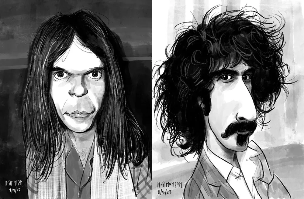
Neil Young and Frank Zappa.
By the end of July, I was doing a full caricature every day. This went on for almost two weeks. Since then, I’ve been doing several a week. I’ve done almost 30 of them now. Mostly rock musicians so far, but I have a long list of possible subjects in other areas, too.
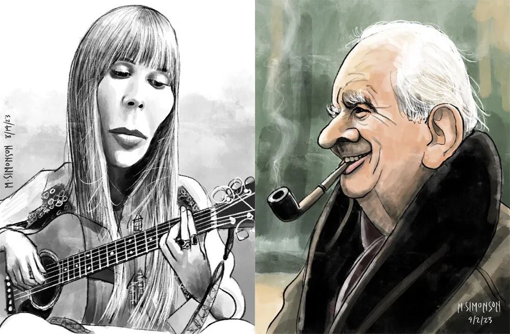
Joni Mitchell and J.R.R. Tolkien.
Rediscovering Myself
I can’t believe how good it feels to reconnect with this. As an artist, knowing that you’re capable of doing something yet not doing it for years—decades even—is painful. It feels like a waste. Of course, I’m doing other things, like making fonts, which is also creatively fulfilling. In fact, I’ve often wondered if getting so busy making fonts was the reason I wasn’t drawing as much. Apparently not.
In my “1979” article, I cast a dim eye on the digital world—the world of screens and pixels—and advocated a return to doing physical things, like drawing on paper. And I have been doing that. But, ironically, getting back into drawing on paper—specifically the habit of drawing daily—led directly to finally getting some use out of my iPad Pro and Apple Pencil. In hindsight, it was all about getting back to drawing, regardless of whether it’s on a screen or not.
Anyway, all of this is a roundabout way of saying that I’m going to start sharing my caricature work online. To be clear: I’m just doing this because I enjoy doing it. It’s a side project. I’m not looking to start a new career or anything like that. Fonts are still my main gig. I just want to share something else I enjoy doing, and I hope others will enjoy seeing it.
If you’re interested, I’ll be posting the work on my secondary Instagram account (not my regular Mark Simonson Studio account, which is for official, font-related stuff). Update: I’ve also created a new website to showcase my non-type-related work: marksimonson.art.
Flash animation designed to promote my typeface Coquette. Amazingly, the entire file shown here weighs in at just over 8k through the magic of ActionScript. Created in 2001.
Note: Flash 5 or later plug-in required for clock to run.
Meta Swash Alternates
ITC ITC Garamond
Avant Garde Oldstyle
Comic Serif
One Pixel
Cooper Black Monospace
Neue Helvetica Super Ultra Thin
Brush Script Titling
Centaur Frisky
Snell Commoncase
My partner, Pat, has been heavily involved with the annual fund-raising plant sale at Friends School of Minnesota ever since our daughter started kindergarten there nearly ten years ago. For the 2007 sale, she wondered if it would be possible to do a time-lapse video of the event to help promote it.
After investigating a number of possibilities, I decided that the simplest way would be to use the iSight camera built into my MacBook Pro along with Boinx Software’s iStopMotion.
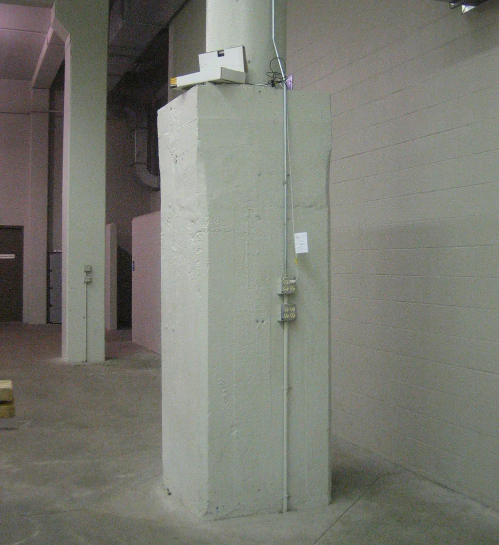
The venue for the sale was the Grandstand at the Minnesota State Fairgrounds, a cavernous space filled with concrete support columns every twenty or thirty feet. I was a bit concerned about leaving my laptop unattended for the week it would take to capture the video, but fortunately we found a well-placed column that had a flat “shelf” about ten feet off the ground. It had just enough space to hold the laptop. There was also a conduit that could be used to attach a security cable.
I still thought it might be a little conspicuous (and tempting) for my not-exactly-cheap MacBook Pro to be visible up there, so I covered it in a make-shift cardboard “disguise” to make it a bit less obvious what it was.
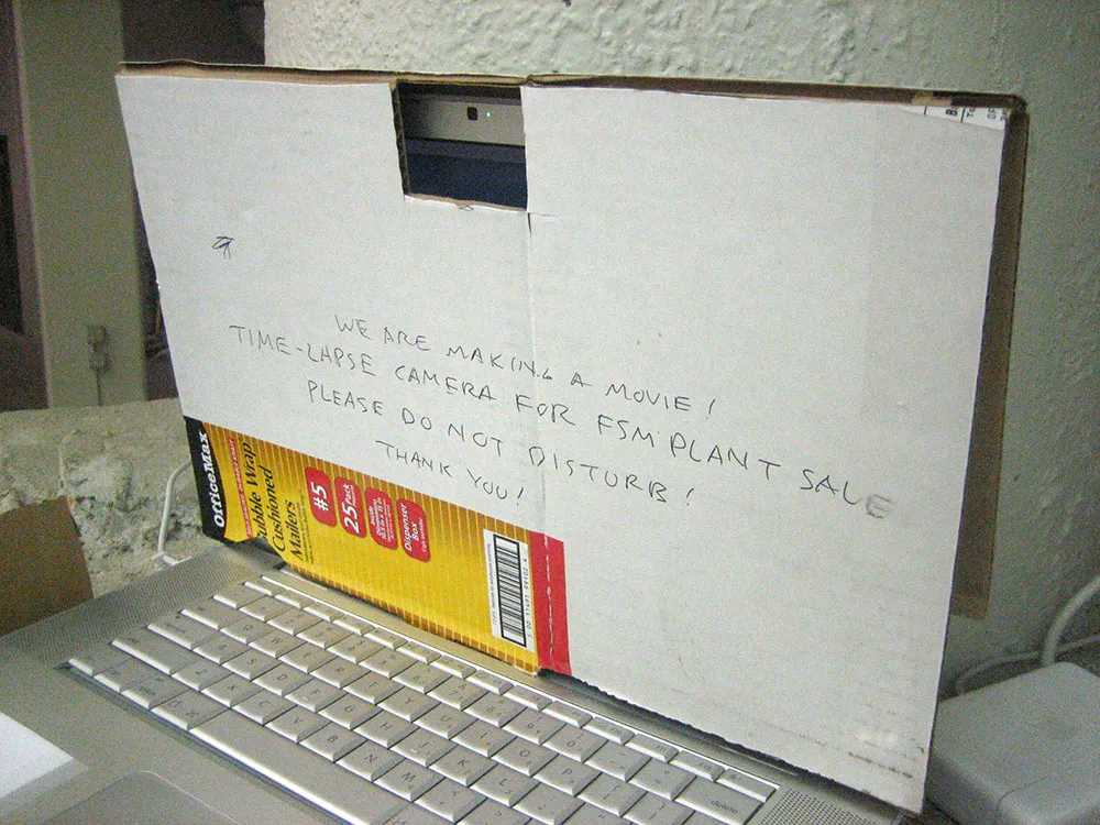
We alerted the fairgrounds security to its presence, but just in case an over-zealous and uninformed security guard happened upon it and thought it was a bomb or something, I added notes and stickers to the outside to explain what it was. And, of course, I completely backed up my hard drive, removed all personal files, logged out of my personal account and set up a temporary user account, in case all else failed and it got stolen or damaged.
Happily, none of that happened. It sat undisturbed for the whole week, shooting one frame every two minutes. I stopped by at least once a day to check on its progress (and to hit command-S to save the footage captured so far), hauling a ladder to and from the site in order to get at it. Unfortunately, some time during the last day of the sale, iStopMotion seems to have crashed, so any video it captured after I hit “save” that morning was lost. (Neither I or the helpful people at Boinx could figure out what happened.)
Nevertheless, the captured video was amazing. I added titles and music, and, well, here is the finished video:
