I’ve been using a Mac for all my design, illustration, lettering, and type design work since the mid-1980s. I embraced it fully and enthusiastically, before it was really even ready sometimes. It made so many things easier and faster. Why would you ever go back once you had experienced the power of “undo”?
I grew up in the analog world, the time before ordinary people had access to computers and digital technology. The most high-tech things in my life were television and the space program (which I saw mainly on television).
The kid who could draw
When I was young, I drew a lot. I had my first piece in a public art show when I was in kindergarten. Sometimes, my first-grade teacher would let me stay inside and draw instead of going outside for recess. When I was in 4th grade, all five of my entries in a Post Cereal drawing contest won prizes. That year, I also started taking oil painting lessons. By the time I was in high school, I was very good at drawing, cartooning, and painting. I consistently got A’s in art class, won awards, and was clearly heading for some kind of career in art.
I majored in art and graphic design in college and initially had ambitions to become a commercial illustrator, given my talent for drawing. But graphic design, lettering—and even type design—also appealed to me. In my first job out of college, I was hired as a graphic designer at a small advertising art studio. I also did illustration jobs on the side for local magazines and newspapers in Minneapolis. My career soon veered into magazine art direction, where I hired illustrators, and my illustration career never really took off.
The digital world
After I bought a Macintosh in 1984 and started using it for creative work, I found myself using the analog tools I grew up with less and less. All the tricks and techniques I’d learned as a young artist were becoming obsolete very quickly. I was drawing less, painting less, and, without realizing it, taking those skills for granted. I could still do it if I wanted to, I told myself.
I tried using graphic tablets, attempting to transfer some of those skills into making art on a computer. Whatever the reason was, drawing on a tablet has never felt the same to me. The immense flexibility and power of computer graphics software has always has felt impoverished and ephemeral next to the richness of physical art tools and media.
Even so, I turned my back on the old ways and embraced the digital.
Admittedly, this has worked out very well for me. I wouldn’t have succeeded as a type designer any other way.
But, as time went by, not just my work, but more and more of my life (and almost everyone’s life) became centered on the digital world, especially with the rise of the internet, and the always-on internet. And with the iPhone, the always-with-you internet. And now they want to put it right in your field of vision with VR/AR, and ultimately a chip in your head. The digital world seems hell-bent on supplanting the physical world.
This used to sound “cool” to me. It seemed like the logical path in human-computer interaction. But I’m not so sure anymore.
We’ve been accepting all this, little by little, because of the convenience. Each step of the way, it’s “so much easier” than the old way. Everything in the world at your fingertips. All the music, all the movies, all the shows, all the art, all the time. Make a mistake? Undo! Change your mind? Redo! Dropped your laptop in the lake? No problem. It’s in the cloud!
But at what price?
I’ve become increasingly skeptical of the digital world as a healthy or desirable place to spend time. Not to mention all the tracking and surveillance that has crept in, the psychological damage of social media, and the rise of “subscription” models where you have to pay for an app indefinitely to maintain access to your documents.
I’ve also grown wary of how much time I spend sitting in front of a computer screen, even for doing creative, useful things (as opposed to YouTube, social media, or other time-wasters). As I get older, time is getting more precious to me. Do I really want to spend it sitting and staring at a screen?
Reconnecting
Getting back into drawing has been on my to-do list for a while. Maybe 20 years. I felt like I was letting my drawing talent waste away, rarely using it anymore. I was spending more time watching videos or reading books about drawing than actually drawing. I tried different things over the years (including joining a group that gets together once a month to draw cartoons), but nothing seemed to work in any sustained way. It’s almost like I’d given up, but didn’t want to admit it to myself.
But recently, I heard about a book called *The Artist’s Way,*by Julia Cameron. One of the things she recommends is to write “morning pages” first thing every day. Most of the rest of the book didn’t really seem to apply to my situation, but this “morning pages” thing got to be a habit, and got me thinking more deeply (through the writing) on improving my relationship with “screens” and getting back to drawing regularly.
1979
One of these insights revolved around the year 1979. In my mind, that year signifies the twilight of the analog world, just before the dawn of the digital era. Things in my 1979 world were entirely analog.
I was 23 years old. The tools of my craft were T-squares, rubber cement, ink, Zip-a-Tone, technical pens, X-acto knives, ellipse templates, markers, illustration board, dividers, Letraset, photostat cameras, and phototypesetting. I listened to music on a Pioneer turntable and a JVC AM/FM receiver. I watched TV on a 13” Panasonic. Cable TV and VCRs weren’t really a thing yet. My telephone was connected to the wall. If I was away from my apartment, I was unreachable. My apartment was filled with inexpensive furniture I’d made myself (thanks to the books Instant Furniture and Nomadic Furniture) I designed and built my own desk/drawing table. I had a 35mm camera and a Polaroid SX-70. I had books and magazines to educate and entertain myself. And a guitar. If I need a photo reference in order to draw something, I’d go down to the picture section at the Minneapolis Public Library.
It might sound terrible to someone who has never known life without the internet, but I miss it. I miss not being surrounded by things trying to get my attention. I miss the simplicity of the way things used to work. You learned to find your way around. You didn’t need GPS. Doing art was a physical, direct, visceral experience—even commercial art.
Don’t get me wrong, I wouldn’t actually want to live that way now. I love technology and gadgets, and all the things they can do for me. But thinking about what things were like in 1979 reminds me that life is perfectly possible without all our modern “conveniences” and their hidden costs and unseen consequences. For instance, my old drawings and artwork could be lost in a fire or flood. But they may well still be around hundreds of years from now, and they won’t need any special device or software to be seen. Whereas my PageMaker files from 1995 are already virtually inaccessible (I have ways, but you get the point). Not to mention degradation of digital media over time, rendering the contents of disks, hard drives, and SSDs unreadable sooner or later.
I’ve come to realize the value of making physical things, the richness of analog art vs. the weightless, scaleless, ephemeral nature of digital art. I’m obviously not the first person to think this. There are books about it. But the trade-offs of the digital world have been growing larger in my mind.
Drawing again
Another insight from my “morning pages” has been discovering a way to trick myself into drawing again. I have a habit of listening to podcasts or videos. Basically, draw at the same time—piggyback on that habit. It’s so simple, I don’t know why it never occurred to me before. I guess I had in my mind that I needed to devote time to do draw, and only draw. And I could never quite make the time. Something else would always seem more important or easier.
But it worked, and now I’m drawing again every day. The old confidence is back (which I didn’t even realize had gone) and it’s been very satisfying. Lack of undo actually increases the enjoyment. Things are at stake. Getting to the end of a drawing without undo is immensely rewarding.
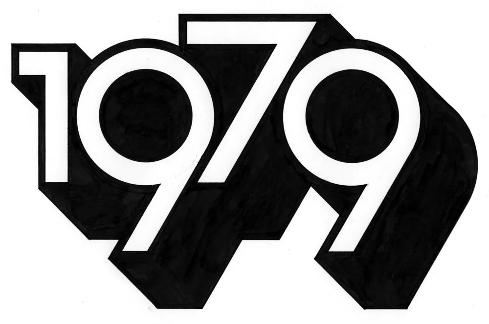
And I’m spending less time staring at screens. In fact, I thought of a way to remind myself to get into “1979 mode.” During my drawing session the other day, I designed and lettered the year “1979” in a style similar to lettering I was doing back around 1979. And I did it only using tools that were available to me in 1979 (yes, I still have them): pencils (for the sketch and the under-drawing), erasers, illustration board, masking tape to hold the board down, circle template, dividers, ruler, triangles, Ulano Glide-Liner (like a T-square, but attached to the table), Higgins Black Magic ink, a Koh-I-Noor Rapidograph, a fine sable brush, and a bit of white water color paint to fix some mistakes.
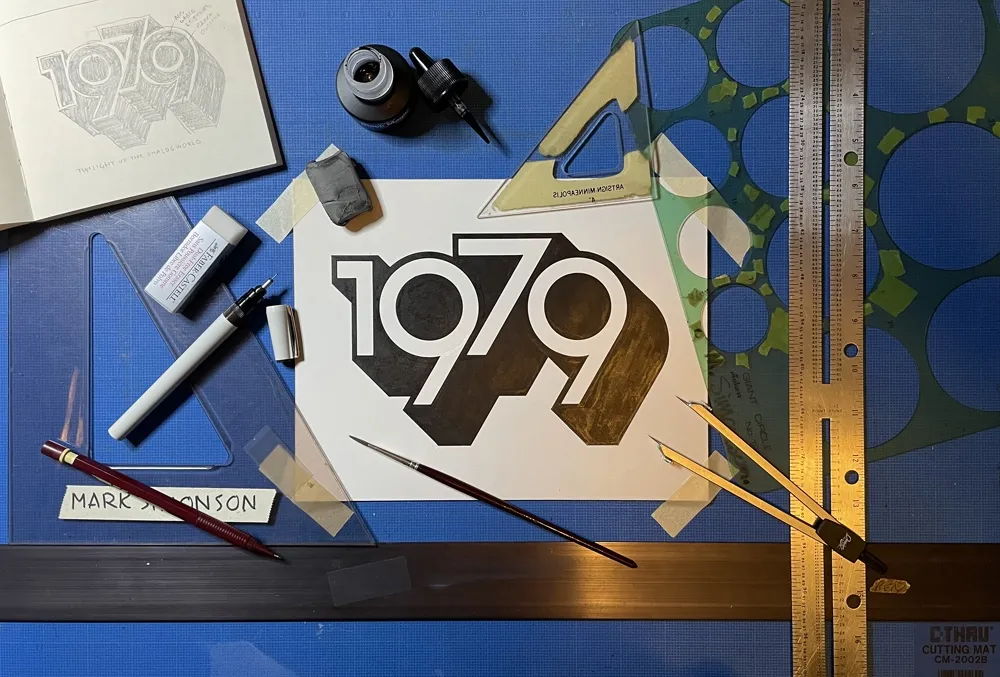
It took about two hours in all—10 minutes to do the sketch and the rest to render it. On my Mac, I could have done the whole thing in a couple of minutes—and with no mistakes. But it would have been much less satisfying when I was finished. And I’d be tempted to fiddle with it endlessly.
So, now I have this little bit of lettering tacked up on my wall to remind me to keep things real, to get my head out of cyberspace once in a while and connect with reality. To remind me I don’t need a computer to draw a picture. I just need some paper and a pencil.
The digital world has its place. You can do amazing things in it (like publishing a blog post). But don’t spend all your time there. It’s not the real world.
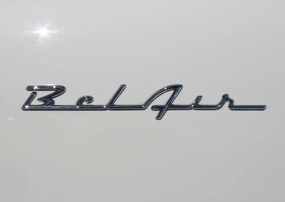
We live a few blocks from the Minnesota State Fairgrounds, and every summer the “Back to the Fifties” car show is held there. There’s usually no need to actually pay to get into it to see the cars—our neighborhood is full of them, cruising around, for the duration of the show. But lately I’ve paid to get in, mainly to get shots of the nameplates, or “brightwork” as it is known.
The Chevy “Bel Air” nameplate, from the late-fifties, is my all-time favorite. The design is so simple and stylish. (Photo taken in Saint Paul, Minnesota, June 20, 2009.)
There might be a personal bias to my “Bel Air” preference. We always had Chevys when I was a kid, a ’59 Bel Air and a ’64 Bel Air—the car I learned to drive on and the car I drove during high school in the early seventies. Here’s a cartoon painting I did of it back then as a joke:
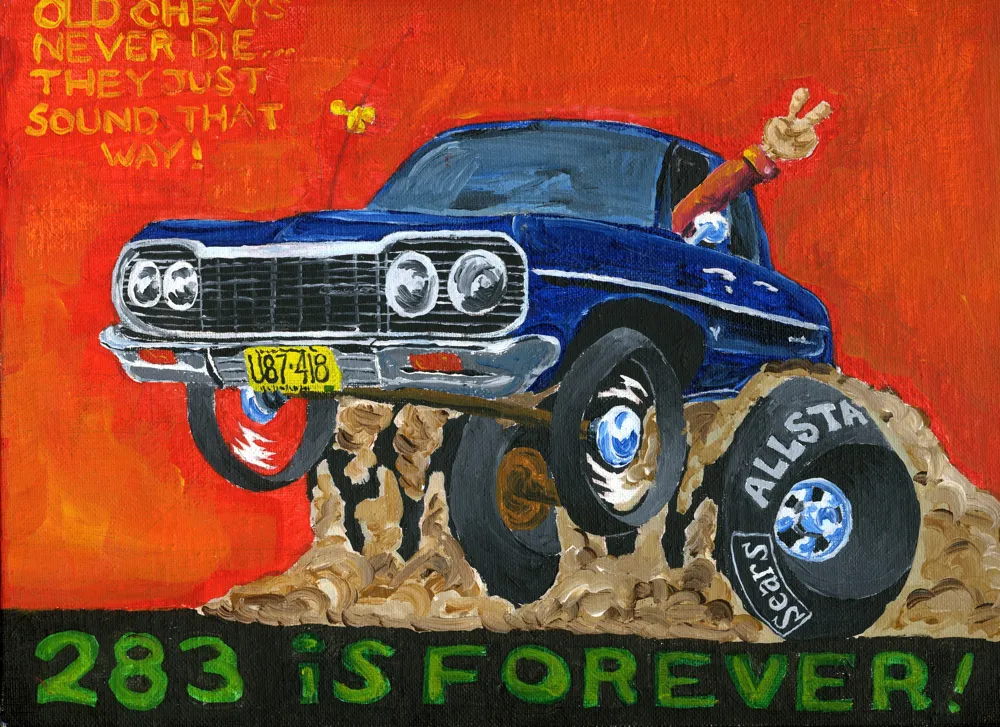
(When I was in high school, I had a little side business doing cartoon drawings of cars like this for my friends. I’ll post more of them sometime.)
I attended two events tonight.
The first was (nominally) a Type Tuesday event, but really a Minneapolis Institute of the Arts / AIGA Minnesota event: “What Fonts Say” featuring Craig Eliason, talking about where type designers get their ideas, going back to Gutenberg, and Chank Diesel, talking about where he gets his ideas. Which was fine and enjoyable.
Afterwards, we headed to the Minnesota Center for the Book Arts in Minneapolis (after stopping for gas) and attended a reunion of people who have worked for the Utne Reader, which was founded almost 30 years ago.
Not everyone who ever worked there attended, but a lot more than I expected. Some I hadn’t seen since the late 80s, when I parted ways with the magazine. Eric Utne was there, of course, but I was surprised and delighted to see so many people from the early years, when I was freelancing as its designer/art director.
Eric managed to get a bottle of 30-year-old scotch for the old-timers. First time I’ve tasted scotch in at least that long, and I’m glad he got it. I might change my mind in the morning.
I’ve got mixed feelings about my time with the Utne Reader for reasons I won’t get into, but I met the love of my life there and worked with a lot of really great people. It was a blast to see them again.
I’m known as a type designer—and fonts are pretty much what it’s all about here on my website, and in my life in general. But I haven’t always been making fonts. At various points of my career (which goes back to 1976) I’ve been a graphic designer, art director, web designer, package designer, product designer, lettering artist, and—very early on—illustrator.
Learning to Do Caricatures
My most active period as an illustrator was for Metropolis, a weekly newspaper in Minneapolis (1976-77). Patrick JB Flynn was the art director. Fairly soon after I started working for them, he asked if I could do caricatures. Caricature was something I dabbled in going back to middle school, mostly in a simple cartoon style. My inspiration came mainly from artists like Mort Drucker (Mad) and Rick Meyerowitz (National Lampoon). But I’d never done a full caricature before. Not really. But, I thought, how hard could it be?
And so I started doing caricatures for Metropolis. I wasn’t that good at first, but I got better. I was actually kind of surprised I could pull it off. Caricature is not the easiest skill—even when you can draw well. And some of my caricatures were better than others.

Above, some of my early caricature work. Clockwise f**rom the top left: economist John Kenneth Galbraith, Jr.; jazz bassist Charles Mingus; a “stoned out” Neil Young; Sylvester Stallone as Rocky with “puppy-dog eyes.”; singer Bonnie Raitt; and orchestra conductor Sir Neville Mariner.
After Metropolis, I kind of stopped doing it. I’d also dropped the idea of being an illustrator. It was easier to be an art director, think up the concepts, and let someone else do the drawing. Plus, I didn’t think my caricature style was “in.” It wasn’t the sort of thing I was seeing in the illustration annuals. I associated it with “kid’s stuff” (Mad especially) and felt almost embarrassed by it.
Getting Back Into It
Earlier this year, I made an effort to get back into drawing and other creative pursuits, and get away from staring at a computer screen all day (see my “1979” post from February). I filled up several sketchbooks over the next few months, drawing nearly every day. And then in July, I started doing daily drawings in Procreate on my 12.9” iPad Pro—quick caricature sketches of people I saw on YouTube while watching videos.
Drawing digitally—that is, drawing on a tablet or screen with a stylus—has always been problematic for me, in spite of all the money I’ve spent on Wacom tablets and Cintiqs and iPads over the years. For some reason, I just never took to it, no matter how much I wanted to. It didn’t feel as fluid and natural to me as drawing on paper. So I never did much but doodle, rarely doing a full drawing.
But I had a breakthrough while doing these quick studies. I figured out a technique for doing full caricatures that works for me, like the ones I used to do for Metropolis. In fact, it works even better.
The trick is to keep things really simple. I use the 6B Pencil brush for the line work on one layer, and the Tamar brush—sort of like painting with a sponge—for shading (and color) on a second layer. I’m careful not to change the size of the pencil brush (~60%). I try to draw at actual size as much as possible and stay loose. It all finally clicked for me.
And of course, working digitally is great for drawing caricatures compared to drawing on paper. It’s so easy to fix problems, like when proportions are off or positions of the features aren’t quite right. I’m able to work very quickly, knowing that if I make a mistake, I can immediately fix it. (Although, I might try redoing some of these using analog media now that I’ve worked out the likeness and everything digitally.)
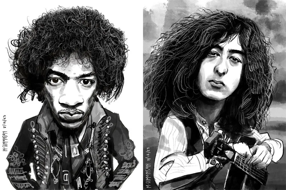
Jimi Hendrix and Jimmy Page.
It takes me anywhere from an hour to three hours to do one of these. I’m working in both black and white and color, depending on the source photo. And, yes, these are based on specific photos, or several photos in some cases. Some of them may be recognizable—even iconic.
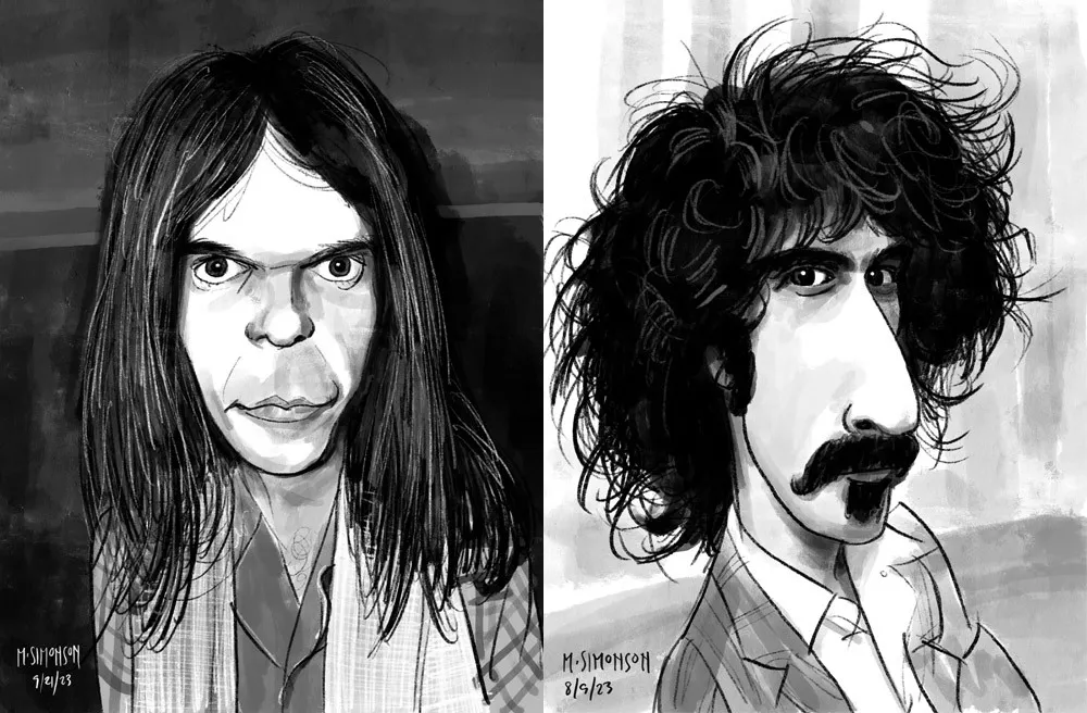
Neil Young and Frank Zappa.
By the end of July, I was doing a full caricature every day. This went on for almost two weeks. Since then, I’ve been doing several a week. I’ve done almost 30 of them now. Mostly rock musicians so far, but I have a long list of possible subjects in other areas, too.
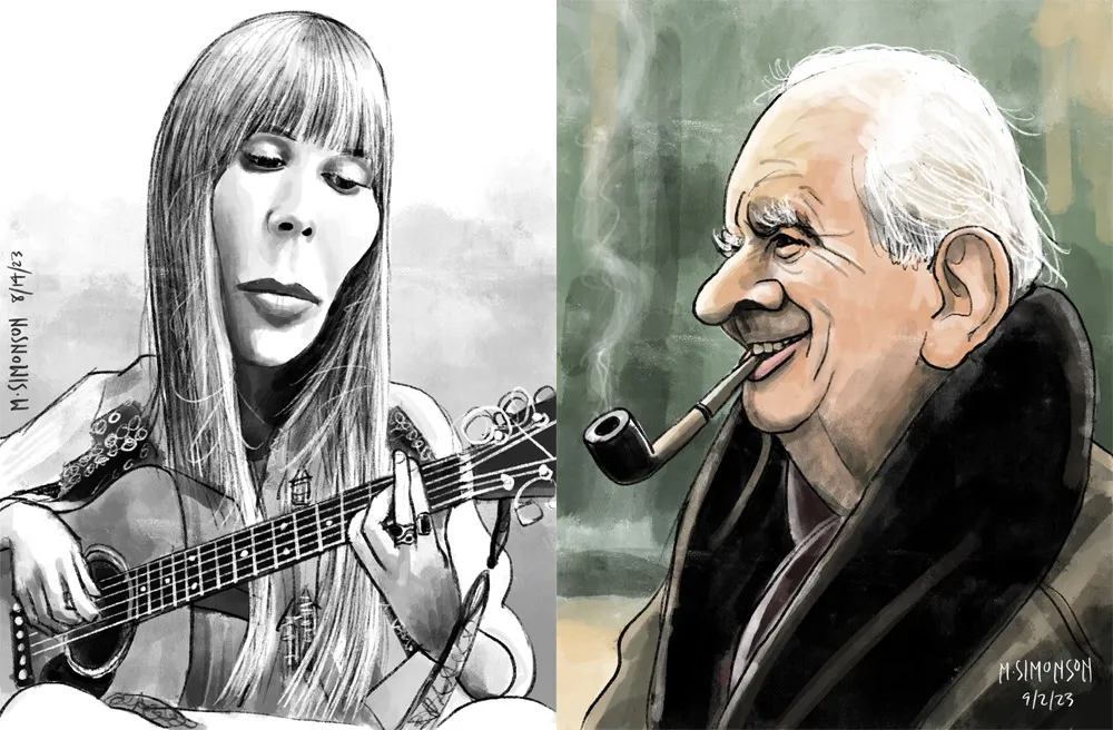
Joni Mitchell and J.R.R. Tolkien.
Rediscovering Myself
I can’t believe how good it feels to reconnect with this. As an artist, knowing that you’re capable of doing something yet not doing it for years—decades even—is painful. It feels like a waste. Of course, I’m doing other things, like making fonts, which is also creatively fulfilling. In fact, I’ve often wondered if getting so busy making fonts was the reason I wasn’t drawing as much. Apparently not.
In my “1979” article, I cast a dim eye on the digital world—the world of screens and pixels—and advocated a return to doing physical things, like drawing on paper. And I have been doing that. But, ironically, getting back into drawing on paper—specifically the habit of drawing daily—led directly to finally getting some use out of my iPad Pro and Apple Pencil. In hindsight, it was all about getting back to drawing, regardless of whether it’s on a screen or not.
Anyway, all of this is a roundabout way of saying that I’m going to start sharing my caricature work online. To be clear: I’m just doing this because I enjoy doing it. It’s a side project. I’m not looking to start a new career or anything like that. Fonts are still my main gig. I just want to share something else I enjoy doing, and I hope others will enjoy seeing it.
If you’re interested, I’ll be posting the work on my secondary Instagram account (not my regular Mark Simonson Studio account, which is for official, font-related stuff). Update: I’ve also created a new website to showcase my non-type-related work: marksimonson.art.
Flash animation designed to promote my typeface Coquette. Amazingly, the entire file shown here weighs in at just over 8k through the magic of ActionScript. Created in 2001.
Note: Flash 5 or later plug-in required for clock to run.
In the early ’80s, before I had a Mac, and before I was making fonts, I was an Atari home computer user. I’ve been down an Atari rabbit hole lately, organizing and documenting my old Atari files and programs, which I originally transferred to my Mac back in the ’90s. As I’ve been going through all this stuff, it occurred to me that people might be interested to learn about what I was doing with my Atari back in the early ’80s (and since then), and how I started using computers in the first place.
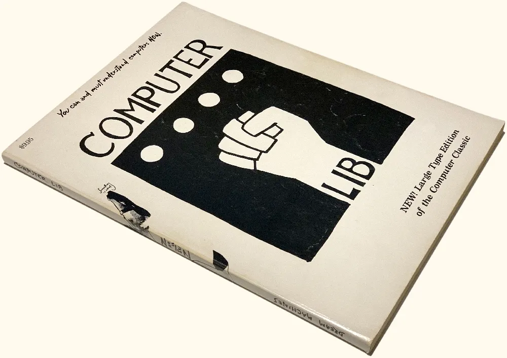
In the late ’70s, microcomputers like the Apple II and Commodore Pet were getting a lot of attention. I wasn’t all that interested until I read Ted Nelson’s self-published, Whole Earth Catalog-style book Computer Lib/Dream Machines in 1980. Computers were not cheap, though. A basic Apple II setup cost over $2,000 (over $6,000 in 2020 dollars). But when I saw an ad for the Sinclair ZX80, which sold for only $199 (plus $5 shipping), I’d found a less expensive way in.
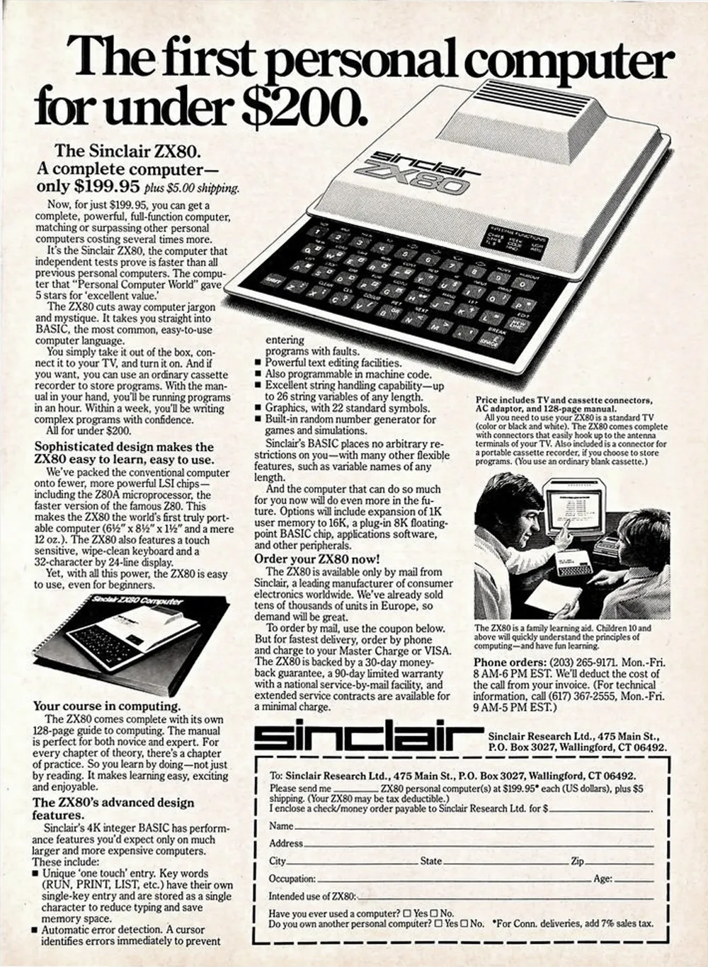
It was much smaller than I expected, about 7 by 9 inches and a little over an inch thick, with a flat membrane keyboard. And it looked cheap. The case was two sheets of vacuum-formed white plastic held together with plastic rivets. There were no moving parts, not even a power switch—just some connectors in the back to plug in the power supply, a standard cassette recorder, and a black and white TV. It only had 1K of memory (1024 bytes), plus 4K of ROM (read-only memory) that contained the operating system and BASIC language interpreter.
I did some tutorials to learn the basics of BASIC and typed in some demo programs, but quickly learned how limited this little machine was. Trying to see what I could do with it graphically, I wrote a program to display a bitmap-style lowercase “a” using graphics characters and simple PRINT statements. It took most of the available memory just to do that.
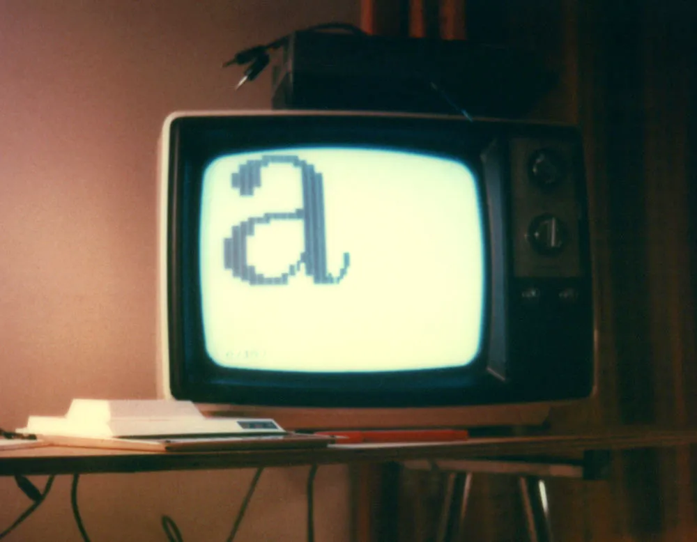
But I’d gotten a taste of what you could do with a computer and started looking for something better.
The Apple II was the most popular at the time, and the first IBM PC had just been introduced. I was 26 years old with a full-time job, but those machines were beyond my means. A little hole-in-the-wall computer store had just opened near where my parents lived, and my dad and I decided to check it out. On display was an Atari 400 running a game called Star Raiders. I’d never seen anything like it. It was a first-person shooter (as they call them now) with a three-dimensional view of stars and space ships. You would “hyperwarp” from sector to sector and then fly around shooting down enemy ships using a joystick. The sound and graphics were amazing for the time—better than the Apple II—and the Atari 400 was a lot cheaper, so I bought one (along with a Star Raiders cartridge). It only had 16K of memory, but that seemed like plenty compared the ZX80.
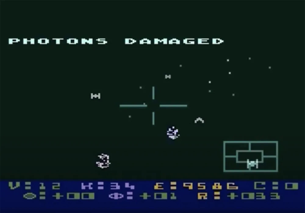
Atari’s line of home computers is remembered mainly for games. I did play a lot of games on it, but I was more interested in programming it and using its graphics capabilities for art.
Like the ZX80, the Atari 400 had a membrane keyboard to keep the cost down. For a touch typist, it wasn’t great, but it worked, and I typed in programs from computer books and magazines to learn what the machine could do. I also went with the cheaper option for storage with the Atari 410 Program Recorder—which let you load and store programs and data (very slowly) on audiocassettes.
Soon after I bought it, there was a free upgrade to a new graphics chip—the GTIA. The GTIA was exciting since it added more graphic modes and up to 256 different colors.
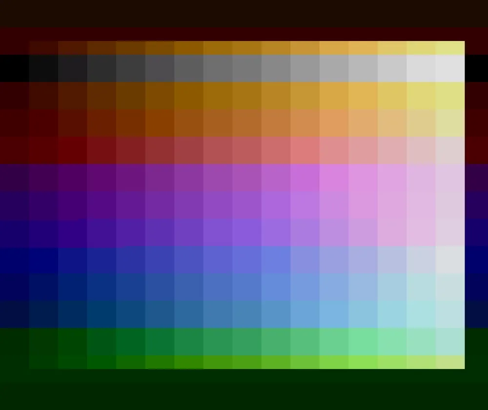
But all the existing drawing programs on the Atari used its older four-color graphic modes, including the first one I bought, Micro-Painter. The way color worked on the Atari was that you had a certain number of colors to work with in each graphic mode, and each of these colors could be set to any of 128 possible shades and hues. A program like Micro-Painter would let you change them whenever you wanted while creating your artwork, but you were still stuck with only four at a time.
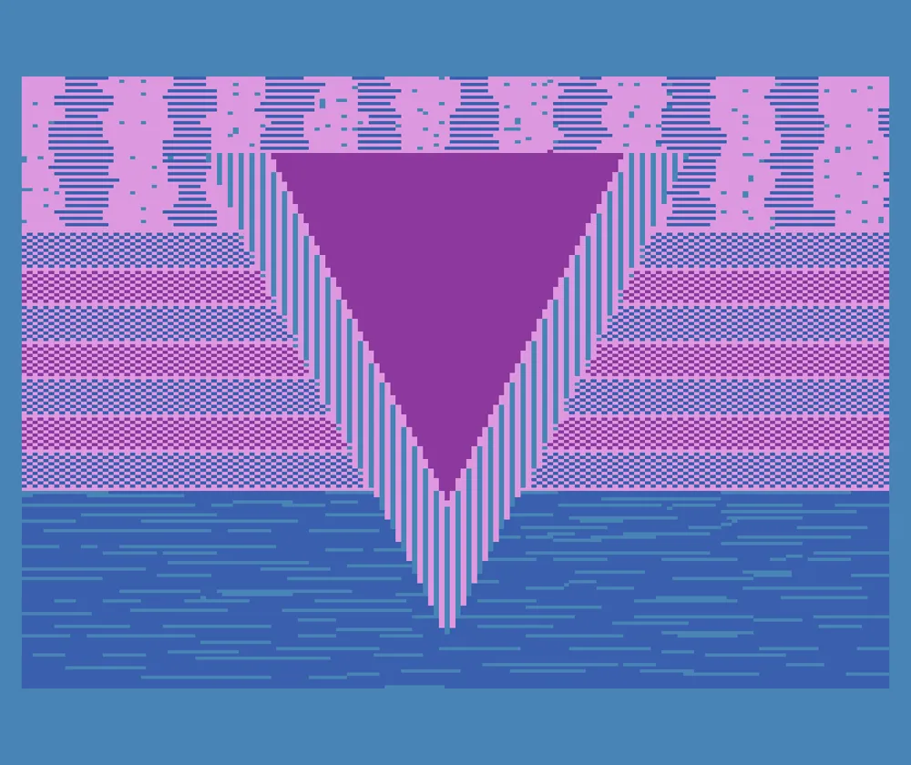
But knowing that this new GTIA chip was in my computer, I wanted to figure out a way to use it. I did this by modifying a type-in program from Compute! magazine called The Fluid Brush. It was little more than a demo that let you draw pictures using a joystick in one of the four-color graphic modes. You could change brushes and colors as you were drawing, but there was no way to “pick up” your brush to move it to a different part of the screen, and there wasn’t any way to save or open picture files.
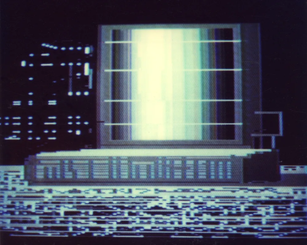
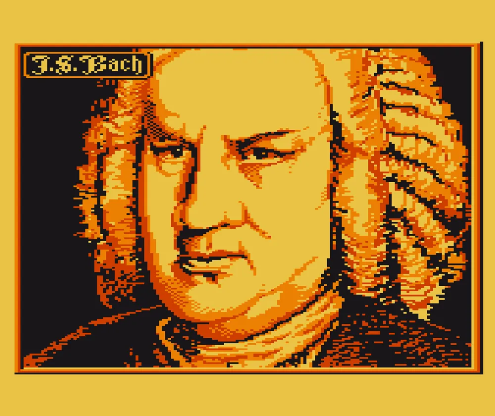
So I modified it to work in the new graphic mode 9, which allowed up to 16 shades of a single hue. This let me draw 16-shade grayscale images. The pixels in this mode were four times wider than they were tall, so the screen resolution was higher vertically than horizontally, a trade-off for getting more colors. (Until I figured out a a way to save files, I had to take Polaroid photos of the screen, as you can see above.)
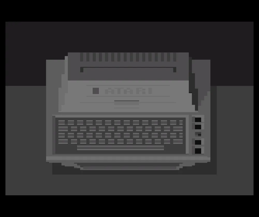
Mode 10 was also interesting since it let you use up to nine arbitrary hues and shades at once. I made a version that worked in this mode and then added a way to save and load pictures. Next I changed it so you could move the brush around without painting.
Since I was getting more serious about all this, I got an 810 floppy disk drive and an Atari 800, which had more memory (48K), a real keyboard, and better video output.
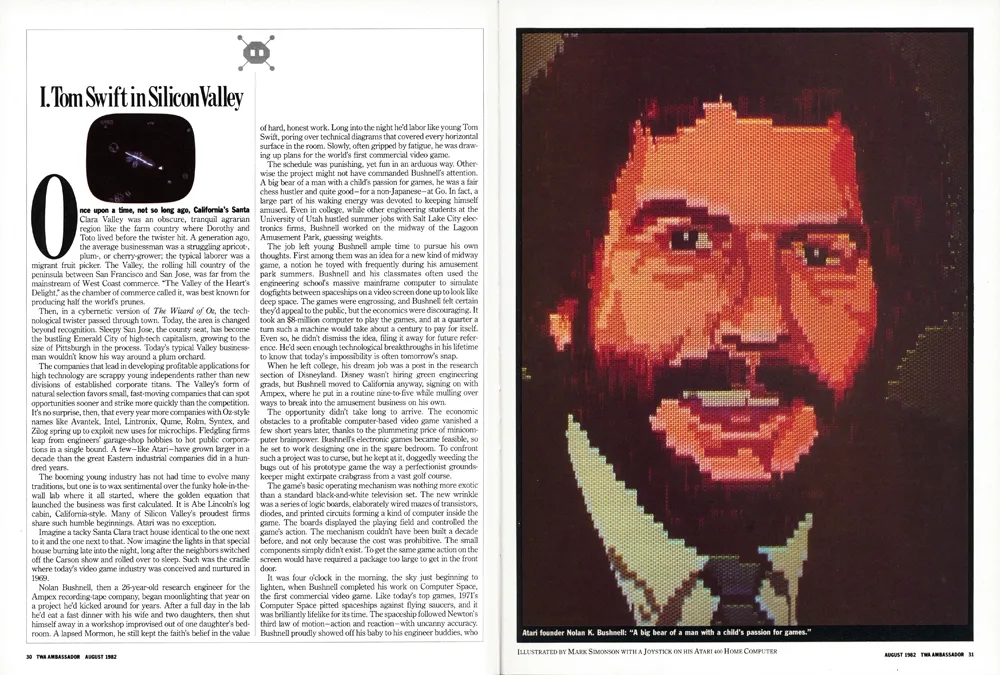
Right around this time, I had left my job as assistant art director at TWA Ambassador magazine and had gone to work at Minnesota Public Radio. The new art director at Ambassador, Barb Koster, knew I had an Atari computer, so when they did an article about Atari in 1982, they hired me to make a digital portrait of Atari’s founder, Nolan Bushnell. I used my mode 10 paint program to do it.
The image needed to be in “portrait” orientation for the magazine. Because TV screens are “landscape” orientation, I had to work sideways. They gave me a photo of Bushnell as reference, which I enlarged and traced onto a sheet of clear acetate. I taped this to my 13” TV screen as a guide for drawing the portrait. For the “final art,” a photographer shot the image directly from my TV screen. There wasn’t any way for me to get good color printouts back then, and forget about sending digital artwork to a magazine. Things like JPEG, TIFF, and PDF were more than a decade away.
I bought a few other joystick-based “paint” programs, including Graphic Master and Fun With Art. Graphic Master used the Atari’s one-color/two shade “high res” mode of 320 by 192 pixels. It seemed to be meant for making technical diagrams and had a rudimentary copy and paste feature. It allowed me to work at the Atari’s highest resolution, though in black and white only. Fun With Art came on a cartridge and used the same four-color mode as Micro-Painter, but used an Atari graphics trick that let it display up to 128 colors at a time, but no more than four per row.
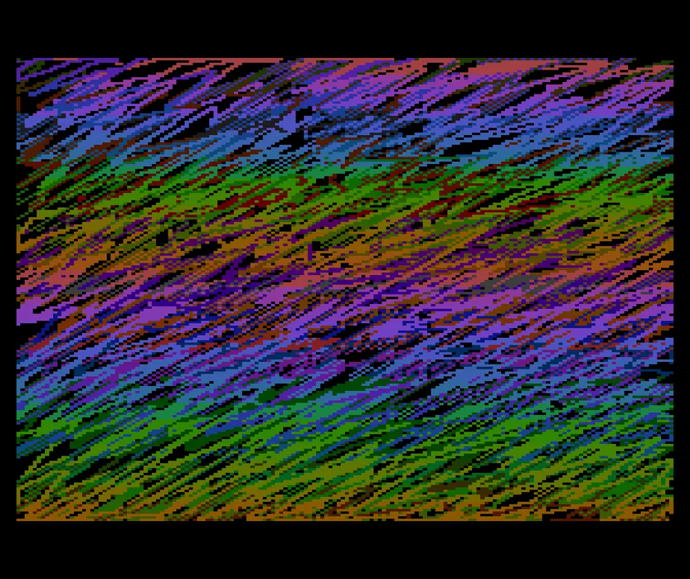
I had two different graphics tablets for the Atari, which worked more or less like a modern Wacom tablet. First was the Koala Pad. It had a great drawing program called Micro Illustrator. Unfortunately, the Koala Pad surface was square, unlike the TV screen, so you had to adjust to the difference in aspect ratio when drawing. Atari introduced its Atari Touch Pad not long after, which was larger and matched the aspect ratio of the screen. It used the same great Micro Illustrator software.
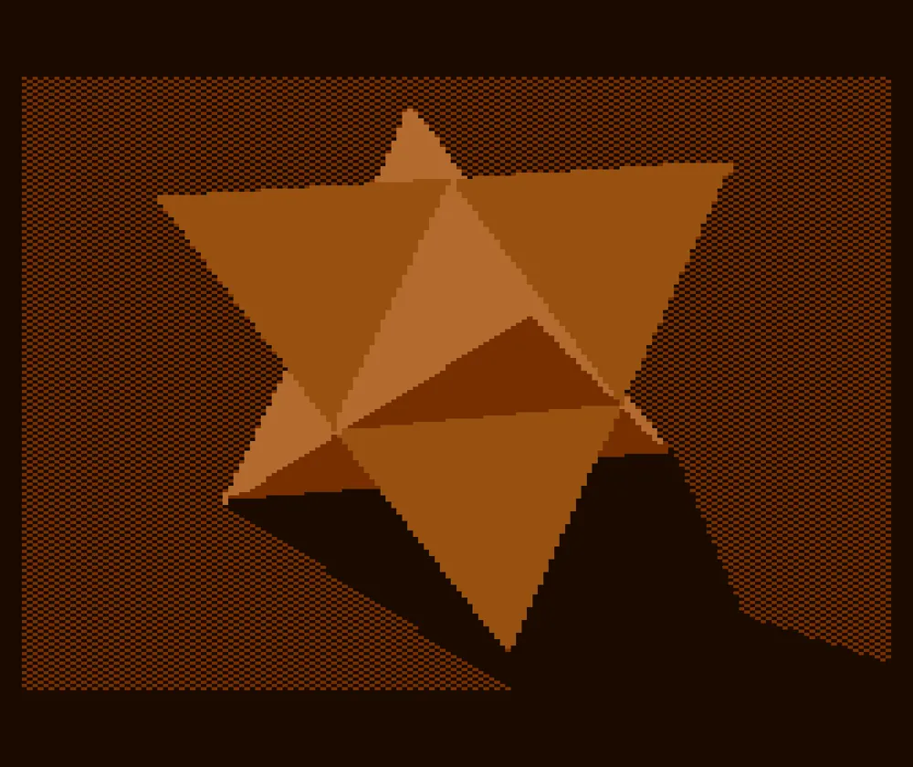
I also had a program called Atari World in which you could create 3D wireframe models. I used its screen capture feature so I could bring the models into paint programs to add color and shading.
Over the next two years, I did illustrations with my Atari for other magazines, including Credit Union Advantage, where I was design consultant in my spare time, two illustrations for The Farmer, a magazine that shared the same publisher as *Ambassador,*and a “digital driver’s license” for AAA Magazine.
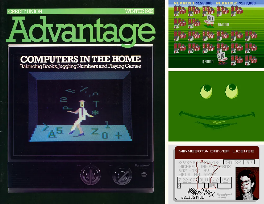
When I went to MPR, I became art director of Minnesota Monthly magazine. For the February 1984 issue, we did a feature article about home computers. I did the cover illustration using Fun With Art and headline type inside using Graphic Master, recreating our house typeface, Alternate Gothic, in bitmap form.
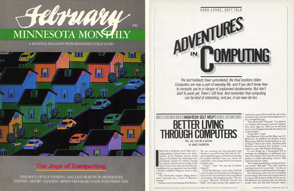
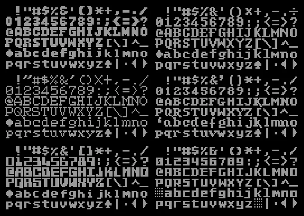
I also made some fonts on the Atari. It didn’t support fonts the way modern computers do. You could use a custom font in your own programs, but, unless you did some tricky programming, only one font was active at any time. You couldn’t use them in off-the-shelf word processors or text editors.
Each character in an Atari font had to fit into an 8 by 8 pixel square. The screen could fit 40 characters across and 24 characters down in the normal text mode. There were 128 possible characters, and you could also display any of them in reverse.
The fonts I made were mostly for fun, since there wasn’t any easy way to use them normally. I did have some ideas for programs and games they could be used for, but I never got very far with it.
Just as I was getting pretty good at doing graphics and programming on the Atari, the Apple Macintosh was launched in January 1984, and I had to have one. As much fun as the Atari was, the Mac was much more advanced. It didn’t have color, but it had a high-res screen and was much faster, with a mouse and graphical user interface. You could do a lot more with it, like use multiple fonts in a word processor or graphics program.
It felt like the future—and it was the future, as it turned out.
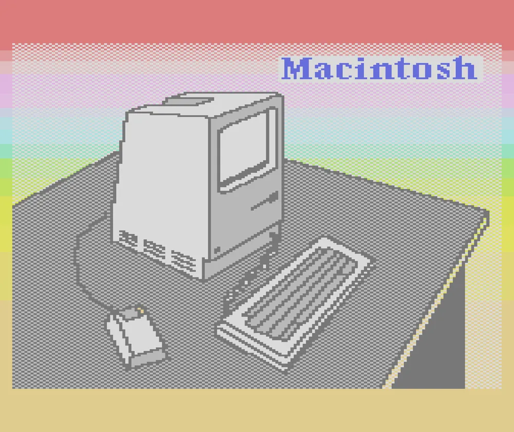
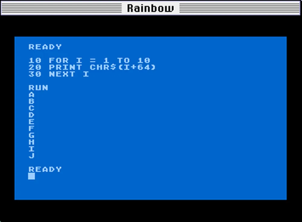
I still did stuff with my Atari after I got my first Mac, and had them side by side on my desk. I was even writing articles for my local Atari user group newsletter on my Mac. Although the Atari was better for games and it was fun to write programs for it, I could see the Atari 8-bit platform didn’t have much of a future. The prices of Atari computers had dropped so low that I could afford a third one—an Atari 800XL. But by 1986, I was barely using it. I tried to learn programming on the Mac, but there was so much else you could do with it, like making real fonts.
Later, in the mid-nineties, when I first started using the internet, I discovered a thriving community of people who were still using old Atari computers, and connecting them to modern Macs and PCs. There were even emulators that let you run Atari software on Macs and PCs. During this time, my dad made a cable for me that let me transfer my old Atari floppy disks to my Mac as disk image files that could be used with an emulator. This also meant that I had a backup of all my old Atari files and programs.
By this time, I had released my first commercial fonts, Felt Tip Roman, Proxima Sans, and Kandal. For fun, I created a PostScript version of the Atari screen font, which I called Atari Classic. I did three different versions: Chunky, Smooth, and Extra Smooth.
I was also starting to learn HTML. My first website, Mac/Atari Fusion, was all about ways you could use Macs and Atari computers together, which I was trying to do at the time. I posted my Atari fonts there as “freeware”. The site is still up, although I haven’t updated it other than posting new versions of my Atari fonts.

This website got the attention of Kevin “Kay” Savetz who, at the time, was building a couple of websites (atarimagazines.org and atariarchives.org) to host searchable archives of old Atari magazines and books. He got me involved in scanning and OCR’ing magazines that I still had. I also created most of the graphics on those two websites. He’s still very active in the Atari community and is one of the hosts of ANTIC, The Atari 8-Bit Podcast.
I gave away most of my Atari gear, books, and magazines about 10 years ago, keeping the 800XL and few other things so I could fire it up now and then. The technology to work with this old stuff—“retro computing” as it’s called now—has gotten increasingly sophisticated. There are ways to use your modern personal computer as a virtual disk drive and printer for the Atari, devices that let you use SD cards for storage, and, most recently, a device called FujiNet that can do all of the above, plus give your Atari computer access the internet via WiFi. The higher quality Atari pictures shown in this article were produced with the Atari800MacX emulator.
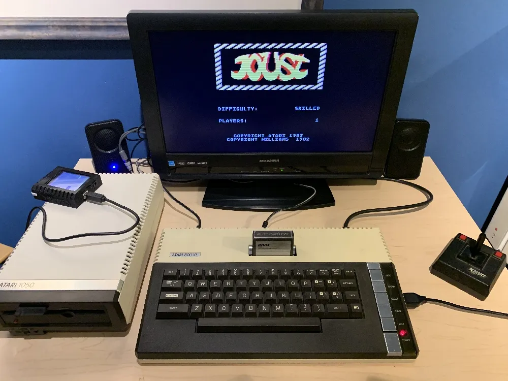
Maybe it’s just nostalgia, but there is something appealing about the simplicity of old computers like the Atari 8-bit line. It’s not very fast (1.79 MHz) and storage and memory are tiny by modern standards. Yet, the entire system architecture is knowable and unchanging. It’s minimalist, in a way. Somehow, the limitations make it more fun to program than a modern computer. And being able to augment it with modern tech makes it a lot easier to use than in the old days.
P.S.: As a postscript (ha!), the Atari fonts I made back in 1996 have become a kind of de facto standard in the Atari retro-computing world. They’re used in emulators for printing to laser printers, for the “hex editor” in a PC-based Atari IDE, and on documentation for various modern devices and software. Even in the Atari world, I’m mainly known for my fonts.
P.P.S.: The title of this post, “De Re Atari”, is a reference to a book by the same name, written by Chris Crawford and published by Atari in 1981. In it, Crawford revealed all the secrets of the Atari 400’s and 800’s advanced graphics and sound capabilities and how to utilize them. It was a goldmine of information for Atari programmers.
