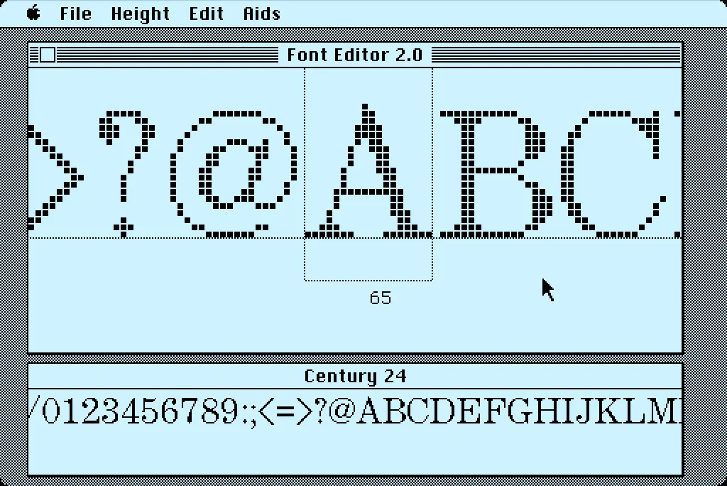
In 1984, I bought one of the original 128K Macs. A big draw for me was how it could display multiple fonts—proportional or fixed-width—anywhere on its screen. I desperately wanted to make my own fonts for it. This was before modern PostScript/TrueType/OpenType fonts, back when there were only “bitmap” fonts—fonts composed of discrete black and white pixels.
That summer, I read about an Apple developer tool called Font Editor 2.0 and sent for a copy of it. It was crude and crashed easily, but it allowed me to make my first Macintosh bitmap fonts. (A little later, AltSys released FONTastic, which was better in every possible way, including being less crash-prone.)
Recently, I fell down the rabbit hole investigating and reacquainting myself with Font Editor 2.0. I wound up making a user guide and a video demo and walk-through. I also prepared some disk images you can use with a real 128K or 512K Macintosh computer or an emulator, such as Mini vMac if you want to try it out for yourself.
I’m planning to make more videos about early font development on the Mac in the near future on my YouTube channel.
I suppose I had an excuse: I had no formal training yet, but I was possessed by the romance of graphic design.
In my senior year of high school, I was the editor of the yearbook. I’d been on staff in previous years, but now I was in charge. Even at 17, I knew what good graphic design looked like. My uncle was a graphic designer in Chicago, where he worked at one point for Container Corporation of America, designing stuff like the original Tab soft drink can and the Keebler Rich ‘n Chips cookie package. His aesthetic and way of looking at the world rubbed off on me at an early age.
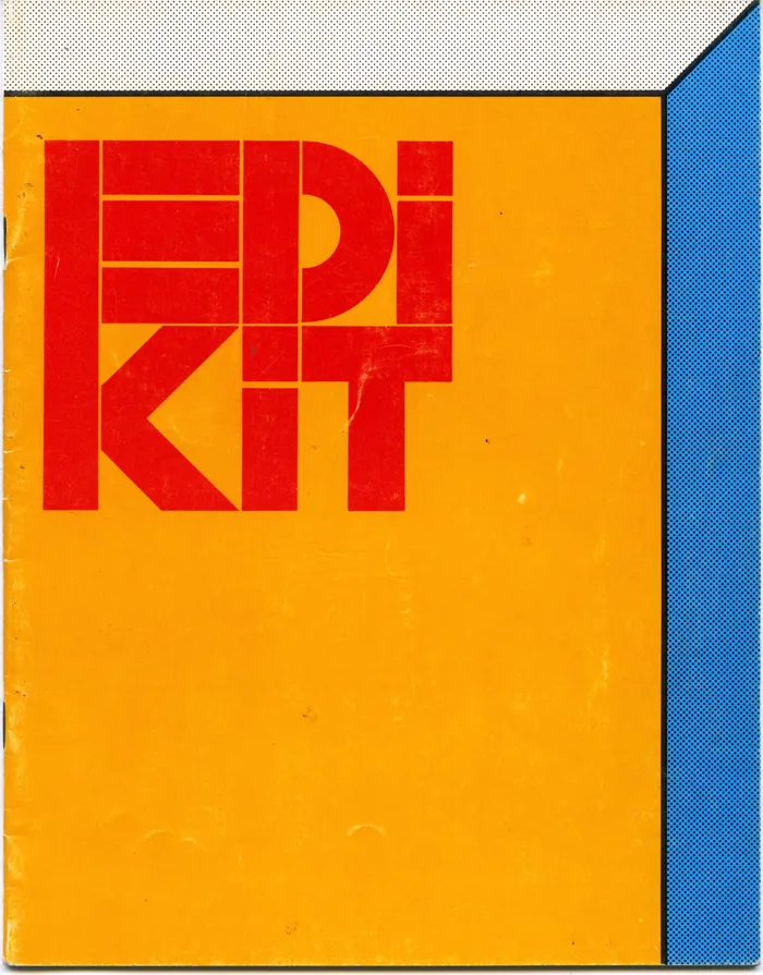
American Yearbook Company sent us a large, beautifully designed yearbook production kit that they cheekily called an “Edikit”. Clearly, they had some talented people working on it, hoping to impart some sense of good design on hapless teenagers. I could see what they were doing and took it to heart.
One of the things that influenced my budding sense of graphic design were the calendars that CCA did every year, which my uncle would send to me. There was one in particular for the year 1968 that came inside a large, bright red paperboard can with “nineteensixtyeight” wrapped around it in large, white Helvetica letters. Here’s the only photo I could find of it:
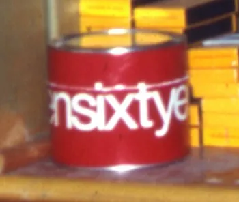
So, in my 12-year-old mind, I associated spelling out numbers (all lowercase) with cool, sophisticated graphic design.
Fast forward to 1973, and I had my first big design project, my high school yearbook. And I wanted to use every design trick I’d learned so far. I was not so much into Helvetica. It already seemed a little passé. My favorite typeface at the time was Times New Roman, which had been used to great effect in National Lampoon magazine. The NatLamp design influence is pretty obvious on some of the pages:
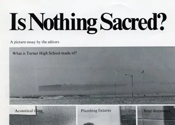
So, as I was developing the format for the yearbook, one of my “clever” design choices was to have all the page numbers spelled out (in lowercase, of course):


So far, so good. But it does this on every page, all the way to the end:

They must have thought I was insane. Keep in mind that this was back when typesetting machines, as far as I know, had only rudimentary ways to store keystrokes. At best, some sort of paper tape system. It horrifies me now to think how much work I made them do, just so I could have my fancy page numbers. Yet, I don’t recall the American Yearbook Company rep objecting to it.
Today, you could easily write some sort of script to get numbering spelled out like this, but back then it probably meant that some poor typesetter had to type it all in manually. And proofread it. I’d like to think that they somehow captured the keystrokes in case some other idiot had the same idea. Or maybe some other idiot already had and so it was really no trouble for them to run the job again for me.
All that aside, it was not a very good design idea anyway. Sure, it looked cool, but page numbers are meant to be read at a glance, not seen. I just shake my head, now. What a dumb idea.
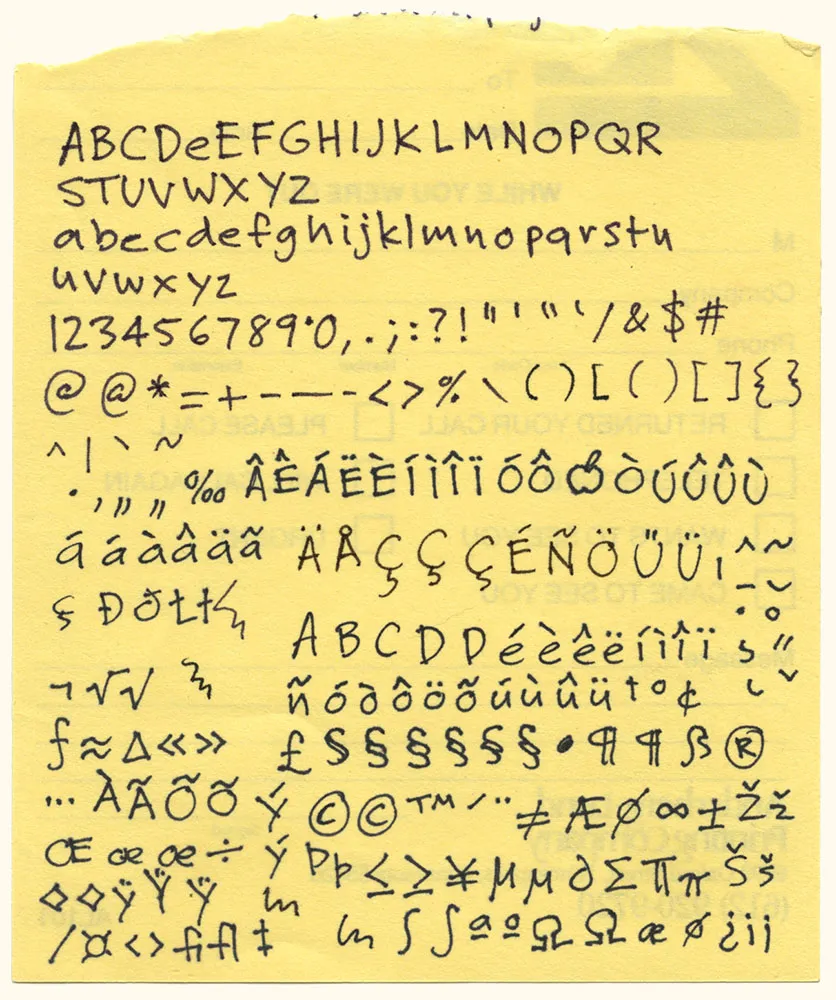
Here it is: The original artwork for one of my most popular fonts, Felt Tip Roman. I scribbled out all the characters needed in a typical font on the back of a phone message pad (about 4.128” x 5”) using a Pilot Razor Point felt pen. I deliberately tried not to be too neat or careful to try to capture the spontaneity of natural handwriting. Whether it would actually work as a font, I had no idea. That it would become a commercially successful font someday would have struck me as absurd at the time. I probably would have been a bit more careful and circumspect if I’d known. But perhaps then it would not have been as popular.
Love this whole idea. This is how I set headlines when I was a young graphic designer. No way would I use a pencil, though. Too much risk of warping the sheet. I had a nylon-tipped burnisher, specially designed for the job of rubbing down transfer type. (Via Draplin)
Field Notes: Dry Transfer Edition Instructions from Coudal Partners on Vimeo.
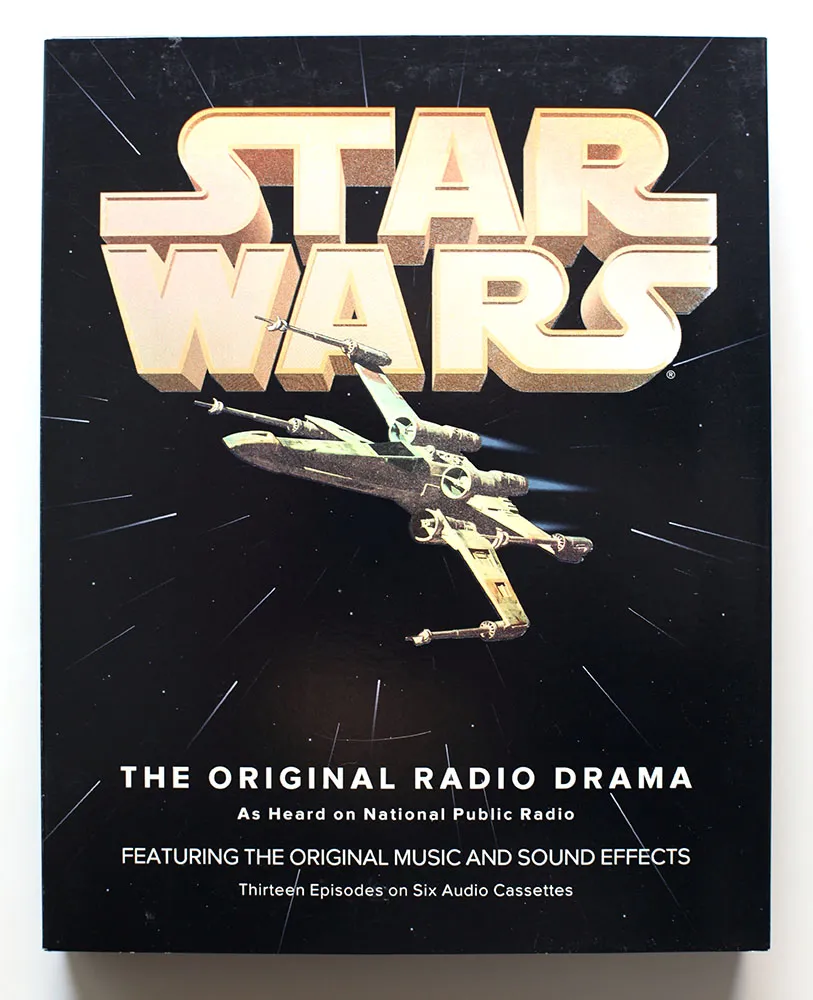
Back in 1993, I had just started a job at Rivertown Trading Company as a graphic designer. Part of that job was to design packaging for a division of the company called HighBridge Audio. One of the most interesting titles I got to work on was *Star Wars: The Original Radio Drama,*which had been broadcast on National Public Radio in the early eighties and was being released for the first time on audio cassette. (CD came later.)
It was one of the most elaborate packaging projects I ever worked on, with complicated die cutting and holographic foil embossing on the cover.
While working on the project, I was flown out to Skywalker Ranch near San Rafael, California, home of Lucasfilm, to rifle through file drawers of 35mm slides for possible use on the packaging. (My flight was delayed, so I missed out on having lunch in the same room as George Lucas.) Considering the rich visual imagery of Star Wars, it was surprising how little suitable photography they had for us to use. The complex visual effects only existed in the film, not in the publicity shots, which were taken on the set for the most part. The “stills” of, say, an X-wing fighter flying over the Death Star only existed as crudely retouched photos.
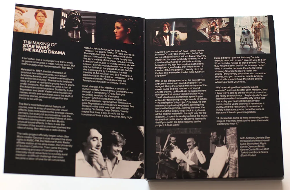
Back then I was also working an early version of Proxima Nova, which at the time I was calling Visigothic. I had tried some different fonts for the Star Wars packaging, including ITC Avant Garde Gothic and News Gothic, but nothing looked quite like what I wanted. On a whim, I tried Visigothic. It was plain (like News Gothic) and also a bit geometric (like Avant Garde). It felt a little weird using my unfinished type design for the project, but it seemed to work. I showed it to the other people I was working with and they thought so, too. So I used it.
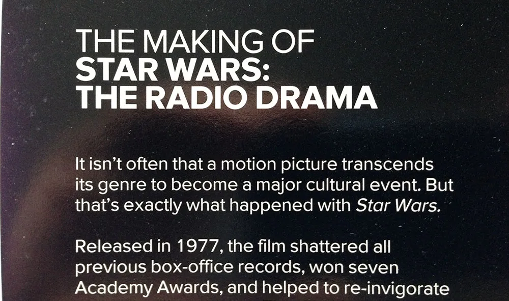
I released the fonts about a year later as Proxima Sans. The version on the Star Wars packaging is fairly close the final version, although you can see from some of these images that the kerning was not quite finished. Also, the italic was just a simple slant of the roman, but with a modified lowercase “a”. Some other differences: the lowercase “y” has a longer tail and I hadn’t done the ligatures yet.
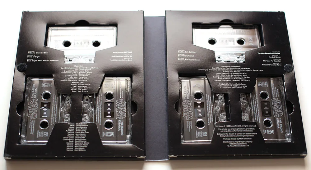
Someday, this font would become Proxima Nova, but this is the first time it was used publicly. It was exciting for me at the time to see how it performed in the real world, and it made me confident that it was worthy of releasing commercially.
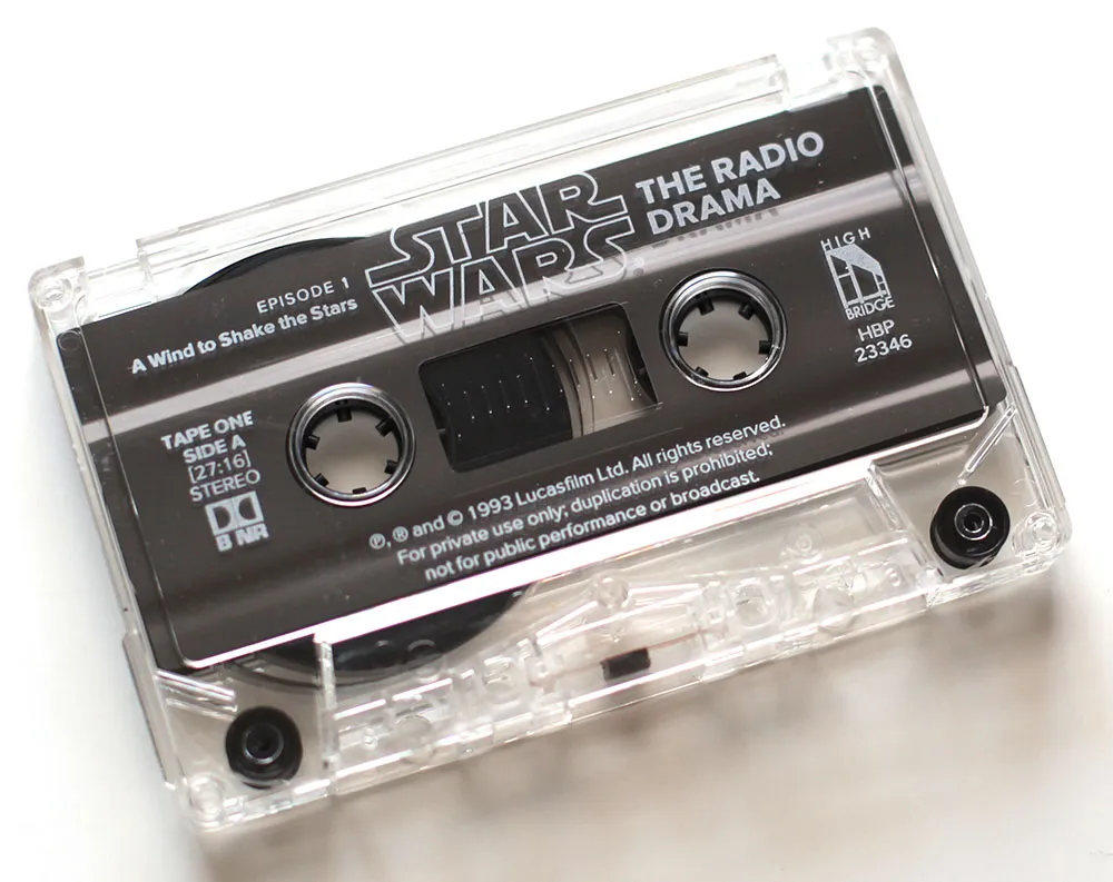
If you ever wondered why Proxima Nova includes a ℗, now you know. On the CD version of the series, which I did in the late nineties, I used Proxima Sans, and I believe HighBridge has used Proxima Nova for more recent incarnations.
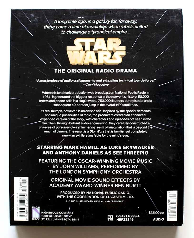
I created the 3D version of the Star Wars logo and the “hyperspace” star pattern in Adobe Illustrator and a program called addDepth. What I remember most about working on this project was how excruciatingly long it took to preview the artwork on the primitive Mac IIcx I had to work with at the time.
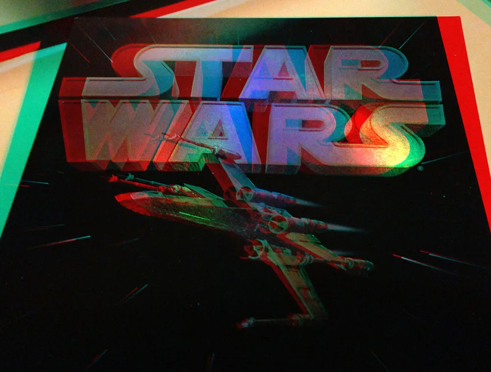
If you’ve got a pair of anaglyphic glasses (red/blue), this will give you a better idea how the holographic foil stamping looked.
Would it surprise you to learn that I am a pack rat? When it comes to things like books and printed material about type, this can be a good thing, as it gives me a rich resource library I can tap whenever the need arises (and it frequently does). When it comes to other things, like old computer software, it is a complete waste of time and space.
It’s not hard to see how it happens. When it is new, software is not cheap (it didn’t used to be, anyway). So, even if you are not actively using it, it feels like it still has value. And how can you tell exactly when a piece of software is no longer useful and the chances of ever running it again are nil? It’s easier to just put it on a shelf and forget about it.
Well, time passes and it becomes much easier to see how little it’s worth to you. But then the question becomes: What to do with it all? I couldn’t bear to chuck it all in the trash (it’s a sickness, I know). Surely there must be somebody somewhere who would be happy to take it off my hands? And so there is: Dan’s 20th Century Abandonware (a.k.a., D2CA). Update: That site is gone now, but the collection can now be seen at Daniel’s Legacy Computer Collections. Same guy.
A few weeks ago, I shipped eight cartons of old Mac software to Dan as a donation. Some of it dates back to the first year of the Mac’s existence (Andrew Tobias’ Managing Your Money). Some of it I bought with high hopes, but never really used (Think Pascal). But most of it simply went obsolete (TOPS networking software).
As he promised, Dan posted a formal thank you on his home page—complete with photos and a listing of everything I sent. Now, if I ever feel a pang of regret, I can go to Dan’s site and still see all my old stuff, comforted that it has found a loving home, instead of an existence of guilty, dusty neglect in my basement. My hat (if I had one) is off to Dan for graciously and willingly accepting my donation.
Of course, this was just the stuff I don’t need any more.
