So, there’s this thing going around blogs where you answer this list of questions, four answers each. I was tagged this morning by John Martz (a.k.a. Robot Johnny). It seems a bit like a chain letter, but I enjoyed reading other people’s answers, so I’ll play along:
Four jobs I’ve had:
- Bag boy, Penny’s Supermarket
- Art director, Minnesota Public Radio and several other places
- Freelance graphic designer and illustrator
- Type designer
Four movies I can watch over and over:
- Blade Runner
- 2001: A Space Odyssey
- The Wrong Trousers
- Time Bandits
Four places I have lived:
- Beloit, Wisconsin
- Osseo, Minnesota
- Minneapolis, Minnesota
- Saint Paul, Minnesota
Four television shows I love to watch:
- Lost
- Monty Python’s Flying Circus
- Futurama
- Doctor Who
Four places I have been on vacation:
- Jamaica
- Montreal
- Lanesborough, Minnesota
- New York City
Four of my favorite dishes:
- Pizza
- Greek salad
- Aloo Mater Paneer
- Bowl of cereal
Four websites I visit daily:
- Typophile
- Typographica
- kottke.org
- Drawn!
Four places I would rather be right now:
- Asleep in bed (up too late last night)
- New York, 1930, with a camera
- Someplace warm
- A good bookstore or library
Four bloggers I am tagging:

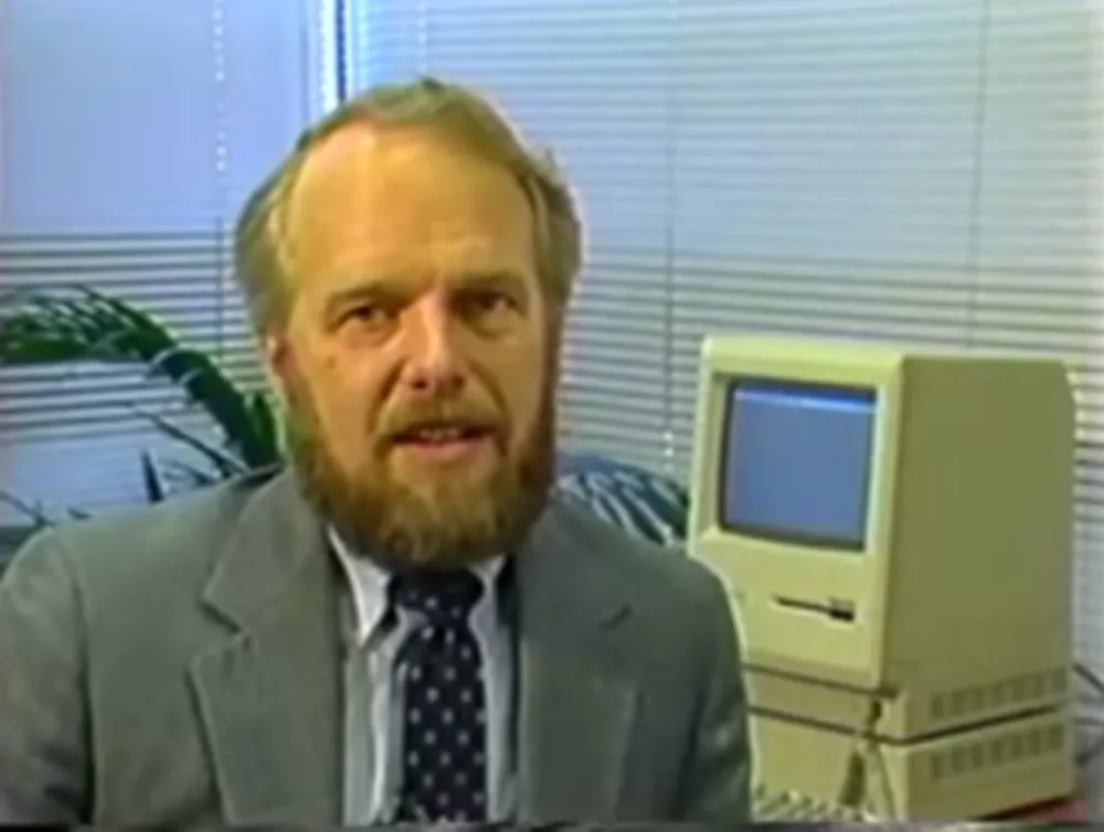
I happened to be looking at Reuben Miller’s blog today and stopped when I got to the item “Introducing Illustrator 88” in which he embedded a link to a YouTube video showing a portion of the VHS tape that shipped with Illustrator 88. I have that tape and also the one that came with Illustrator 1.0. (And the disks, and the packaging. I know. It’s a disease.) I’d been toying with the idea of digitizing these videos and posting them online, but someone saved me the trouble. (It appears that John Nack of Adobe posted the 1.0 video.)
I particularly remember the tape that was included with 1.0, which featured John Warnock, the CEO and founder of Adobe himself, doing the demos. I’ll never forget the way he exclaimed “Isn’t that neat?” after showing how the pen tool works. And it was neat. The YouTube clip only shows about the first ten minutes of the tape, so it’s missing that little gem.
It’s amazing how good the program was right from the start. It had a long way to go (no color, no layers, no drawing in preview mode, no composite paths, only one font in a text block, no converting text to outlines, no pathfinder tools, etc., etc.), but the foundation was solid. It sure looks slow running on that tiny Mac Plus screen, though.

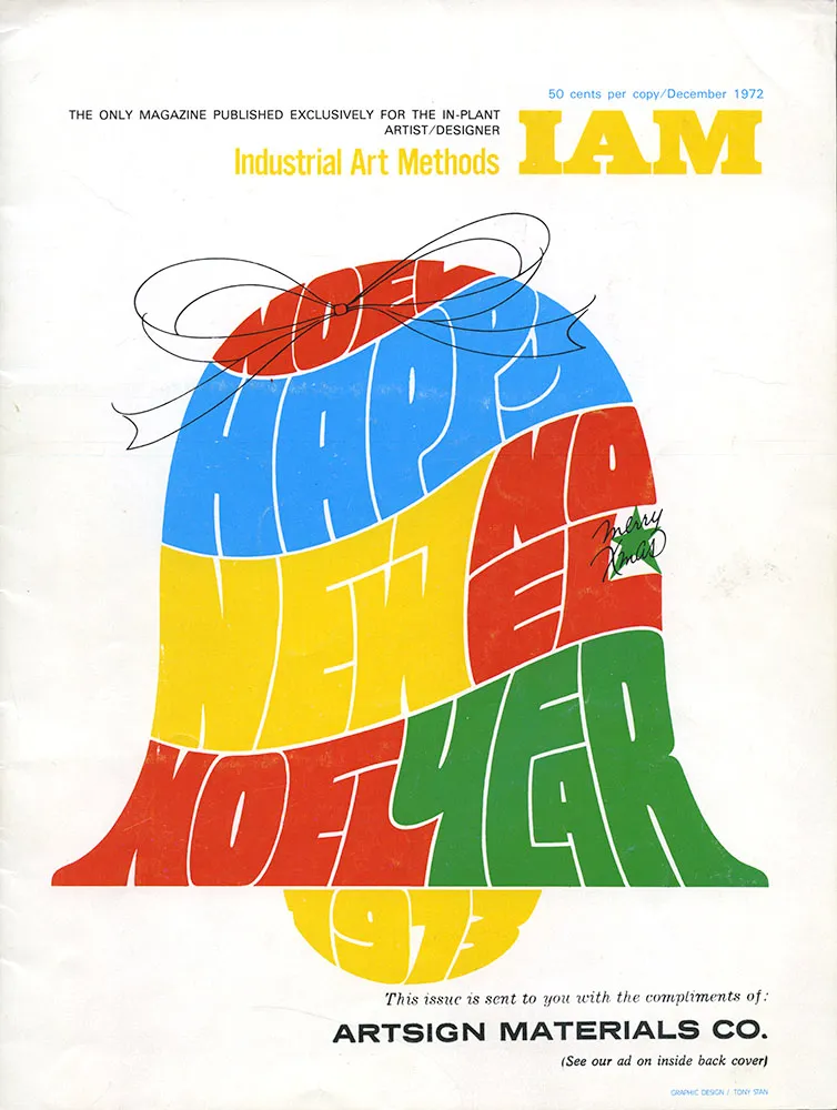
I don’t remember the details of how I got hold of this particular issue of Industrial Art Methods (“The Only Magazine Published Exclusively for the In-Plant Artist/Designer”), but it was one of the key things that sparked my interest in type design when I was a teenager.
I didn’t notice until years later that the lettering/illustration on the cover was by Tony Stan, designer of many faces for International Typeface Corporation, such as ITC Garamond, ITC American Typewriter, and ITC Cheltenham.
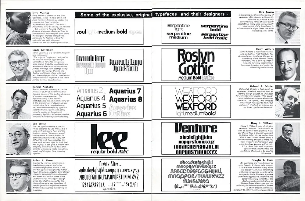
What caught my interest, though, was an article titled “How visual graphics develops new alphabets for the photo typositor”. By “visual graphics” they mean Visual Graphics Corporation (VGC), and by “photo typositor” they mean the Photo Typositor®, one of the most widely used headline setting machines of the phototype era. The article included this two-page spread:

I was already interested in type at this point, having purchased sheets of rub-down type for my high school newspaper. I didn’t know what a Typositor was, but here were a bunch of guys who had designed some really cool typefaces for it. I started imagining creating my own type designs and maybe getting them published, like these guys. Let’s take a closer look.

I have no idea what became of Jerry Matejka. His Soul family was one of my favorites in this article. It seemed very hip and cool. I’ve rarely seen it used, though. It’s funny how the description isn’t much different than what you still see in the marketing hype for fonts. As far as I know, this is Jerry’s only type design.

Sandi Governale’s description is even more hyperbolic—there’s nothing this typeface can’t be used for! Can’t say I ever did see it in use, though. I remember thinking this was one of the weaker designs in the article. Sandi also designed some typefaces for Photo-Lettering, Inc.

Ron Arnholm is still around. He is best known for designing ITC Legacy (1992), a “super family” with both serif and sans serif styles. I used to see Aquarius quite a bit on book covers back on the seventies. It always reminded me of the old 3M corporate typeface, but more stylish. Ron has attended the last few TypeCons, so I’ve gotten to know him a little bit. Nice guy. What I want to know is, whatever happened to Aquarius 1 and 3?

You wouldn’t expect that a guy who looked like Leo Weisz would have designed a weird-ass typeface like this, would you? It seems to be his only type design. You’ve see Lee in use on the VHS logo and the Charlie’s Angels logo. Leo is still around. He’s over 100 years old now, still paints, and even has a Facebook page.

As far as I know, this is the only typeface Arthur Rawn is credited for. It seemed strange to me when I first saw it, even more so looking at it now. A very odd design, very uneven rhythm. I can see a little bit of Amelia and Peignot as possible influences. I don’t recall ever seeing it in use.

Serpentine is probably the most well-known typeface of the bunch, one of the few that made the transition to digital type fairly early on. I can’t explain why, but Dick Jensen looks like just the guy to design something like this. Turns out Dick was a Minnesota boy, born in Saint Paul (where I live now). As far as I can tell, this is his only type design. He died in 2000 at the age of 72.

I remember liking this one a lot when I first saw it. It was fairly popular in the seventies. Looking at it now, it has a kind of Arts & Crafts look to it. Not sure what became of Harry Winters. He doesn’t seem to have been responsible for any other type designs.

Richard Schlatter (his name was spelled wrong in the magazine) is still around and living in Michigan. Besides Wexford, he also designed a series called Glyphic, a very bold, high contrast sans serif. Wexford was another of my favorites from the article. A very seventies art deco face if there ever was one.

According to Canada type, which did a revival of Venture recently under the name Chopper, Harry Villhardt was a friend of Dick Jensen (above). I can’t remember this typeface having been used much, although it’s easy to picture it being used on 1970s science fiction paperback covers.

When I tried to do a web search of Douglas Jones and his Skin & Bones typeface, all I could find were references to a TV show called Fear Itself which had an episode called “Skin and Bones” starring an actor named Doug Jones. As for Doug Jones the type designer, Skin & Bones is the only published design of his I could find. I quite liked it back when I saw it in this article. Doug also gets my vote in the Sonny Bono Look-Alike Contest.
Sorry for not posting more stuff here lately. I’ve been busy working on fonts (probably a better use of my time anyway). In the mean time, here is another interview with me, this time with Grant Friedman of ArtBistro.com.
Almost forgot to mention: I did an interview with LetterCult, the new website devoted to the art and culture of making letters. It just went up today. Link.
The site’s been up less than a week, but there’s already a ton of great stuff on it about lettering and type design.
I was interviewed a couple of months ago for a podcast called Cedar Cathedral, which focusses on “artistry, craftsmanship, and the creative life in the Great Lakes” region. Somehow, I missed that they posted it in mid-July.
Steve and Claire Hendershot, the hosts, did a wonderful job. Total pros, not slackers. They actually came all the way from Chicago to my house with a digital audio recorder, professional mic, and everything—none of this Skype nonsense. I think it’s one of the best interviews I’ve done. Definitely the best sounding.
Update: Unfortunately, this podcast is no longer available.
