I’ve attended all three of the Hamilton Wood Type and Printing Museum’s annual “Wayzgoose” events so far. Last year’s, held in early November, was enjoyable as always, but I think I prefer the mix of presentations and hands-on workshops of previous years over having only workshops.
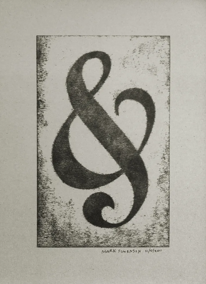
Still, it was great how they tied all the workshops around a common purpose—creating a portfolio of prints (including the portfolio itself). You can see one of my prints above, a pressure print from a hand-cut plate based on a free-form ampersand design.
I highly recommend the Wayzgoose if you are a type fanatic like me, into letterpress printing, or both. It’s held in the Fall in Two Rivers, Wisconsin. Attendance is limited, and it fills up quick, so you might want to get on their mailing list to be notified regarding when the next one will be held.
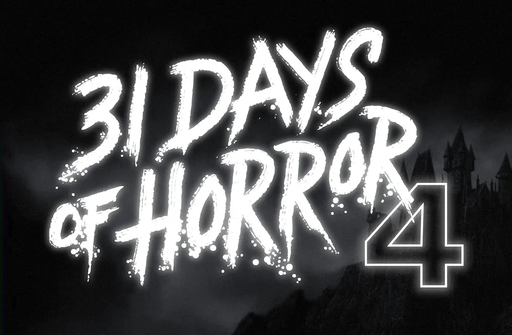
This was a fun one. Rumsey Taylor of Not Coming to a Theater Near You asked me to create lettering for a splash page graphic for the site’s fourth annual horror film festival.
The idea was to emulate classic horror film title screens. Thanks to Steven Hill’s Movie Title Screens Page I was able to find loads of reference. At first I was thinking I would use some kind of blackletter style, but it turns out almost no horror films use that style, unless they involve Dracula or Frankenstein. (More often it’s used for pirate movies.)
In the end I decided to go with the classic scrawled-in-blood look. To get the effect, I wrote out the letters freehand using a Wacom Cintiq and Corel Painter. It took a lot of experimentation and “takes” to get the right look. Once I had the basic lettering, I enhanced it in Illustrator and Photoshop to get the look of an old black and white movie title, complete with light-spill on the brightest areas.
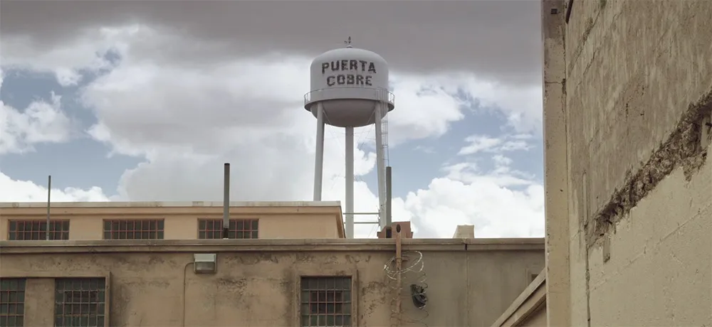
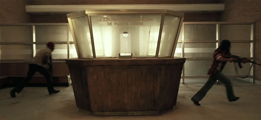
I don’t normally plug movies here, but I had a small part to play in this one as a technical advisor. It’s set in 1972. My job was to advise about typographic details so they would be correct for the period. (See Typecasting and Son of Typecasting.)
I haven’t seen the movie yet, or even all the shots that have typography in them, but you can see some of the results in the trailer. They first contacted me about it in 2008. It’s really cool to see it finally coming to theaters this fall. Congrats to Justin and his crew!
I recently completed work on a lettering design for the front of a building in Ketchikan, Alaska. The letterforms were based loosely on historical examples from the area. Traditionally, sign makers would fill as much space as possible, using the slats or runs of bricks as a grid on which to build the letters. The shapes of the letters themselves, while following standard styles and practices, often displayed idiosyncrasies unique to each sign maker, unlike today when most such signs are made with off-the-shelf fonts, typed on a computer keyboard, and “output” to a vinyl cutter.
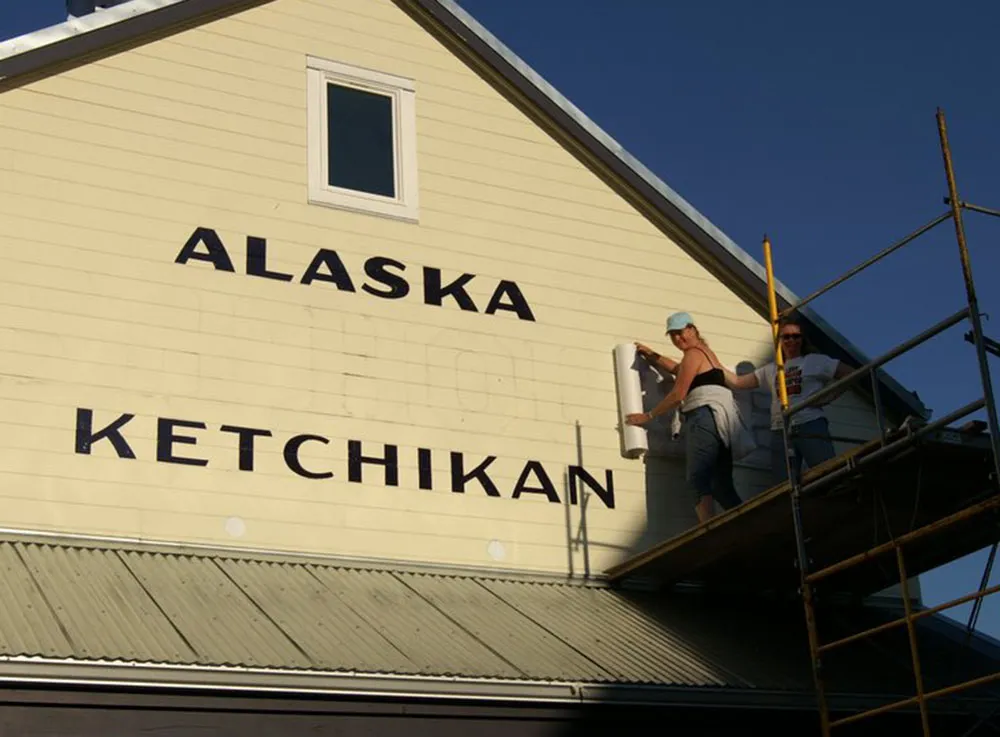
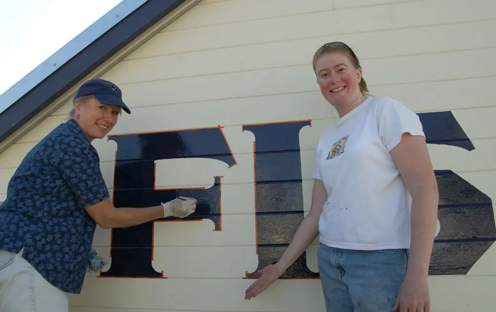
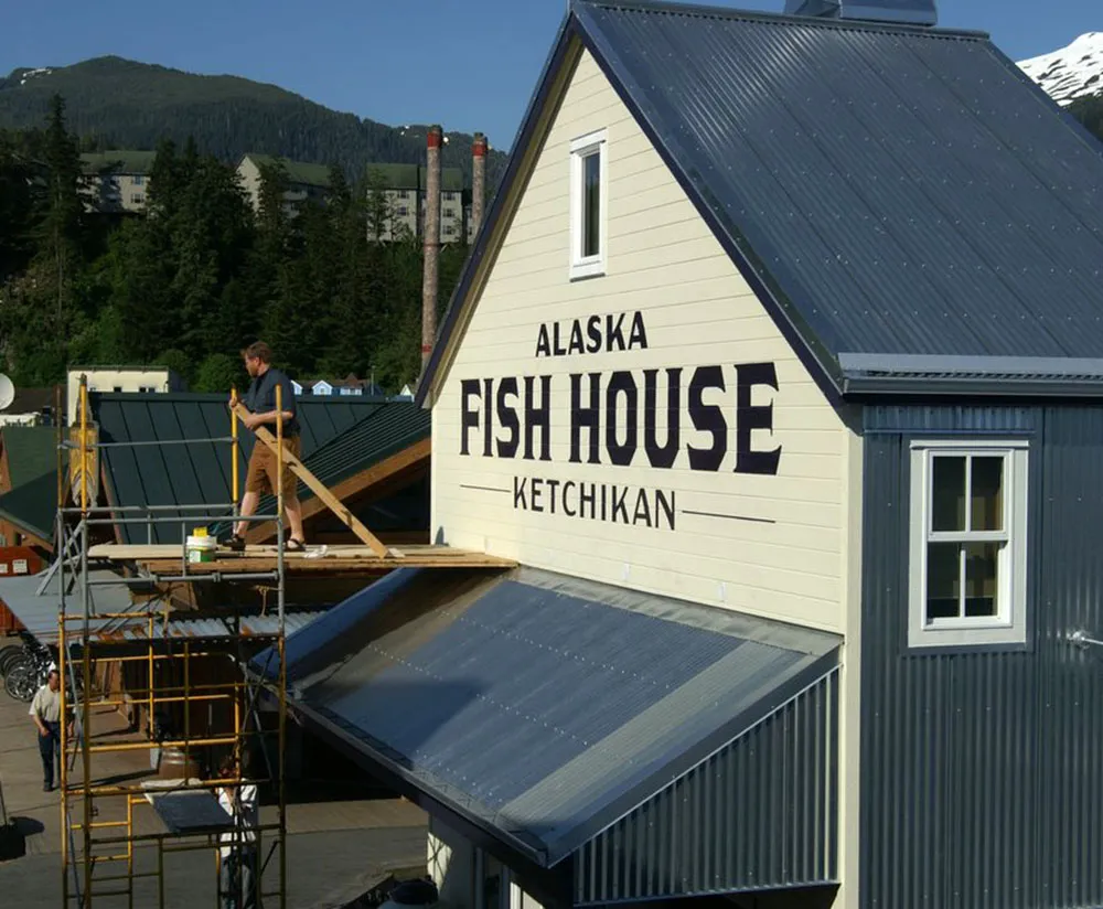
Although I do my final artwork electronically, the letters were designed from scratch with paper and pencil. The finished design was sent to Ketchikan where local sign painters (above) applied my design to the building using traditional techniques—real paint and real brushes. According to the client, the sign has become a “photo op” for tourists.

(Photos courtesy Deby Slagle, Alaska Fish House. Used with permission.)
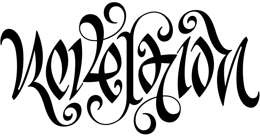
I’ve never designed a tattoo before, and not many ambigrams, either.
An ambigram is a form of lettering in which a word or phrase can be read in more than one direction. Or it may be two words combined into one image in which only one can be seen at a time, depending on how you look at it. The master of this art is John Langdon whose 1992 book Wordplay showcased his work. (A new edition is in the works.)
The design above was for a tattoo and was commissioned by a client in Canada. It reads the same if you rotate it 180°. (I don’t know where she had it placed, but she promised to send a photo.)
Ambigrams are partly luck, partly skill. I feel lucky it turned out as well as it did. I hate to think of someone permanently dyeing their skin with a design that didn’t quite work.
Last Friday, I spent the afternoon frantically trading files with Peter Bruhn (of Fountain type foundry in Sweden) for an exhibition match of Layer Tennis. The basic idea is to pass a layered Photoshop file back and forth for ten “volleys”, about one every 15 minutes. The resulting “volley” image is displayed live for the world to see, with running commentary (in this case by the witty and capable Grant Hutchinson.
What may not have been obvious to some was that the Photoshop compositions were not where Peter and I were spending most of our time (well, maybe in some cases it was obvious). In fact, we were designing, building and generating fonts in FontLab, and then using them in Photoshop. With most of the volleys, we started from the font that had been built in the previous one.
Although the images created in Photoshop were the ultimate public face of the match, I thought it might be interesting to show what was going on behind the scenes with the fonts.
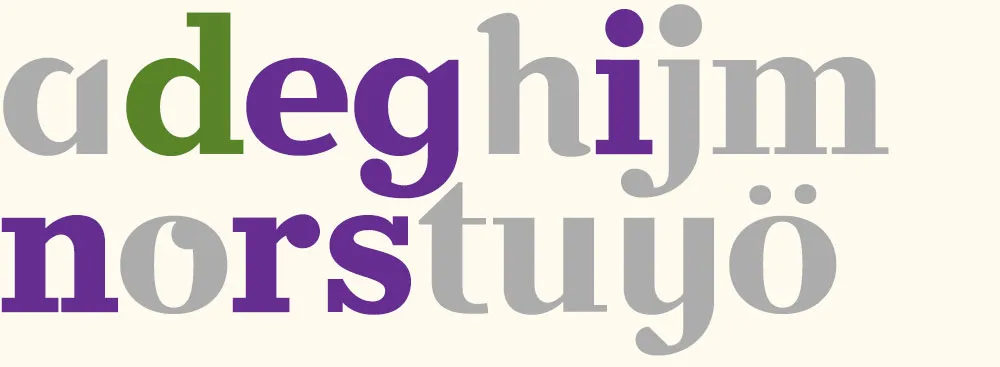
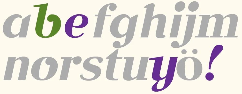
To make it easier to tell what was going on, I’ve color-coded the glyphs:
- Green = new glyphs
- Purple = modified glyphs
- Gray = unmodified glyphs.
Volley 1: “jam” I got the coin toss, so I went first. I created a font with three simple glyphs in a sort of bloopy geometric style.

Volley 2: “your ham” Peter followed up by ably adding several more glyphs in the same style.
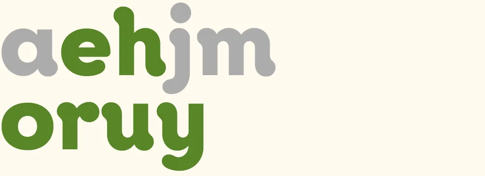
Volley 3: “more homey” I modified all the existing glyphs to create a higher-contrast semi-serif design. (You can see more clearly in this version that the basic construction is that of an upright italic.)
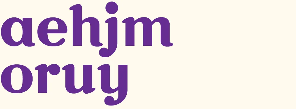
Volley 4: “möre” Peter takes it in a different direction, more like a Bodoni or Didot, and adds a whimsical swash and umlaut. He also takes advantage of the fact that he only really needs to change enough glyphs to spell the word he wants to use in the image, in this case “more”. Both of us adopt this strategy as the game progresses.
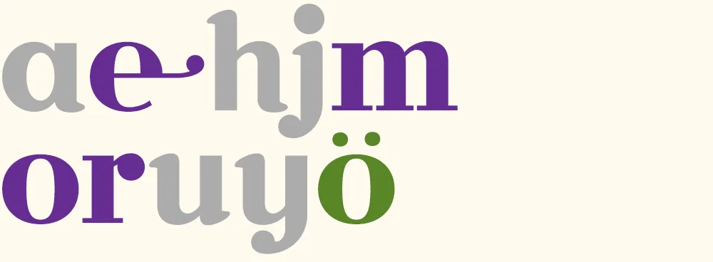
Volley 5: “major surgery” I continue the transformation to a Didone style, conforming several other glyphs and adding a g and an s.
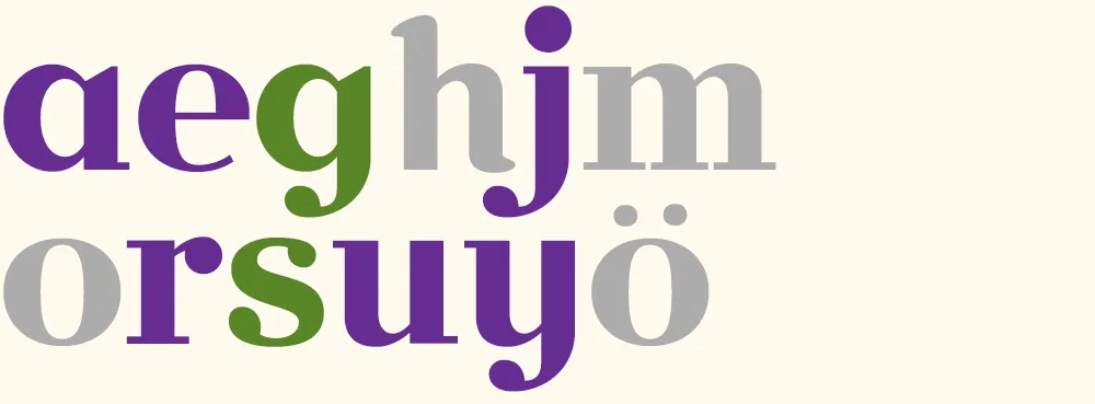
Volley 6: “no sanity” Peter changes the direction, this time deconstructing several glyphs and doing a “serif-ectomy”. Note the nod to my Coquette in the o.
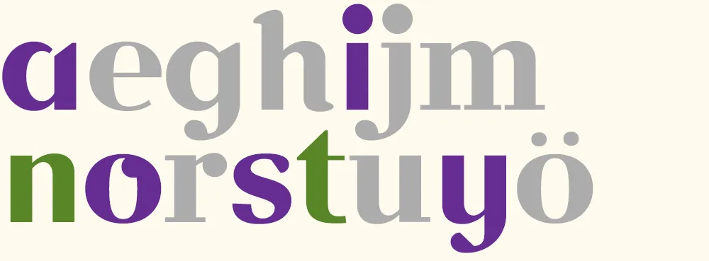
Volley 7: “faster!” I change the style again, albeit in an expeditious manner, by slanting all the glyphs. I add an f and a ! and tweak a few existing glyphs. (Merely slanted glyphs are shown in light purple.)
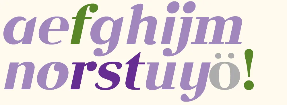
Volley 8: “aefghijm” Peter does something “meta” by printing out and critiquing an unslanted version of font.
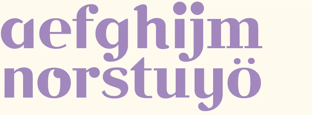
Volley 9: “redesign” I discard my cheap slanting trick from volley 7 and, starting from the font in volley 6, change it into a slab serif for my final volley.
Volley 10: “bye!” Peter takes my slanted font from volley 7 and gives it a more cursive flair, with a reprise of the Coquette reference. According to Peter, the “waving” exclamation point was a happy accident. Works for me.
In the end, we had created ten new fonts in a few hours. Not complete, full-featured fonts, or the best-built fonts in the world, but good enough to set some type. I set them all together to show the sum of what we made:
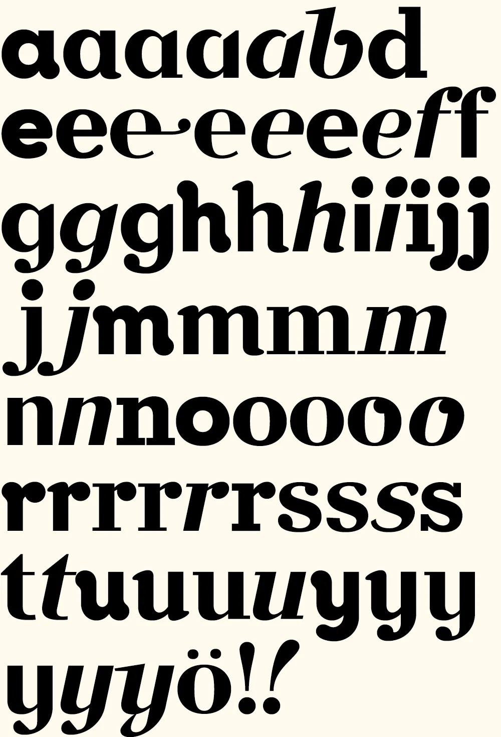
Now comes the hard part: Coming up with a name for it….
(Thanks to Peter Bruhn, and Jim Coudal and Bryan Bedell of Coudal Partners.)
