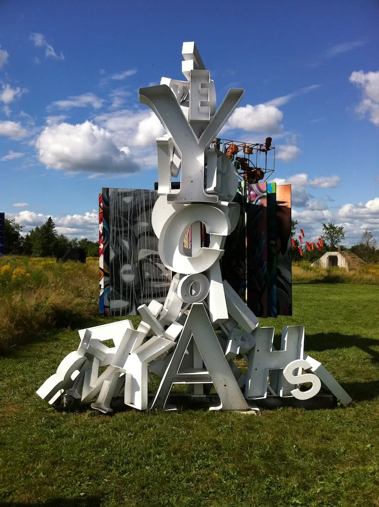
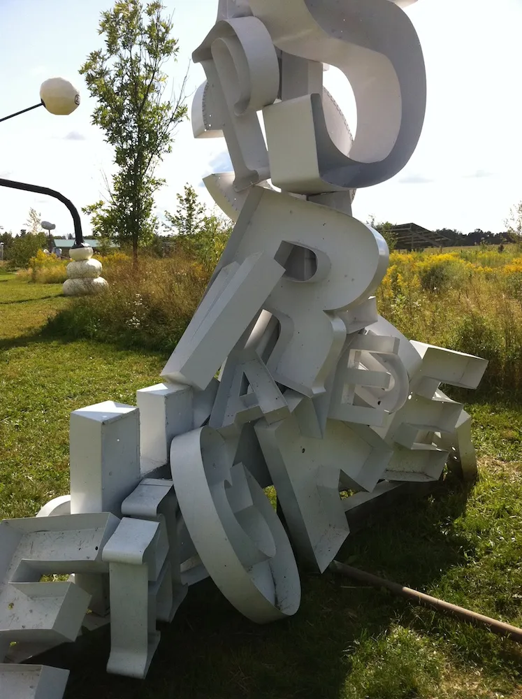
Saw this sculpture by an artist named “Peyton” at the Franconia Sculpture Park, Franconia, Minnesota, back in August 2011.

For the last couple decades or so, automobile license plate design has become increasingly poor. In Minnesota, we’ve lived with the stylized lake shore design (top left) since the early 1980s. I have never cared for it much. I prefer the way license plates used to look—plain design, two contrasting colors, name of the state and a slogan, with large, easy-to-read numbers. Simple and clear.
States have long seen license plates as a sort of advertisement, as evidenced by the obligatory slogan. New production methods, developed in the 1970s at 3M, a Minnesota company, allowed greater freedom than the old stamp and paint method. The current Minnesota “10,000 Lakes” design was one of the early ones and hasn’t changed much over the years. Recently, though, things have been getting strange.
First there was the “Critical Habitat” plate (middle). For an extra fee, you make a small contribution to help preserve wetlands and such, and let everyone know it by sporting this plate. When I first saw these, I was struck by two things. One, it looks like a little wildlife painting.Some people like that sort of thing, but I think it’s a bit out of place on a car bumper and makes the plate unnecessarily busy. Second, the numbers are smaller, narrower, and not raised. In fact, it looks like you could crank one out on an ink jet printer. The font itself is not the old standard license plate font, but some sort of artificially condensed version of Univers. It’s noticeably harder to read than the standard plates. And notice how the hitch obscures the second letter. There are a lot of cars with hitches in Minnesota. Did they not think of this?
But the “Critical Habitat” plate pales in comparison to the latest design which came out in December: The “Support Our Troops” plate (right). I don’t mind people wanting to show their support for the troops. What I have a problem with is the design. It looks as if it was intentionally laid out to make it hard to read the plate number. It’s got the same font problem as the “Critical Habitat” plate. On top of that, the number is printed in dark blue over a wavy, red stripe. Any competent graphic designer will tell you that dark blue on red is a terrible combination for readability. The wavy shape doesn’t help. Because of the reflective material used, it’s not so hard to read at night with a light shining on it. The background is more reflective than the numbers giving it decent contrast. But during the day, depending on the lighting conditions, these plates are sometimes impossible to read. Especially with numbers that have similar shapes on the top and bottom, like 0, 3, 6, 8, and 9.

I’ve blurred all three plates in the bottom three photos just to show how much harder these new plates are to read under less than ideal conditions. You can still easily make out the first one, but the others are anyone’s guess.
I always thought license plates were meant to make it easy to identify individual vehicles, say if a car is stolen or used in a crime. I guess that’s not such a big deal anymore compared to the fundraising and promotional opportunities.
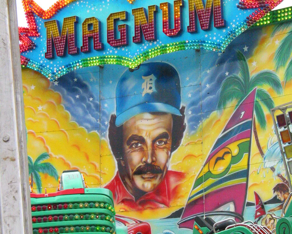
A brainy looking portrait of Tom Selleck seen on a carnival ride at the Minnesota State Fair on August 26, 2004.
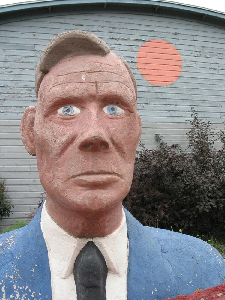
Bust of artist Herman Rusch. Photographed at the Prairie Moon Sculpture Garden and Museum, Cochran, Wisconsin, on August 3, 2003.
