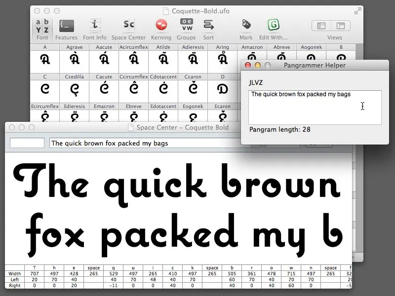
Almost ten years ago, I made a little program called Pangrammer Helper. It’s a little tool to help compose pangrams, which are sentences containing every letter of the alphabet. It was built in Flash and was designed to run in a web browser.
Type designers are especially enamored of pangrams, as you can imagine. Fellow type geek and friend, Craig Eliason, has been using it for several years to compose entries for his Daily Pangram site.
Recently, a new font editing app called RoboFont was released, and I’ve been starting to use it in my work. One of the neat things about it is that it’s fully extendable—that is, if you are willing to do a little Python programming, you can add features to it.
Last week, the Robothon 2012 conference was held in The Hague. It was all about type design and technology. I wasn’t able to attend, but videos of most of the talks have been made available on Vimeo, and I’ve been watching them the last couple days. Two of them in particular, one by Tal Leming about Building Stuff and another by Frederick Berlaen introducing RoboFont, inspired me to rewrite my Pangrammer Helper in Python so it could work inside RoboFont.
It took less than a day to do it, and it works great. You can use it by itself, and it works a lot like the old Flash version (a bit simplified), or, if you have RoboFont’s “Space Center” window open (the window were you work on your font’s spacing), the text also appears there as you compose it.
If you happen to be a RoboFont user, you can download version 1.2 of the script here. Just drop it into your scripts folder and you can run it right from the Extensions menu.
Update: Frank Grießhammer (currently working in Adobe’s type department) has contributed some improvements to my script, mainly adding the ability to add non-ASCII characters (as in “Grießhammer”) and an option for mixed-case pangrams. Thanks, Frank! The download link above will download this version (1.2).
Flash application featuring Raster Gothic Condensed.
How it works: A “pangram” is a sentence or phrase that uses every letter of the alphabet at least once. Type your pangram in the box. Pangrammer Helper will tell you which and how many letters you haven’t used and how long your pangram is. It will also tell you how many of each letter has been used. It’s a real challenge to get them down to or near 26 letters without resorting to nonsense.
First released in 2003; 2.0 version released in 2008.
Note: Flash 8 or later plug-in required to run from the Web.
You can use Pangrammer Helper here in your Web browser, or download a standalone version (which doesn’t require the Flash Player plug-in) for your Mac or PC:
Mac Version (4.5mb)
Windows Version (1.8mb)
July 2020 Update: Now that we live in a virtually Flash-free world, someone has fortunately taken the trouble to build a web-based version called Pangrammer. Even better, it works on any modern web browser, whether on a computer, tablet, or smartphone. Created by Tory Anderson of Brigham Young University.
Before digital type and desktop publishing took over the world in the late 1980s, there was metal type and phototype. But if you were on a tight budget, you could set type yourself using various “dry transfer” products, Letraset being the most famous. But Letraset wasn’t the only one.
I used Formatt sheets a lot in the late 70s and early 80s. I’ve still got a few catalogs (No. 7 from 1981, No. 8 from 1986, and pages from what I believe is No. 6 from 1976) and a few sheets of type.
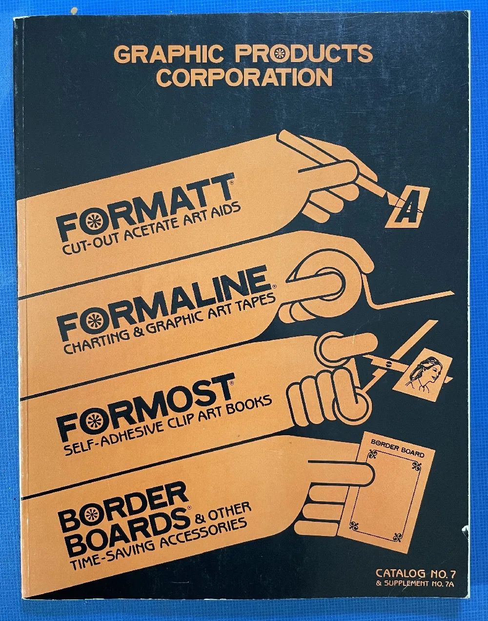
Unlike Letraset and other “rub down” type products, Formatt was printed on a thin, translucent acetate sheet with low-tack adhesive backing on a paper carrier sheet. To use it, you cut out the letters with a razor blade or X-acto knife and positioned them on a suitable surface and then burnished it down. I usually used illustration board and then made a photostat for paste up, but you could put it right on the mechanical if you wanted.
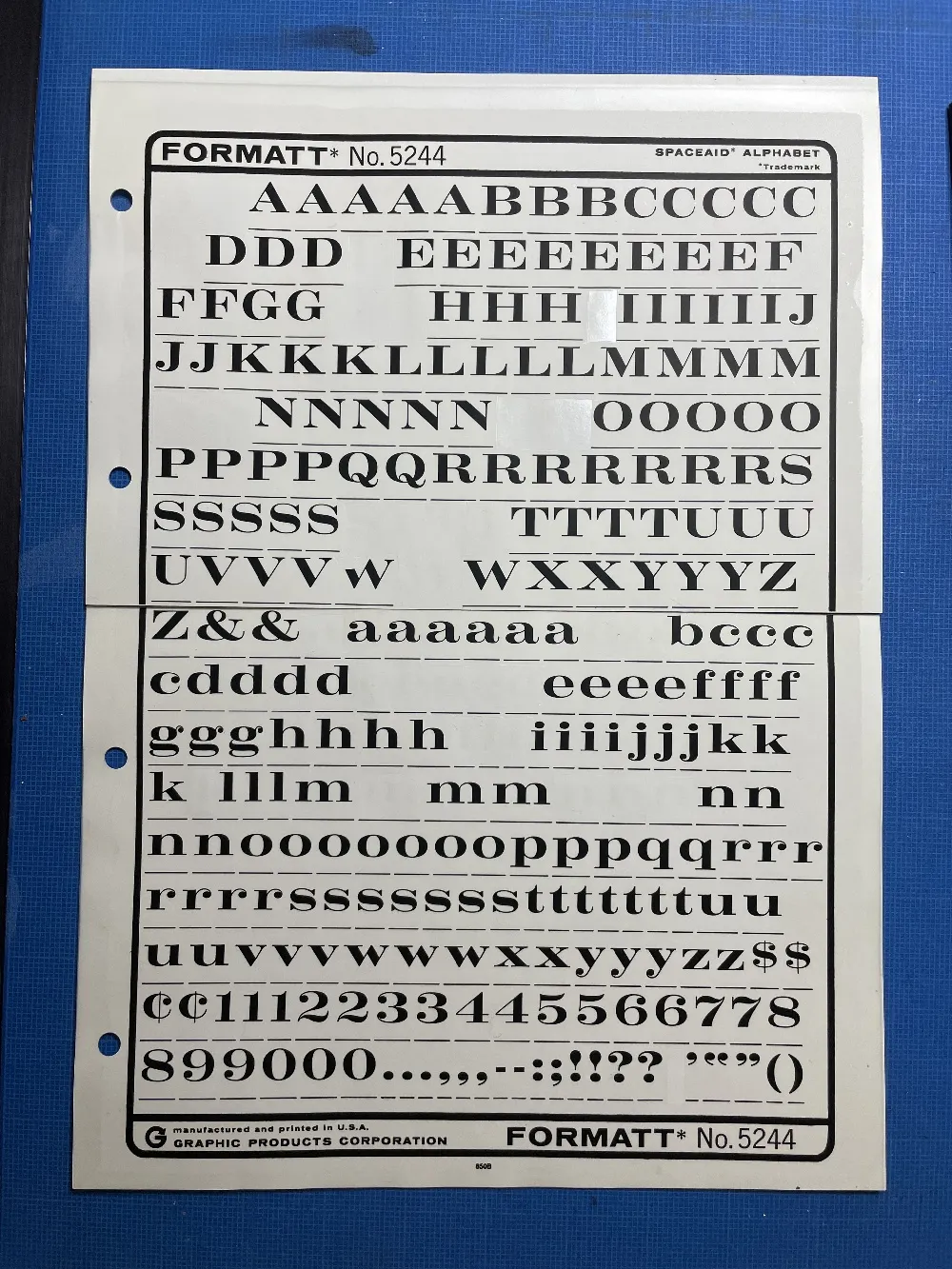
The sheets had guides below each character to aid in spacing and alignment. Although I always spaced it by eye, the guides were essential to keep the characters aligned to each other. I would draw a line for positioning the guidelines using a non-repro pen or pencil before setting the characters down and trim away the guidelines after.
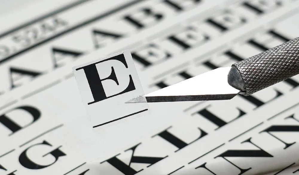
Formatt was not as high in quality as Letraset, but it was cheaper and offered typefaces—especially older metal typefaces—not available from any similar product. But they also carried more recent faces, such as those from ITC. They carried about 250 different typefaces in the catalogs I have. I only bought Formatt type sheets in order to get certain typefaces that weren’t available elsewhere (other than from typesetting houses, which were not in my budget at the time).
In addition to type sheets, they also produced a whole range of pattern sheets, rule and border sheets and tape, color sheets, decorative material, etc. A lot of the graphic material seems to have come from old metal foundry sources. Besides the type sheets, I used their border sheets and tapes a lot, too.
I also made my own “Formatt” sheets sometimes back in the early 80s. I had access to a process camera, which could make high-quality photographic copies of black and white originals, colloquially known as “photostats” or “stats.” Normally you would use white RC (resin-coated) photographic paper with it, but it was possible to get clear acetate photostat material that had a peel-off adhesive backing. Using this, I made copies of pages from old metal type specimens, allowing me to set display type using otherwise unavailable typefaces.
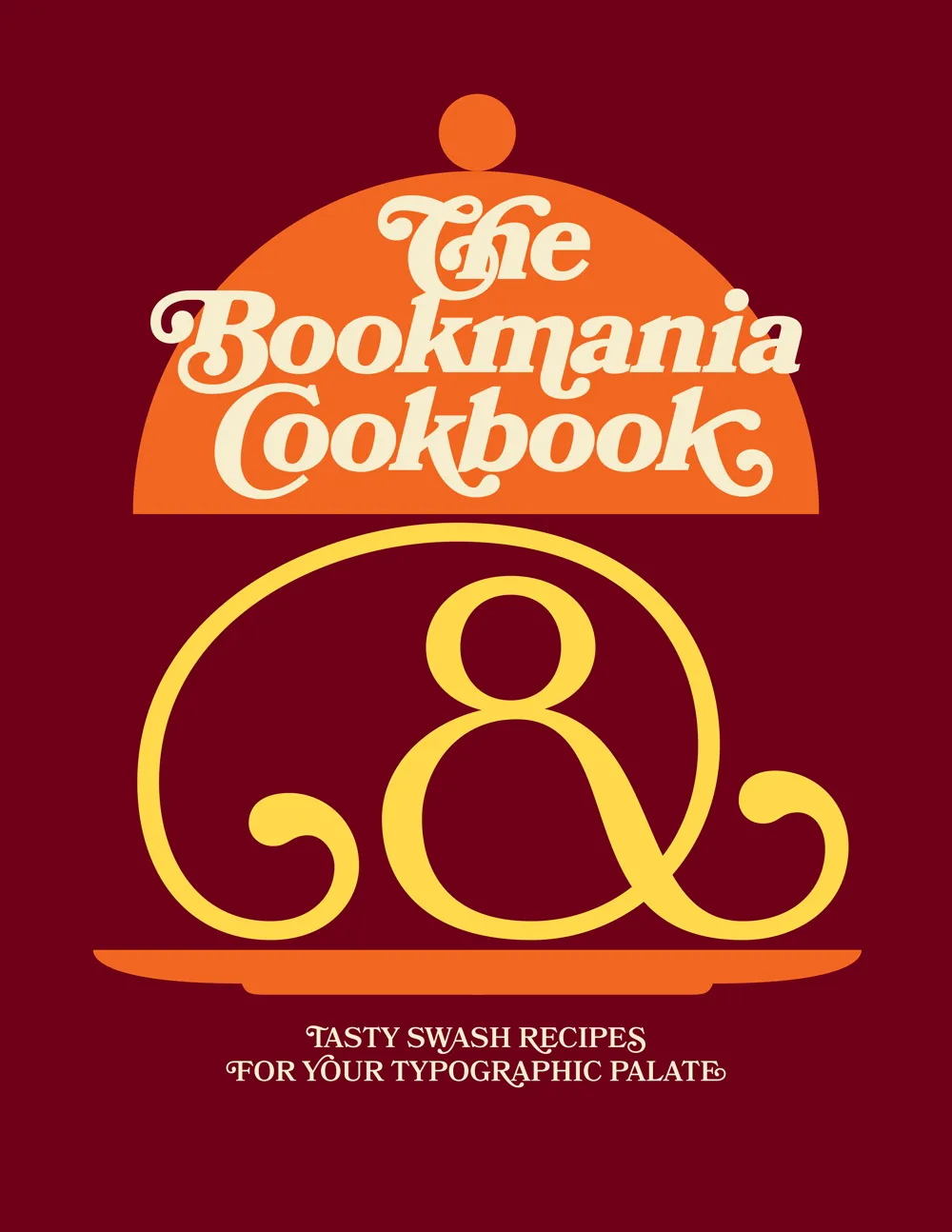
Ten years ago, when I first released Bookmania, I mentioned in the specimen book that there would be a user guide showing how to take advantage of the hundreds of swash and alternate characters. While the concept was clear in my mind from the start, it became one of those projects that were perpetually on the back burner, the kind of project I procrastinate about in order to get other things done.
But recently, after getting yet another email from a user asking how to access Bookmania swashes, I finally found the time and energy to finish The Bookmania Cookbook.
It starts with an overview on how to access swash and alternate characters in desktop apps and in CSS for the web. It then goes over some of the do’s and don’ts of using swashes.
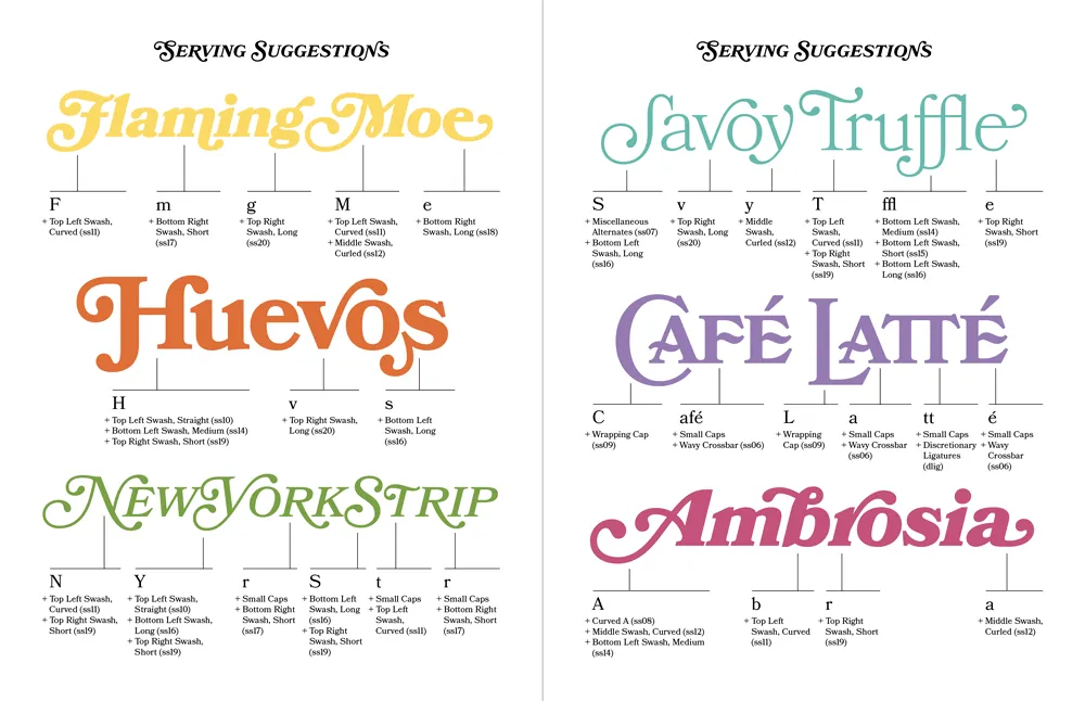
This is followed by a “serving suggestion” section where I prepared over a dozen examples of Bookmania swashes in use to give you some ideas and inspiration for your own designs.
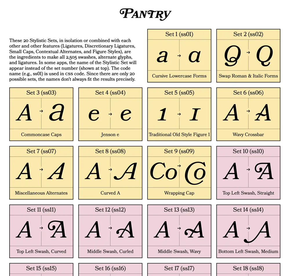
Finally, there is a reference section which includes a table of Stylistic Sets and a complete “recipe” section that shows you how to produce every swash and alternate character using Stylistic Sets and other OpenType features, which is especially useful on the web.
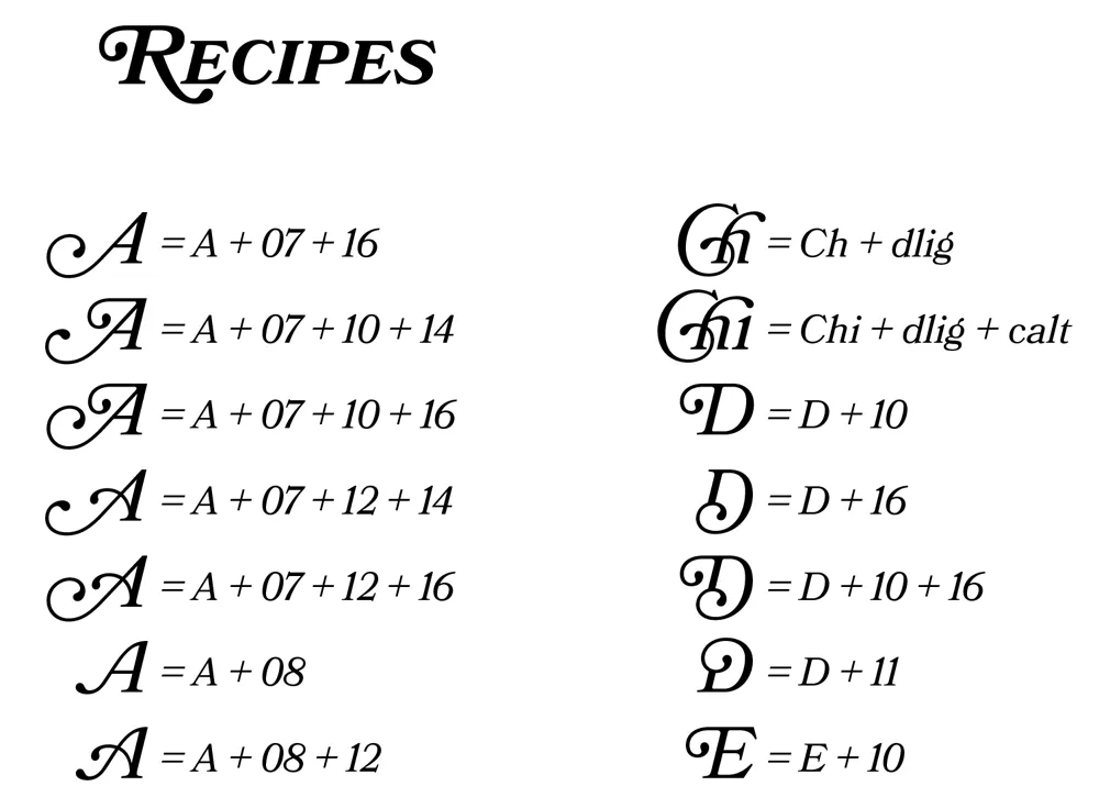
Sorry it took so long to put this together. If you’re a Bookmania user, I hope you will find this “cookbook” helpful. You can download it here.
