 This is something I’ve been meaning to post for a while.
Last summer, at TypeCon in Boston, Adrian Frutiger was honored with SOTA’s 2006 Typography Award. Mr. Frutiger couldn’t attend, but several SOTA board members travelled to his home in Switzerland to present the award to him. I was among the people who gave a presentation during the ceremony in Boston. The others were Akira Kobayashi, Bruno Steinert (both of Linotype) and Mike Parker (formerly of Linotype), who each shared personal anecdotes; and Tiffany Wardle and Jon Coltz, who shared the stage in a deeply philosophical rhapsody.
I was asked by SOTA to say some words about Mr. Frutiger, even though, unlike Akira, Bruno, or Mike, I had never worked with him, and in fact I’ve never even met him. Even worse, I had never given a talk at a conference before. But Tamye Riggs (from SOTA) pointed out that it only needed to last about ten minutes and that it would be nice to get a perspective from somebody who was not an “insider.” So, I said “okay” and jumped into the deep end.
In spite of my nervousness and minor technical nightmares (“sorry, we can’t change the screen set up to a dual display just so you can read your notes off the laptop on the podium while the presentation plays on the big screen”) it went fine and was well-received.
If you missed it, or want to see it again, I’ve made a PDF from the Keynote document, which can be found here:
Adrian Frutiger: A Personal Perspective
If you have a slow internet connection, please note: The PDF is pretty image-heavy and weighs in at 17.6MB.
About the formatting: The text you see at the bottom of the screens is my actual script—the words I was saying while the image above them was being shown. I formatted it to make it easy for me to read and not mess up the phrasing. I know that some people recommend against using a script when giving presentations, but, having never done it before, I couldn’t take the chance.
Last Friday, I spent the afternoon frantically trading files with Peter Bruhn (of Fountain type foundry in Sweden) for an exhibition match of Layer Tennis. The basic idea is to pass a layered Photoshop file back and forth for ten “volleys”, about one every 15 minutes. The resulting “volley” image is displayed live for the world to see, with running commentary (in this case by the witty and capable Grant Hutchinson.
What may not have been obvious to some was that the Photoshop compositions were not where Peter and I were spending most of our time (well, maybe in some cases it was obvious). In fact, we were designing, building and generating fonts in FontLab, and then using them in Photoshop. With most of the volleys, we started from the font that had been built in the previous one.
Although the images created in Photoshop were the ultimate public face of the match, I thought it might be interesting to show what was going on behind the scenes with the fonts.
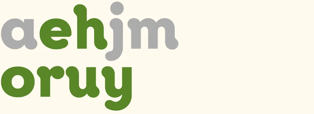
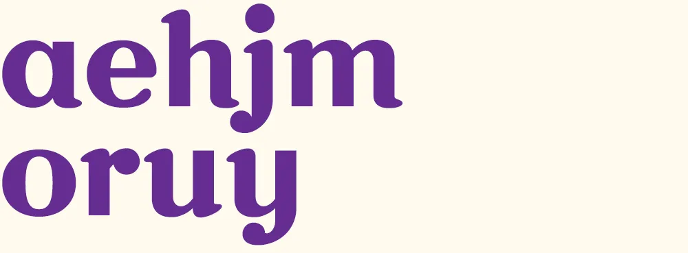
To make it easier to tell what was going on, I’ve color-coded the glyphs:
- Green = new glyphs
- Purple = modified glyphs
- Gray = unmodified glyphs.
Volley 1: “jam” I got the coin toss, so I went first. I created a font with three simple glyphs in a sort of bloopy geometric style.

Volley 2: “your ham” Peter followed up by ably adding several more glyphs in the same style.
Volley 3: “more homey” I modified all the existing glyphs to create a higher-contrast semi-serif design. (You can see more clearly in this version that the basic construction is that of an upright italic.)
Volley 4: “möre” Peter takes it in a different direction, more like a Bodoni or Didot, and adds a whimsical swash and umlaut. He also takes advantage of the fact that he only really needs to change enough glyphs to spell the word he wants to use in the image, in this case “more”. Both of us adopt this strategy as the game progresses.
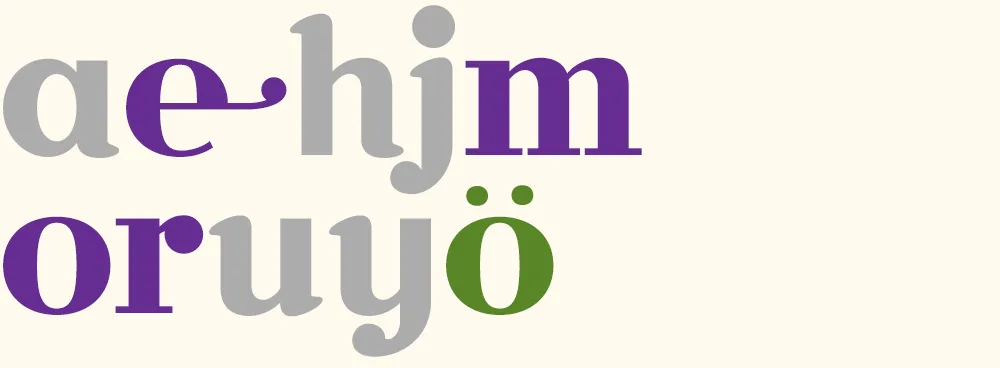
Volley 5: “major surgery” I continue the transformation to a Didone style, conforming several other glyphs and adding a g and an s.
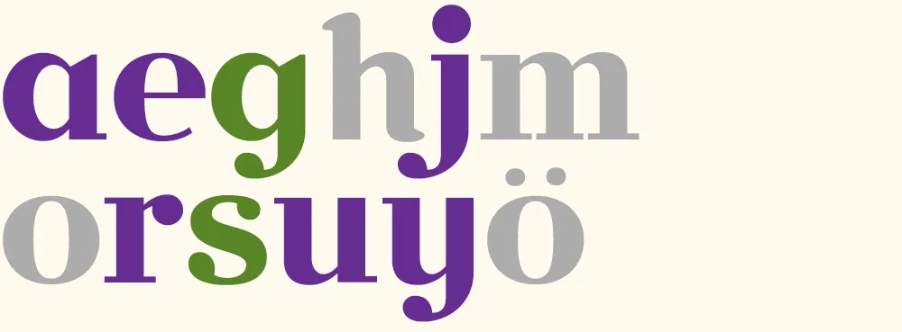
Volley 6: “no sanity” Peter changes the direction, this time deconstructing several glyphs and doing a “serif-ectomy”. Note the nod to my Coquette in the o.
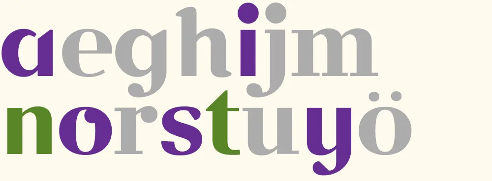
Volley 7: “faster!” I change the style again, albeit in an expeditious manner, by slanting all the glyphs. I add an f and a ! and tweak a few existing glyphs. (Merely slanted glyphs are shown in light purple.)
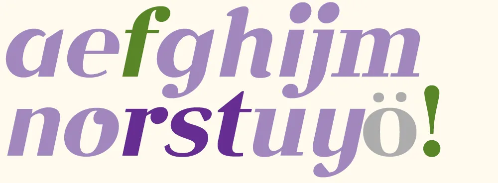
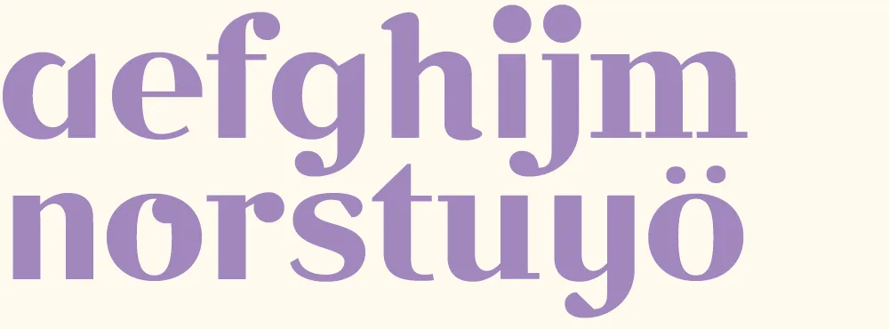
Volley 8: “aefghijm” Peter does something “meta” by printing out and critiquing an unslanted version of font.
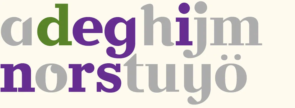
Volley 9: “redesign” I discard my cheap slanting trick from volley 7 and, starting from the font in volley 6, change it into a slab serif for my final volley.
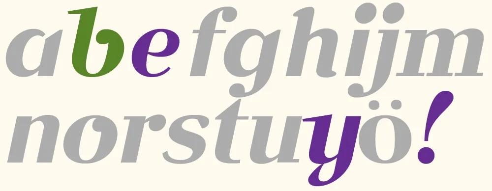
Volley 10: “bye!” Peter takes my slanted font from volley 7 and gives it a more cursive flair, with a reprise of the Coquette reference. According to Peter, the “waving” exclamation point was a happy accident. Works for me.
In the end, we had created ten new fonts in a few hours. Not complete, full-featured fonts, or the best-built fonts in the world, but good enough to set some type. I set them all together to show the sum of what we made:
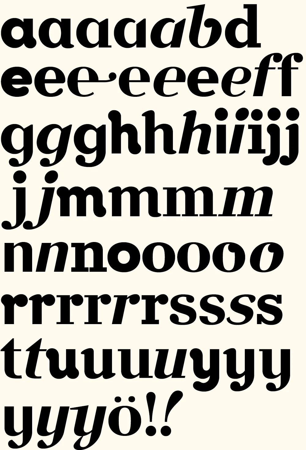
Now comes the hard part: Coming up with a name for it….
(Thanks to Peter Bruhn, and Jim Coudal and Bryan Bedell of Coudal Partners.)
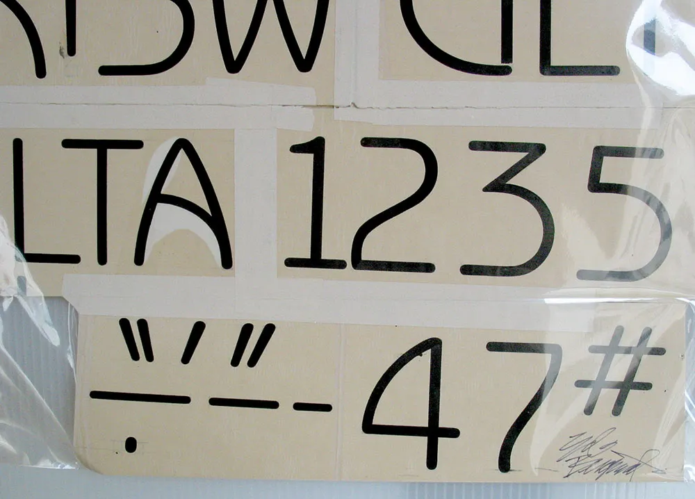
Original (signed) drawings by type and lettering legend Ed Benguiat for his typeface Benguiat Gothic. Seen in the Type Gallery at TypeCon2004 in San Francisco on July, 24, 2004.
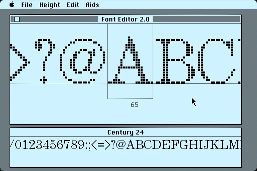
In 1984, I bought one of the original 128K Macs. A big draw for me was how it could display multiple fonts—proportional or fixed-width—anywhere on its screen. I desperately wanted to make my own fonts for it. This was before modern PostScript/TrueType/OpenType fonts, back when there were only “bitmap” fonts—fonts composed of discrete black and white pixels.
That summer, I read about an Apple developer tool called Font Editor 2.0 and sent for a copy of it. It was crude and crashed easily, but it allowed me to make my first Macintosh bitmap fonts. (A little later, AltSys released FONTastic, which was better in every possible way, including being less crash-prone.)
Recently, I fell down the rabbit hole investigating and reacquainting myself with Font Editor 2.0. I wound up making a user guide and a video demo and walk-through. I also prepared some disk images you can use with a real 128K or 512K Macintosh computer or an emulator, such as Mini vMac if you want to try it out for yourself.
I’m planning to make more videos about early font development on the Mac in the near future on my YouTube channel.
Back in March, I mentioned that I was in the final stages of developing a new font family, Proxima Nova. It’s now about three months later and most of that time was taken up by doing the italic.
“What took so long?” you might wonder, “Isn’t it just a matter of slanting the roman version and saving it? That couldn’t take more than an minute or two.” As you may have guessed, it’s not that simple, especially if one wants to do it right. Allow me to illustrate.
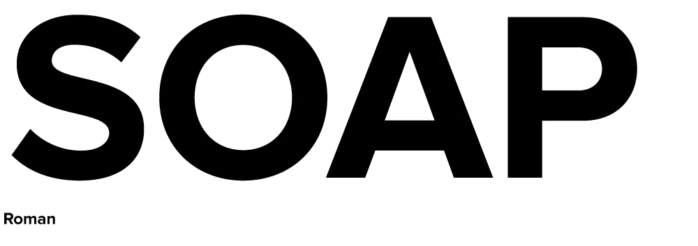
Here is a sample set in Proxima Nova Bold:
Here it is simply slanted:
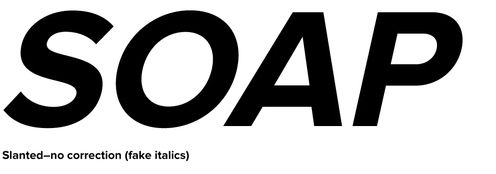
Notice how the curves have become distorted. The subtle modulation of the stroke weight is thrown completely out of whack, getting thinner in some places and thicker in others. This is especially noticeable with the S, O and P. Notice how the O looks kind of squashed. The A is also affected, but the difference is less obvious: the left stroke has become slightly thinner while the right stroke has become slightly thicker.
Characters like E and H, with only vertical and horizontal strokes, are virtually unaffected by slanting. However, any characters which are composed of curves or angled strokes must be optically corrected in a high quality font.
Here is the same sample set in Proxima Nova Bold Italic:
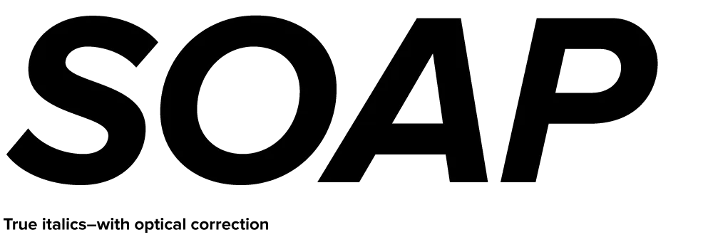
Much better, isn’t it? It takes a lot longer to make all those optical corrections, but the result—a font that simply looks right—is definitely worth it.
I expect to release Proxima Nova by the end of June. It’s available now.
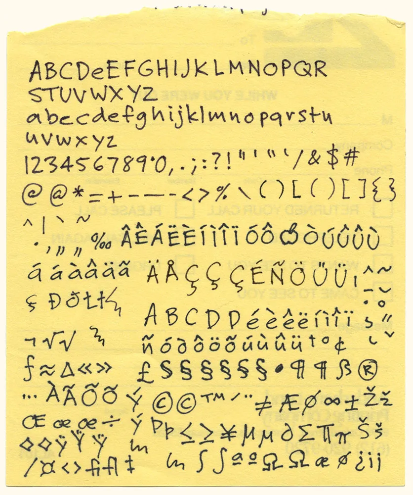
Here it is: The original artwork for one of my most popular fonts, Felt Tip Roman. I scribbled out all the characters needed in a typical font on the back of a phone message pad (about 4.128” x 5”) using a Pilot Razor Point felt pen. I deliberately tried not to be too neat or careful to try to capture the spontaneity of natural handwriting. Whether it would actually work as a font, I had no idea. That it would become a commercially successful font someday would have struck me as absurd at the time. I probably would have been a bit more careful and circumspect if I’d known. But perhaps then it would not have been as popular.
