I’ve attended all three of the Hamilton Wood Type and Printing Museum’s annual “Wayzgoose” events so far. Last year’s, held in early November, was enjoyable as always, but I think I prefer the mix of presentations and hands-on workshops of previous years over having only workshops.
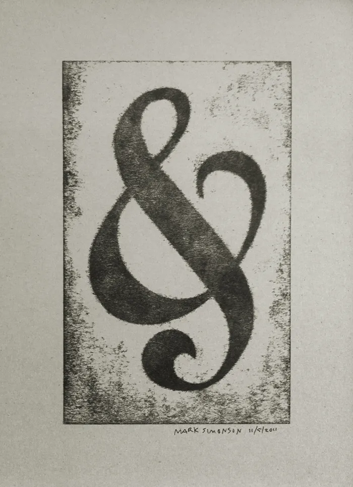
Still, it was great how they tied all the workshops around a common purpose—creating a portfolio of prints (including the portfolio itself). You can see one of my prints above, a pressure print from a hand-cut plate based on a free-form ampersand design.
I highly recommend the Wayzgoose if you are a type fanatic like me, into letterpress printing, or both. It’s held in the Fall in Two Rivers, Wisconsin. Attendance is limited, and it fills up quick, so you might want to get on their mailing list to be notified regarding when the next one will be held.
After posting my follow-up on Sunday, my uncle sent me some more details about the CCA calendars:
“Most of the calendars during the late sixties and early seventies were designed at the CCA Corporate Design Center, which was located in downtown Chicago. It was run by John Massey who was head of all CCA corporate design and promotional material. He had two brothers that worked for him. We referred to them the Kalfus brothers (not sure of the spelling). They did many of the calendars. John Massey used Helvetica type only on everything they designed. Bill Bonnell came later and may have designed some of the last calendars CCA did.”
Somebody ought to do a site about CCA’s design history. So many things like this are virtually non-existent on the web.
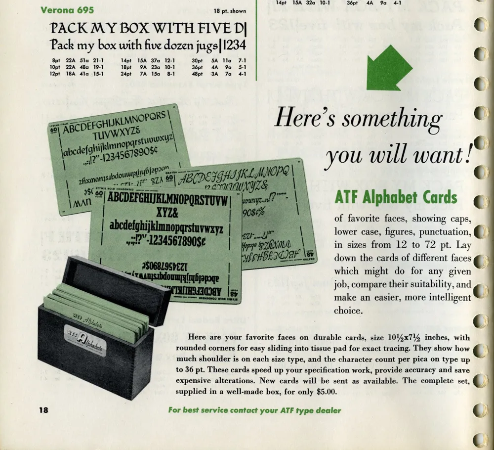
While looking for some obscure typographical thing this morning, this ad in a 1955 ATF (American Type Founders) catalog caught my eye:
I have several boxes like the ones shown in the photo. I acquired them with a bunch of other stuff some years ago when the University of Minnesota Journalism School revamped its graphics lab. Here’s one of them:
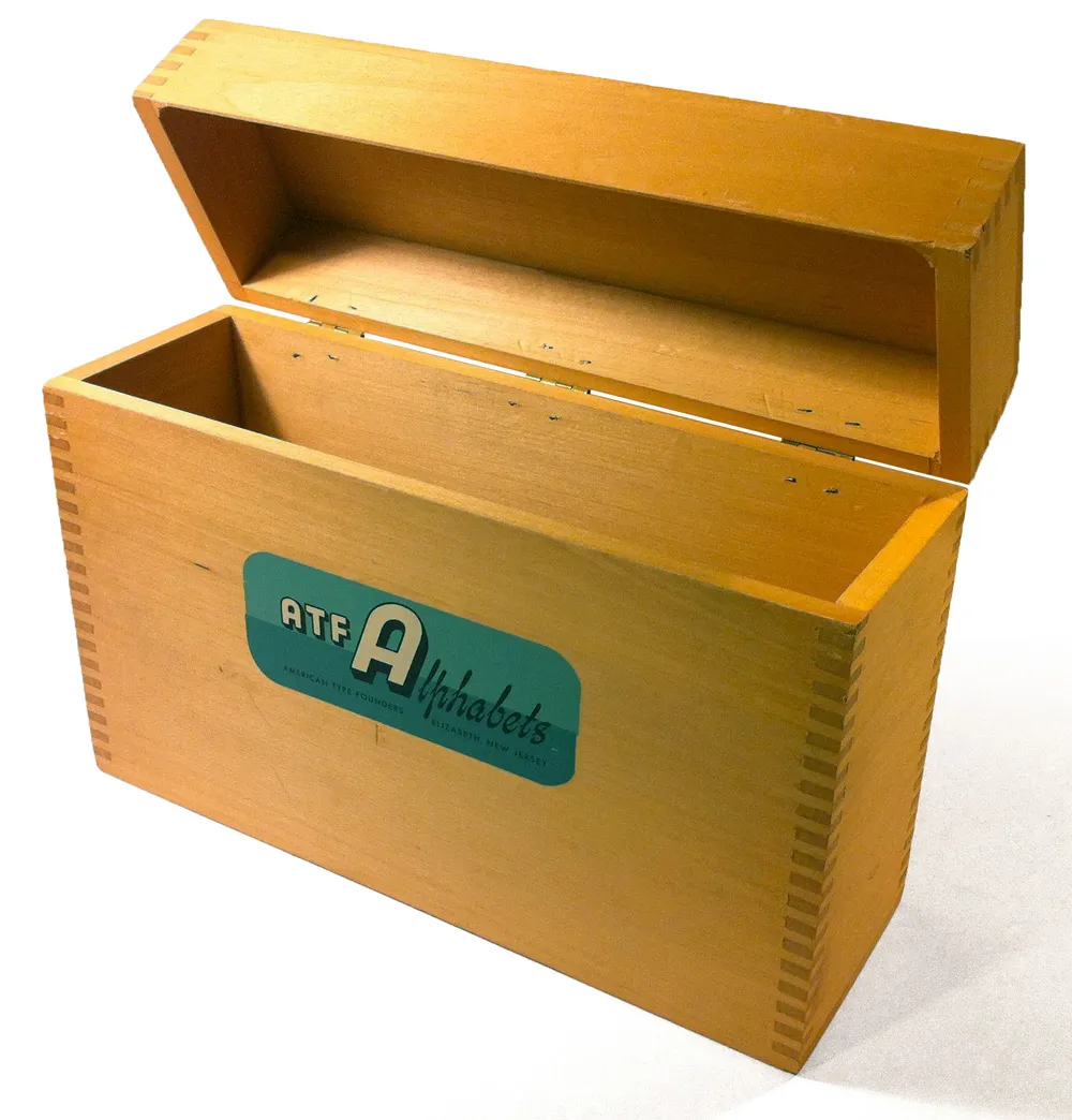
The silk-screened label is beautiful:
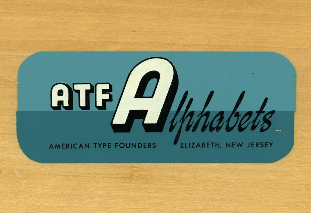
It’s too bad I don’t have any of the type sample cards they were designed to hold. “Here’s something you will want!” Still true, even in 2012.
Postscript: An Etsy page with photos of what went in these boxes. Thanks to Joel for the link, and thanks to Kathy for sending me a complete set of the cards.
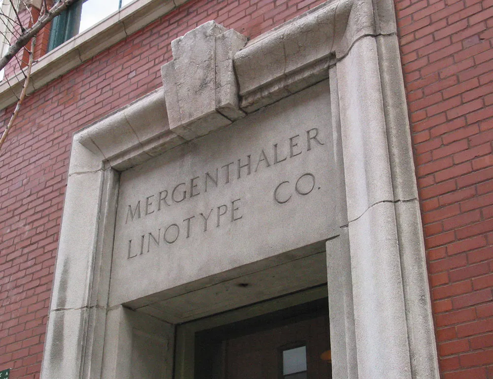
On a recent trip to Chicago, I made my way to Printing House Row and snapped this photo of the entrance to the old Mergenthaler Linotype Co. headquarters:
I can’t say exactly why, but it was a little distressing to see these rather tacky ads for a photographer in the window adjacent to the entrance:
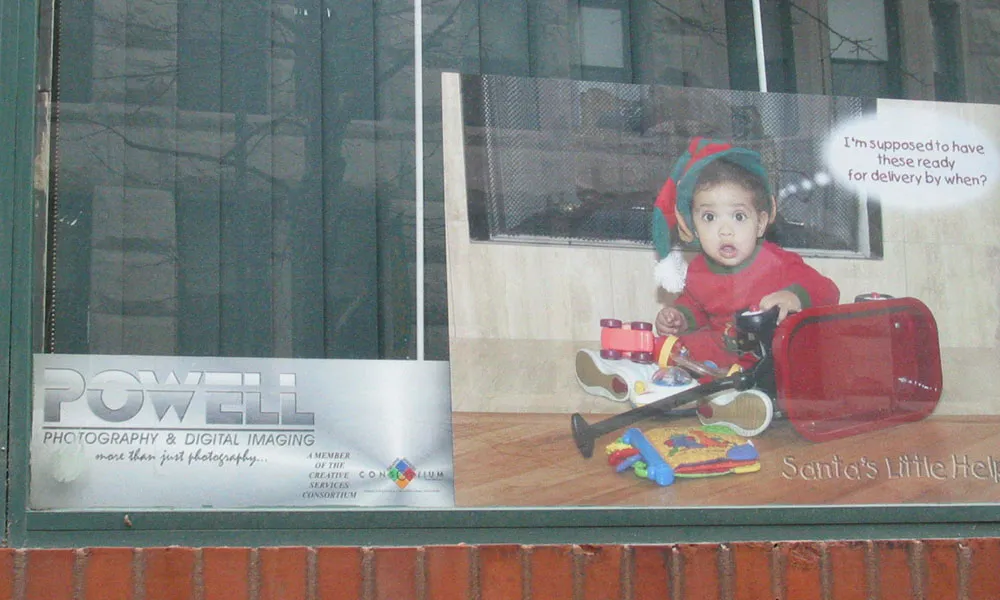
I guess I thought it would be a museum or something.
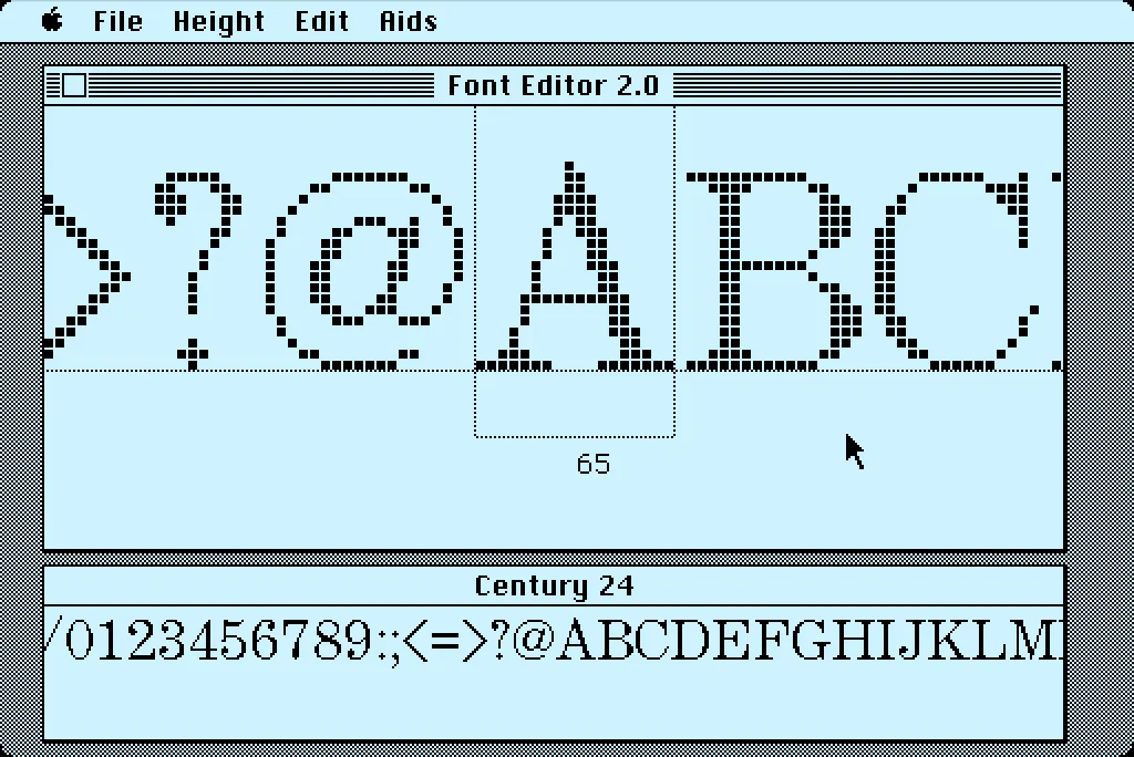
In 1984, I bought one of the original 128K Macs. A big draw for me was how it could display multiple fonts—proportional or fixed-width—anywhere on its screen. I desperately wanted to make my own fonts for it. This was before modern PostScript/TrueType/OpenType fonts, back when there were only “bitmap” fonts—fonts composed of discrete black and white pixels.
That summer, I read about an Apple developer tool called Font Editor 2.0 and sent for a copy of it. It was crude and crashed easily, but it allowed me to make my first Macintosh bitmap fonts. (A little later, AltSys released FONTastic, which was better in every possible way, including being less crash-prone.)
Recently, I fell down the rabbit hole investigating and reacquainting myself with Font Editor 2.0. I wound up making a user guide and a video demo and walk-through. I also prepared some disk images you can use with a real 128K or 512K Macintosh computer or an emulator, such as Mini vMac if you want to try it out for yourself.
I’m planning to make more videos about early font development on the Mac in the near future on my YouTube channel.
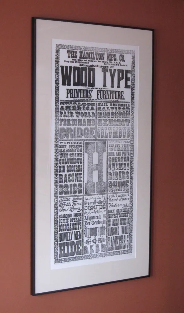
I finally got around to framing the beautiful commemorative print I got from the Hamilton Wood Type & Printing Museum back in 2009. To give you an idea of the size, the frame is five feet tall. By far the biggest thing I’ve ever had framed. Here are a couple close-up shots:
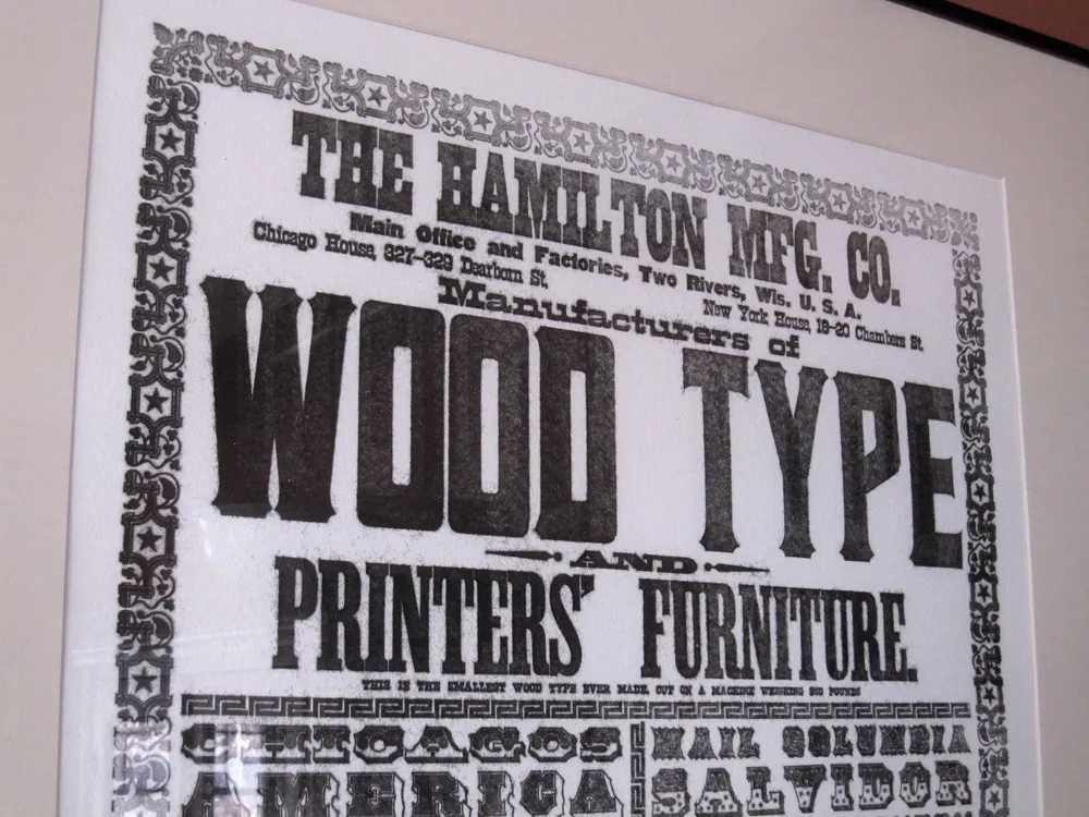
I love the part below the big heading where it says, “THIS IS THE SMALLEST WOOD TYPE EVER MADE, OUT OF A MACHINE WEIGHING 950 POUNDS”.
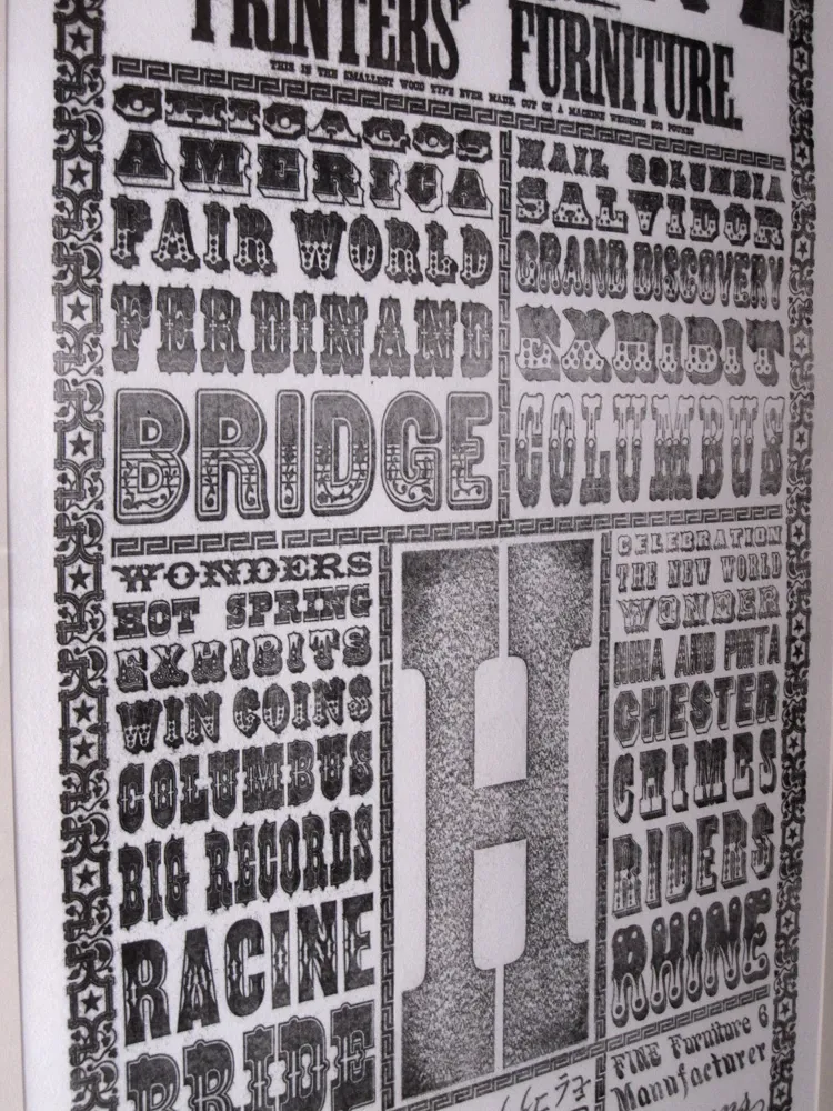
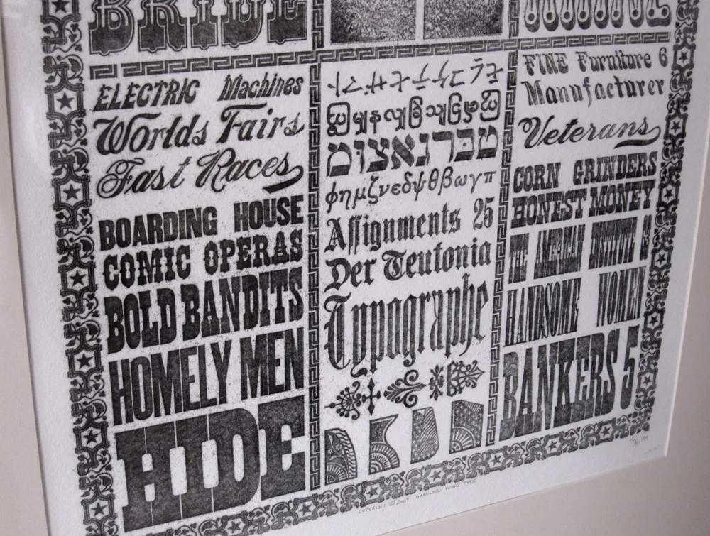
The print was taken from a literal showcase of Hamilton Wood Type made for the 1893 Columbia Exposition in Chicago. It’s composed of virgin (never used for printing) wood type, some of it painted. If you have seen wood type before, it’s usually dark brown in color, stained from use. This is what the stuff looked like when it was brand new.
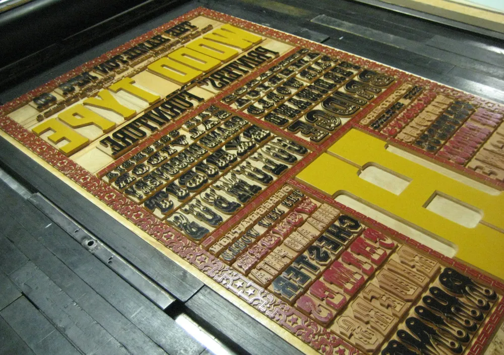
The curators of the Hamilton were able to pull prints from the showcase without getting a bit of ink on it. The display was taken out of its protective case and wrapped in 3M window insulator film. The film was inked and the prints were pulled from that. It’s not as crisp as a print taken directly from wood type, but it’s the first time any kind of print was made from this old type in over 100 years.
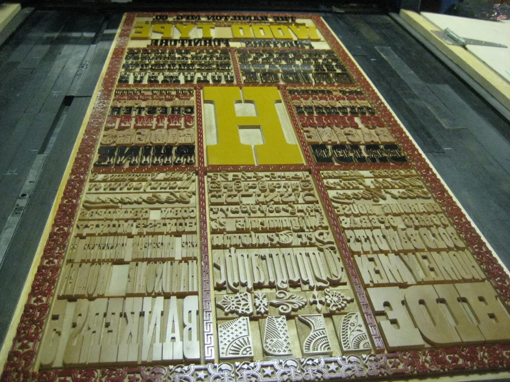
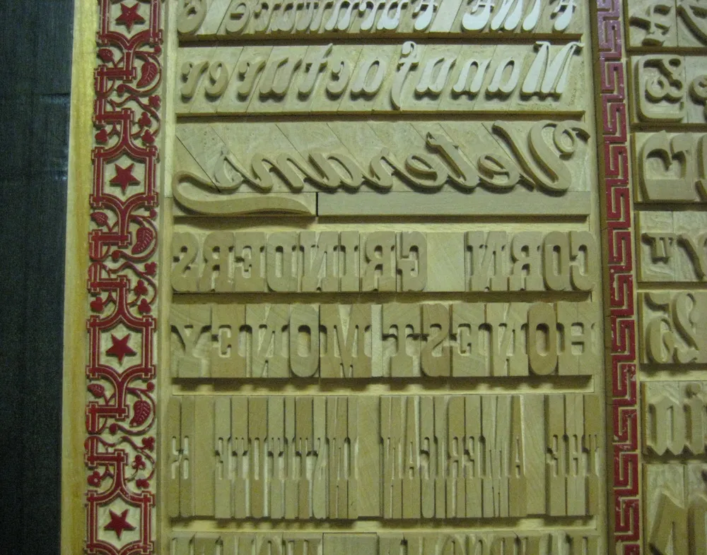
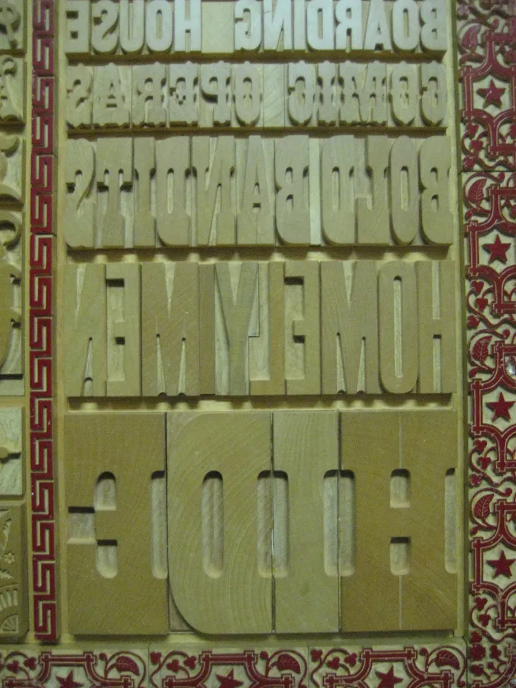
More photos here. If you’re at all interested in type, wood type, or letterpress printing, I highly recommend paying a visit to the Hamilton Wood Type & Printing Museum. It’s in Two Rivers, Wisconsin, about a couple hours by car north of Milwaukee.
