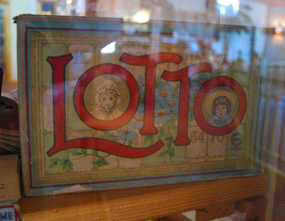
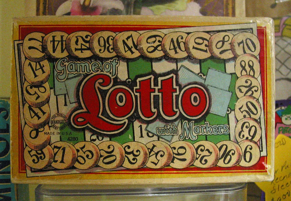
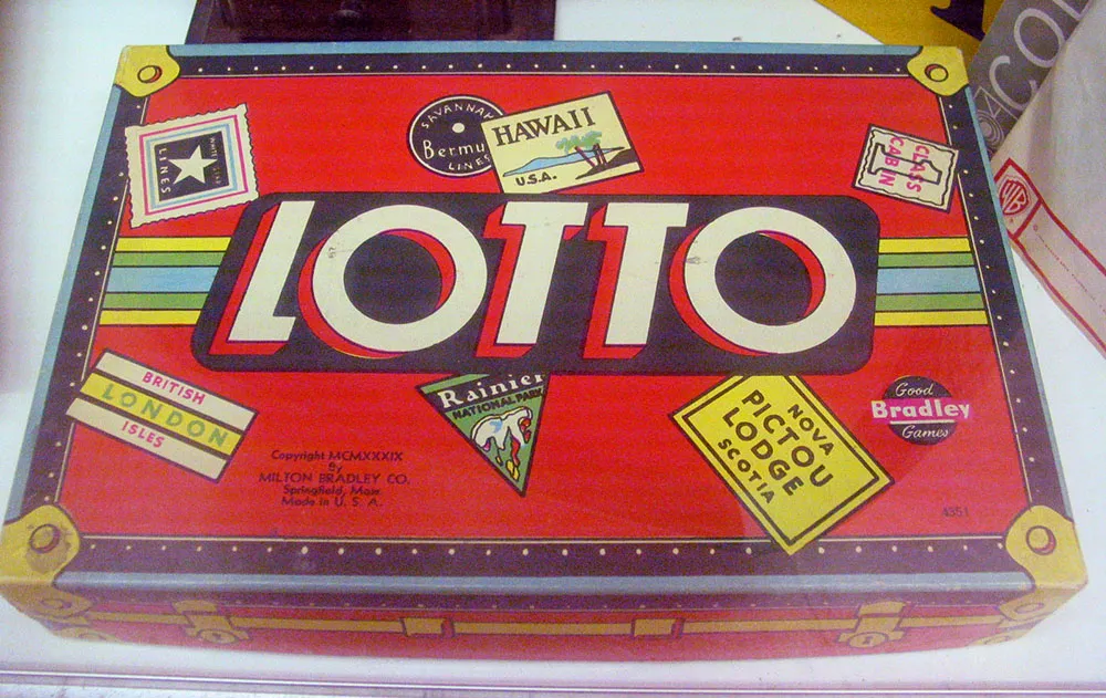
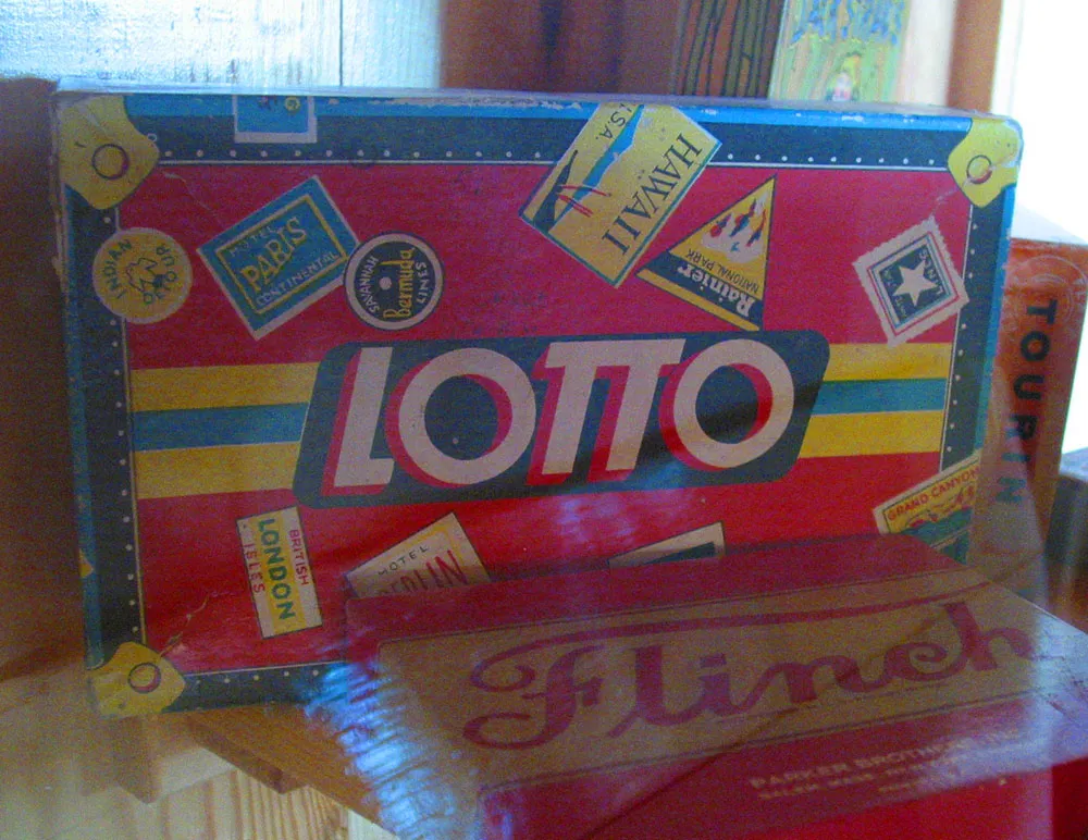
Vintage Lotto game boxes. Photographed (top to bottom) at Kellogg, Minnesota, August 21, 2004; Hopkins, Minnesota, December 18, 2004; Wisconsin Dells, July 31, 2004; and Kellogg, Minnesota, August 21, 2004.
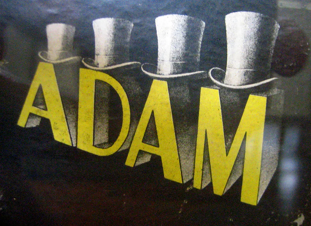
Logo on a hat box, seen in an antique store in Oneonta, New York, July 7, 2007. Those are some snappy caps.

Ever wondered why albums are called “albums”? At one time, a record album was literally an album that contained records.
A few years ago, I ran across a handful of them in an antique store. They were all from around 1949 or so and contained 45 r.p.m. discs. A lot of the records were missing, but I had to buy them because they had the most amazing cover designs. I wonder who designed them?
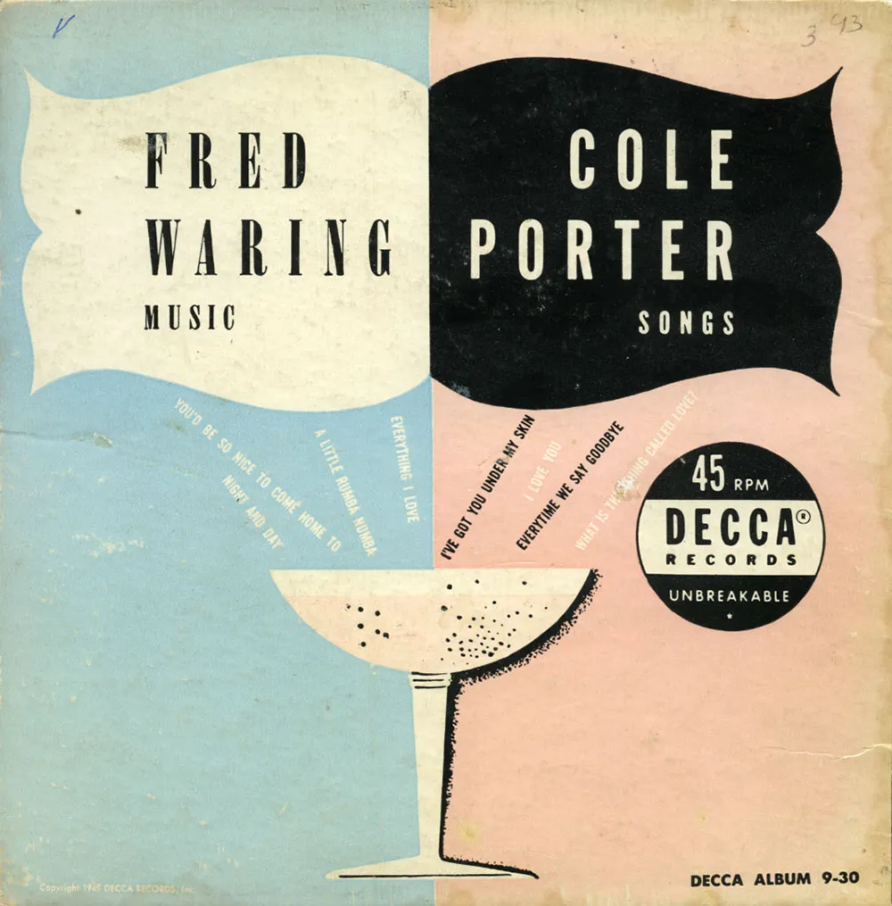
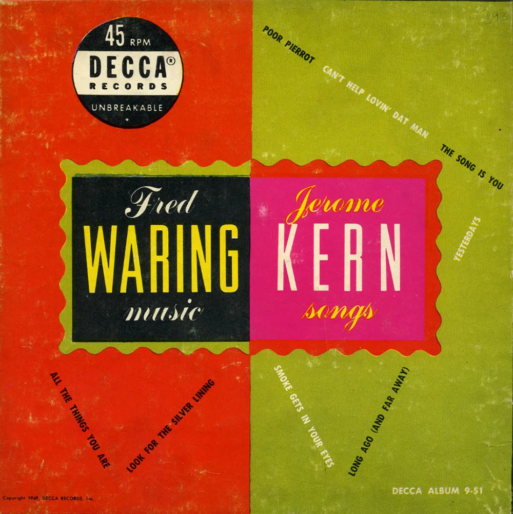
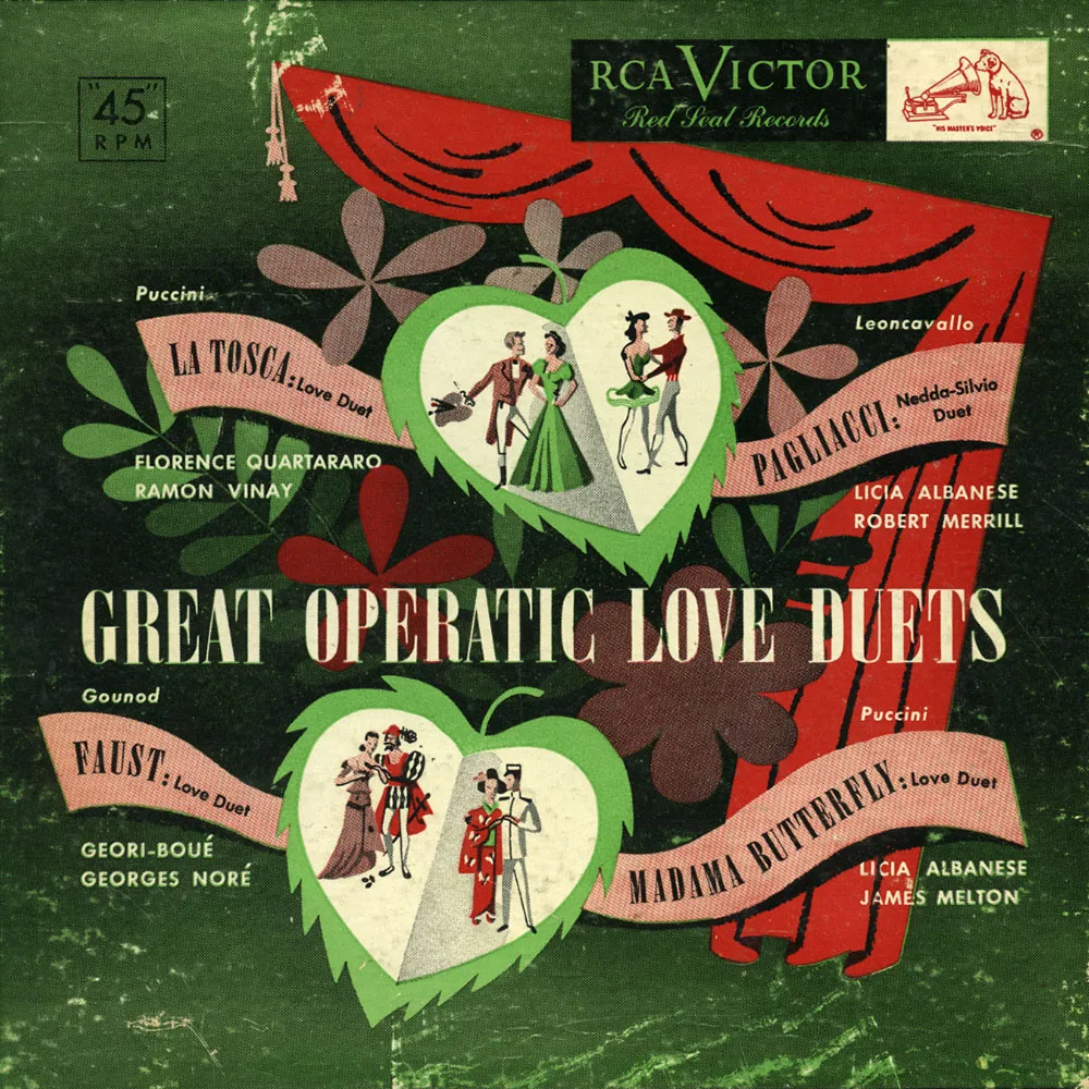
The first two are Fred Waring albums on the Decca label and the third is a collection of opera duets on RCA Victor. They remind me of the new wave album covers of the early Eighties used by groups like The Art of Noise. Or maybe it’s the other way around. I love how “45” is put in quotes on the RCA album—as if it’s not really 45 r.p.m.
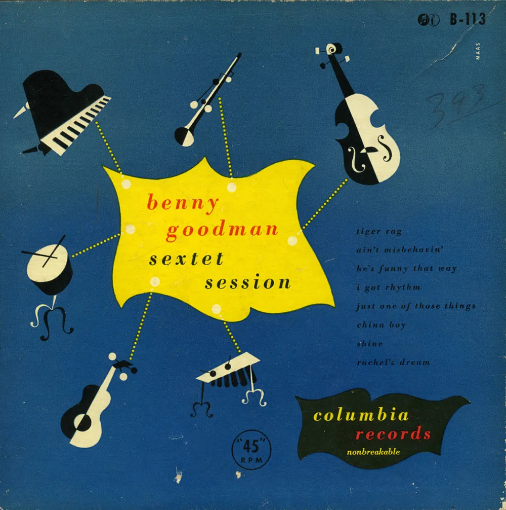
This Columbia Records Benny Goodman Sextet album seems to have some Joan Miró influence. Spaced out Bodoni Italic, dotted lines, bee-bop cartouches—what’s not to like? Notice how they advertise that the records are “unbreakable.” This must have been a big marketing issue at the time.
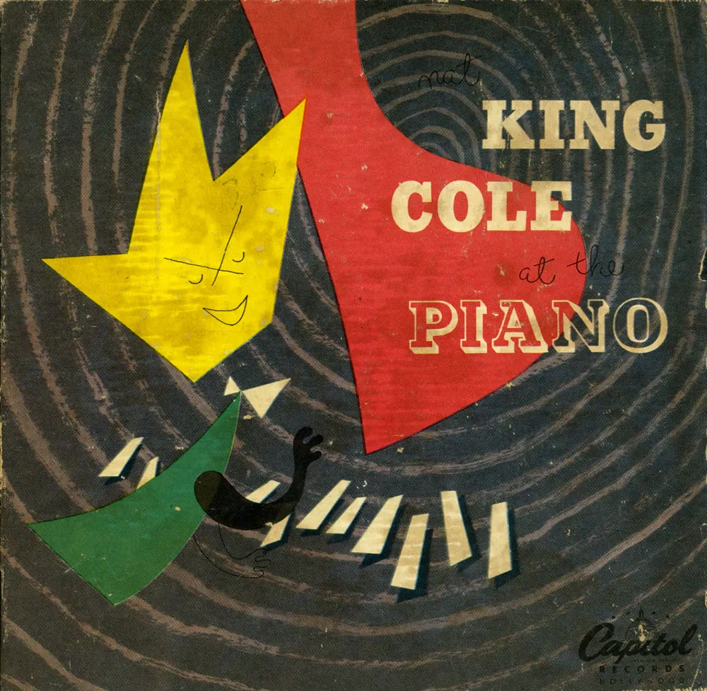
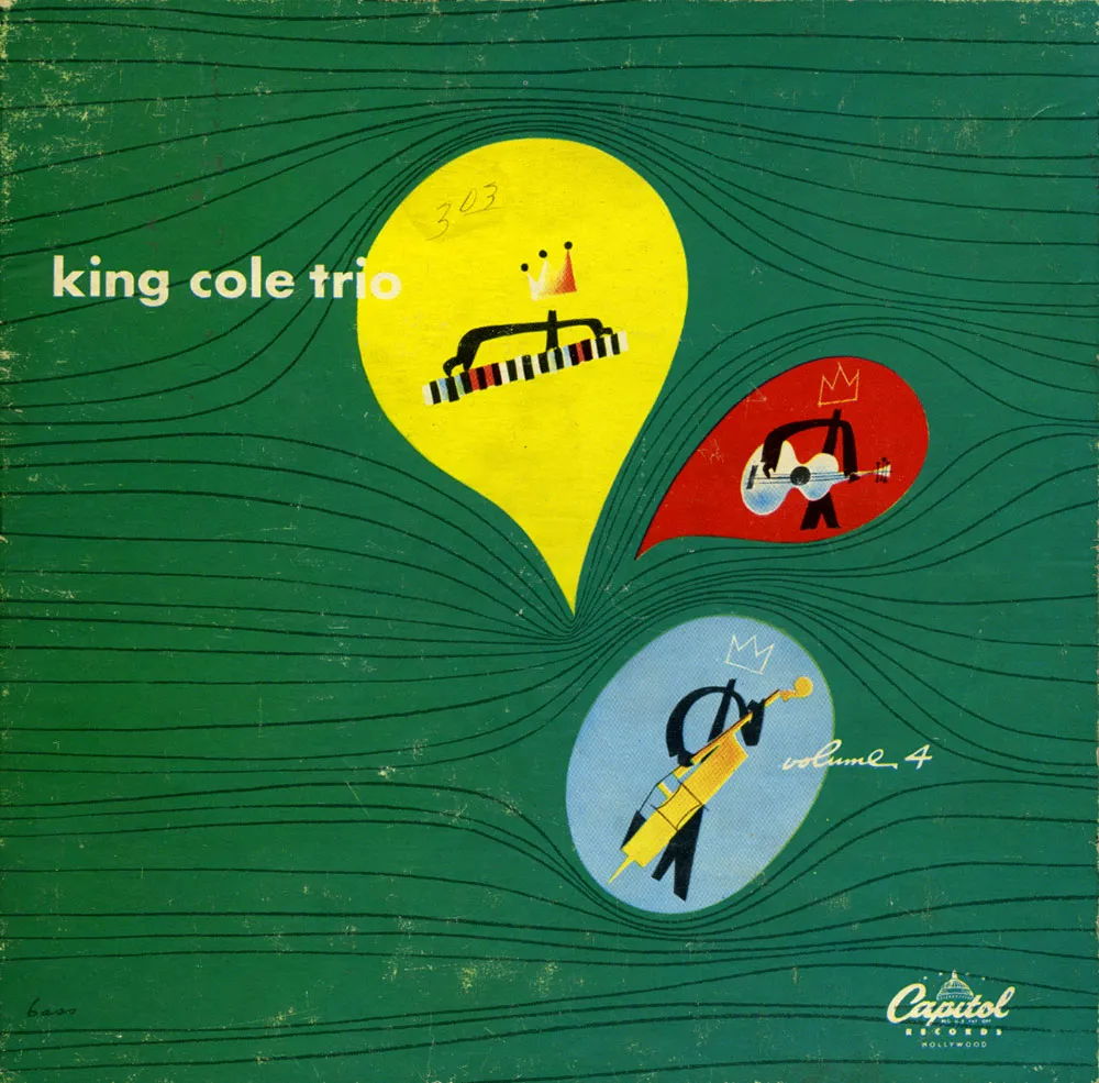
The last two are Nat “King” Cole albums released by Capitol Records. They both feature bold, lively abstract designs in which Cole is represented by a crown. In the first one, it even looks kind of like him. The piano is reduced to a big red shape (the lid) and a few small white ones (the keys) with emanating sound waves tying it all together. The second one uses sound waves again, but shown more like a stream of air flowing around the musicians. Whatever. It’s cool.

I don’t know what’s in this building, but I like the 1970s-style script lettering on their sign. Those ones look like dancing scimitars. Photographed on April 1, 2005 in Milwaukee, Wisconsin.
I used to draw a lot more when I was young and got to be pretty good by the time I was in college. I might have had a career as an illustrator if I hadn’t taken a detour into graphic design and art direction.
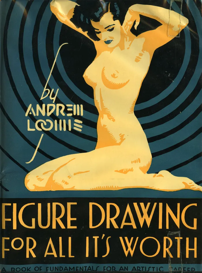
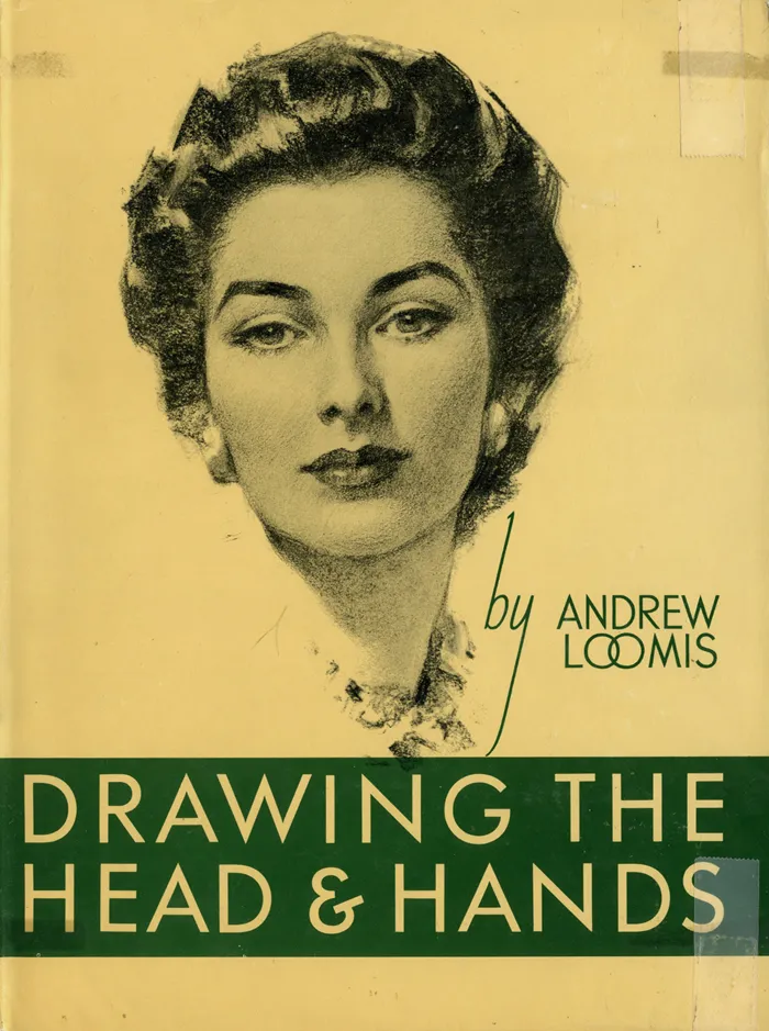
For the last few years, I’ve been trying to get back into drawing again, but more for enjoyment than anything commercial. Not long ago, I discovered the books of Andew Loomis, who died in 1959. He was a commercial illustrator who did a popular series of books on drawing and painting, starting in 1939 with Fun With A Pencil.
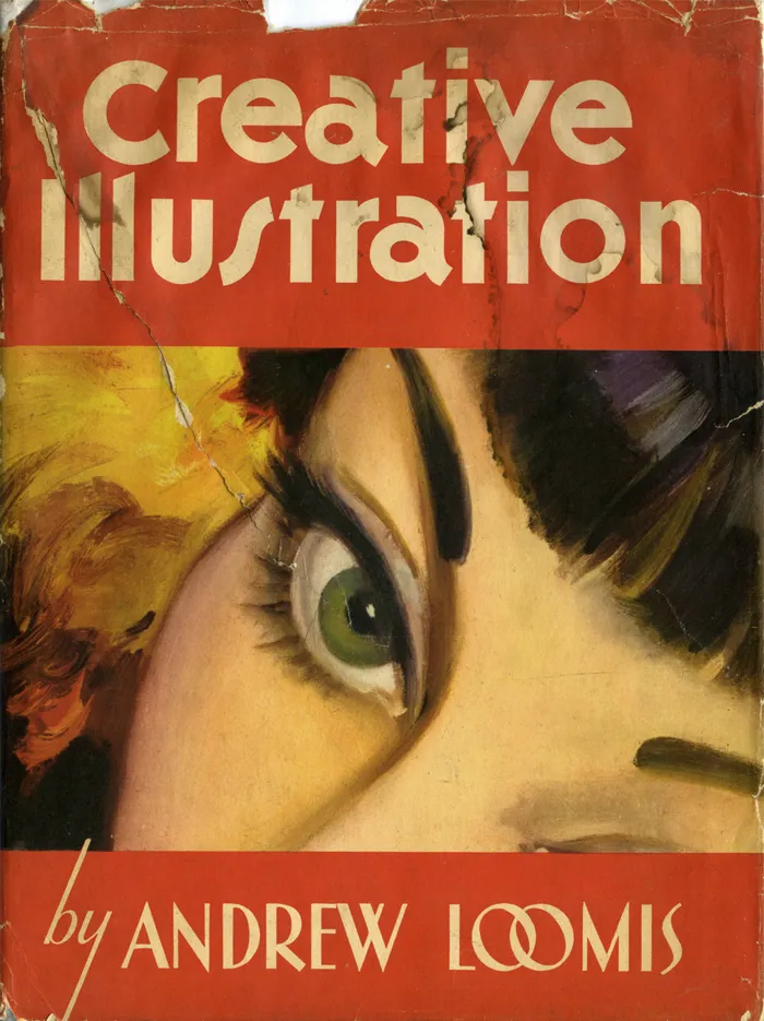
Loomis’s facility for drawing was astonishing. One thing I’ve never been good at is figure drawing without referring to a live model or a photo. Loomis lays it all out clearer and with more depth than anything I’ve seen before. Where were these books when I needed them?
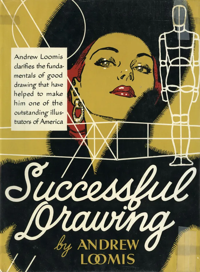
I don’t know if I have the time or patience to begin again with these books, but I’d love to try. More likely, they’ll be fuel for day dreams, and I’ll stick to doing what I do—type and lettering. Speaking of which, aren’t the covers terrific?
By the way, don’t write asking what fonts are used on the covers. Except for some Futura on the first cover, it’s all hand-lettered, presumably by Loomis. There’s lots more lettering inside, too, for title pages and illustration captions.
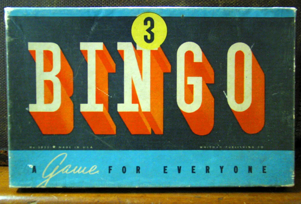
Seen in an antique store in Prescott, Minnesota on July 10, 2004.
