Chris Foresman, at Ars Technica, has written a nice, informative piece about WOFF (Web Open Font Format).
I know I’ve been lax in posting items to Notebook lately. Somehow, between Twitter, Typophile, and making fonts (mostly), I forget it’s here.
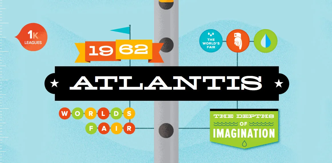
Anyway, a really cool thing happened last Wednesday: Lost World’s Fairs. It demonstrates the support of web fonts in the new Internet Explorer 9 for Windows, but it works equally well in most other desktop web browsers (not on mobile phone browsers yet, as far as I can tell). You can read about how it was put together on Jason Santa Maria’s blog.
The big surprise for me was that all three of the demo pages feature fonts designed by me, served via Typekit. Many of my fonts have been available for web use through Typekit for a while, but recently also through Extensis’ WebINK service, Fontspring, and Fontdeck. Note: WebINK and Fontdeck ceased operation in 2015 and 2016 respectively.
Ten years ago, when I first released Bookmania, I mentioned in the specimen book that there would be a user guide showing how to take advantage of the hundreds of swash and alternate characters. While the concept was clear in my mind from the start, it became one of those projects that were perpetually on the back burner, the kind of project I procrastinate about in order to get other things done.
But recently, after getting yet another email from a user asking how to access Bookmania swashes, I finally found the time and energy to finish The Bookmania Cookbook.
It starts with an overview on how to access swash and alternate characters in desktop apps and in CSS for the web. It then goes over some of the do’s and don’ts of using swashes.
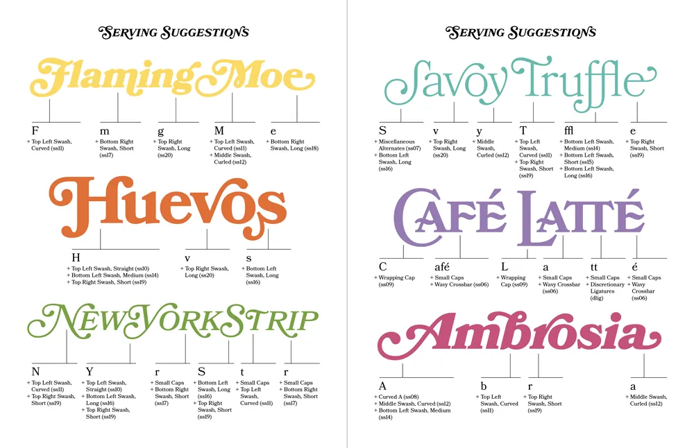
This is followed by a “serving suggestion” section where I prepared over a dozen examples of Bookmania swashes in use to give you some ideas and inspiration for your own designs.
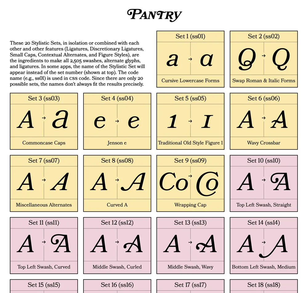
Finally, there is a reference section which includes a table of Stylistic Sets and a complete “recipe” section that shows you how to produce every swash and alternate character using Stylistic Sets and other OpenType features, which is especially useful on the web.
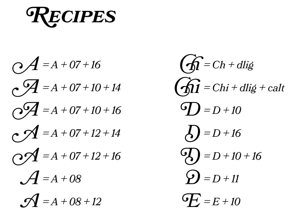
Sorry it took so long to put this together. If you’re a Bookmania user, I hope you will find this “cookbook” helpful. You can download it here.
In the late seventies, personal computers were starting to emerge and generate interest among some people. I was mildly interested, but I had no idea what I would do with one. Suggested uses were things like: storing recipes, an electronic address book, or maybe play computer games like Star Trek. Mostly it seemed to be about writing programs in BASIC to, say, store recipes. Anyway, none of this really got me excited enough about computers to actually buy one.
All that changed when I came across a copy of a book by Ted Nelson called Computer Lib / Dream Machines. He wrote the first edition in 1974. The copy I bought was the 1980 edition. In it, Nelson presented a vision of computers as tools to enhance and expand human intelligence and creativity. One of the big ideas he talks about in the book is hypertext, a term he coined. Hypertext is, of course, one of the foundations of the Web, as in HTML, or Hypertext Markup Language. When you click on a link, that’s a kind of hypertext.
But, to Nelson, hypertext was much more than simple links to other documents. He envisioned a new kind of non-linear, dynamic form of literature, with variable levels of detail and hierarchy, tailored to the variable needs of authors and readers, all made possible by computers, which could do things that would be impossible on the printed page. After reading Computer Lib, I had to have a computer. I wanted to be part of this future.
Of course, it didn’t happen right away, this vision of Ted Nelson. When the Mac came out, everyone (including me) was astounded by its point-and-click graphical user interface. However, as I recall reading in one of the computer magazines of the day, Nelson was unimpressed. While he agreed that it was a good start, he criticized the Mac’s WYSIWYG presentation of text and graphics as being too limited, too static and bound to the ink and paper media of the past. The desktop publishing revolution, as amazing as it was for the print publishing world, fell far short of what was possible with this new digital medium.
In a few years, we got the World Wide Web. But, as Gerry Lieonidas tells in his talk (below), we are still in many ways stuck in print-oriented concepts, just as Ted Nelson was complaining back in 1984. When I saw Gerry’s talk earlier this evening, it immediately made me think of Ted Nelson and these ideas that got me excited about computers in the first place.
Gerry, I think you’re onto something.
Above: Gerry Leonidas on The Newest New Typography from Clearleft on Vimeo.
