Coming Soon: Three New Fonts
As you may be able to tell by my sporadic Notebook postings of late, I’ve been a very busy guy. Some of the things I’ve been working on I can’t talk about (yet).
One of the things I can talk about is three new fonts I will be releasing in the near future. All three were inspired by hand lettered titles in 1940s films.
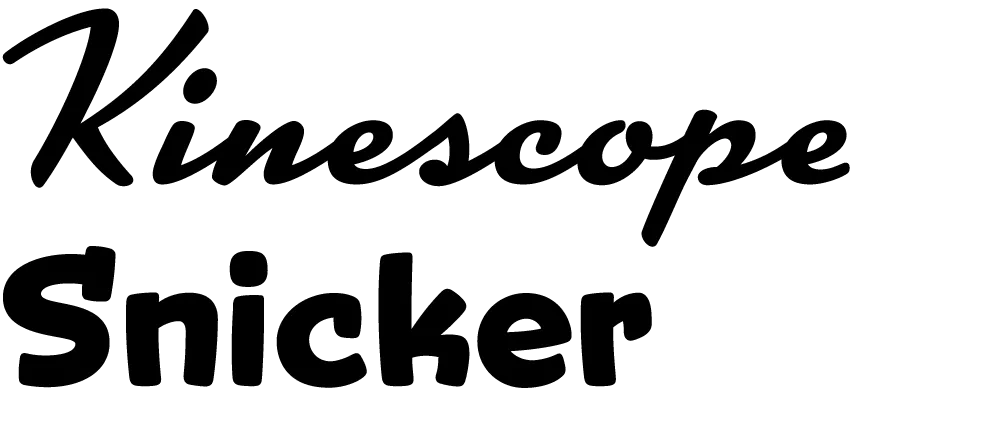
Kinescope and Snicker are loosely based on title lettering in Fleischer Studio’s animated Superman films from the forties.
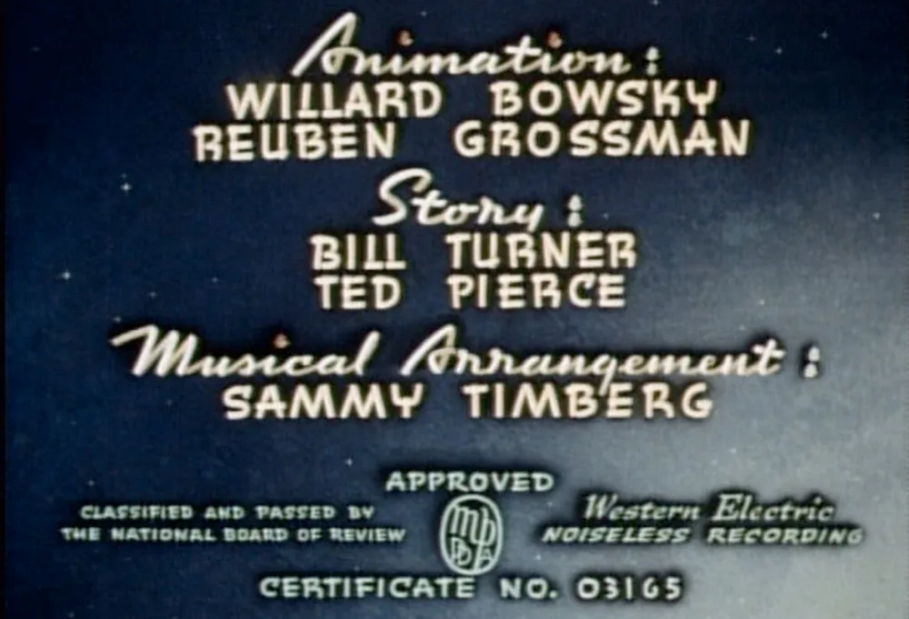
In both fonts I’ve ended up with something a bit different than the source of my inspiration, but I think you can see the resemblance.
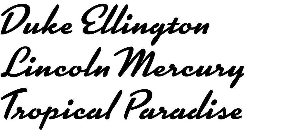
Kinescope will include context-sensitive characters. For example, when a letter falls at the end of a word, the connecting stroke is clipped off. This gives settings a more natural hand-lettered look. Stylistically, Kinescope falls somewhere between Brush Script and Kaufmann Script, but more elegant than either.
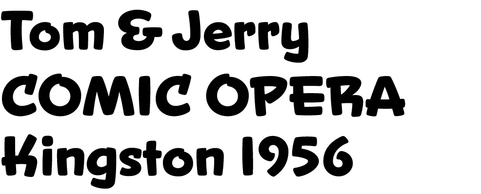
Snicker is a cartoony block letter style. One of the design challenges with Snicker was to come up with a suitable lowercase—the lettering in the Fleischer titles that inspired me only used capitals. Although it is intended for display sizes, it works pretty well for text. Consequently, I’m toying with the idea of adding a lighter weight and italics. It could perhaps become a typographically interesting alternative to Comic Sans…

The third font, Launderette, is based closely on lettering used in the titles of the 1944 Otto Preminger film, Laura:
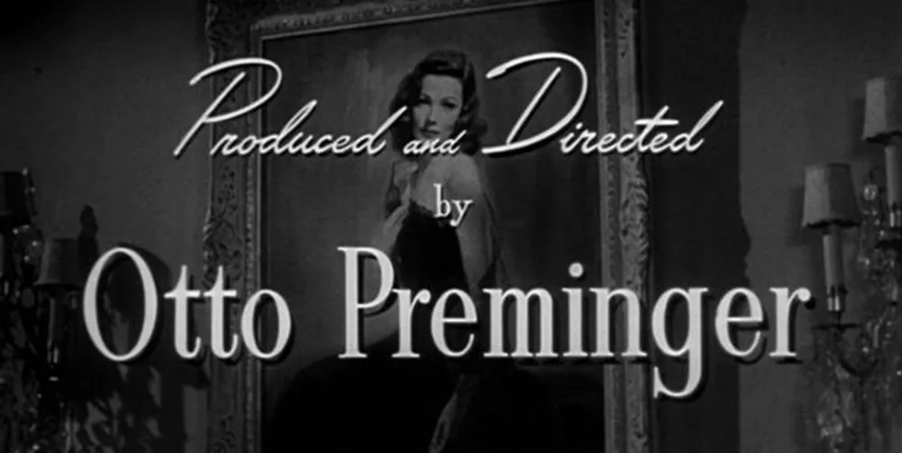
This font was originally commissioned by a filmmaker who wanted to use the same “font” in the titles of his own film. As with most films of that time, the titles were hand-lettered by an artist, not typeset.
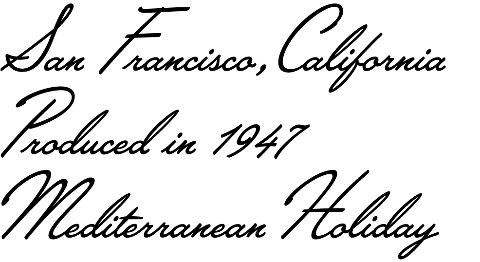
The challenge with this font was that there were very few characters in the source lettering. Most of the characters had to be created from scratch to match the style of the existing ones. Launderette, like Kinescope, will have context-sensitive characters to give it a custom, hand-lettered look.
I hope to release these new fonts by the end of the year.
Update: Kinescope and Snicker have now been released (April 30, 2007). Unfortunately, the name Landerette was already in use (twice!), so I changed it to Lakeside. Lakeside has also been released (February 7, 2008).
