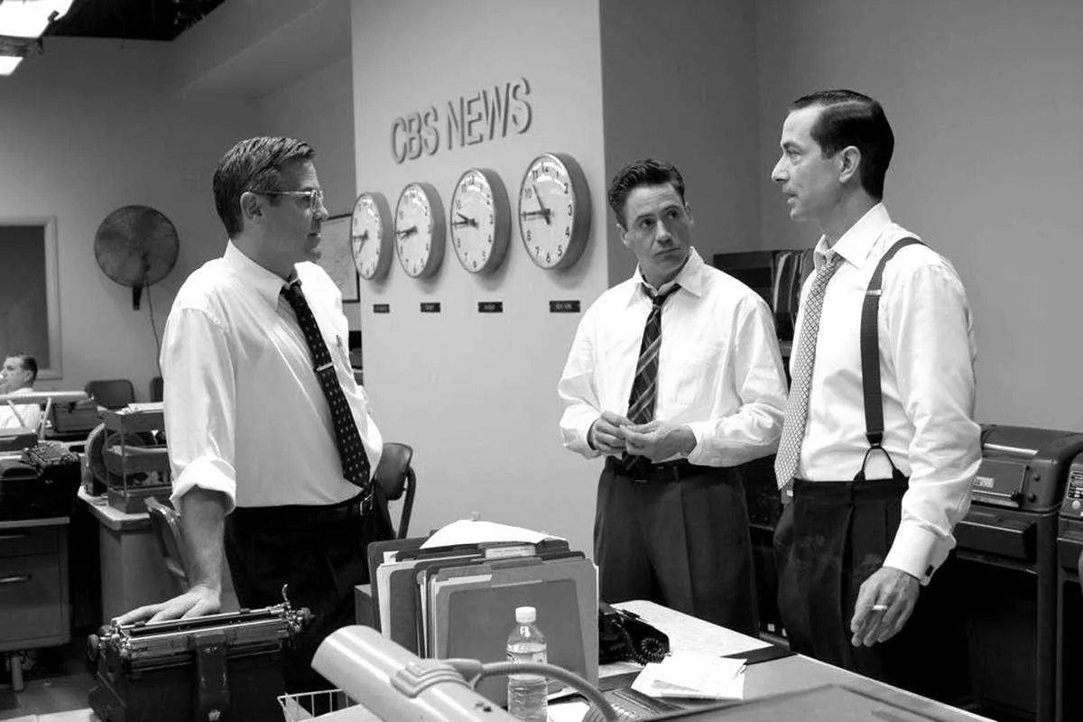
Good Article, Shame About “Good Night”

I was very happy to be included in a short article in today’s New York Times Good Film, Shame About the Helvetica about designers who notice anachronistic font choices in films, but I was a bit taken aback when I received an email first thing this morning from the art director of Good Night, And Good Luck. She pointed out that Helvetica was not used in the film, contrary to what was claimed in the article. She said, rather, that the sign shown in the example frame was set in Akzidenz Grotesk, a face which predated (and in fact was the basis for) Helvetica, and that this choice was based on extensive research of CBS’s graphic design during the period depicted in the film.
This is no skin off my nose since I have not made any comments (yet) about the use of type in Good Night, And Good Luck. The comment was made by graphic designer and fellow font flub finder Michael Bierut, who, along with Scott Stowell and myself, is quoted in the article. Judging from the still shown in the article, I might have come to the same conclusion. As it happens, I missed the film when it was in theaters and will have to wait for the DVD release to see for myself.
If what she says is true (and she was very adamant about it), it is very unfortunate that Good Night, And Good Luck was chosen as the lead example in the article. Especially since its art director appears to be one of the rare people working in film who cares about getting the type details right.
Update: Thanks to some detective work by Stephen Coles, as reported at The Design Observer and Typophile.com, it has been confirmed that Good Night, And Good Luck really does use Akzidenz Grotesk.
