Introducing Acme Gothic and Parkside
At long last, two totally new, original typeface families! The last new one was Bookmania in 2011, which admittedly was a kind of revival, so not totally new and original. For that you have to go back to Lakeside, which I released in 2008—ten years ago! In any case, it’s about time. I have many more in the works, so stay tuned.

Acme Gothic is based on the thick-and-thin gothic lettering style popular in the U.S. in the first half of the twentieth century. There have been typefaces in this genre before, but they were either too quirky (Globe Gothic), too English (Britannic), too Art Deco (Koloss), too modern (Radiant), or too Art Nouveau (Panache). None captures the plain, workman-like, vernacular style of Acme Gothic.

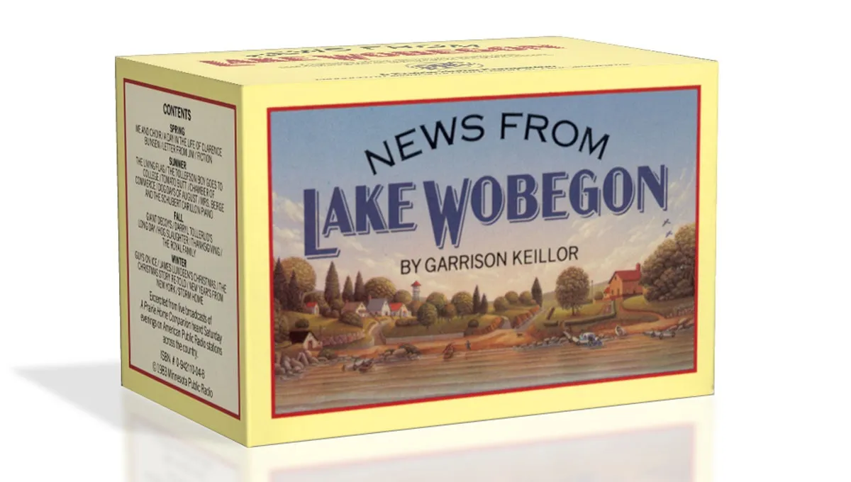
I’ve used the “thick and thin” gothic style in lettering projects as far back as 1982 (the “News From Lake Wobegon” audiocassette package I designed for A Prairie Home Companion). Off and on since the 1990s, I tried turning it into a typeface, but it wasn’t until 2012 that it finally started to come together. My aim was to make a font that feels like a revival of a long-lost metal typeface from the 1920s, but one that never happened to exist.

There are five widths (Compressed, Condensed, normal, Wide, and Extrawide) each with five weights (Light, Regular, Semibold, Bold, and Black) for a total of 25 different styles. Acme Gothic has extensive language support, covering most Latin-based writing systems.

Acme Gothic also includes both small caps and raised small caps (accessed through an OpenType stylistic set) both of which can be found in vintage examples of this lettering style.

Parkside is a script typeface inspired by typefaces and lettering of the 1930s and 1940s. Unlike metal typefaces from that era, it takes advantage of modern digital typography, where letters may overlap and automatically change shape to flow better with surrounding letters.
The idea for Parkside came to me in the mid-1990s, around the same time that I was first working on Coquette (released in 2003). You could say that Coquette and Parkside are cousins. Unlike Coquette, Parkside is a connecting script, with more contrast and less geometric forms. But it shares many of the same stylistic ideas, especially in the capital letters.

There are six weights: Hairline, Thin, Light, Regular, Bold, and Black. Parkside has extensive language support, covering most Latin-based writing systems. Parkside uses OpenType magic to automatically select letter variations that seamlessly connect to the letters coming before and after.
