Introducing Dreamboat

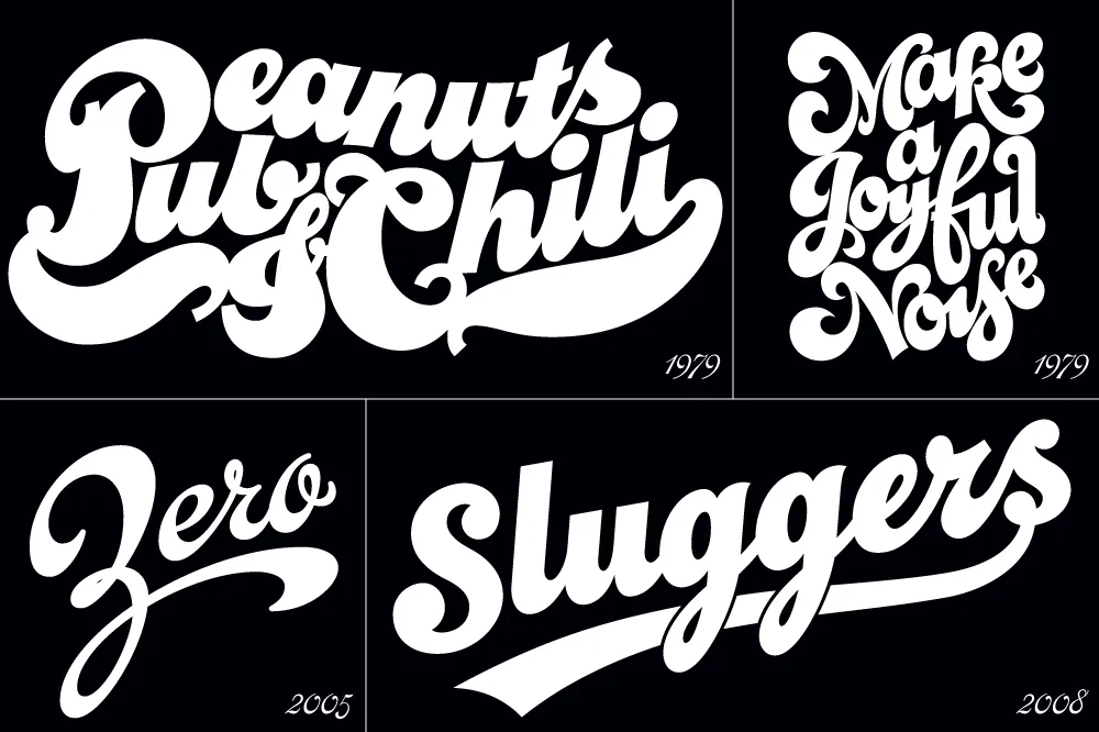
I’ve been interested in the classic script style of the early 20th century for as long as I’ve been drawing letters. It was commonly used in logos and trademarks, meant to convey the idea of a signature. Think: Ford. Coca-Cola. Coors. Blatz. Schlitz. Rainier. Campbells soup. Any number of baseball clubs. The style was revived in the 1960s, sometimes evolving into psychedelic or pop-art forms.
There have been fonts from time to time based on this script style, but quite often they have more of a sixties or seventies look. I decided to try my hand, hoping to get closer to the early 1900s feel.
In 2004, I pitched the concept to House Industries. They liked idea, and we made a deal to develop the script, along with a sans and a serif, all with a “sports” theme.
Working with Ken Barber, I was impressed with his commitment to quality and detail. I thought I was an okay type designer at the time, but my experience with Ken significantly raised my standards on all the fonts I’ve done since then. Unfortunately, the project languished due to other priorities at House and was eventually put on hold.
Around 2012, I decided to resume work on the script on my own. At that point, only the lowercase and a few caps had really been drawn, and I was really itching to design the rest of the caps.
In 2017, I showed Ken what I’d been up to with the script. I asked if he thought House was ever going to get the project going again, and, if not, could we amend the agreement to allow me to release it myself? Long story short, House agreed.

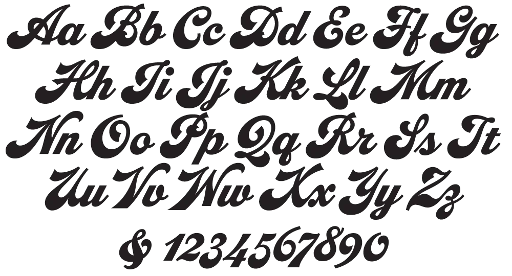
With the script fully in my hands, I stepped up the pace to finish it. Five years later, the result is Dreamboat.

Back when I was working on it with House, there was only a single bold weight. To provide more flexibility for designers, I expanded this to six—Light, Regular, Semibold, Bold, Extrabold, and Black. (Dreamboat might be the only script in its genre with such a wide weight range.)

One of the things that bug me about a lot of script typefaces is lack of a solution to situations where you need to set something in all caps, such as roman numerals or acronyms. For that I added small caps.

There is also a stylistic set which raises the cross-bar of the lowercase “t” and extends it for more of a custom look.

To top it off, Dreamboat includes three styles of tails—an element quite often used with bold scripts.
Check out the User Guide to see how it all works. Tip: Many of my vendors have type testers where you can type your own text and see how it looks. The tails work by typing one or more underscores at the end of a word. Just make sure that ligatures are enabled on the site (sometimes they are not).
I never dreamed when I started that it would take nearly 20 years to finish Dreamboat. But, to be honest, I’m glad it did because it was really beyond my skills when I first started working on it. It’s been one of the most enjoyable typefaces to design, and I’m excited to see what people will do with it.
Dreamboat is available at all the usual places for desktop, web, and other uses.
