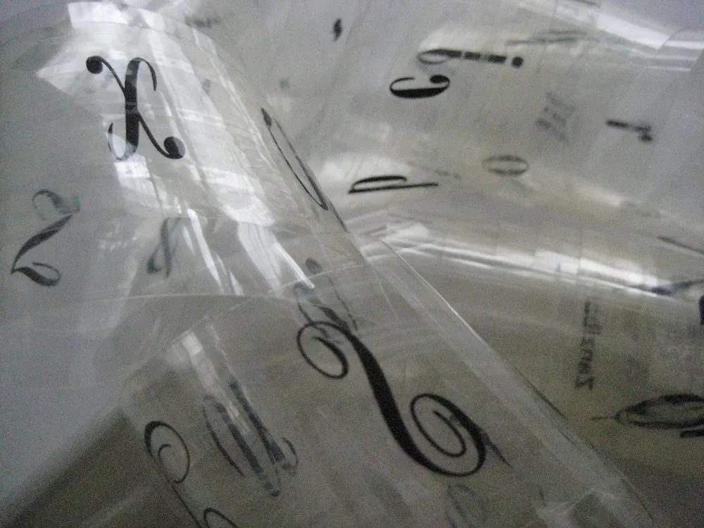
Introducing Filmotype Zanzibar

Zanzibar is the second Filmotype font I’ve digitized. (The first was Glenlake.) At first glance, I didn’t think much of it. But when I started looking more closely, I realized I’d never seen anything quite like it and decided I needed to do it.

That “Zanzibar” is nearly an anagram of “bizarre” seems fitting. The surviving people from Filmotype (later Alphatype) have not been able to tell us who designed this gem, so we have no record of the designer’s intentions. Released in the early 1950s, it seems somewhat inspired by the work of Lucian Bernhard (Bernhard Tango, 1934) and Imre Reiner (Stradivarius, 1945). At first, it appears to be a formal script, but there are no connecting strokes. It would be better described as a stylized italic, similar to Bodoni Condensed Italic or Onyx Italic, with swash capitals.

About those capitals: If they were plans for roller coaster tracks, they would either be unsafe or very exciting to ride. I have rarely seen such a whimsical combination of spirals and angles. Perhaps the happy result of one too many martinis?

The overall effect—a mix of hairlines, swelling strokes, and dots—reminds me of musical notation. I kept this in mind as I filled out the missing characters. Film font designers had it easy. The original design included only caps, lowercase, numbers, and a minimal set of punctuation and currency symbols—about 70 characters. The digital version contains over 400 characters, including support for most Latin-based languages, math symbols (you never know), user-defined fractions (OpenType support required), and all the usual characters you expect in a modern font.

I also added a few alternate characters to address a design flaw in the original. The lowercase b, h, and k all have a little hook at the top that goes to the left. Unfortunately, when one of these characters follows an f or l, it causes an unsightly collision. Moving them apart only makes it worse. To address this, I created hookless versions of all three that come into play automatically when you enable the OpenType Contextual Alternates feature in your layout or graphics program.
