Mostra Nuova 2.0
I’ve made a big update to one of my most popular type families, Mostra Nuova.
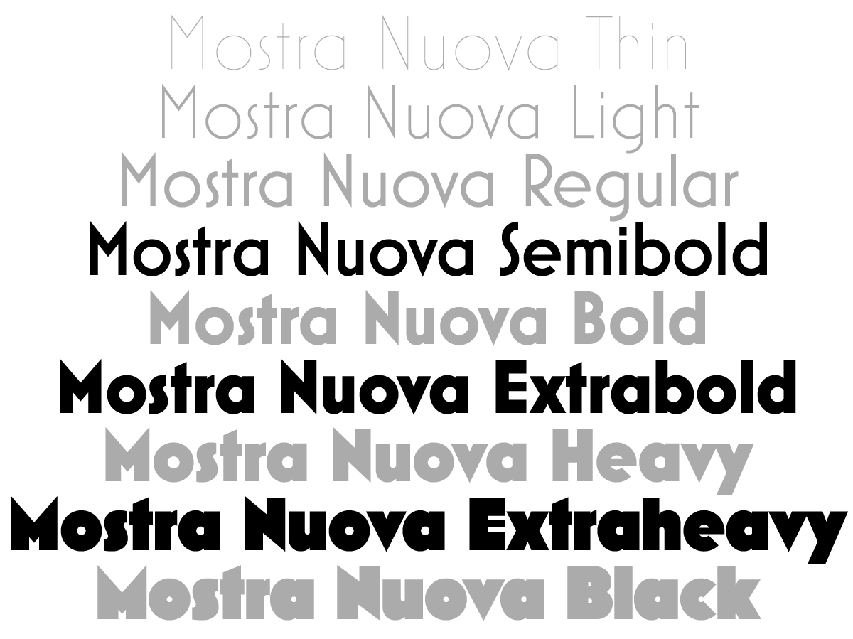
First, I’ve added three new weights: Semibold, Extrabold, and Extraheavy. The Semibold weight was based on a request from a user. He had a good point. There was a big jump in weight between Regular and Bold. Sometimes you need something between those. While I was at it, I noticed that there were similar jumps—maybe not quite as big, but jumps nonetheless—between Bold and Heavy, and between Heavy and Black. You’d rarely need all these at once, but it’s easier now to get just the right weight.
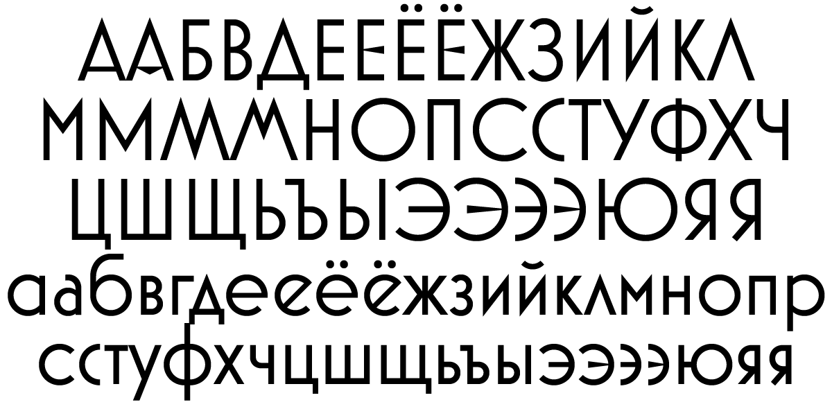
 Second, I’ve added support for Cyrillic. I’ve been doing this a little at a time with my existing type families. So far, I’ve added Cyrillic to Proxima Nova, Proxima Soft, Goldenbook, Refrigerator Deluxe, Changeling Neo, and Felt Tip Roman. It was quite fun to do Cyrillic for Mostra Nuova. I found lots of examples of Cyrillic Art Deco lettering online to get an idea how it should work. But I also got feedback from Russian type designer Ilya Ruderman, to make sure what I was doing made sense to native readers. (I’ve gotten to know the Cyrillic alphabet fairly well over the years, and can sound out words, but I can’t really read it.)
Of course, there are all the same kinds of alternate characters in the Cyrillic as there are for the original Latin characters.
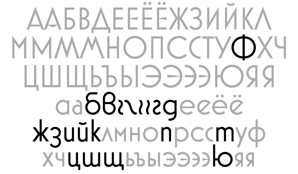
 It also features Bulgarian variants. Bulgarian Cyrillic is pretty interesting. A lot of the letters, especially in the lowercase, look more like the Latin alphabet.
 Finally, based on a user request, I added a narrow alternate D to match the narrow C, G, and c. And, based on no requests at all, I added the capital sharp S for German users who might want it.
 The new version of Mostra Nuova is already available at some of my distributors, and the rest should soon follow.
