Not a Font
I spend a fair amount of time (too much, probably) helping to identify fonts at Typophile.com’s Type ID Board. One thing that comes up over and over is when someone offers a photo or sample of a sign or advertisement from before the 1960s or 1970s, and they want to know what font it is. Except it’s not a font, it’s lettering or sign painting or some other sort of custom-made letters.
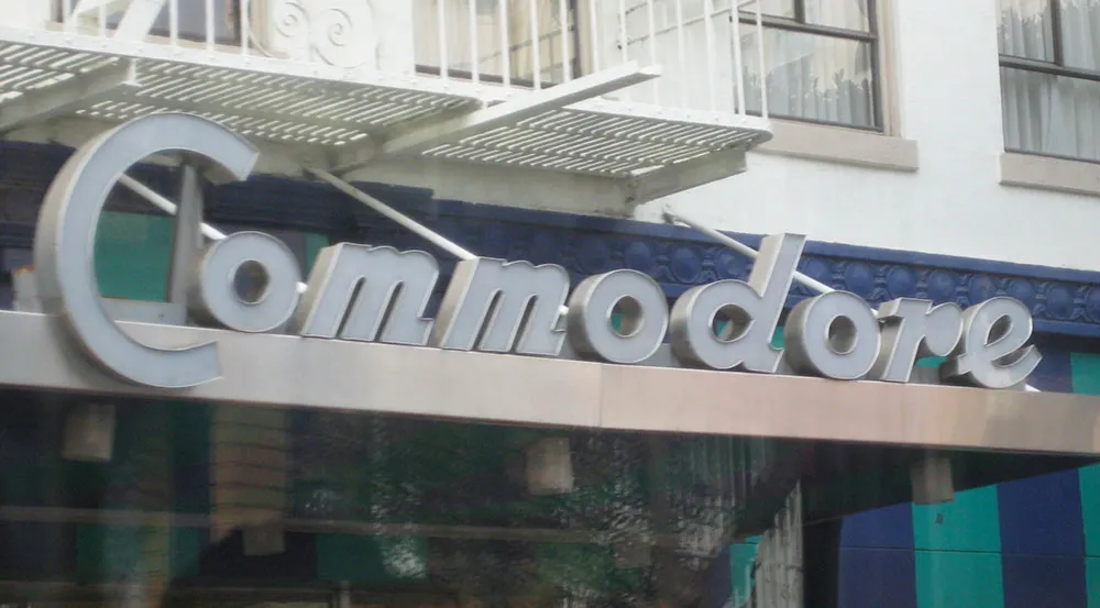
Handmade sign in San Francisco, photographed April 2, 2008.
It’s not surpising that most people (including younger designers) assume that any letters they see out in the world were made using some sort of font. In the modern world, they are usually right. Computers have made it possible to set type at any scale, from the tiniest footnote on the back of a credit card to letters several stories tall on the side of a building. This was not always so.
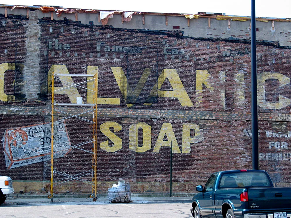
Vintage painted sign on the side of a building during restoration, Beloit, Wisconsin, August, 8, 2004.
Type did not used to be so flexible. It existed as raised images on small bits of metal (or sometimes wood). It came only in certain sizes. The number of styles available was small—a few thousand at the most, and most typesetting houses offered only a dozen or two of the most popular typefaces. You couldn’t reverse it, change its size, print it over a photograph, make it multi-colored, change its porportions, distort it, make it follow a curve or a wavy line, or even set it at an angle.
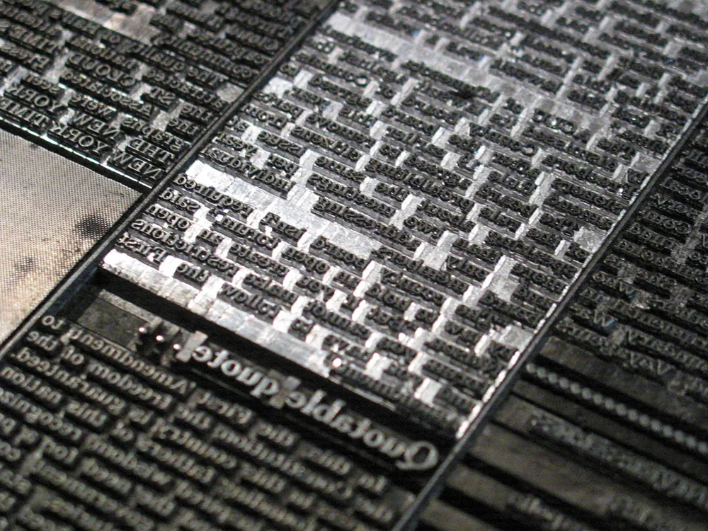
Machine-set metal type for a newspaper page.
However, there was a simple solution: The lettering artist.
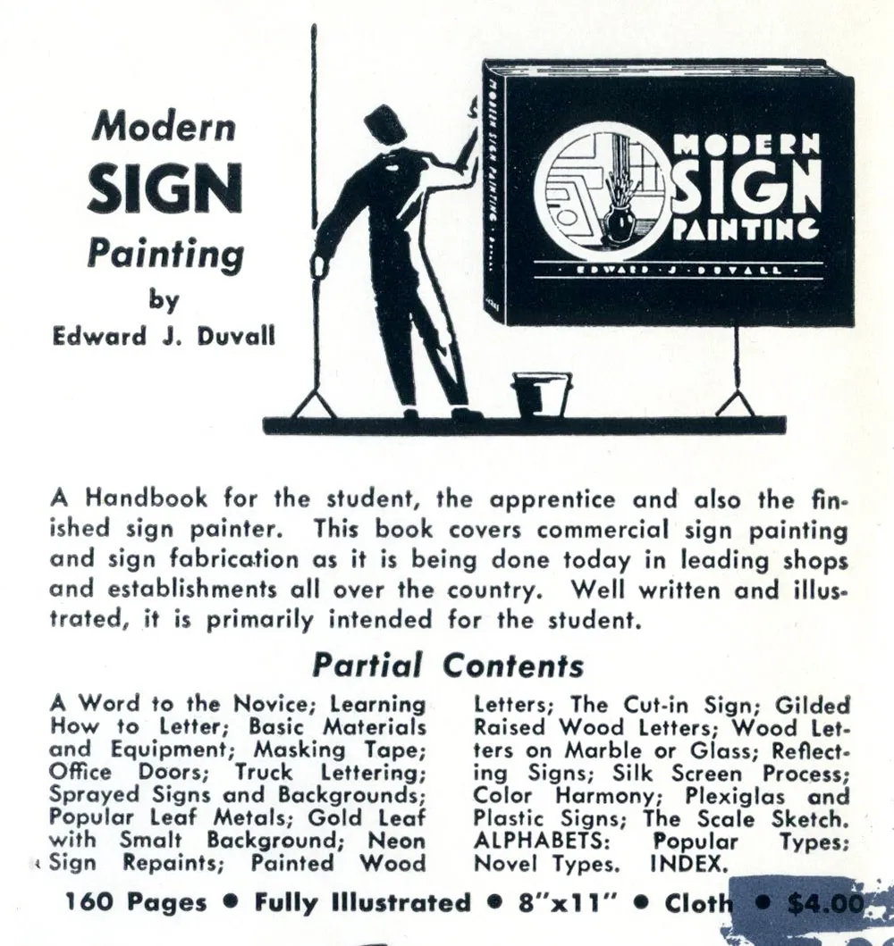
Ad for sign painting how-to book, 1957.
Because of the inflexibility of type, sign painters and lettering artists flourished. Lettering could go where type could not: Large signs and posters, over photographs and illustrations in magazines and advertisements, on windows and billboards, on the sides of automobiles and appliances, on clocks and watches, on packages and movie titles. Lettering was ubiquitous because it was practical. It was easier, cheaper and more flexibile than trying to do the same thing with type.
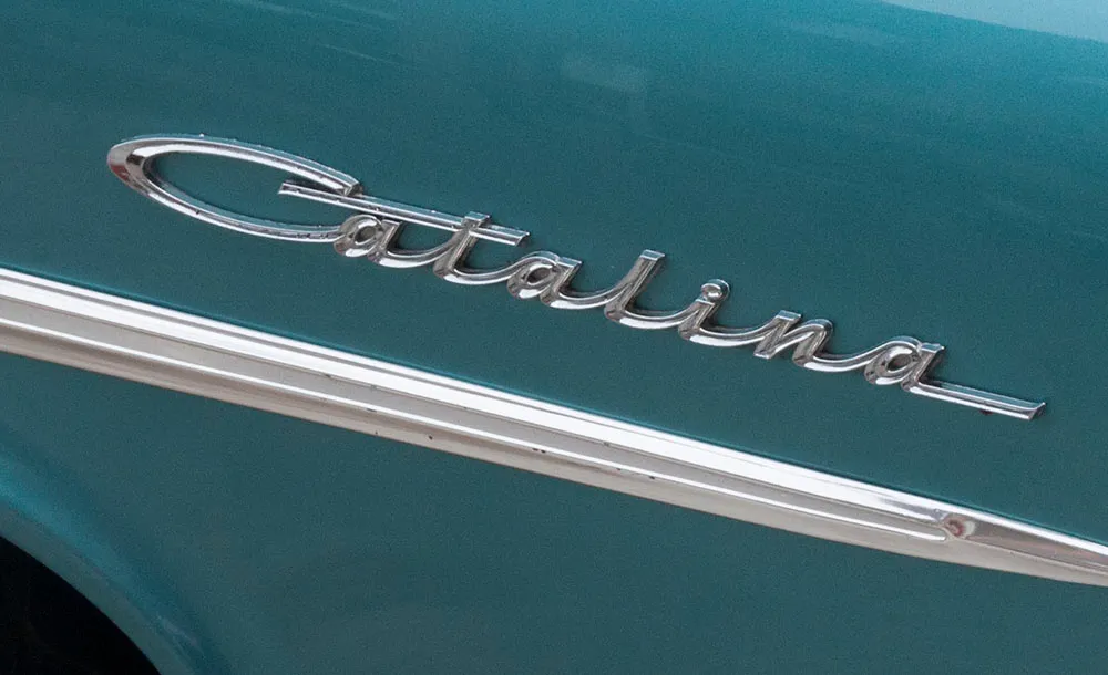
Nameplate on an automobile.
As phototypesetting began to replace metal type in the 1950s, type started getting more flexible. It was no longer limited to fixed sizes. With cheap photo-based headline setting machines, the number of styles available exploded in the 1960s, and demand for lettering began to decline. By the mid-1970s, type had become so flexible, the role of lettering was greatly reduced. Digital type and large-output devices in the 1980s all but killed it.
Today, lettering is very much a specialty area, used mainly when a unique design solution is desired, or when the few remaining limitations of type are still encountered.
But, the next time you see a “font” in an old movie or on the cover of an old magazine, remember: It’s probably not a font.
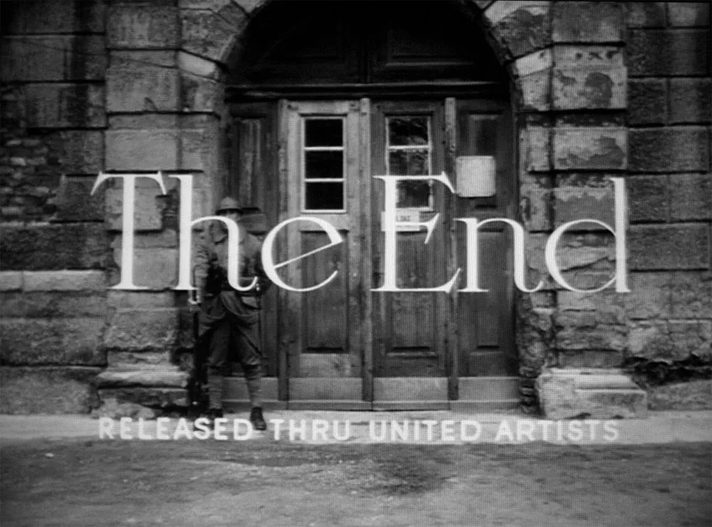
Hand-lettered title from Paths of Glory, 1957.
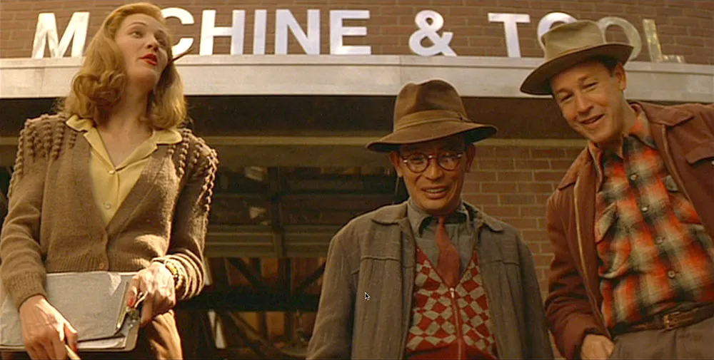
Postscript: The topic of this item was suggested by San Francisco sign painter Bill Stender, who has created hand-lettered signs and other props for period movies. Bill pointed out that, in my discussion of the use of Helvetica in the movie Tucker, not only would Helvetica not have been available in 1949, type would not have been used for such a large sign. It would have been designed and built by hand.
