Popeye
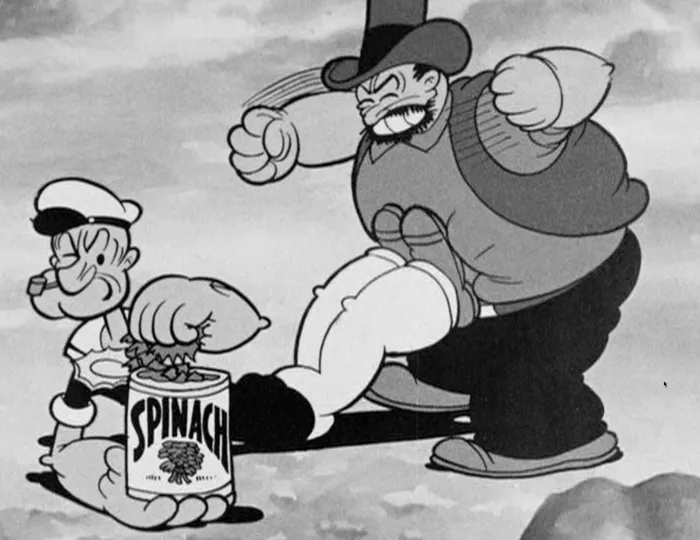
Popeye was my favorite cartoon when I was four or five years old. The ones I remember best—and love most—are the early one’s made by Max Fleischer Cartoon Studio. These are the ones in which Popeye wears a black shirt and the characters all mumble a lot.
The drawings have a solid feel to them, like they’re three-dimensional, but everything is stylized in very a cartoony way, including the movement. You can see a similar sort of style in the Beatles’ Yellow Submarine.
I’ve been making my way through the “Popeye The Sailor: Volume One, 1933-38” DVD set (which, coincidentally, uses my Mostra fonts on the package). Here are some things that have crossed my mind while watching these classic cartoons:
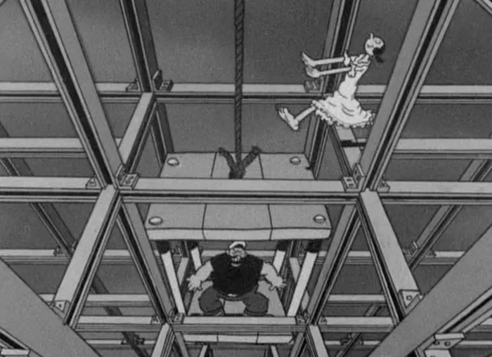
- “A Dream Walking” is one of the cleverest animated cartoons ever. Popeye and Bluto fight over who will save Olive as she sleepwalks through an under-construction skyscraper. There is a lot of complicated timing and tricky animation in this, and the humor comes out of it.
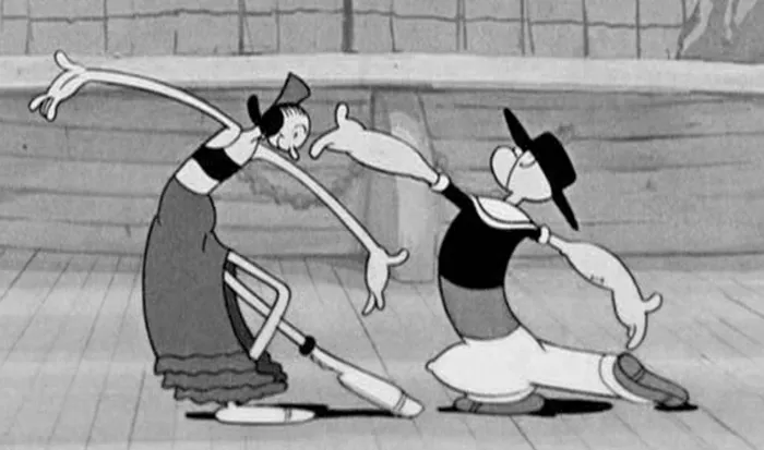
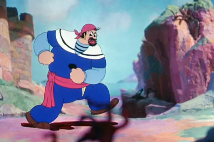
- The dance scenes in “Morning, Noon, and Nightclub”, in which Popeye and Olive Oil are nightclub performers, are beautifully cartoony—and funny. I also love the way Bluto walks in this one.
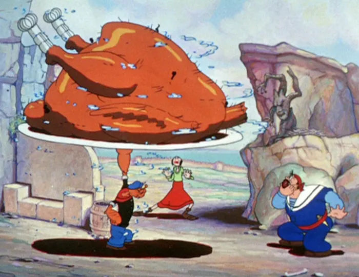
- “Popeye the Sailor Meets Sinbad the Sailor”, the earliest of the three two-reel Popeye color cartoons, has to be my all-time favorite. It’s too bad the Fleischers didn’t do any feature-length Popeye cartoons in this style.
-
Several of the cartoons in this period (including “Sinbad”) utilize three-dimensional set for backgrounds. They are built to look like the usual painted backgrounds—until the camera moves, and the characters seems to be walking through a three-dimensional world.
-
When I was in kindergarten, Olive Oyl was my dream girl. I’d forgotten about that.
-
I was so into Popeye when I was little, I asked my mom to buy canned spinnach for me, which I ate—it was actually kind of good if you put enough butter on it. Had to be the first time I ate something because I heard it made you healthy.
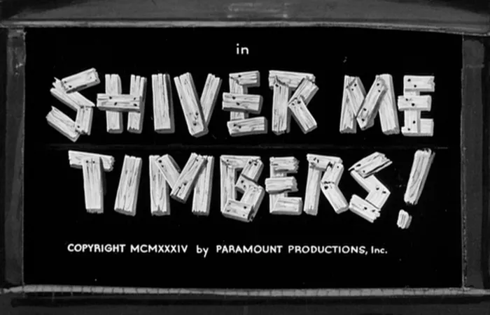
- Every one of the title cards is beautifully hand-lettered. This was routine back when these shorts were made. It was much easier to use lettering than type for movie title cards, and less expensive. It affords much more variety of treatment as well, including illustrated effects.
