Presenting Filmotype Glenlake

You could say I’m a Tim Burton fan. I’ve written elsewhere about some of the typographic anachronisms in his film Ed Wood, but I also think the titles in that film are wonderfully, typographically evocative—pitch perfect for the period in which the film is set. For a long time, though, I couldn’t figure out what the bold, condensed sans serif typeface was that they used in the titles.
I’m not easily stumped identifying typefaces, but this was one of only two times I’ve posted a query to the Typophile Type ID Board. In the end, I found it myself: Glenlake. (After I found it, I wondered if the Ed Wood title designers chose it because of the name—as in Ed Wood’s film Glen or Glenda… Could be.)

Still, Glenlake was something of a mystery. It popped up here and there in old film font catalogs, sometimes with a different name, but where did it come from? The more I looked at it, the more distinctive it seemed… a kind of Fifties precursor of Compacta or Helvetica Compressed (both Sixties designs).
So last year, when Stuart Sandler invited me to help digitize the classic Filmotype library, and I saw Glenlake was part of the library, I had to say yes. There are more of these funky/cool Filmotype faces to come—perhaps even more weights of Glenlake (it had only one)—including some really cool scripts that I’m working on.

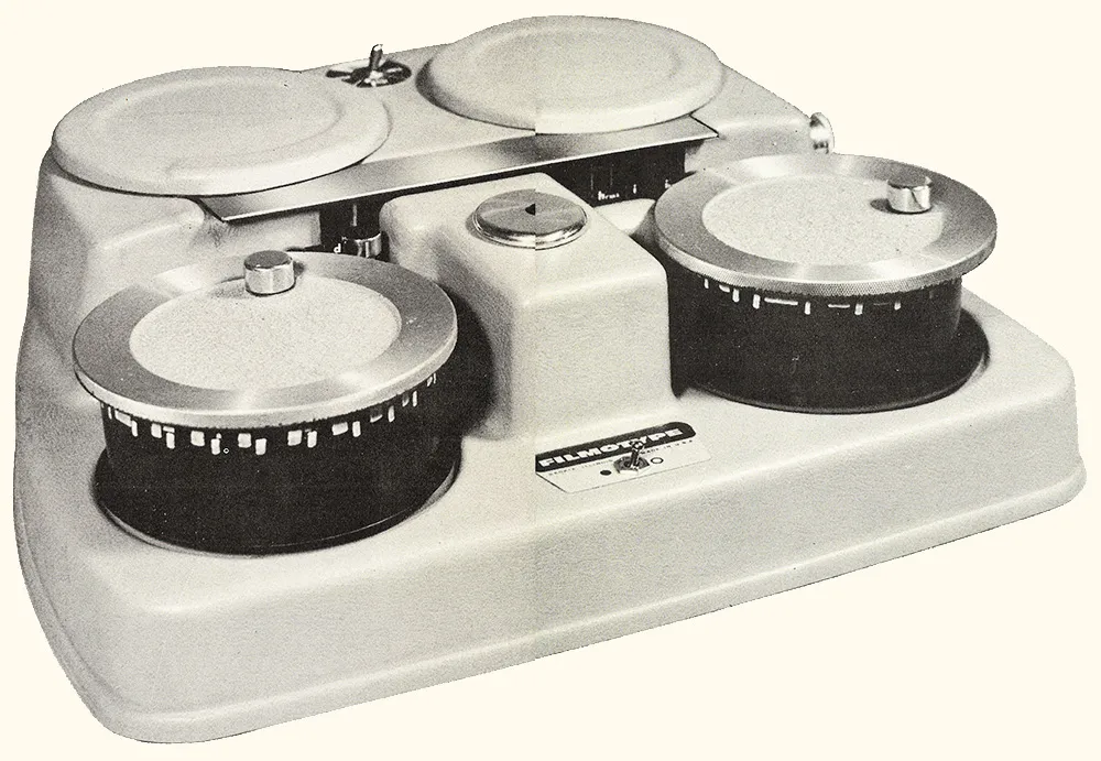
Above: One of the original Filmotype film font machines.
Of course, the old Filmotype fonts were made mostly in the Fifties, and they pretty much only did the basic character set—caps, lowercase, numbers, and some punctuation. The digital version is being released in the oh-so-modern OpenType format and includes a complete, modern character complement, suitable for setting type in most Latin-based languages. I even threw in alternate designs for the “a” and “y”—something that didn’t exist in the original Glenlake design, but was common in Filmotype’s other sans serif fonts.

So, there you have it. Filmotype Glenlake, a digital revival of a classic Filmotype font from the Fifties, available for online purchase from Font Bros. I think it’s a heck of a font, and one that I’m proud to have helped bring back from obscurity. (Be sure to check out the other new release, Filmotype MacBeth, a bouncy, casual serif design.)
