Proxima Nova Released
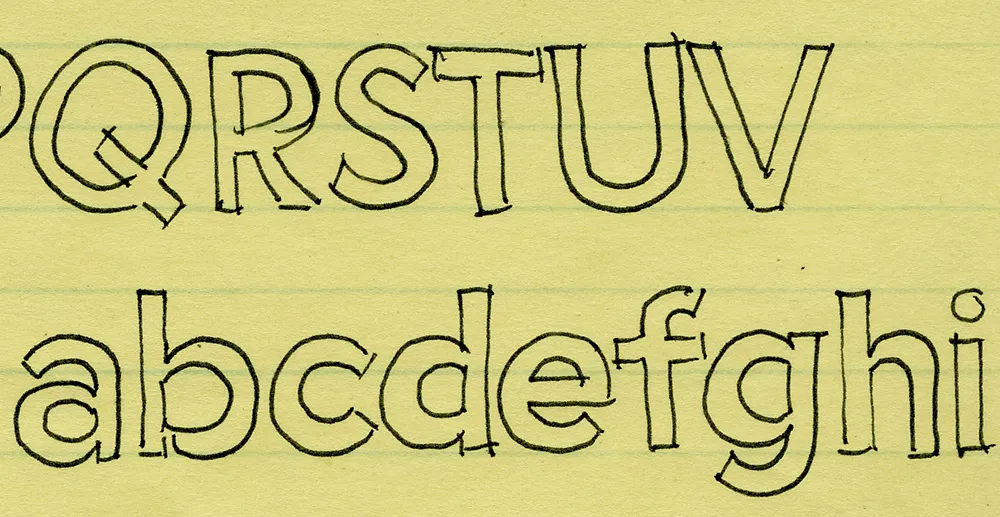
I’ve been working on this font family for almost 25 years. Here’s an early sketch (possibly the first one) from 1981:

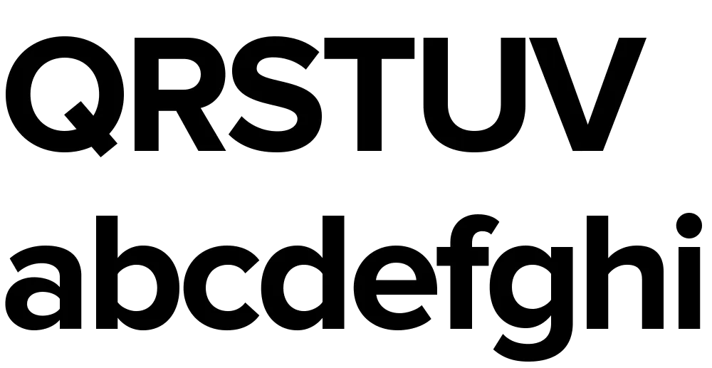
Here’s Proxima Nova Bold for comparison:

The caps are a bit different from the early concept sketch (they started out with proportions more like Futura), but my concept for the lowercase has remained virtually the same all these years.
Proxima Sans (released in 1994) was my first attempt to realize that concept, and one of the first major fonts I developed. Proxima Nova, just released today, has ten years more thinking and experience behind it. It also fulfills many of the plans and ideas I had for Proxima Sans—small caps, wider range of weights and styles (including Condensed and Extra Condensed), and things I never dreamed of, like extended language support and UniCode.
If you want to know more about this new family of fonts, here are some links:
There is also a comprehensive 93-page PDF sample book. I split it into two parts in case you just want to look at the overview (the first part):
Proxima Nova Overview This nine-page introduction has complete information about the fonts with one-line display samples and a page of text samples. (420k PDF)
Proxima Nova Full Specimen This 84-page comprehensive specimen devotes two pages to each of the 42 Proxima Nova fonts—one with display showings and one with text samples and complete character set. You might want to make sure your printer has enough paper before printing this out. (2.2mb PDF)
