Renaissance Anomaly

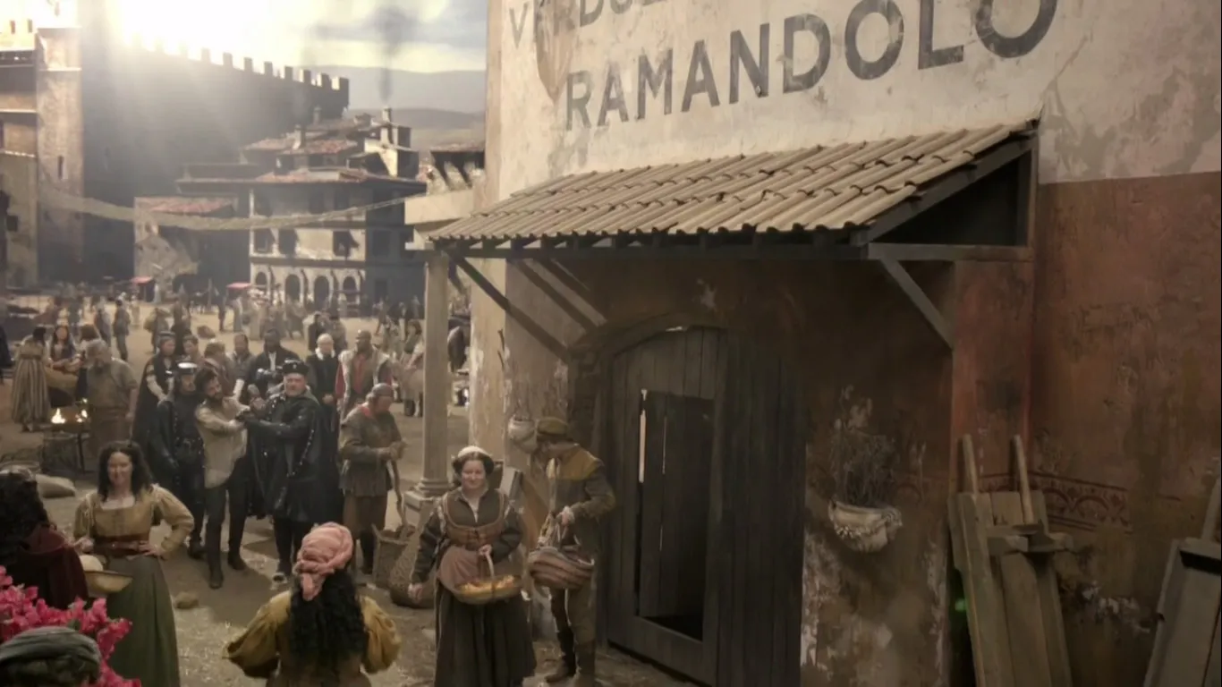
Reader Ivan Filipov sent me this curiosity from the FOX/Starz TV show *Da Vinci’s Demons.*I haven’t seen the show, but this is definitely a typographic anachronism.
First of all, the typeface Gotham (released in 2002) has no place in Renaissance Italy. Gotham is based on mid-twentieth century American vernacular styles. In the Renaissance, the prevailing style, if it were painted on a wall, would have been something more along the lines of the versal hand (for example, something resembling Goudy Lombardic).
That said, the idea that a large painted sign would appear on a building, as shown here, is almost more anachronistic than the choice of Gotham. Signs like this didn’t really exist until the nineteenth century after the industrial revolution and the rise of commercial enterprise and advertising.
Almost no one in the Renaissance could read, so such a sign would be rather useless in any case. If there were a sign at all, it might possibly be in the form of a small inscription near the entrance of the building, or more likely a sign with some kind of symbol or picture.
Anyway, this is definitely wrong for the period. Kind of makes me think of The Flintstones. One star.
(Thanks to Paul Shaw for providing some background on this.)
