Royal Tenenbaum’s World of Futura
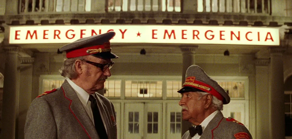
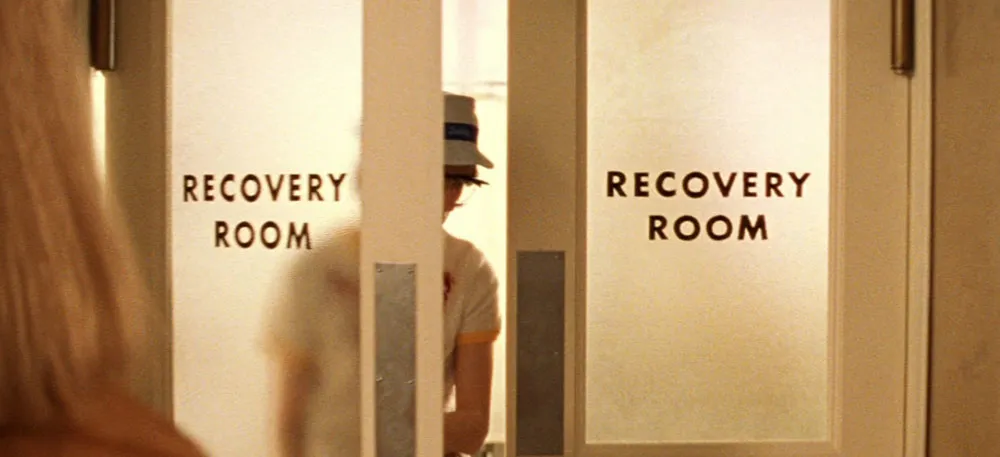
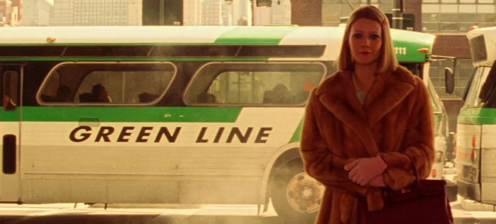
Quite a few people have written me to ask about the type in The Royal Tenenbaums (2001). The type isn’t anachronistic so much as idiosyncratic. Director Wes Anderson seems to have a thing, bordering on obsession, for Futura. The credits are set in Futura Bold—nothing strange about that. But it doesn’t stop there. The Tenenbaums seem to exist in a world dominated by Futura (mainly Futura Bold):
On buses:

At the hospital:
More buses (slanted this time):
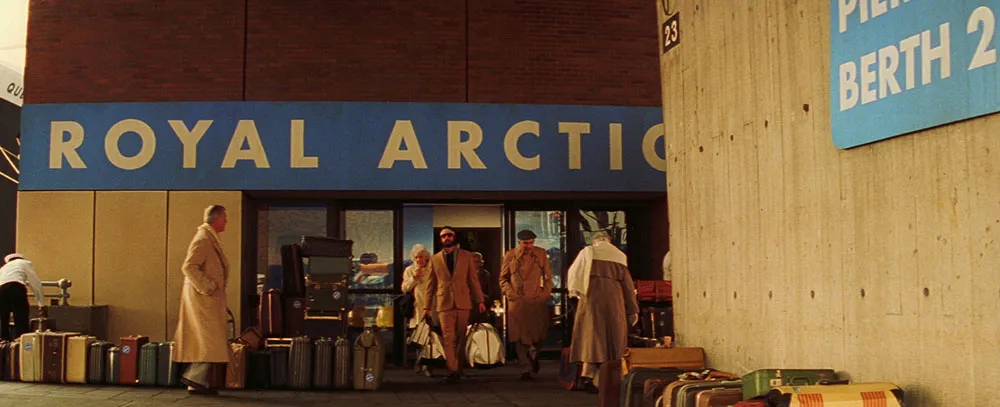
For a cruise line (notice it’s called Royal Arctic):
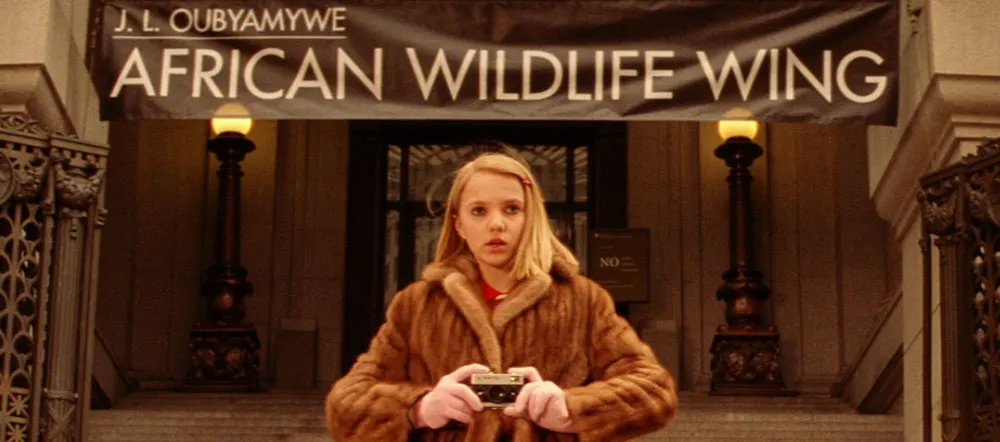
At the museum (Medium weight instead of Bold):
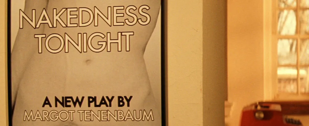
On posters (Margot Tenenbaum seems to favor Medium):
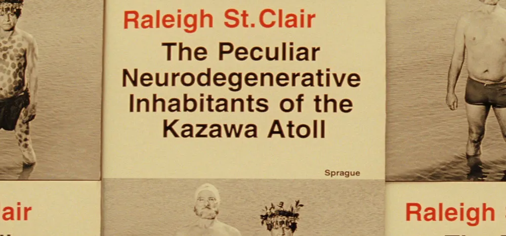
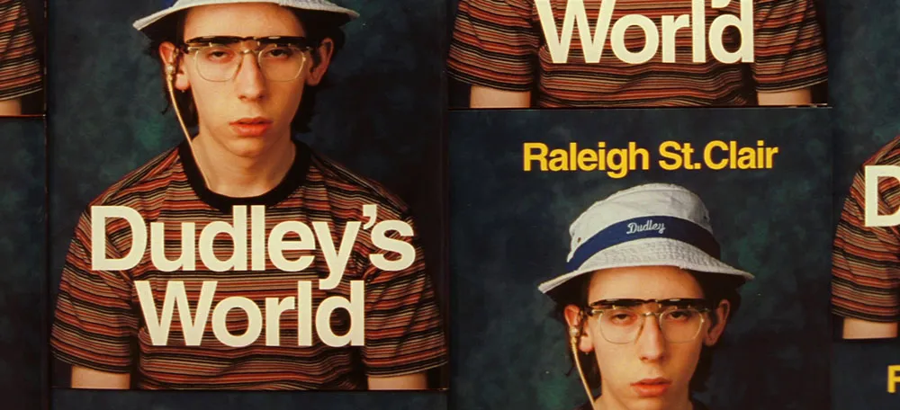
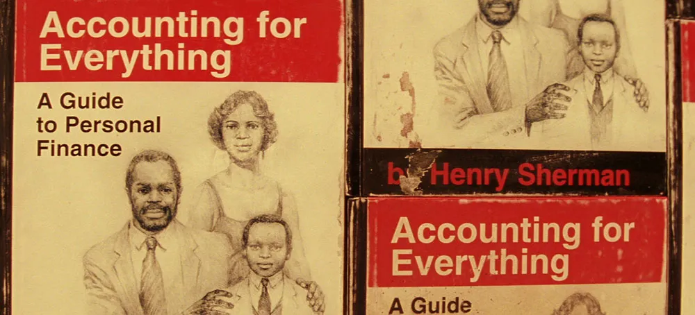
Yet, as much as Futura is used in the movie, a few other typefaces make their appearances. Interestingly, it is usually in connection to someone or something outside the Tenenbaum family and is usually Helvetica:
On Raleigh St. Clair’s books:
On Henry Sherman’s book:
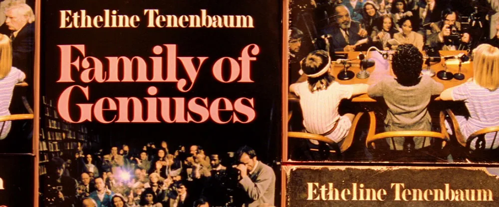
A curious (and possibly significant) exception to this pattern is on the cover of a book supposedly written in the 1970s by Royal Tenenbaum’s wife, Etheline. The typeface is Milano, a quintessentially 1970s choice:
I give The Royal Tenenbaums five out of five stars for its use of type, not because it’s perfectly chosen for the period it depicts (though, as far as that goes, it is), but because Anderson has used type in such an integral way in the film. (I also happen to like Wes Anderson films a lot.)
