The Lost Art of Type Spec’ing
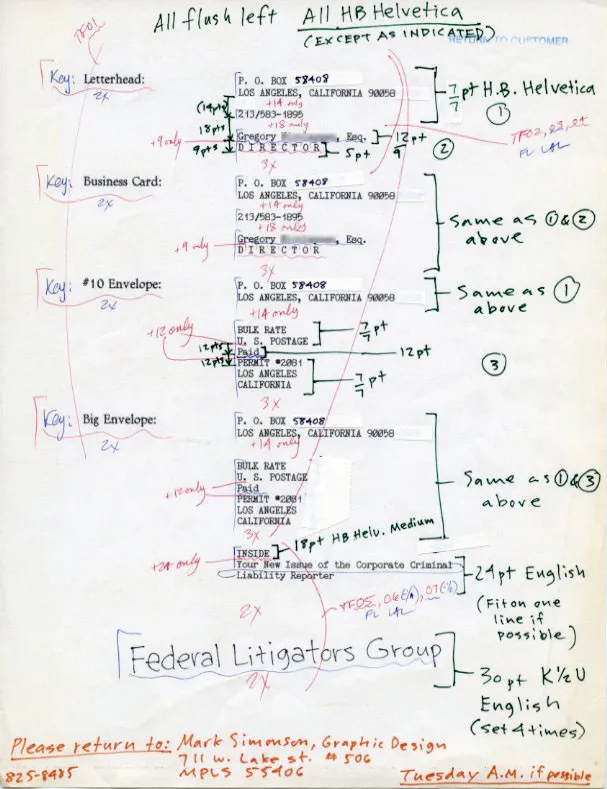
Here is an example of what designers used to have to do in the days before desktop publishing:

All this for a few blocks of text. In this case, for a client’s stationery. It’s from about 1986 or so. I was already starting to use PageMaker for some jobs, but high resolution output was not available quite yet in Minneapolis, and 300 dpi LaserWriter output would not do for a job like this.
Note the note at the bottom: “Tuesday A.M. if possible.” It was probably sent out on a Monday (delivered via courier), and would have been considered a “rush” job. The markings in blue and light red were made by the typesetter to themselves. The others are mine. I don’t remember exactly, but it probably cost $75-$100 to have this copy typeset, including delivery charges.
There was never any question that the spacing and quality would be anything but perfect. None of this had to be stated in the “specs” unless something unusual was called for, like the note near the bottom that says “K 1/2 U” meaning “kern one half unit.” The finished “repro” would still need to be cut up and pasted into position on illustration board before it could be printed.
We are so spoiled nowadays. We can set the type ourselves, right at our desks (or laps), and instantly see what it will look like. No more spec’ing, or waiting, or paying big typesetting bills. On the other hand, you do have to know a lot more about setting type than you did back then to get the same level of quality.
(A possibly interesting footnote: The copy was printed out on a dot-matrix printer, an Apple Imagewriter II, using bitmapped fonts I made myself on my Mac, including one that mimics the look of a typewriter.)
