Two for the Road

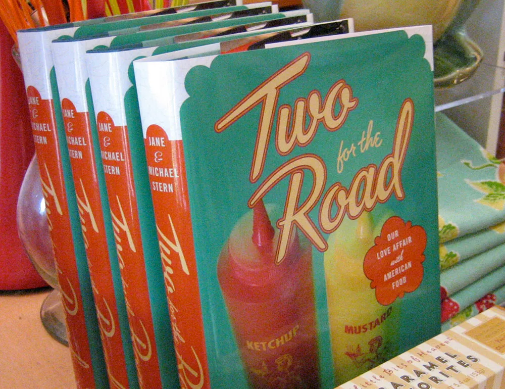
Here’s a fun lettering job I did for the cover of “Two for the Road” by Jane & Michael Stern. The book is a bunch of recipes collected from roadside diners all over the U.S. Art director Martha Kennedy asked me to make the lettering look like something you might see on a sign for a diner. In fact, it’s somewhat based on the sign from a famous diner called Rosie’s.
(This work is actually not that recent, but just I realized that I never posted anything about it here when the book was published last year.)
Filed under: Recent Work , Lettering
