When I decided to sell the rights to my library of fonts to The Type Founders in 2021, one of the big reasons for me was the ever-growing burden of maintaining and developing that library.
As a one-person studio, there was only so much I could do. Proxima Nova had become very popular since I released it in 2005, and I regularly got requests to expand its language coverage.
At first, I did this task myself, adding support for Greek and Vietnamese in 2009 and Cyrillic in 2010. Even though I can’t read languages that use these writing systems, they were close enough to the Latin alphabet that I felt sufficiently confident to design them. But I’ve always felt out of my depth as a type designer even thinking about designing non-Latin fonts.
Still, I could see that adding even more language support would make a lot of sense for such a popular type family. Theoretically, I could hire other designers and production people to help, either as employees or as contractors. But that would mean managing those people, something I know I’m not very good at.
I like working by myself, and I would rather spend my time working on new typefaces.
It was around the time I was thinking about these problems back in 2019 that I was approached by Paley Dreier (now Managing Partner of The Type Founders) about selling my font library. It was something I’d never thought about before, but I eventually realized that it would be a neat solution to my problems. I would be relieved of the burden of maintaining and expanding my existing fonts, giving me time to focus on designing and releasing new fonts—which is what I’ve been doing for the last few years, with the release of Proxima Sera, Dreamboat, Proxima Nova Wide and Extra Wide, Viroqua, Cheesecake, Madcap, Gertie, and Skin & Bones. In fact, I’m currently working on a new sans serif family, the first since Proxima Nova, if you don’t count display faces.
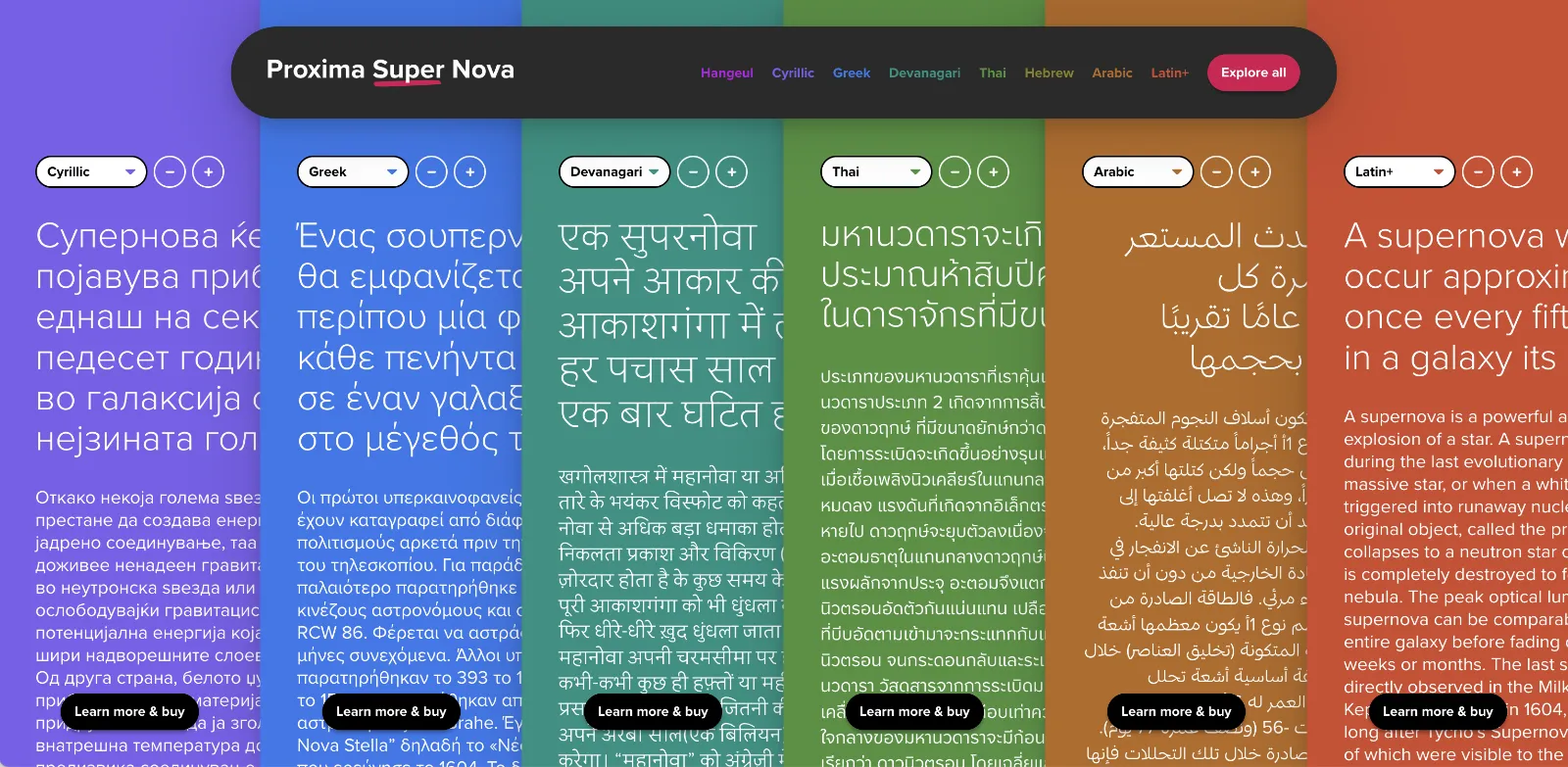
In the meantime, The Type Founders has been working to expand language support for Proxima Nova, with the aid of some really talented type designers from around the world. We’ve dubbed the fruits of this effort Proxima Super Nova.
In addition to most Western and Eastern European Latin, Greek, Vietnamese, and Cyrillic, Proxima Nova now supports Arabic, Devanagari, and Thai (both looped and loopless). More writing systems are in the works, including Hebrew and Hangeul.
Check out the Proxima Super Nova mini-site to find out all about it.
If you have any questions, are interested in extended or enterprise licensing, or need additional language support or customizations, get in touch! Send a note to info@marksimonson.com
A big thanks to the following people:
Proxima Nova Thai: Smich Smanloh of Cadson Demak
Proxima Nova Devanagari: Vaibhav Singh and Alessia Mazzarella of Typeland
Proxima Nova Arabic: Khajag Apelian and Wael Morcos
The mini-site: Elliot Jay Stocks (site design and content development) and Roel Nieskens (site development)
Project management and production support: Glenda Bellarosa and Dyana Weissman
Last week I did a talk for Type Tuesday in Minneapolis where I did a live demo of early font editors on a real Macintosh Plus. I’ve uploaded a video recording of it on YouTube, or you can watch it here.
6/27/24 Update: I’ve also posted a video about the story behind the Mac Plus I used for my Type Tuesday talk:
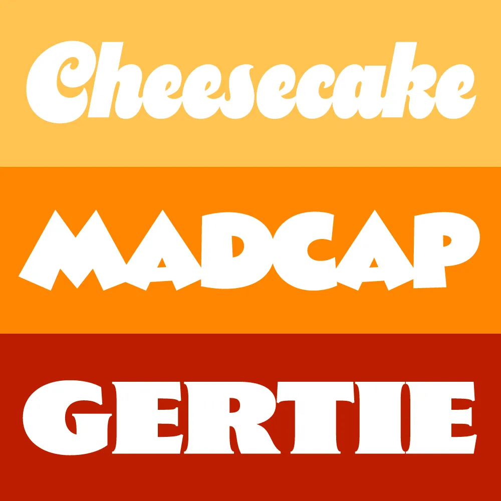
I took a break from my usual practice of working on larger families to create a trio of heavyweight display typefaces: Cheesecake, Madcap, and Gertie. They come from different historical periods—and different periods in my life.
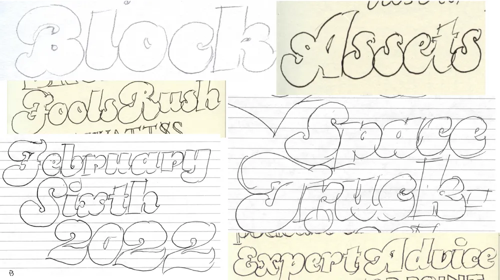
Cheesecake is the most recent design. It bubbled up from my subconscious over the last ten years while I was working on Dreamboat. Like Dreamboat, it’s a “bold script” style, but it has more in common with 1970s lettering and fonts, and is a simpler design without any need for fancy OpenType magic in order to set properly.

I tried to push the weight as far as I could without sacrificing legibility. It has an alternate lowercase “s” (in case you’re not into that old-school cursive form) and a set of matching dingbats and symbols.
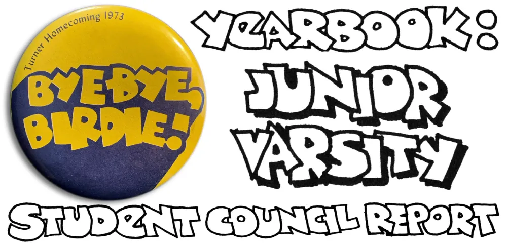
Madcap goes back to my high school years in the early seventies, before I was even thinking about type design. I worked on student publications and often did lettering in a cartoony, all-caps style, with overlapping letters. I was influenced by vintage MAD magazine and Hallmark and American Greetings’ psychedelic period.

Madcap has a few special features: An alternate lowercase-style E and a set of matching dingbats and symbols.
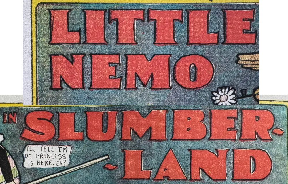
Gertie is a design that’s been in the back of my mind since the late nineties. The inspiration is Winsor McCay’s distinctive lettering in his iconic Little Nemo comic strips from the early twentieth century. Think of it as Copperplate Gothic on steroids. The name comes from McCay’s 1914 animated short Gertie the Dinosaur—the first fully-realized animated cartoon character.

As an all-caps design, it can be awkward to set words and abbreviations that normally contain lowercase like “McCAY” or “4th” or “Co.” So I’ve included a set of raised caps for those situations. And it works with more than one letter in a row. You can also use it for the cents part of prices. Like Cheesecake and Madcap, it includes a set of matching dingbats and symbols.
All three fonts are available now.
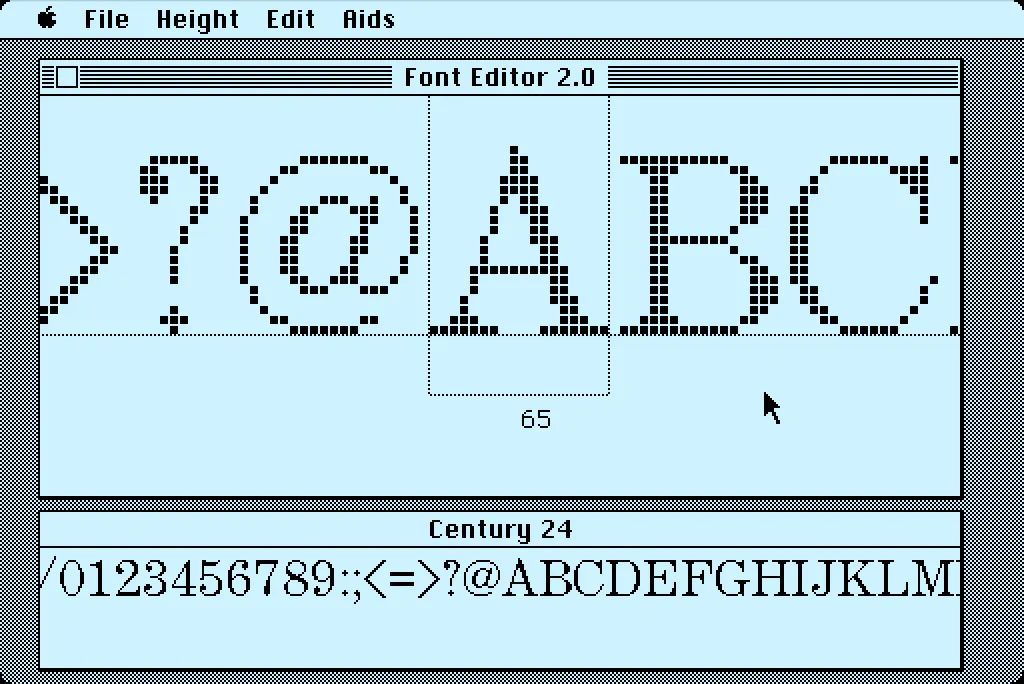
In 1984, I bought one of the original 128K Macs. A big draw for me was how it could display multiple fonts—proportional or fixed-width—anywhere on its screen. I desperately wanted to make my own fonts for it. This was before modern PostScript/TrueType/OpenType fonts, back when there were only “bitmap” fonts—fonts composed of discrete black and white pixels.
That summer, I read about an Apple developer tool called Font Editor 2.0 and sent for a copy of it. It was crude and crashed easily, but it allowed me to make my first Macintosh bitmap fonts. (A little later, AltSys released FONTastic, which was better in every possible way, including being less crash-prone.)
Recently, I fell down the rabbit hole investigating and reacquainting myself with Font Editor 2.0. I wound up making a user guide and a video demo and walk-through. I also prepared some disk images you can use with a real 128K or 512K Macintosh computer or an emulator, such as Mini vMac if you want to try it out for yourself.
I’m planning to make more videos about early font development on the Mac in the near future on my YouTube channel.
Skin & Bones is an unusual font release for me. It’s not only a revival, it’s a designer-authorized revival. It was originally designed by Douglas F. Jones and released as a 2” film font in 1972 by VGC (Visual Graphics Corporation, now defunct). I got to know Doug by email in 2017 after a friend of his saw him mentioned in a Notebook post of mine from 2013. He agreed to do an interview as a follow-up to that post. You can read the interview here, which I recently published in anticipation of the release of my revival of Skin & Bones.
While we were doing the interview, I noted that there was no official digital version of Skin & Bones—and the free, unauthorized version which has been around for a while is not only very poor, but incomplete. It’s missing the alternate characters that Doug designed for the 1972 film font. When I proposed doing a proper, fully-modern digitization of Skin & Bones, Doug was all for it.
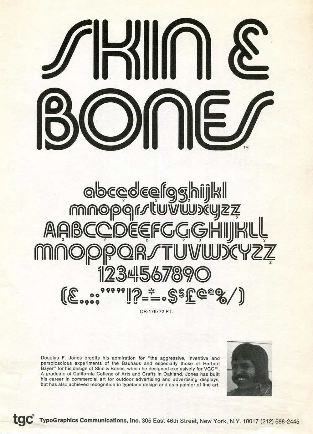
Doug no longer had any of the original artwork, so my digitization is based mainly on available samples from vintage VGC catalogs, promotional brochures, and even the unauthorized Chartpak lettering sheets.
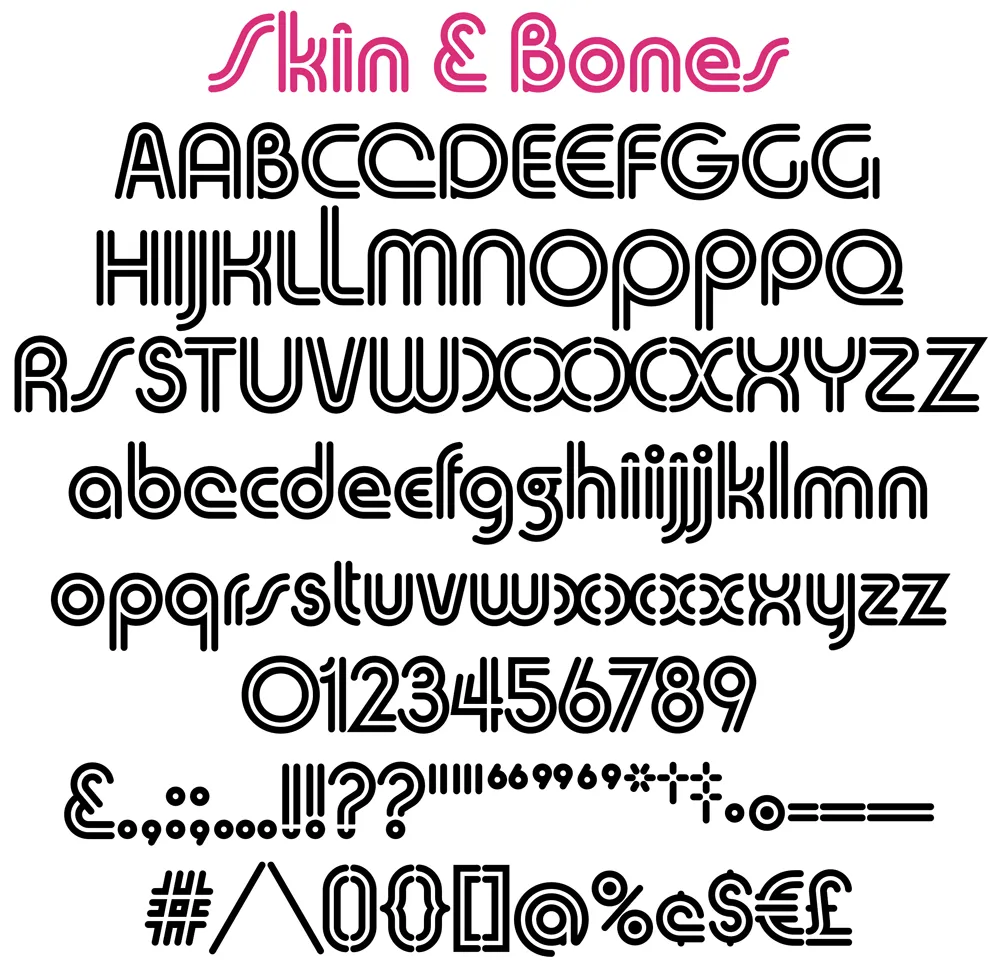
VGC film fonts had a pretty limited character set by modern standards—uppercase and lowercase (sometimes with alternate characters), figures, basic punctuation, and a few symbols (usually $, ¢, £, an asterisk, and an ampersand). (You can see the entire character set in the image above.) Often, there weren’t even accents or “foreign” characters, which kind of made sense at the time since the primary market was the U.S., Canada, and Britain. The unauthorized version did have a few accents and as well as Æ, æ, Œ, œ, and ß, but they weren’t very good and didn’t follow the design logic of Skin & Bones.
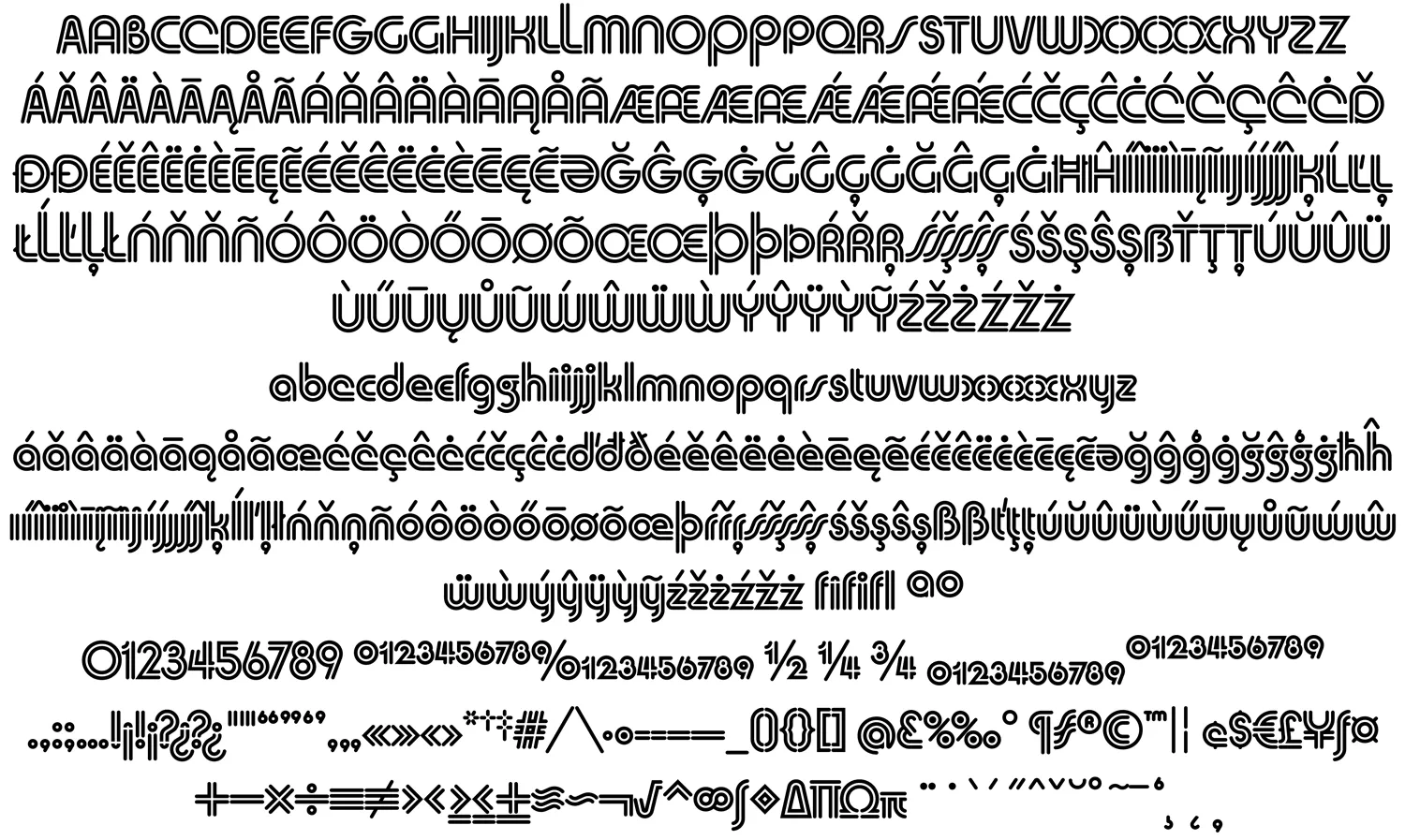
After I digitized the existing characters as faithfully as I could and got Doug’s approval, I expanded it to modern standards. This included designing a full set of diacritical characters to cover most Western-, Central-, and Eastern-European Latin-based languages, as well as small figures (for superscript, subscript, and fractions), a full set of punctuation and delimiters (parentheses, brackets, and braces), and the standard range of symbols and currency marks.
Beyond this, I added a few new alternate characters, including variations of Æ/æ/Œ/œ based on Doug’s original alternates for A, E, and e. My most significant additions are the alternate S/s, which follow a more conventional form, rather than the “lazy S” style that Doug used, and alternate full dots on the i, j, !, and ?.
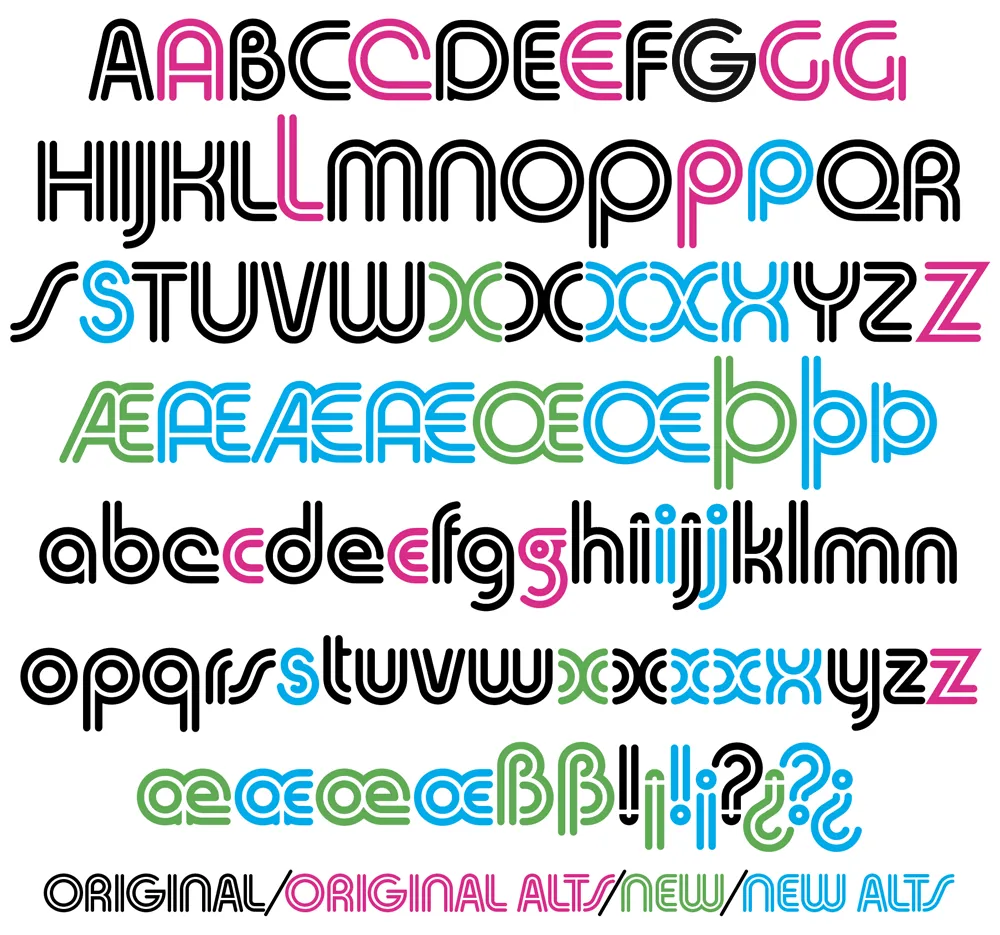
I did make one change to Doug’s original design in the X/x, which I thought (and Doug agreed) could be made more consistent with the design logic of the alphabet. His original X and x are available as stylistic alternates for completeness, plus three new variations I came up with. If you’re setting anything with an X, you’ve got lots of options.
Unlike the original VGC film font, the digital version of Skin & Bones is carefully spaced and kerned so it automatically sets perfectly. It includes support for OpenType features like Named Stylistic Sets (to make it easy to use the alternate characters), Localized Forms, Subscript and Superscript, Fractions, and Ligatures.
To sum up, Skin & Bones is a classic early-seventies Bauhaus-inspired display typeface, expertly remastered and extended for modern use.
The royalties for the sales of Skin & Bones will be shared with Doug, who made a total of $240 after it was originally released by VGC. I expect he will do better this time.
You can purchase the font here.
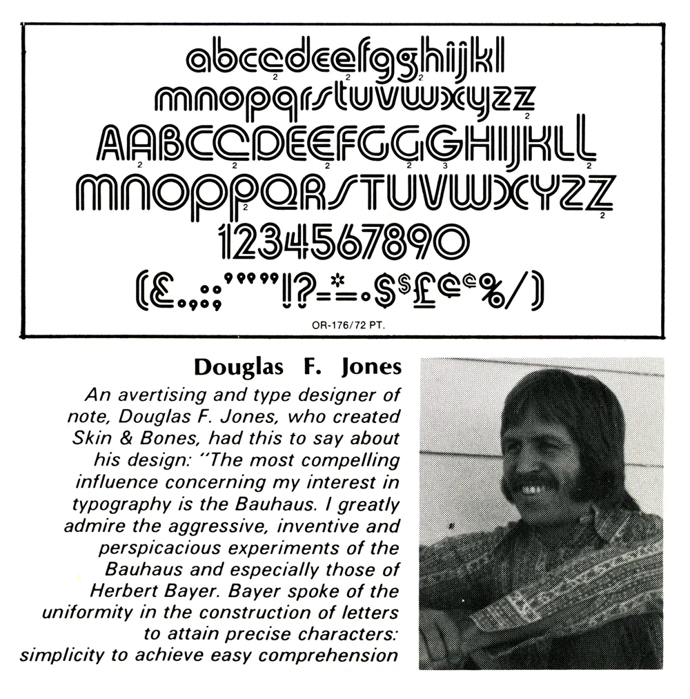
Jones with his creation, Skin & Bones, in Industrial Art Methods magazine, 1972.
In 2013, I posted an item here about a magazine article I saw as a teenager back in 1972, which helped spark my interest in type design. It was about some recent typefaces released by Visual Graphic Corporation. VGC made the Photo Typositor, a machine for setting headline type. It included photos and short bios of the designers. One of them was Douglas F. Jones, designer of the typeface Skin & Bones.
A few years later, in 2017, someone who knows Doug emailed me with his contact info and said he might like to hear from me. I emailed Doug and asked if he would like to do an interview as a follow-up to my 2013 blog post.
I meant to publish the interview sooner, but in our exchange, I noted that there was no official digitization of Skin & Bones, just some crappy free versions, and that I would be willing to do a high-quality, official digitization of his design. I decided to hold off publishing the interview until it was finished.
That task is now completed, and the font will soon be available at Mark Simonson Studio (and Adobe Fonts). Of course, the royalties will be shared with Doug.
In the meantime, here’s the interview….
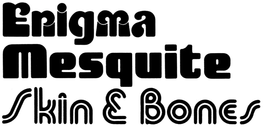
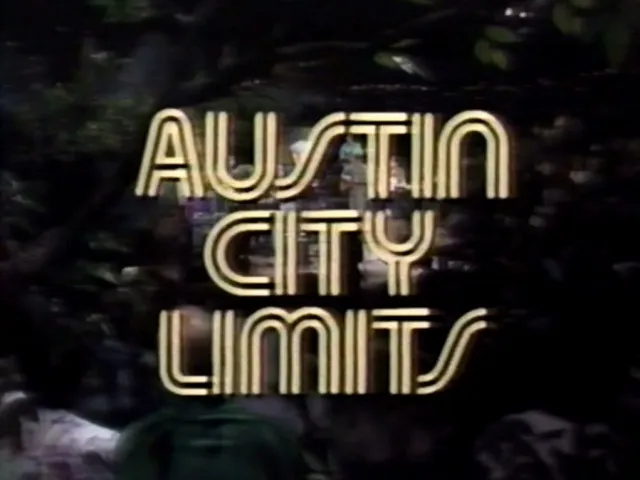
Doug: I designed three fonts for VGC, all published between 1972 and 1976: Skin & Bones, Mesquite, and Enigma. Fonts In Use notes that Skin & Bones has been used by the music program “Austin City Limits” since 1974 and that it was used on the VGC Typositor, one of which is in the printing museum at the Romano Library & Museum in Haverhill, MA.
I became interested in calligraphy and paper sculpture after designing fonts.
Mark: How did you get into designing typefaces? What made you want to do it?
Doug: I graduated in 1962 with a BFA from California College of Arts and Crafts (CCAC) in Oakland, CA (now CCA). Charles Eames, of chair fame, was the keynote speaker at the graduation. He said that we graduates had learned our ABCs at CCAC, and now it is time to go out and learn the rest of the alphabet. Boy, was he right—and I’m still learning! Haha.
After graduating, I got a job designing signs for an electric sign company in Las Vegas. In those pre-computer days, all lettering had to be hand-drawn (including menu boards, ouch!). Just by repetition, one begins to have a feel for letters.
Soon, I began designing my own letters for signs. Then, while working in Las Vegas, I embarked on a project to design a complete alphabet called Skin & Bones, unaware of the amount of work it would entail.
Mark: What was the concept or inspiration for Skin & Bones?
Doug: I was very interested in the Bauhaus and the simplicity of their designs, but don’t be fooled. Simplicity is very difficult! When I was experimenting with Skin & Bones, I was impressed by the fact that a letter with an inline attracts the eye.
Now, the real work began. It is easy to design one letter, but an entirely different matter to formulate 52 letters and have them relate seamlessly one to the other.
Mark: How did you find out about VGC, and what was the process for producing a typeface with them?
Doug: I had submitted some font designs to other companies to no avail. Although some gave me encouragement. I even won a contest from LetterGraphics with an alphabet called “Gnome.” It was only a lower-case font, so they told me in the future to design both upper- and lowercase.
It was about this time that I had heard of VGC, after seeing it in a graphics book. So I decided to submit Skin & Bones as an unsolicited font. They were interested.
They had a system for judging fonts. The designer is required to submit certain letters: Caps - A E G M O R S and lowercase - a e f g p t y. Then a panel of VGC staff members would evaluate the samples and, if accepted, tell you to proceed. And it was.
The characters had to be inked at a 2” cap height on individual cards (3” x 5”) with 1/4” punched holes in cards to align with register posts. A metal plate with registration posts and cards were supplied to complete the project. As it turned out, I needed 115 separate cards. Foreign accents and ligatures were required for distribution in other countries. When inking was finished, the cards would be sent to VGC to be photographed and duplicated on film to be used in their Photo Typositor machines.
Skin & Bones took six months from concept to final inking. All of the inking was done with a Rapid-o-Graph technical pen. When the entire font was completed, each letter, accent, and punctuation mark had to be “letter perfect.” VGC demanded this!
Mark: Once the font was released, what kind of response did you get? Were you involved in marketing it? Was creating Skin & Bones financially rewarding?
Doug: VGC did all the marketing and agreed to give designers 25% of the gross sales. There was a bumpy start at first and it took a while before I got my first royalty check. But it didn’t last long before things went south.
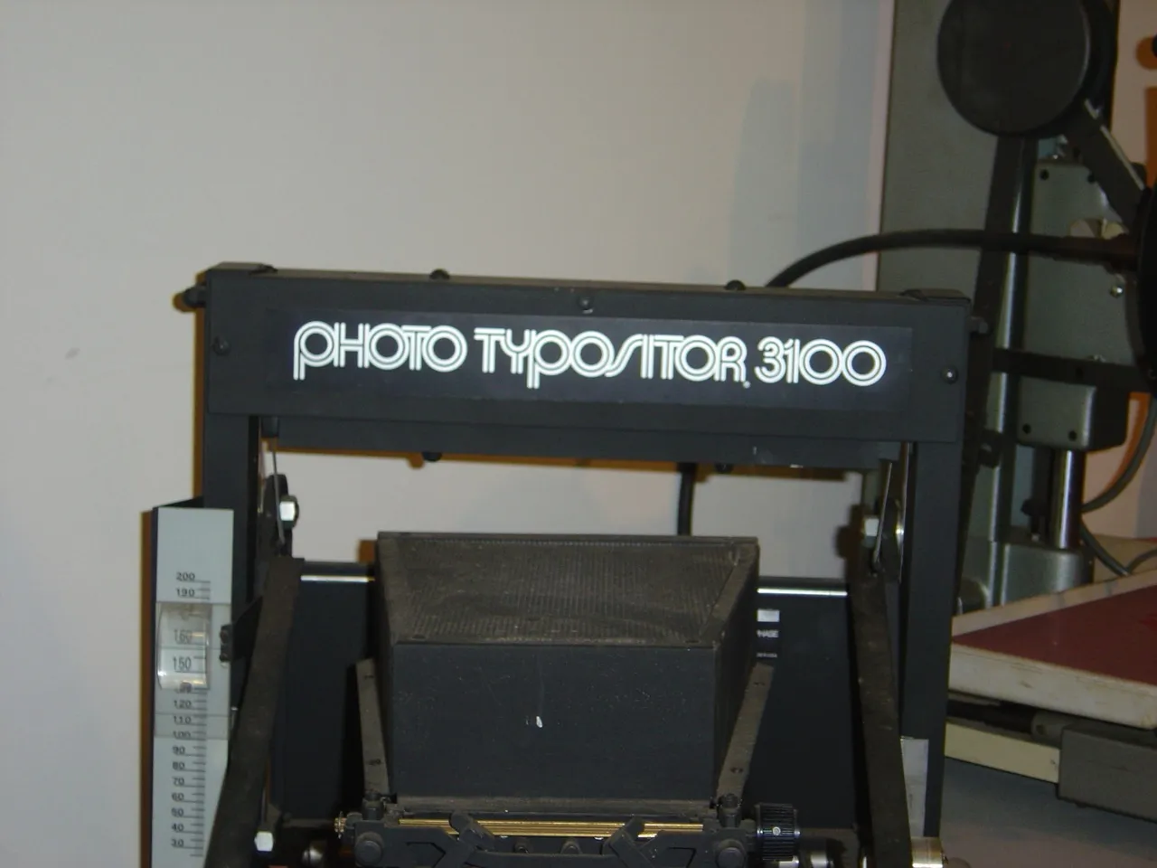
Skin & Bones in use on the VGC Photo Typositor. (Source: www.flickr.com Tamye Riggs. License: All Rights Reserved.)
When I was working in Phoenix, I saw a ripoff of Skin & Bones in Chartpak rub-down lettering. When I notified VGC, they were aware of it and told them to “cease & desist,” which they did. It was an awful reproduction—rough. This was about 1974. I didn’t receive any royalties from Chartpak.
About this time I saw S&B showing up in magazines and newspapers. I have clippings from Time and Newsweek, Spalding basketballs—even Kobe Bryant used it. No royalties. Lucas Samaras (artist) used it for title pages in his book. And, of course, Austin City Limits. No royalties. I even saw it two weeks ago in an ad in a paper in Berkeley, CA.
In all, I received $240 in royalties. VGC had problems securing sales with the advent of computers. Ultimately, VGC went out of business and the fonts all fell into public domain. All the designers, including myself, were deprived of any future royalties from the sales of our fonts.
Mark: Well, now that I’ve agreed to digitize Skin & Bones, maybe that will change.
Doug: As it stands right now, nothing has happened or will happen concerning any royalties, so we have nothing to lose by re-releasing Skin & Bones and seeing what comes of it.
* * *
Here’s a sneak peek at the newly digitized Skin & Bones:
Stay tuned….
