
Well, this has been a long time coming.
Variable fonts (a.k.a., OT-VAR, or OpenType Variable) started to become a thing in late 2016, with backing by Apple, Microsoft, Adobe, and Google. The standard took a while to be worked out, but it’s fairly settled now.
The good news is that variable fonts work great in all the major web browsers, and the web is where variable fonts make the biggest difference. It lets you put an entire font family with unlimited styles into a single font file that is about the same size as a few traditional fonts. This gives the web designer a much larger typographic palette without the bandwidth penalty.
On the desktop, variable fonts are not as well-supported. Adobe Creative Cloud apps (Photoshop, Illustrator, and InDesign) have good support at this point. Others include Sketch and Corel Draw. You can see a current list here. I expect this will improve over time and, eventually, they will work everywhere.
I knew from the beginning that I would want to do a variable version of Proxima Nova. I started work on it in late 2017. This was when support was low and the standard was in flux, so it sat on the back burner after some initial tests.
In Spring of 2019, I enlisted the help of Rainer Erich Scheichelbauer and his team at Schriftlabor for technical and production assistance. Although I’m an old hand at making OpenType and other kinds of fonts, I felt a bit out of my depth with variable fonts. Given the amount of user stress that a variable version of a face as popular as Proxima Nova would need to withstand, I needed to bring in an expert. Rainer has been at the cutting edge of variable font technology, including being one of the developers of Glyphs (the app I use to make fonts), so it was in good hands.
Nearly two years later, I’m ready to introduce Proxima Vara. (You can try it out here.)
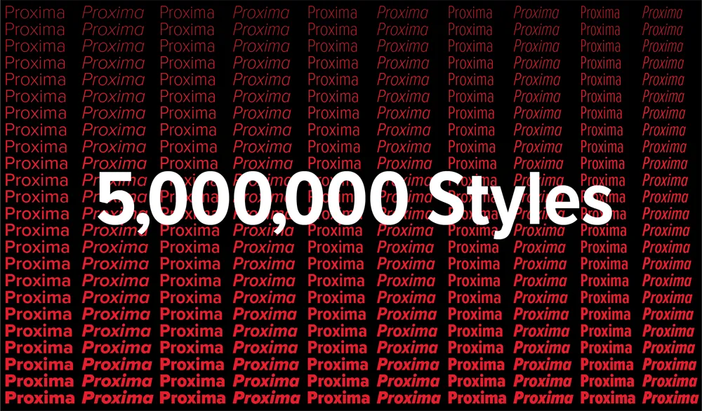
Proxima Vara is a completely new family, not an update to Proxima Nova, and there are some differences. One is that the default figure style is tabular rather than proportional. This was often requested by Proxima Nova users, but changing it would have affected existing users’ documents. There are also improvements to character shapes and spacing.
Proxima Vara, as a variable font, contains built-in weight and style “instances” that match Proxima Nova and can be selected in font menus, as if they were separate fonts. There are six new styles, in the new Extralight weight, making 54 styles, up from 48.
Unlike Proxima Nova, you are not limited to these built-in styles and can specify any arbitrary style along the weight, width, and slant axes using sliders or by specifying values, for example in CSS. In all, there are 5,000,000 possible styles, going from Thin Extra Condensed to Black Italic.
L**icenses for Proxima Vara start at US$99** for a basic desktop license and will be rolling out at most of my distributors starting today. (See “Where to Buy” on this page.)
The one exception is Adobe Fonts (a.k.a., Typekit), which is unfortunately not yet ready to host variable fonts for web or desktop use.

 Christmas came early for me this year when I received the latest issue of Entertainment Weekly and saw my Mostra Nuova all over the cover. It’s always a big deal as a type designer to see my fonts in use, but this was a special treat. Not only was it the primary font on the cover, they also used it extensively on the big feature section inside.
The feature section starts out with a full page that uses nothing but type. Mostra Nuova is used both large and small, and not just all-caps. The first version I released in 2001 had only caps and I added lowercase in 2009. It’s still mostly used all-caps, so it always makes me happy to see the lowercase get some play.
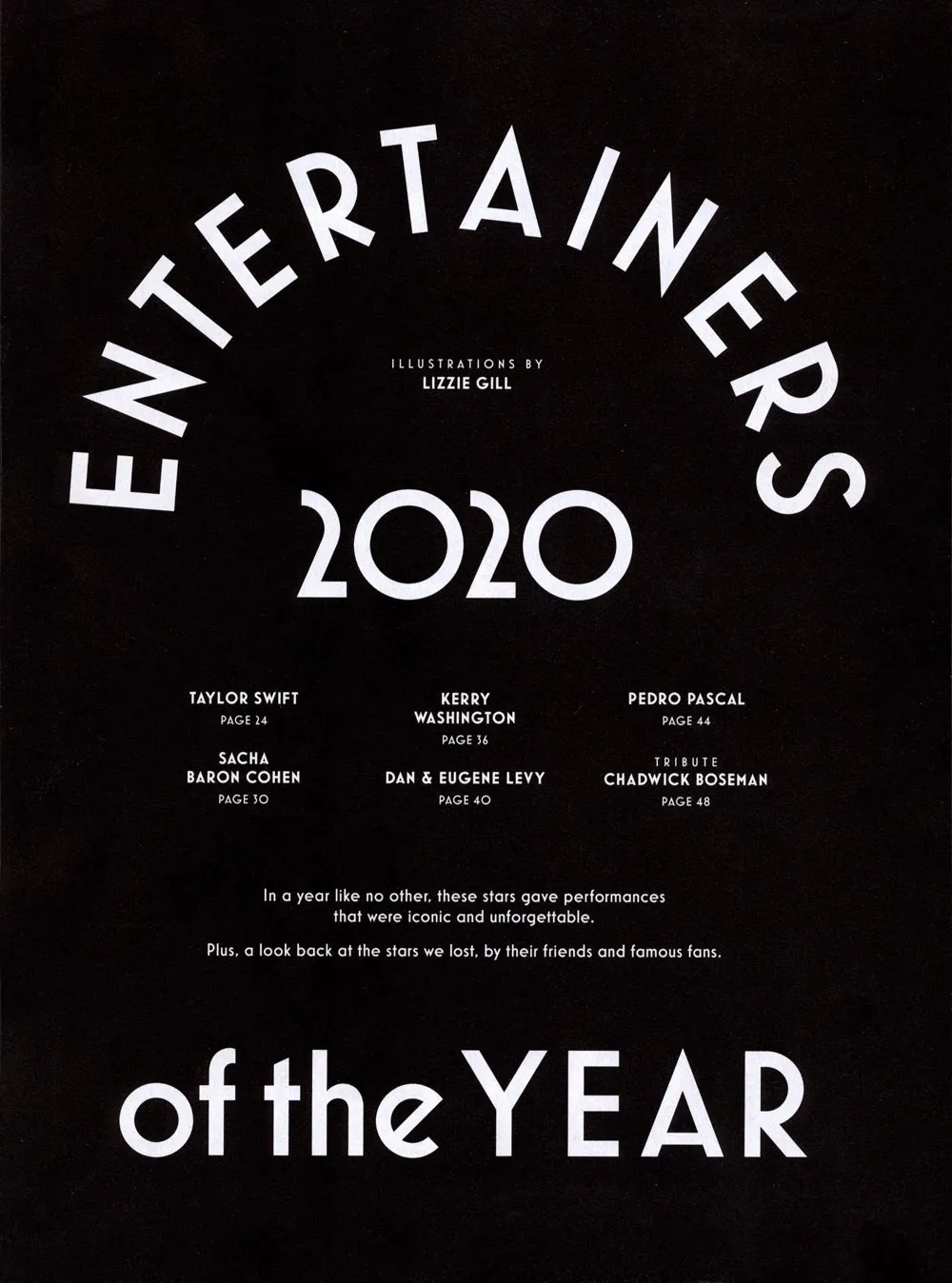
EW’s designers also made extensive use of Mostra Nuova’s alternate characters, sometimes even in the same block of text. They used the Regular, Semibold, Bold, and Extrabold weights. Adding Semibold and Extrabold earlier this year was a good move. If I hadn’t, I imagine that Mostra Nuova might not have been chosen here. (Thanks to Matt Smith at Louise Fili Ltd. for suggesting I add Semibold.)
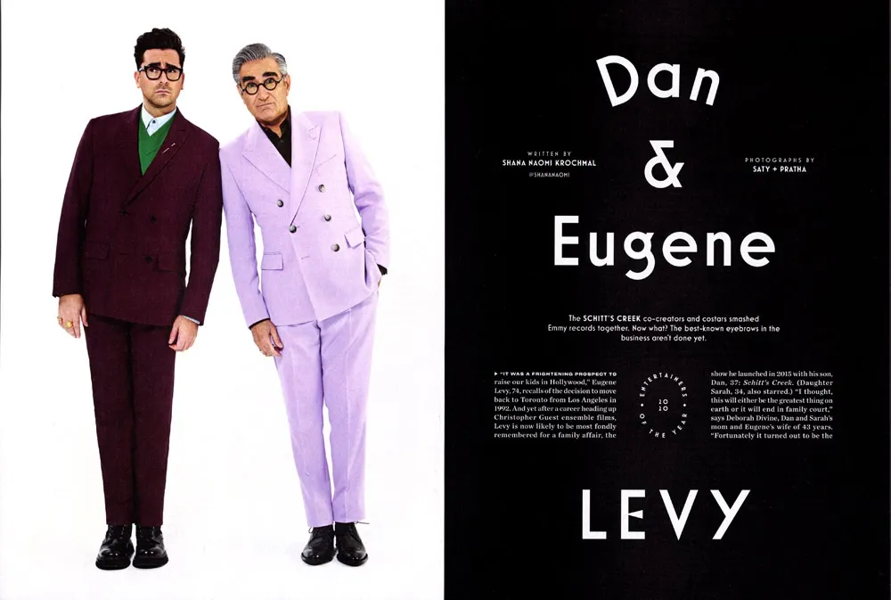
The section is comprised of spreads highlighting a particular entertainer (or entertainers) featuring a full-page photo and title page followed by a page of text. Sandwiched between these highlight articles are pages of shorter pieces featuring other individuals, two per page. (I’ve included a detail of the type treatment on the right.)
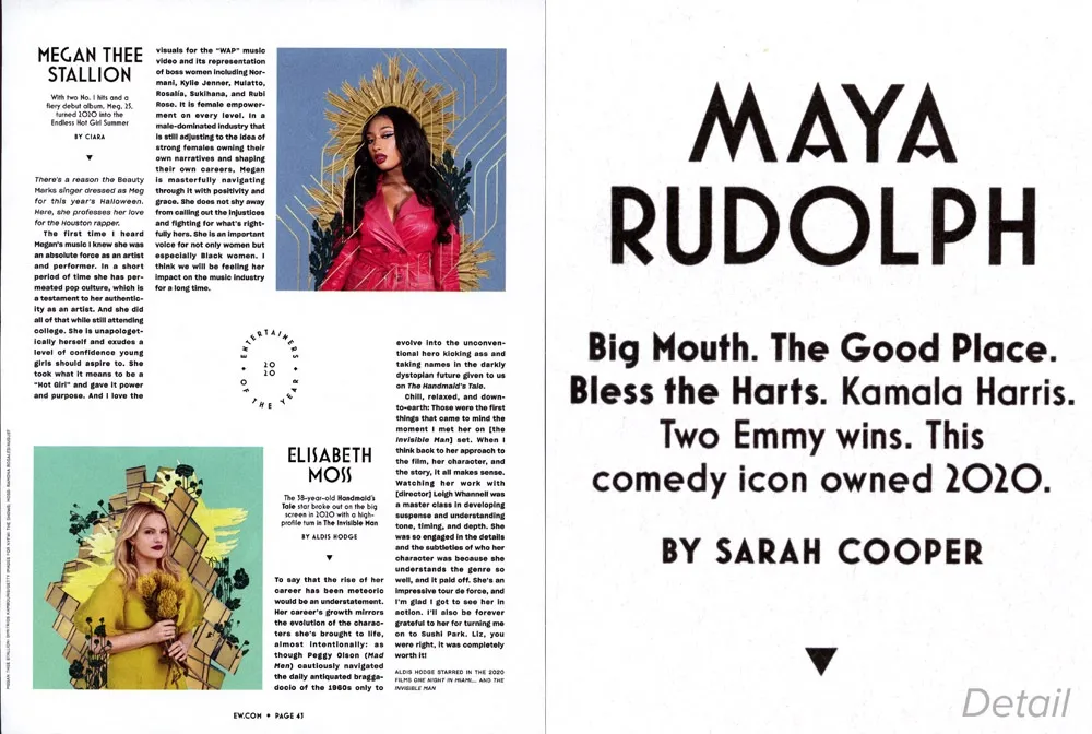
I thought it was really cool that they even used Mostra Nuova in the folios (page numbers).
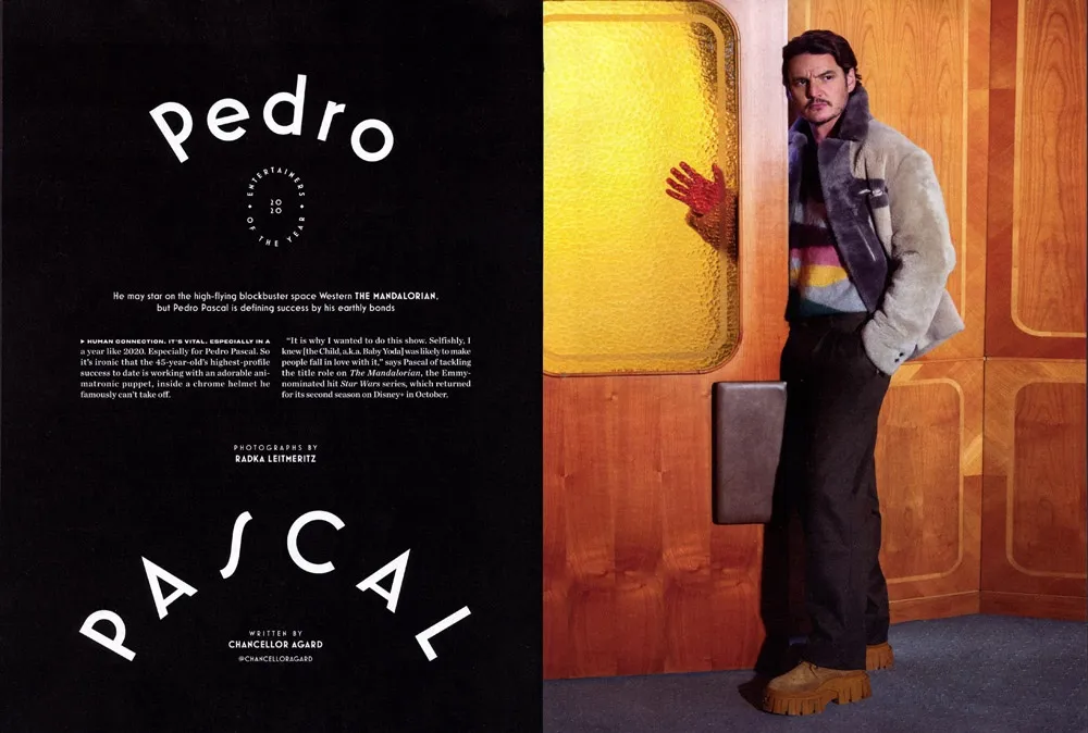
The section closes with several pages about entertainers who died in 2020.
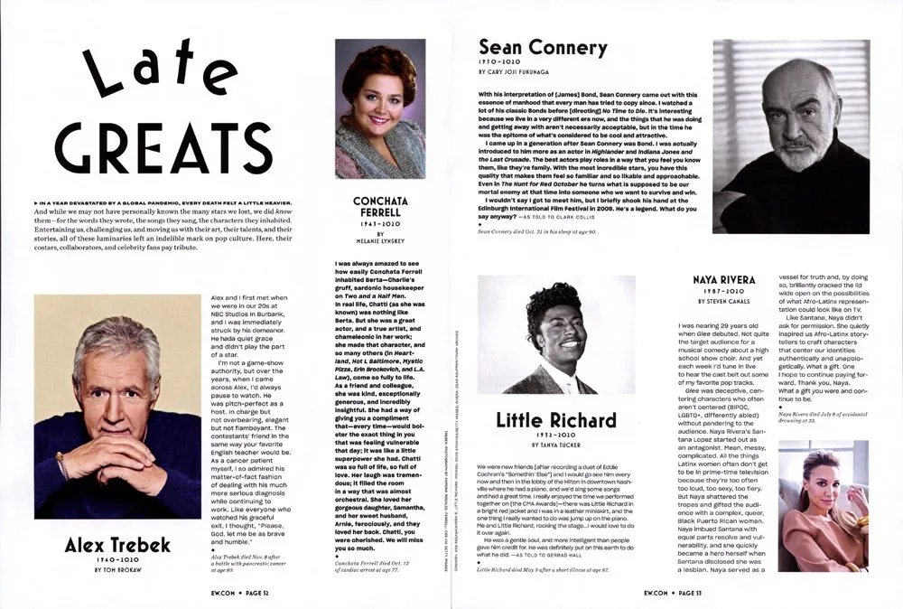
All in all, this is one of the most extensive uses of Mostra Nuova I’ve seen in a magazine. Unfortunately, Entertainment Weekly doesn’t print a staff listing, so I don’t know who to credit with the design and art direction. To whomever you are, nice work!
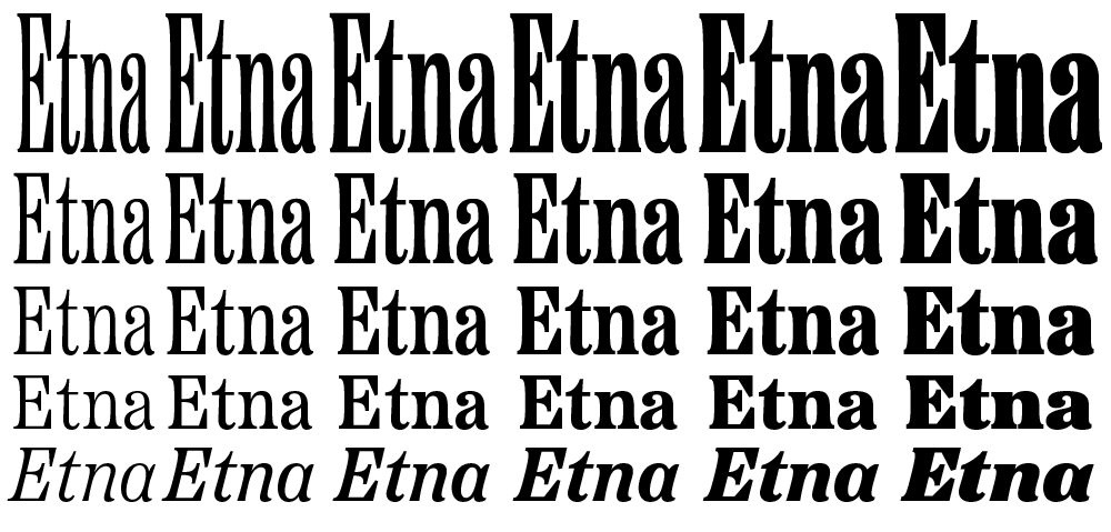
I’m very excited to introduce a brand new typeface family that’s been on my back burner for decades: Etna.
It was inspired mainly by the Aetna style of wood type from the 1880s. Etna tames this quirky Victorian design transforming it into a complete family suitable for modern use, adding a full range of six weights and italics, allowing it to work equally well for both text and display.

The Etna family also includes three different condensed widths in all six weights intended for display use. These are meant to be used LARGE.
All 30 styles include four different figure styles, alternate characters, true small caps, and a selection of dingbats, including arrows, stars, asterisks, and manicules (pointing hands).
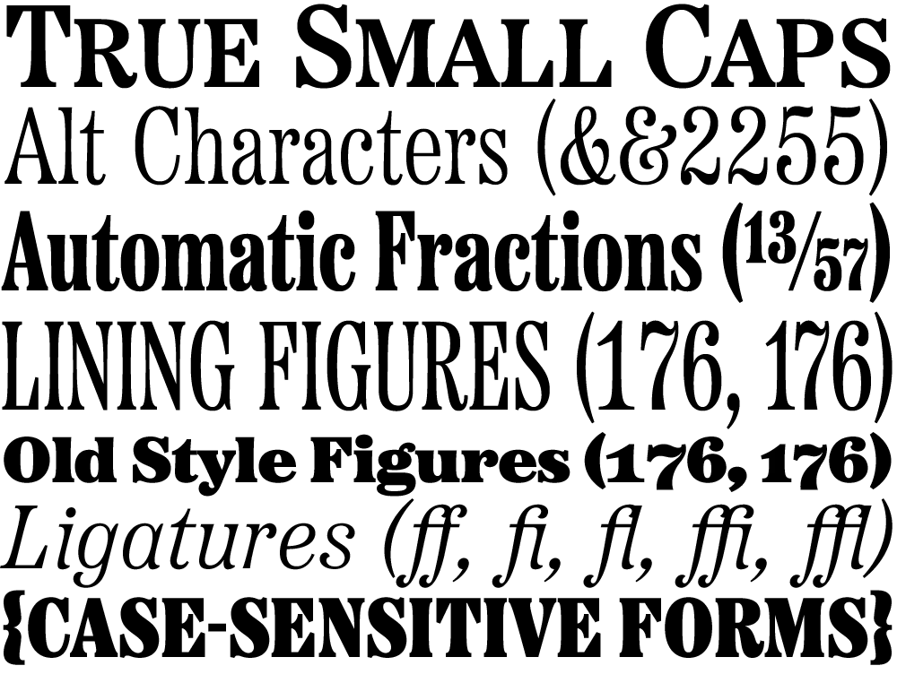

Etna is just rolling out starting today. You’ll find a list of places where you can buy a desktop, web, app, or ebook license on the main Etna page on my site. There is also a nice Etna mini-site that tells the complete story of Etna and the history of the Aetna genre.
Thanks to Nick Sherman for designing and coding the mini-site and to David Shields for writing the history section. Also thanks to Nick for suggesting that I add the manicules and many other features. Finally, thanks to Schriftlabor for technical assistance in developing the fonts.
For some reason, a high percentage of sightings of Acme Gothic in use have been in science fiction movies and TV shows. Not what I would have expected at all for what I admit is a somewhat “retro” typeface. Then again, Bank Gothic, released in 1930, is super popular for futuristic sci-fi uses.
Here are the examples I’ve spotted so far:

In a brief shot in the HBO series Watchmen, Acme Gothic Wide Regular can be seen on the side of a Saigon police car it its alternate timeline of 2019 where Vietnam is the 51st U.S. state. Lucky thing I included Vietnamese diacritics.

Acme Gothic Extrawide Regular as seen very widely spaced in the first trailer for Tenet. The rotated palindrome concept was dropped for a straight treatment after it was discovered that there was a bicycle company called Tenet that had already used the same idea in their logo. Happily for me, they kept the Acme Gothic for the revised branding.
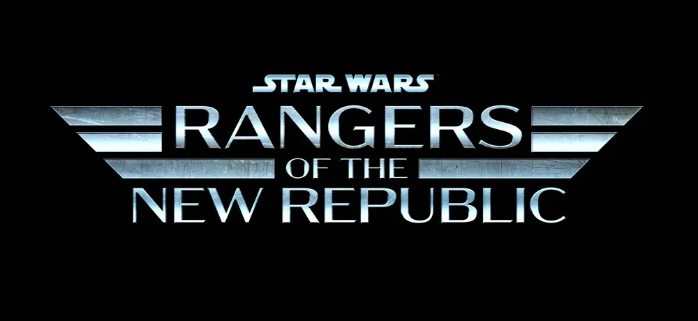
In what appears to be a spin-off of the Mandalorian Disney+ series, the logo for Star Wars: Rangers of the New Republic features Acme Gothic Extrawide Regular like Tenet, but much more tightly spaced with a brushed metal treatment.
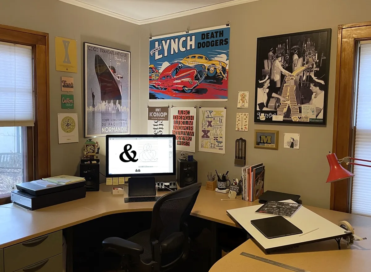
I recently had the ceiling in my studio repaired due to some water damage. While they were at it, I had them give the room a fresh coat of paint. Out with the yellow, in with the warm gray. This was a good opportunity to update my studio tour, which I’d barely touched since I first posted it on the site in March 2013. (Gosh, how time flies!)
Some things have changed: Completely different computer, mostly different things on the walls, some furniture changes. No inkjet printer anymore. (I have a Xerox color laser printer in another part of the house.) And no cats. Sadly, they both passed away a few years ago. Quite a bit is still the same though, like my desk, storage cabinet, and bookcase. The overall arrangement is about the same as it’s been for the last 12 years or so. What can I say? I’m a creature of habit.
In the early ’80s, before I had a Mac, and before I was making fonts, I was an Atari home computer user. I’ve been down an Atari rabbit hole lately, organizing and documenting my old Atari files and programs, which I originally transferred to my Mac back in the ’90s. As I’ve been going through all this stuff, it occurred to me that people might be interested to learn about what I was doing with my Atari back in the early ’80s (and since then), and how I started using computers in the first place.
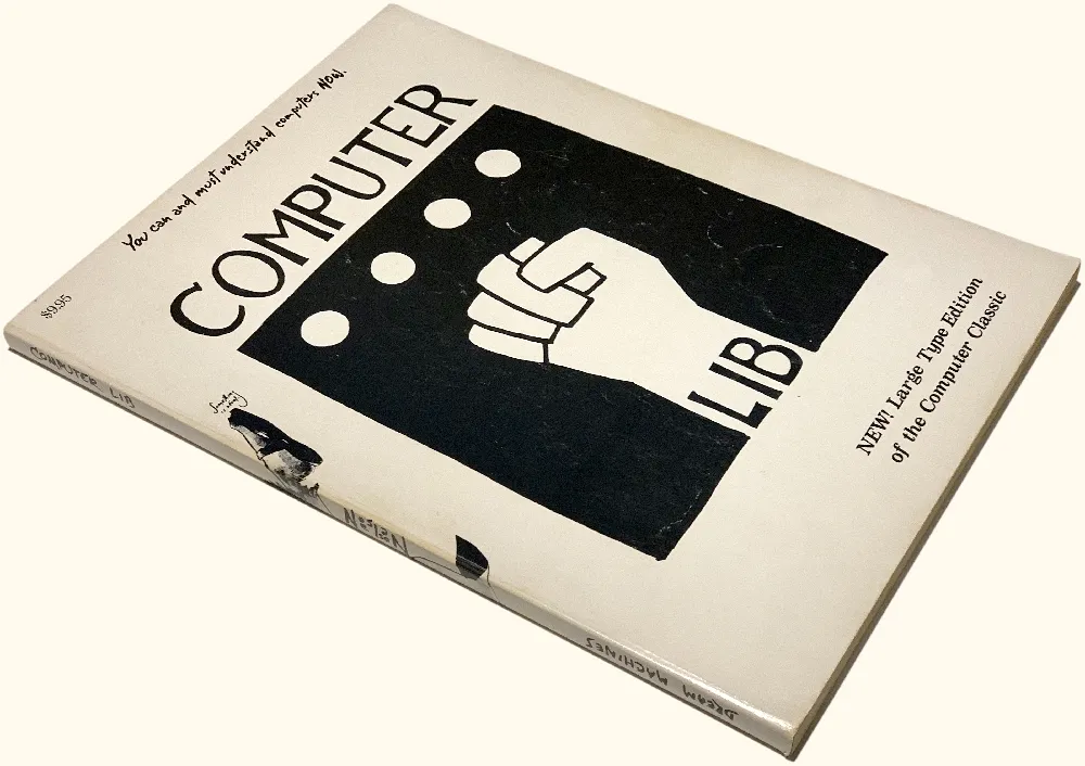
In the late ’70s, microcomputers like the Apple II and Commodore Pet were getting a lot of attention. I wasn’t all that interested until I read Ted Nelson’s self-published, Whole Earth Catalog-style book Computer Lib/Dream Machines in 1980. Computers were not cheap, though. A basic Apple II setup cost over $2,000 (over $6,000 in 2020 dollars). But when I saw an ad for the Sinclair ZX80, which sold for only $199 (plus $5 shipping), I’d found a less expensive way in.
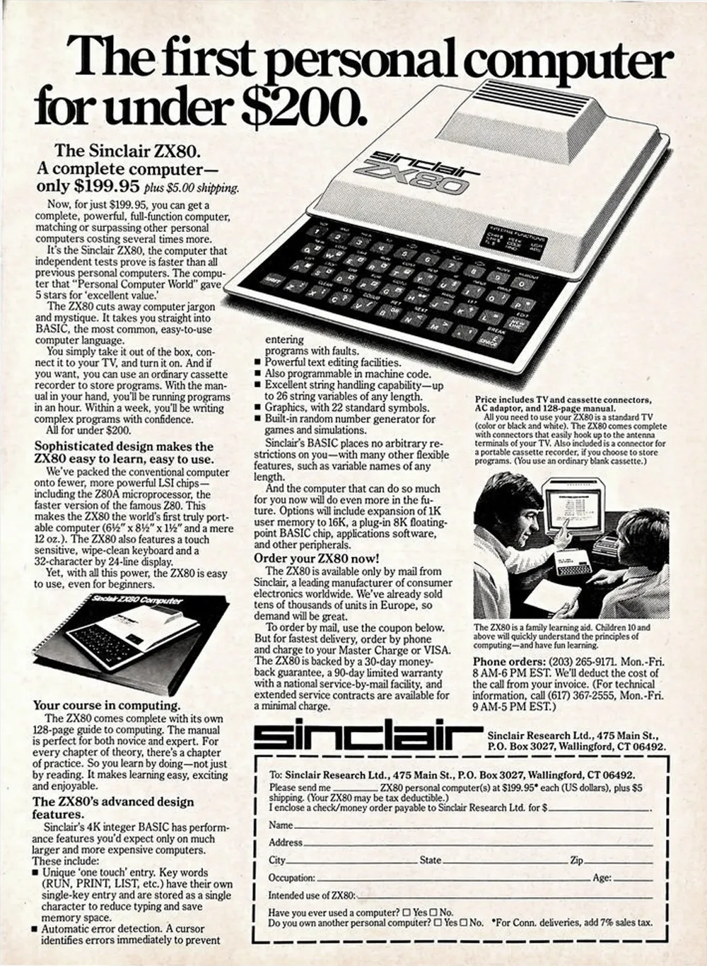
It was much smaller than I expected, about 7 by 9 inches and a little over an inch thick, with a flat membrane keyboard. And it looked cheap. The case was two sheets of vacuum-formed white plastic held together with plastic rivets. There were no moving parts, not even a power switch—just some connectors in the back to plug in the power supply, a standard cassette recorder, and a black and white TV. It only had 1K of memory (1024 bytes), plus 4K of ROM (read-only memory) that contained the operating system and BASIC language interpreter.
I did some tutorials to learn the basics of BASIC and typed in some demo programs, but quickly learned how limited this little machine was. Trying to see what I could do with it graphically, I wrote a program to display a bitmap-style lowercase “a” using graphics characters and simple PRINT statements. It took most of the available memory just to do that.
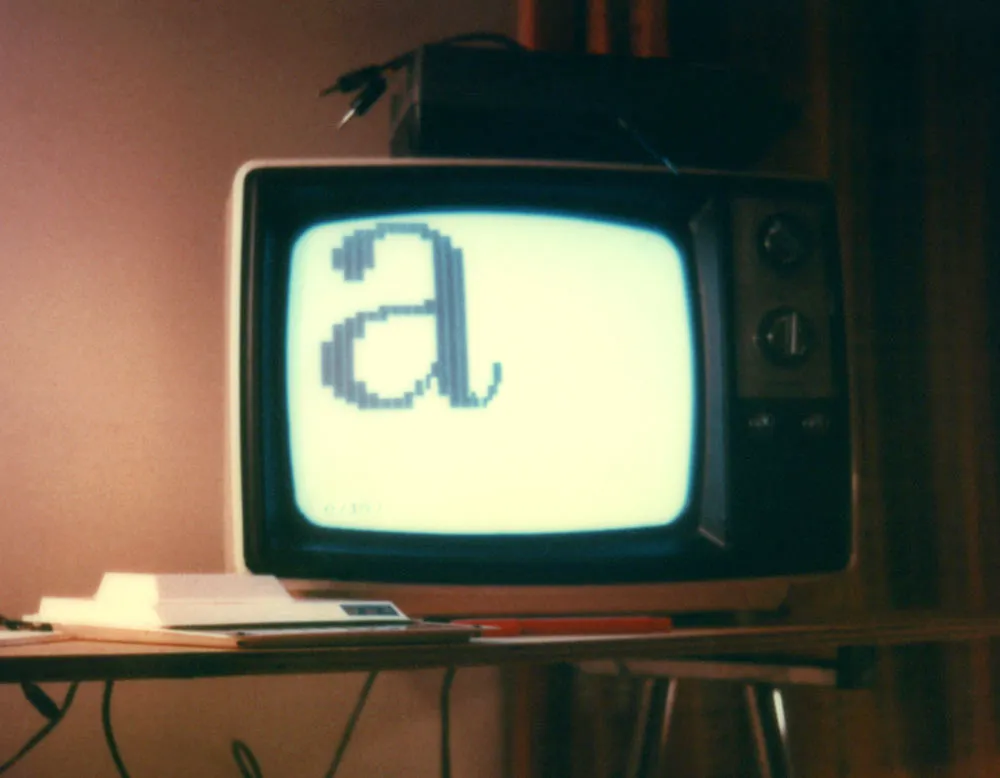
But I’d gotten a taste of what you could do with a computer and started looking for something better.
The Apple II was the most popular at the time, and the first IBM PC had just been introduced. I was 26 years old with a full-time job, but those machines were beyond my means. A little hole-in-the-wall computer store had just opened near where my parents lived, and my dad and I decided to check it out. On display was an Atari 400 running a game called Star Raiders. I’d never seen anything like it. It was a first-person shooter (as they call them now) with a three-dimensional view of stars and space ships. You would “hyperwarp” from sector to sector and then fly around shooting down enemy ships using a joystick. The sound and graphics were amazing for the time—better than the Apple II—and the Atari 400 was a lot cheaper, so I bought one (along with a Star Raiders cartridge). It only had 16K of memory, but that seemed like plenty compared the ZX80.
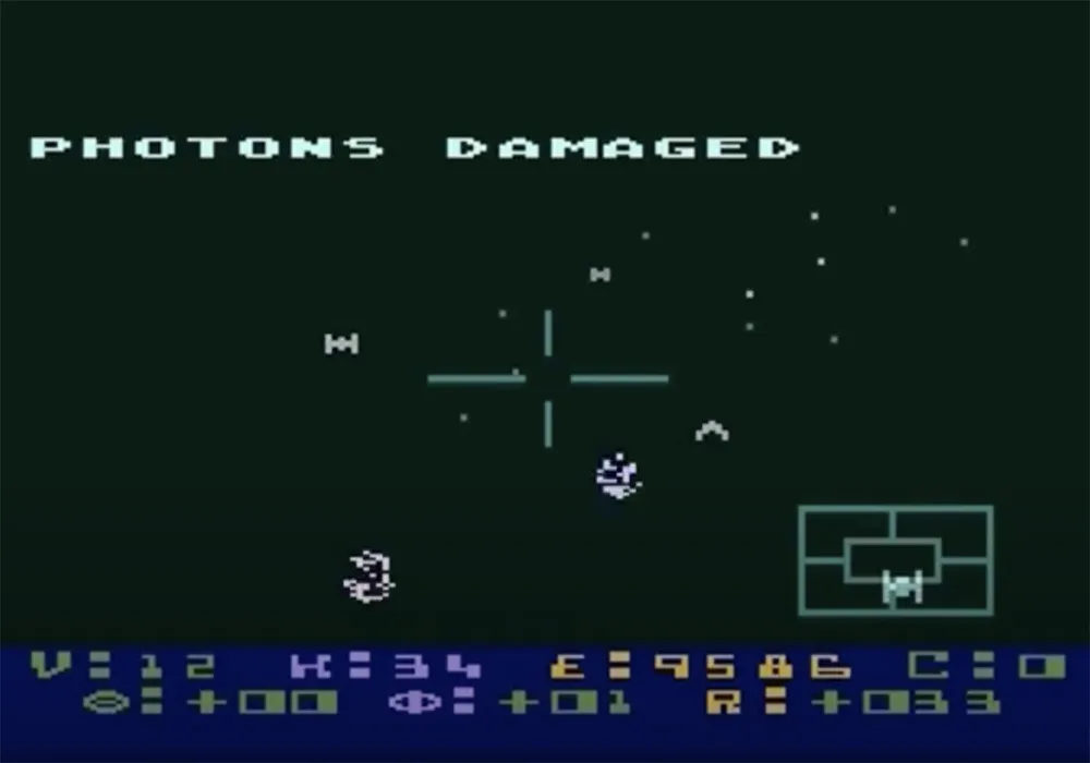
Atari’s line of home computers is remembered mainly for games. I did play a lot of games on it, but I was more interested in programming it and using its graphics capabilities for art.
Like the ZX80, the Atari 400 had a membrane keyboard to keep the cost down. For a touch typist, it wasn’t great, but it worked, and I typed in programs from computer books and magazines to learn what the machine could do. I also went with the cheaper option for storage with the Atari 410 Program Recorder—which let you load and store programs and data (very slowly) on audiocassettes.
Soon after I bought it, there was a free upgrade to a new graphics chip—the GTIA. The GTIA was exciting since it added more graphic modes and up to 256 different colors.
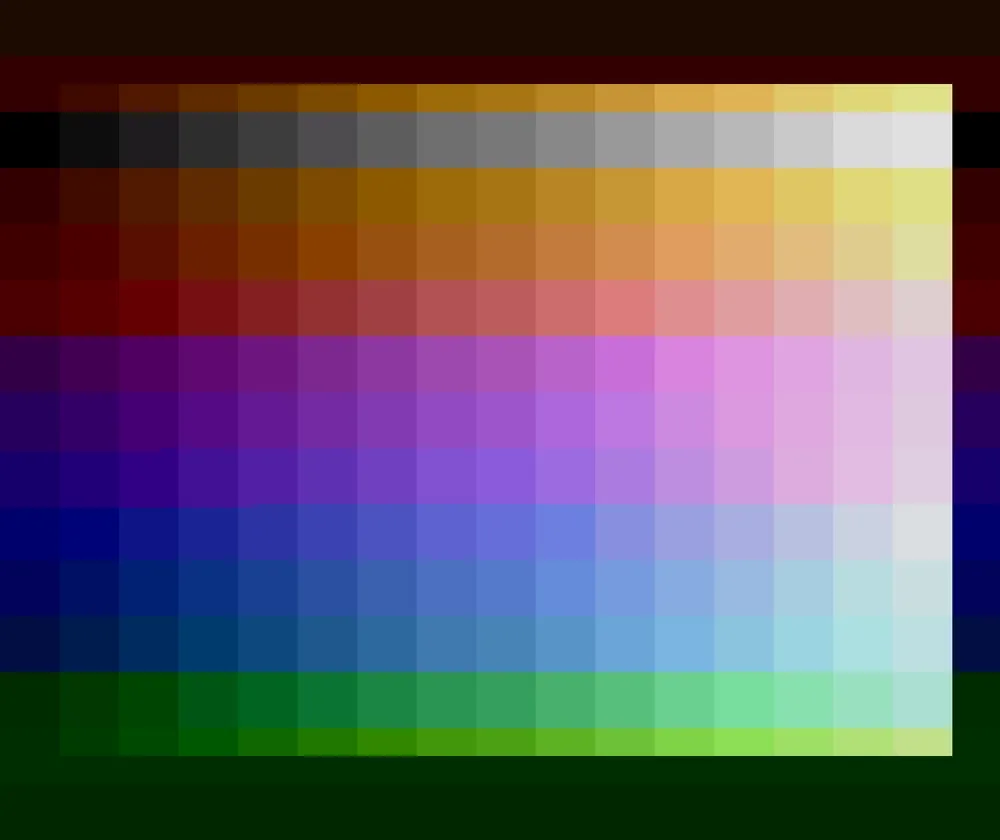
But all the existing drawing programs on the Atari used its older four-color graphic modes, including the first one I bought, Micro-Painter. The way color worked on the Atari was that you had a certain number of colors to work with in each graphic mode, and each of these colors could be set to any of 128 possible shades and hues. A program like Micro-Painter would let you change them whenever you wanted while creating your artwork, but you were still stuck with only four at a time.
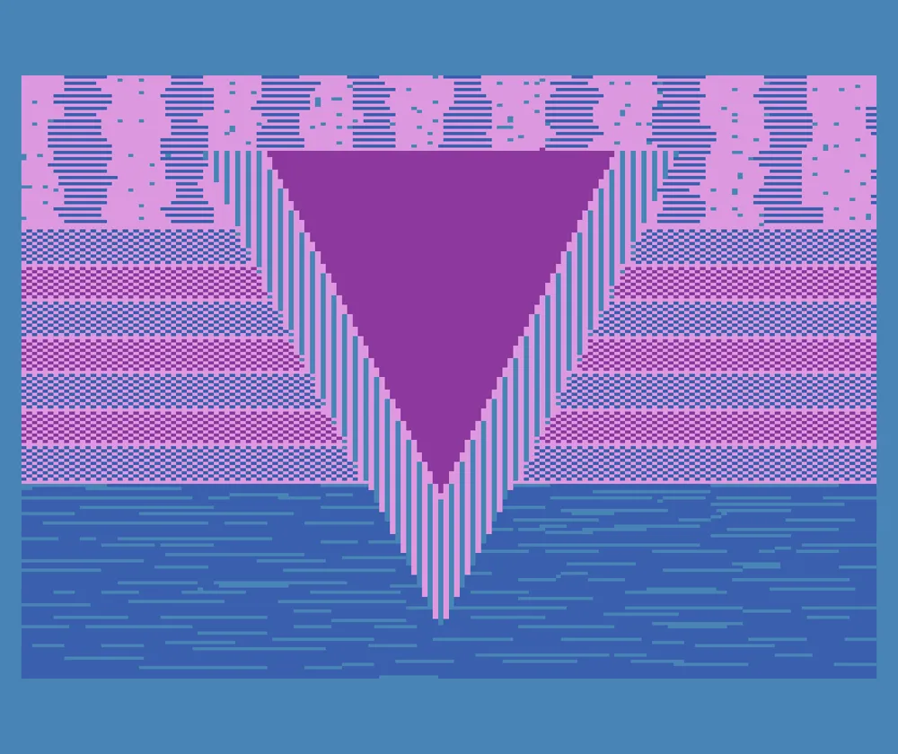
But knowing that this new GTIA chip was in my computer, I wanted to figure out a way to use it. I did this by modifying a type-in program from Compute! magazine called The Fluid Brush. It was little more than a demo that let you draw pictures using a joystick in one of the four-color graphic modes. You could change brushes and colors as you were drawing, but there was no way to “pick up” your brush to move it to a different part of the screen, and there wasn’t any way to save or open picture files.
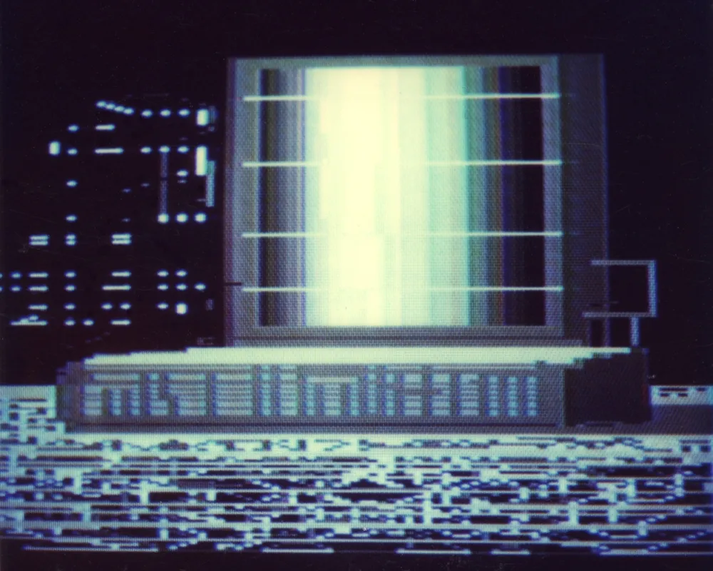
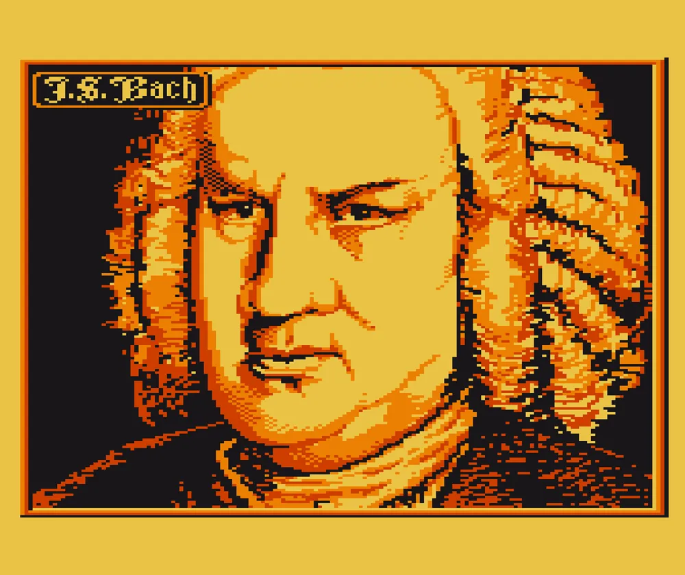
So I modified it to work in the new graphic mode 9, which allowed up to 16 shades of a single hue. This let me draw 16-shade grayscale images. The pixels in this mode were four times wider than they were tall, so the screen resolution was higher vertically than horizontally, a trade-off for getting more colors. (Until I figured out a a way to save files, I had to take Polaroid photos of the screen, as you can see above.)
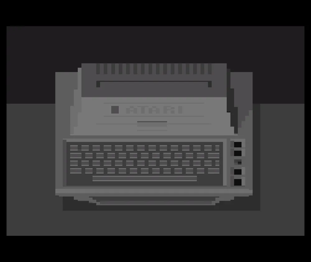
Mode 10 was also interesting since it let you use up to nine arbitrary hues and shades at once. I made a version that worked in this mode and then added a way to save and load pictures. Next I changed it so you could move the brush around without painting.
Since I was getting more serious about all this, I got an 810 floppy disk drive and an Atari 800, which had more memory (48K), a real keyboard, and better video output.
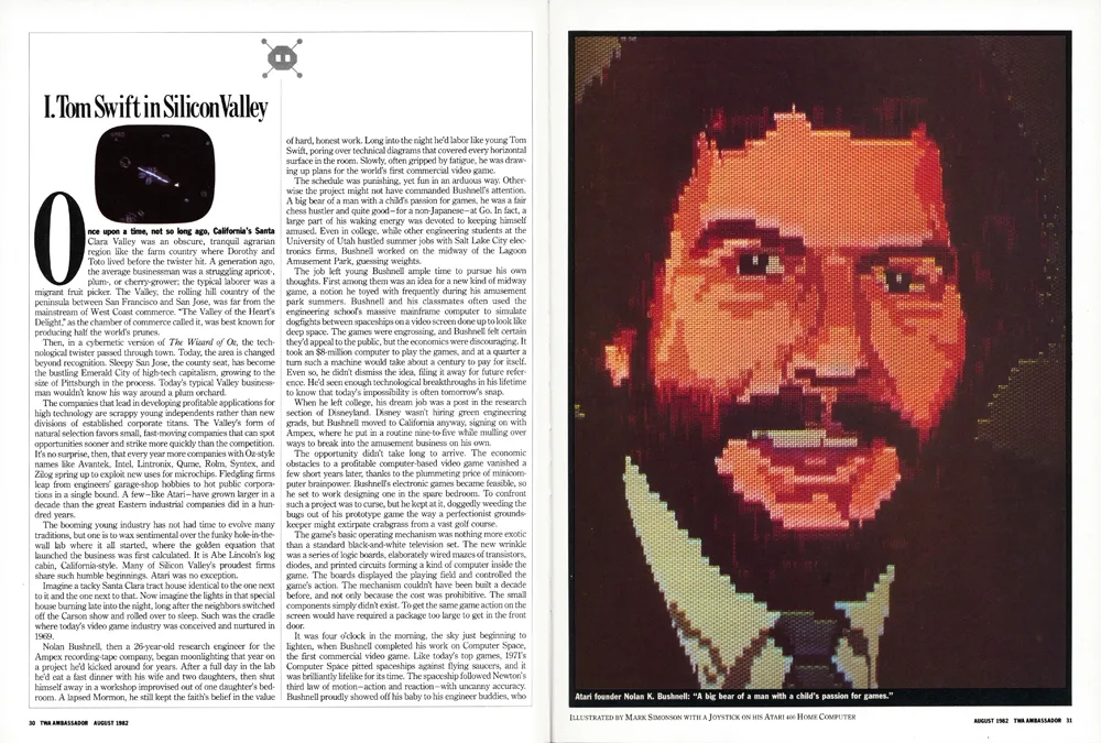
Right around this time, I had left my job as assistant art director at TWA Ambassador magazine and had gone to work at Minnesota Public Radio. The new art director at Ambassador, Barb Koster, knew I had an Atari computer, so when they did an article about Atari in 1982, they hired me to make a digital portrait of Atari’s founder, Nolan Bushnell. I used my mode 10 paint program to do it.
The image needed to be in “portrait” orientation for the magazine. Because TV screens are “landscape” orientation, I had to work sideways. They gave me a photo of Bushnell as reference, which I enlarged and traced onto a sheet of clear acetate. I taped this to my 13” TV screen as a guide for drawing the portrait. For the “final art,” a photographer shot the image directly from my TV screen. There wasn’t any way for me to get good color printouts back then, and forget about sending digital artwork to a magazine. Things like JPEG, TIFF, and PDF were more than a decade away.
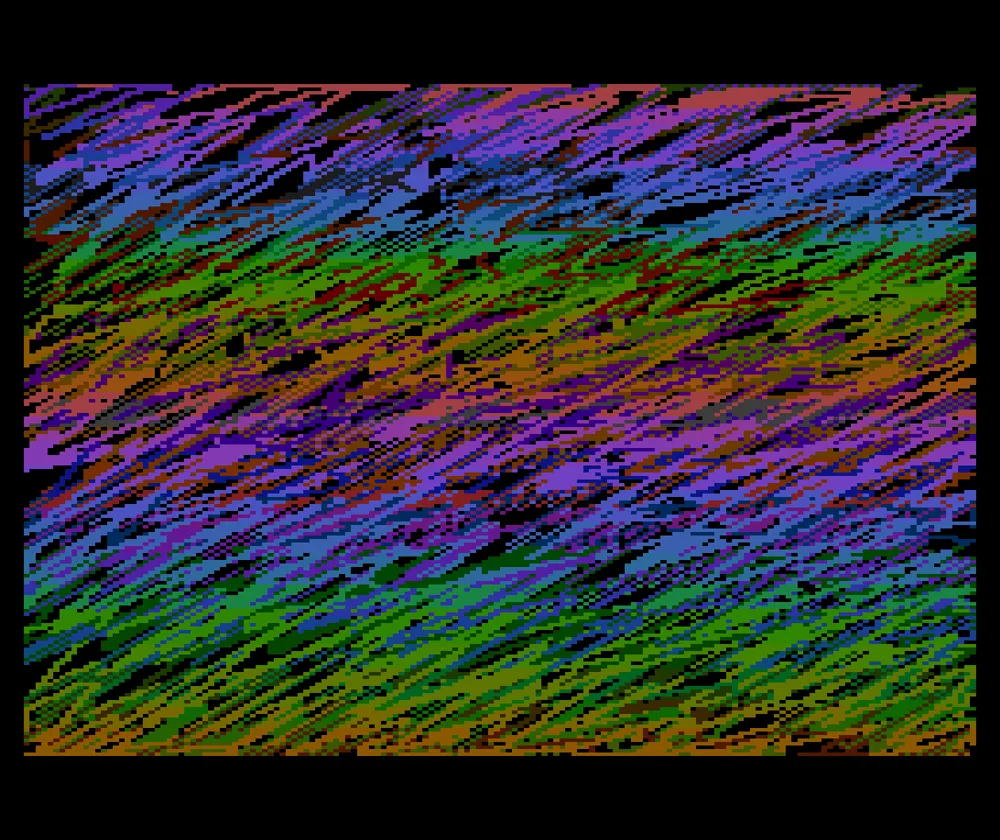
I bought a few other joystick-based “paint” programs, including Graphic Master and Fun With Art. Graphic Master used the Atari’s one-color/two shade “high res” mode of 320 by 192 pixels. It seemed to be meant for making technical diagrams and had a rudimentary copy and paste feature. It allowed me to work at the Atari’s highest resolution, though in black and white only. Fun With Art came on a cartridge and used the same four-color mode as Micro-Painter, but used an Atari graphics trick that let it display up to 128 colors at a time, but no more than four per row.
I had two different graphics tablets for the Atari, which worked more or less like a modern Wacom tablet. First was the Koala Pad. It had a great drawing program called Micro Illustrator. Unfortunately, the Koala Pad surface was square, unlike the TV screen, so you had to adjust to the difference in aspect ratio when drawing. Atari introduced its Atari Touch Pad not long after, which was larger and matched the aspect ratio of the screen. It used the same great Micro Illustrator software.
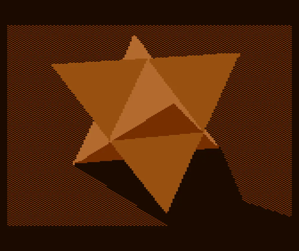
I also had a program called Atari World in which you could create 3D wireframe models. I used its screen capture feature so I could bring the models into paint programs to add color and shading.
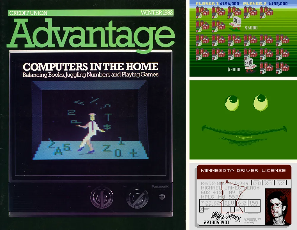
Over the next two years, I did illustrations with my Atari for other magazines, including Credit Union Advantage, where I was design consultant in my spare time, two illustrations for The Farmer, a magazine that shared the same publisher as *Ambassador,*and a “digital driver’s license” for AAA Magazine.
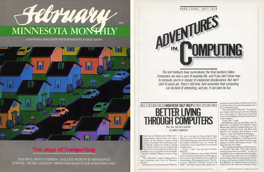
When I went to MPR, I became art director of Minnesota Monthly magazine. For the February 1984 issue, we did a feature article about home computers. I did the cover illustration using Fun With Art and headline type inside using Graphic Master, recreating our house typeface, Alternate Gothic, in bitmap form.
I also made some fonts on the Atari. It didn’t support fonts the way modern computers do. You could use a custom font in your own programs, but, unless you did some tricky programming, only one font was active at any time. You couldn’t use them in off-the-shelf word processors or text editors.
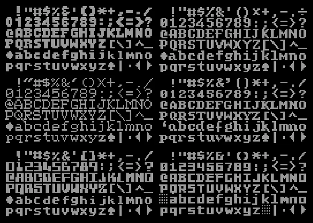
Each character in an Atari font had to fit into an 8 by 8 pixel square. The screen could fit 40 characters across and 24 characters down in the normal text mode. There were 128 possible characters, and you could also display any of them in reverse.
The fonts I made were mostly for fun, since there wasn’t any easy way to use them normally. I did have some ideas for programs and games they could be used for, but I never got very far with it.
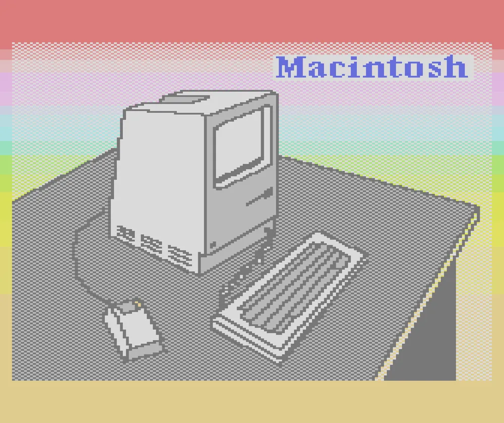
Just as I was getting pretty good at doing graphics and programming on the Atari, the Apple Macintosh was launched in January 1984, and I had to have one. As much fun as the Atari was, the Mac was much more advanced. It didn’t have color, but it had a high-res screen and was much faster, with a mouse and graphical user interface. You could do a lot more with it, like use multiple fonts in a word processor or graphics program.
It felt like the future—and it was the future, as it turned out.
I still did stuff with my Atari after I got my first Mac, and had them side by side on my desk. I was even writing articles for my local Atari user group newsletter on my Mac. Although the Atari was better for games and it was fun to write programs for it, I could see the Atari 8-bit platform didn’t have much of a future. The prices of Atari computers had dropped so low that I could afford a third one—an Atari 800XL. But by 1986, I was barely using it. I tried to learn programming on the Mac, but there was so much else you could do with it, like making real fonts.
Later, in the mid-nineties, when I first started using the internet, I discovered a thriving community of people who were still using old Atari computers, and connecting them to modern Macs and PCs. There were even emulators that let you run Atari software on Macs and PCs. During this time, my dad made a cable for me that let me transfer my old Atari floppy disks to my Mac as disk image files that could be used with an emulator. This also meant that I had a backup of all my old Atari files and programs.
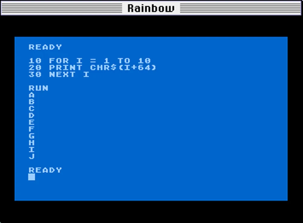
By this time, I had released my first commercial fonts, Felt Tip Roman, Proxima Sans, and Kandal. For fun, I created a PostScript version of the Atari screen font, which I called Atari Classic. I did three different versions: Chunky, Smooth, and Extra Smooth.
I was also starting to learn HTML. My first website, Mac/Atari Fusion, was all about ways you could use Macs and Atari computers together, which I was trying to do at the time. I posted my Atari fonts there as “freeware”. The site is still up, although I haven’t updated it other than posting new versions of my Atari fonts.

This website got the attention of Kevin “Kay” Savetz who, at the time, was building a couple of websites (atarimagazines.org and atariarchives.org) to host searchable archives of old Atari magazines and books. He got me involved in scanning and OCR’ing magazines that I still had. I also created most of the graphics on those two websites. He’s still very active in the Atari community and is one of the hosts of ANTIC, The Atari 8-Bit Podcast.
I gave away most of my Atari gear, books, and magazines about 10 years ago, keeping the 800XL and few other things so I could fire it up now and then. The technology to work with this old stuff—“retro computing” as it’s called now—has gotten increasingly sophisticated. There are ways to use your modern personal computer as a virtual disk drive and printer for the Atari, devices that let you use SD cards for storage, and, most recently, a device called FujiNet that can do all of the above, plus give your Atari computer access the internet via WiFi. The higher quality Atari pictures shown in this article were produced with the Atari800MacX emulator.
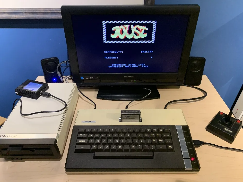
Maybe it’s just nostalgia, but there is something appealing about the simplicity of old computers like the Atari 8-bit line. It’s not very fast (1.79 MHz) and storage and memory are tiny by modern standards. Yet, the entire system architecture is knowable and unchanging. It’s minimalist, in a way. Somehow, the limitations make it more fun to program than a modern computer. And being able to augment it with modern tech makes it a lot easier to use than in the old days.
P.S.: As a postscript (ha!), the Atari fonts I made back in 1996 have become a kind of de facto standard in the Atari retro-computing world. They’re used in emulators for printing to laser printers, for the “hex editor” in a PC-based Atari IDE, and on documentation for various modern devices and software. Even in the Atari world, I’m mainly known for my fonts.
P.P.S.: The title of this post, “De Re Atari”, is a reference to a book by the same name, written by Chris Crawford and published by Atari in 1981. In it, Crawford revealed all the secrets of the Atari 400’s and 800’s advanced graphics and sound capabilities and how to utilize them. It was a goldmine of information for Atari programmers.
