In the late seventies, personal computers were starting to emerge and generate interest among some people. I was mildly interested, but I had no idea what I would do with one. Suggested uses were things like: storing recipes, an electronic address book, or maybe play computer games like Star Trek. Mostly it seemed to be about writing programs in BASIC to, say, store recipes. Anyway, none of this really got me excited enough about computers to actually buy one.
All that changed when I came across a copy of a book by Ted Nelson called Computer Lib / Dream Machines. He wrote the first edition in 1974. The copy I bought was the 1980 edition. In it, Nelson presented a vision of computers as tools to enhance and expand human intelligence and creativity. One of the big ideas he talks about in the book is hypertext, a term he coined. Hypertext is, of course, one of the foundations of the Web, as in HTML, or Hypertext Markup Language. When you click on a link, that’s a kind of hypertext.
But, to Nelson, hypertext was much more than simple links to other documents. He envisioned a new kind of non-linear, dynamic form of literature, with variable levels of detail and hierarchy, tailored to the variable needs of authors and readers, all made possible by computers, which could do things that would be impossible on the printed page. After reading Computer Lib, I had to have a computer. I wanted to be part of this future.
Of course, it didn’t happen right away, this vision of Ted Nelson. When the Mac came out, everyone (including me) was astounded by its point-and-click graphical user interface. However, as I recall reading in one of the computer magazines of the day, Nelson was unimpressed. While he agreed that it was a good start, he criticized the Mac’s WYSIWYG presentation of text and graphics as being too limited, too static and bound to the ink and paper media of the past. The desktop publishing revolution, as amazing as it was for the print publishing world, fell far short of what was possible with this new digital medium.
In a few years, we got the World Wide Web. But, as Gerry Lieonidas tells in his talk (below), we are still in many ways stuck in print-oriented concepts, just as Ted Nelson was complaining back in 1984. When I saw Gerry’s talk earlier this evening, it immediately made me think of Ted Nelson and these ideas that got me excited about computers in the first place.
Gerry, I think you’re onto something.
Above: Gerry Leonidas on The Newest New Typography from Clearleft on Vimeo.
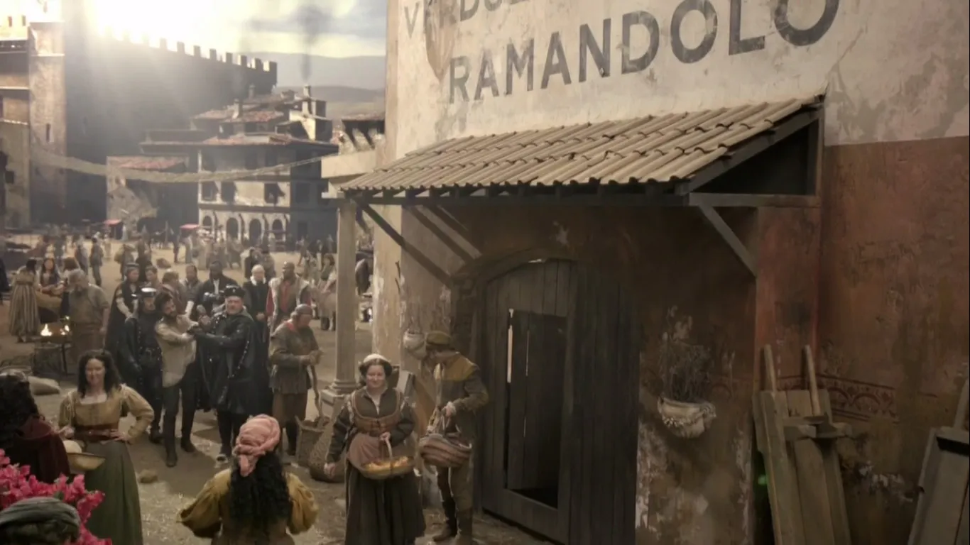
Reader Ivan Filipov sent me this curiosity from the FOX/Starz TV show *Da Vinci’s Demons.*I haven’t seen the show, but this is definitely a typographic anachronism.
First of all, the typeface Gotham (released in 2002) has no place in Renaissance Italy. Gotham is based on mid-twentieth century American vernacular styles. In the Renaissance, the prevailing style, if it were painted on a wall, would have been something more along the lines of the versal hand (for example, something resembling Goudy Lombardic).
That said, the idea that a large painted sign would appear on a building, as shown here, is almost more anachronistic than the choice of Gotham. Signs like this didn’t really exist until the nineteenth century after the industrial revolution and the rise of commercial enterprise and advertising.
Almost no one in the Renaissance could read, so such a sign would be rather useless in any case. If there were a sign at all, it might possibly be in the form of a small inscription near the entrance of the building, or more likely a sign with some kind of symbol or picture.
Anyway, this is definitely wrong for the period. Kind of makes me think of The Flintstones. One star.
(Thanks to Paul Shaw for providing some background on this.)
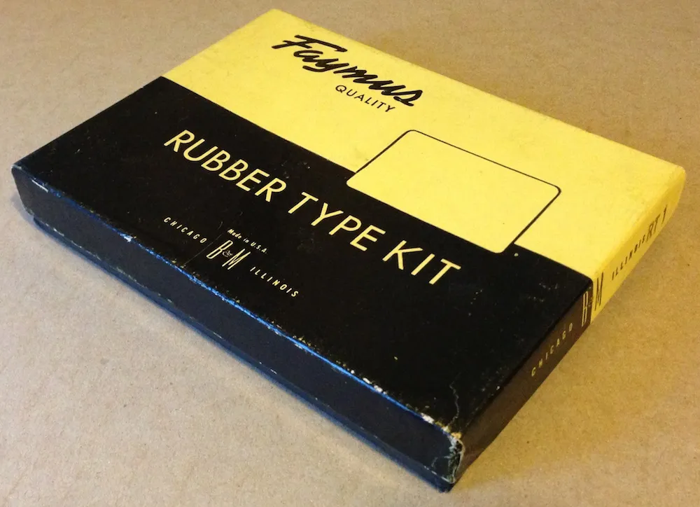
I ran across this today in my studio while searching for something else. Given today’s big Typekit announcement (with which I’m participating), I thought it would be fun to post a photo of it. With this Type Kit, you only got one font.
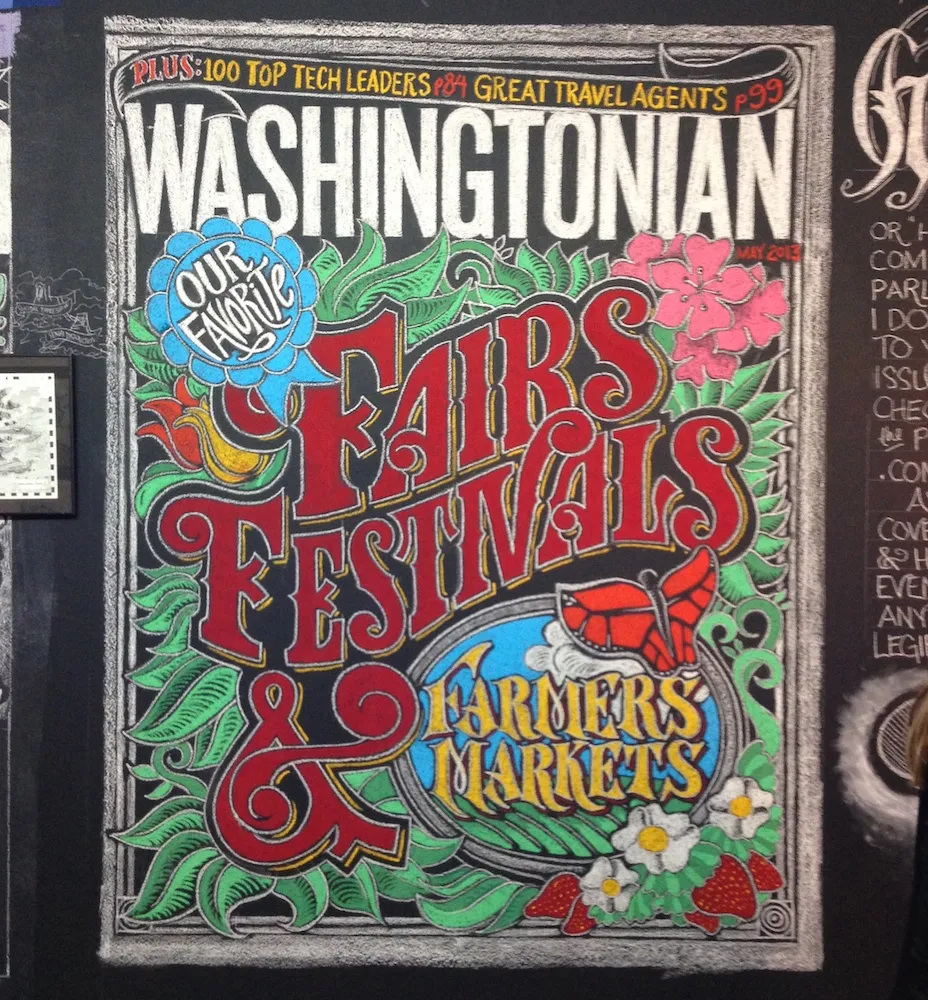
This last Saturday night, I stopped by the annual Saint Paul Art Crawl. It takes place in the Lowertown area of downtown Saint Paul, where former warehouses have been turned into artists’ lofts, starting back in the 1980s. I don’t go to The Crawl every year, but I’m glad I did this year.
One of the artists who had work on display was a guy named Jeff Nelson. Lately, Jeff has been doing wall-sized chalk murals of lettering and illustration at area restaurants. I first noticed one a month or so ago at The Cheeky Monkey in Saint Paul. I didn’t notice who did it at the time, but I knew as soon as I stepped into Jeff’s studio Saturday night. Nice work, Jeff!
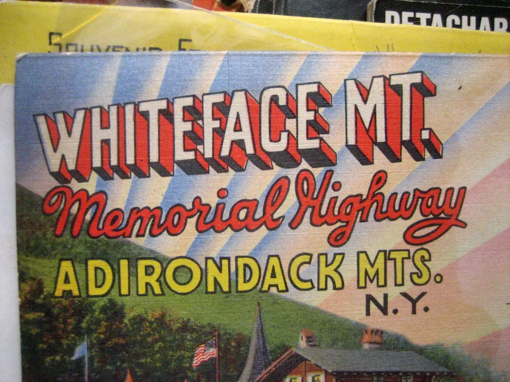
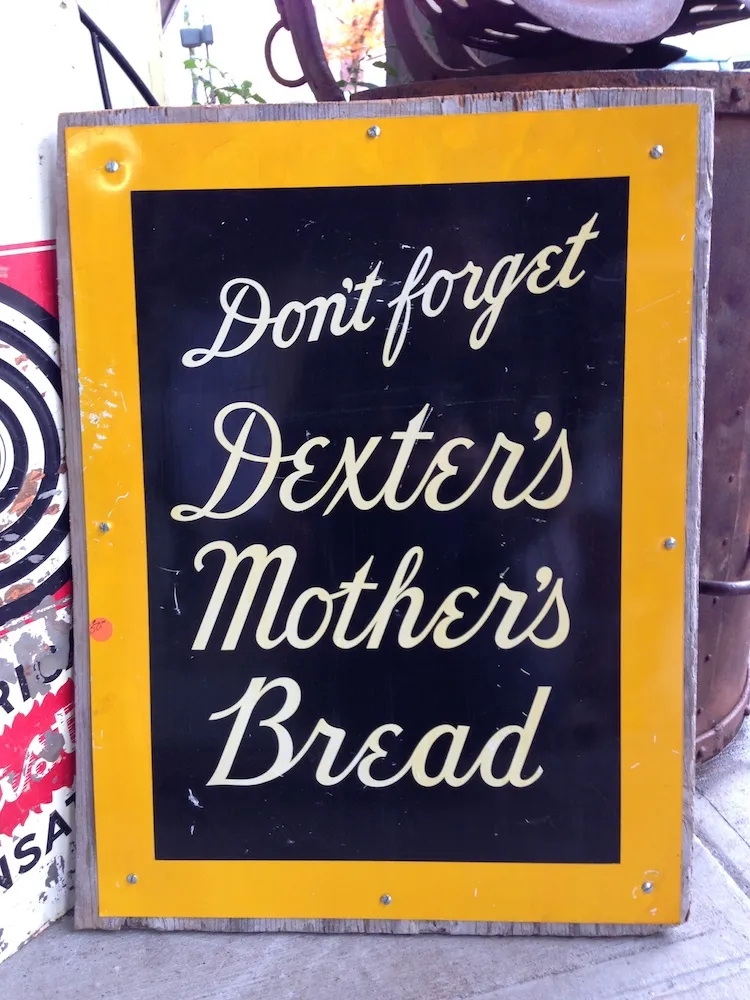
Seen in an antique store (a former dress factory) in Oneonta, New York, July 7, 2007.
