Fellow font guy Stuart Sandler and his partner, Mike Ibach, have launched a new online font venue called Font Bros. The site has some of the same retro look as Stuart’s older Font Diner site, but unlike Font Diner, it offers a hand-picked selection of display faces from a dozen or so independent foundries (including Mark Simonson Studio).
The range of styles covers the whole gamut of type and lettering genres, not just retro. Some of the fonts (like Michael Doret’s amazing Metroscript) are brand new. They are also in the process of remastering the formerly freeware Fontalicious library, bringing it up to professional quality standards.
So, go check it out. It’s pretty cool. www.fontbros.com
Goldenbook and Refrigerator Deluxe have become two of my most popular type families in recent years. The last couple of months I’ve been working on big updates for both of them.
I first released Goldenbook in 2003 in three weights—Light, Regular, and Bold. It was based on the logo of the 1930s literary magazine The Golden Book. Over the years, I’ve made improvements to the fonts and added more language support, but this is the first major update.
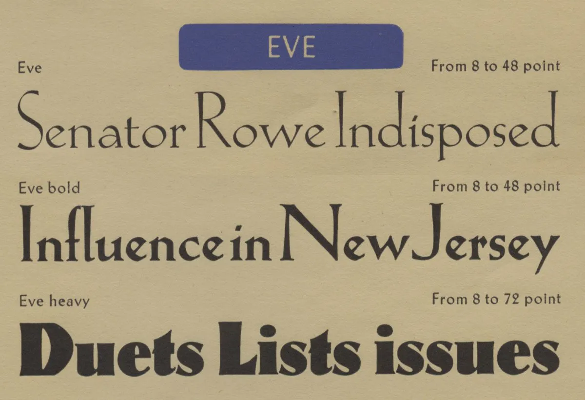 Eve Heavy was the inspiration for adding an ultra-bold weight to Goldenbook.
The three weights I did originally were all fairly light. But I’d long thought about going super bold with it, the way Klingspor did with Eve Heavy. It was really fun to see how bold I could go with it. I initially considered raising the x-height as it got bolder, as Klingspor did. This trick works especially well for low contrast designs, like sans serifs, but Goldenbook has enough contrast that I found I could get away with keeping the x-height the same across the weights. The result is three new styles—Extrabold, Heavy, and Black.
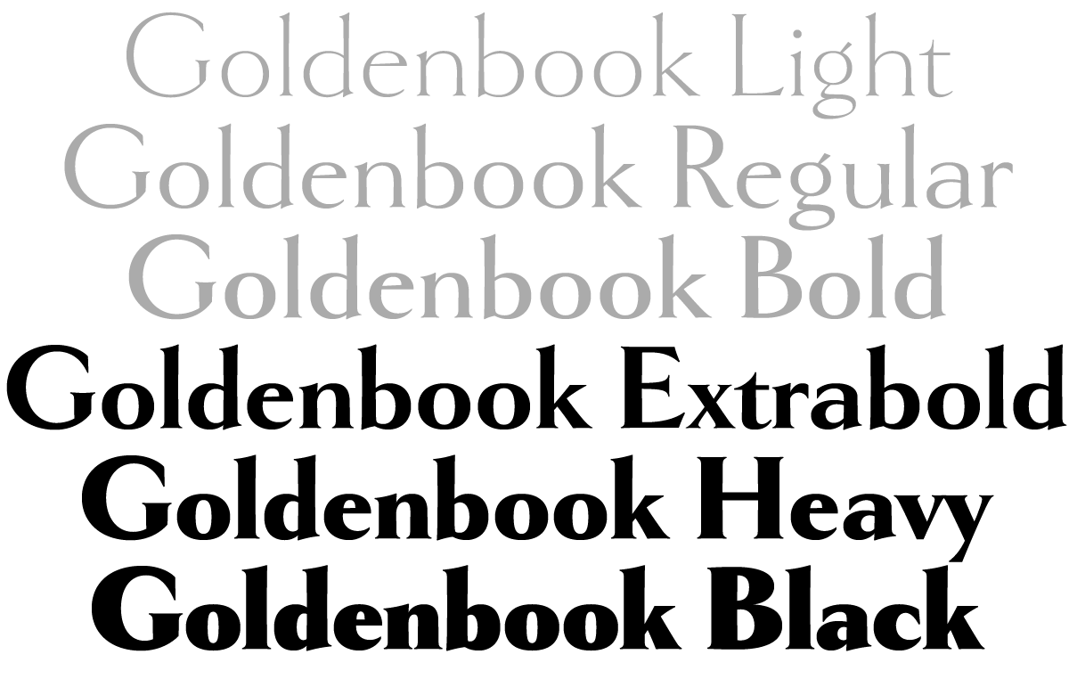 Adding new weights to Goldenbook was not on my to do list. It was something that’d been on my back burner forever, like a lot of things. But I got an email back in December asking whether Goldenbook supported Cyrillic. I had to say no, but the wheels in my brain started turning and the next thing I knew, I was adding Cyrillic to Goldenbook. Once I got going, I figured I might as well do the bold weights while I’m at it.
< figure >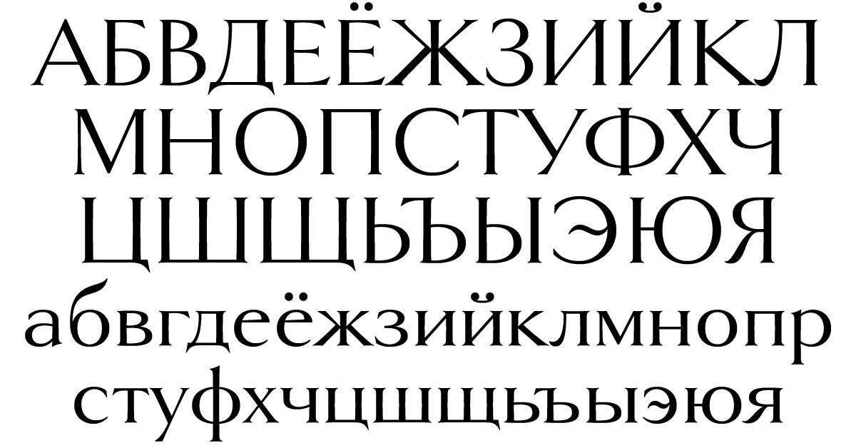
I had a pretty good idea what I thought the Cyrillic should look like, but I’m not Russian, so I got help from someone who is, type designer Ilya Ruderman. Ilya critiqued my designs and pointed out things I never would have noticed (and a few I should have). Thanks to him, I feel confident that Goldenbook will find an audience among Cyrillic users. And it looks super cool.
 I made many other improvements to Goldenbook, like extending language support to add things like the acute IJ/ij for Dutch and the controversial capital sharp S for German. I also added an alternate long-tailed R (a user request), a more traditional-style alternate ampersand, a full set of “f” ligatures, and the historical ct and st ligatures, and long s.
Refrigerator Deluxe began life in 1988, one of my earliest attempts to make a digital font. I’ve updated it, added new features, and expanded the number of styles over the years, but this new version is a complete overhaul.
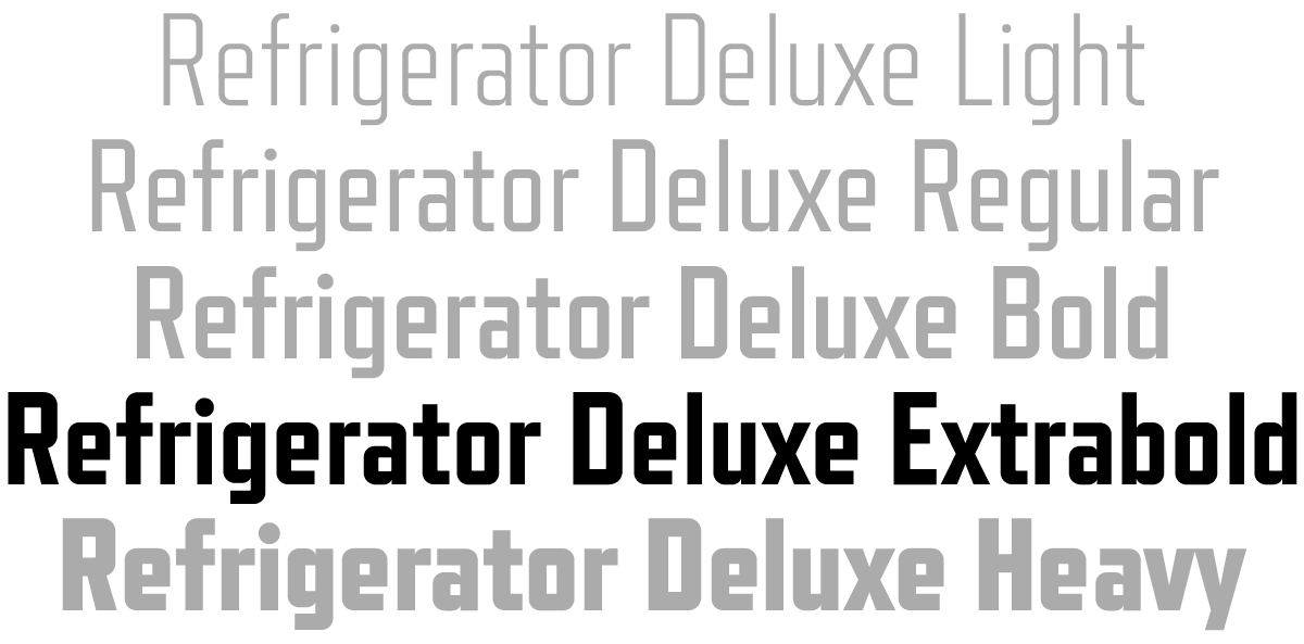 Like Goldenbook, this new version started from a user request to add Cyrillic, but I took the opportunity to make other changes, such as adding a new weight, Extrabold, between Bold and Heavy. Given that I’d started Refrigerator when I was just a beginner at making digital fonts, there were some weird things about the way I constructed it, things I would never do today. So I went through, character by character, and fixed all of it, making optical adjustments and other tweaks to bring it up to my current standards. Most of these changes are subtle and you might never notice, but overall it should be much nicer to work with, and I tried to minimize the impact they might have on existing documents if you are upgrading from the older version.
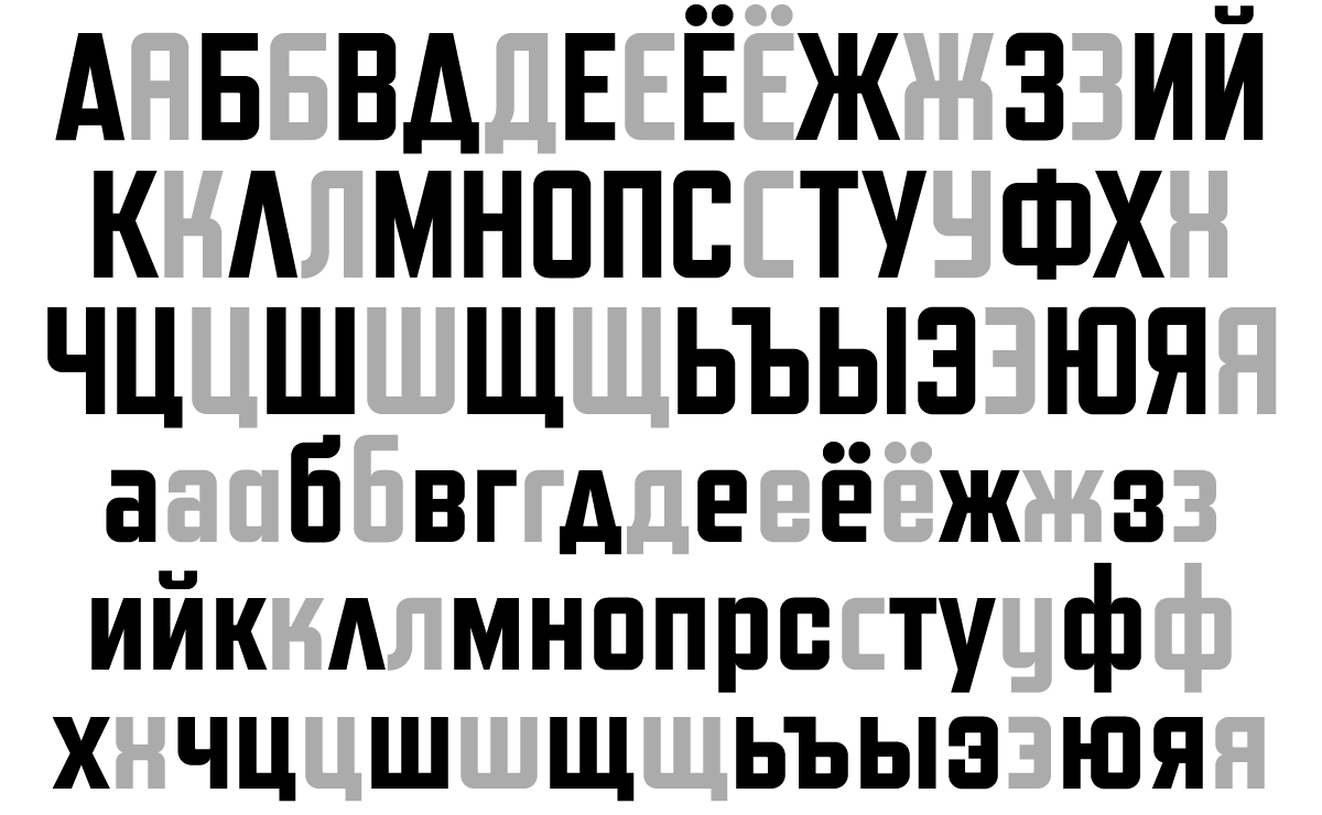 Ilya helped me out on adding Cyrillic to Refrigerator Deluxe as well. Just like the Latin characters, the Cyrillic includes numerous alternate characters to change that you can use to change look and feel of the font to your taste. Like Goldenbook, I extended language support, adding things like the acute IJ/ij for Dutch and capital sharp S for German. I also redesigned the diacriticals (accents) and many other characters outside the core alphanumerics.
 Goldenbook 2.0 and Refrigerator Deluxe 2.0 started rolling out to my distributors yesterday, and some of them (Fontspring 1, 2, and YouWorkForThem 1, 2) have already made them available. If you previously purchased a license for any of the existing styles of Goldenbook or Refrigerator Deluxe, you can get a free update for those styles. Check with the place you got the license from to find out how to get it.
For more information, including PDF specimens and licensing info, see the pages for Goldenbook and Refrigerator Deluxe.
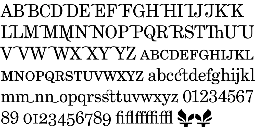
In case anyone’s wondering why I’ve been posting items less frequently lately, it’s because I’ve been working on fonts. The family closest to completion is Phil Martin’s Grad. It consists of just three fonts (plain, italic, bold), but I’ve been getting a little carried away and have added small caps, ligatures, old style figures, swash characters, and even a few dingbats (see above). All of these existed in Phil’s original private version of this face which he used for a couple of newsletters he published in the 1990s. If one had a mind to, one could recreate Re:Language, Millenium Memorandum, or even Phil’s personal stationery. Yes, some of the characters in Grad are…unusual. But that’s Phil for you. Ever the iconoclast.

Some might say that Grad is nothing but Century Schoolbook in drag. There is some truth to that. And I think Phil would even agree. But looking over Phil’s output from the late sixties through the eighties, this is the kind of thing he does best. I have come to the conclusion that Phil is the George Barris of type designers. Phil’s best-known faces were redesigns, customizations, or hybrids of existing—often classic—faces. In the type world, such an approach to type design is sometimes looked down upon. Yet Phil is very good at it. He considers Grad one of his best.
Grad is an unusual font for me to develop. It’s not a design I would have conceived myself. Nevertheless, it’s turning out very nicely. I’m putting everything I know into making it a well-tuned machine that works as well for text as for headlines. In order to accommodate all the extra characters Phil designed, I’m planning to release it in OpenType format. This will mean that things like the real small caps and alternate characters will be accessible from a single font in each style. I plan to also do Grad Condensed at a later date, completing the family.
In the mean time, I have other fonts in the works, including a re-release of Proxima Sans. The new version will have more weights (lighter, bolder, and more in-between) as well as condensed and semi-condensed styles. Plus small caps and other typographic niceties. More information on this as it develops.
For more about Phil Martin, see my interview with him on Typographica or visit his personal website. [Update: Phil died in 2005 and his original site is long gone, but I’ve linked to an archived version on archive.org.]

One of the fonts I’m getting close to finishing is Grad, the most recent type design of Phil Martin. Phil designed it in the early 1990s for use in a newsletter he published called Re:Language. Until I started work on it earlier this year, it only existed as a set of bitmap fonts on Phil’s old DOS computer, and it only worked with the old desktop publishing/word processing program XyWrite.
Grad is essentially an enhanced and augmented version of Century Schoolbook. While Phil did his version by modifying bitmaps of the Bitstream version of Century Schoolbook, I went back to original American Type Founders specimens, creating my own version of Century Schoolbook, rather than relying on existing digital versions. My Century Schoolbook fonts won’t be released, but were used as the basis for the new Grad.
Stylistically, Grad is similar to late nineteenth century faces like Ronaldson or Bookman, with other touches that could only come from the mind of Phil Martin. In the initial release, there will be three styles: Regular, Italic, and Bold (as shown above). There is also a condensed style planned for later release.
If you want to see it in action in text, here is a PDF from Phil’s website (a chapter of his on-going autobiography) which is set in the final PostScript Type 1 versions of the fonts. [Update: Phil’s website no longer exists.]
I’m doing Grad at Phil’s request, but I will be marketing it in the usual venues and splitting the revenues with Phil.
At long last, two totally new, original typeface families! The last new one was Bookmania in 2011, which admittedly was a kind of revival, so not totally new and original. For that you have to go back to Lakeside, which I released in 2008—ten years ago! In any case, it’s about time. I have many more in the works, so stay tuned.

Acme Gothic is based on the thick-and-thin gothic lettering style popular in the U.S. in the first half of the twentieth century. There have been typefaces in this genre before, but they were either too quirky (Globe Gothic), too English (Britannic), too Art Deco (Koloss), too modern (Radiant), or too Art Nouveau (Panache). None captures the plain, workman-like, vernacular style of Acme Gothic.
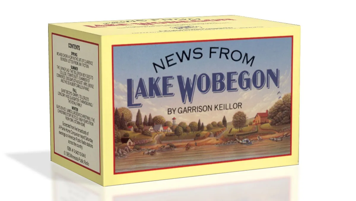
I’ve used the “thick and thin” gothic style in lettering projects as far back as 1982 (the “News From Lake Wobegon” audiocassette package I designed for A Prairie Home Companion). Off and on since the 1990s, I tried turning it into a typeface, but it wasn’t until 2012 that it finally started to come together. My aim was to make a font that feels like a revival of a long-lost metal typeface from the 1920s, but one that never happened to exist.

There are five widths (Compressed, Condensed, normal, Wide, and Extrawide) each with five weights (Light, Regular, Semibold, Bold, and Black) for a total of 25 different styles. Acme Gothic has extensive language support, covering most Latin-based writing systems.

Acme Gothic also includes both small caps and raised small caps (accessed through an OpenType stylistic set) both of which can be found in vintage examples of this lettering style.

Parkside is a script typeface inspired by typefaces and lettering of the 1930s and 1940s. Unlike metal typefaces from that era, it takes advantage of modern digital typography, where letters may overlap and automatically change shape to flow better with surrounding letters.
The idea for Parkside came to me in the mid-1990s, around the same time that I was first working on Coquette (released in 2003). You could say that Coquette and Parkside are cousins. Unlike Coquette, Parkside is a connecting script, with more contrast and less geometric forms. But it shares many of the same stylistic ideas, especially in the capital letters.

There are six weights: Hairline, Thin, Light, Regular, Bold, and Black. Parkside has extensive language support, covering most Latin-based writing systems. Parkside uses OpenType magic to automatically select letter variations that seamlessly connect to the letters coming before and after.

In 2003, I released my interpretation of China, an old VGC face, which I called Changeling. I redesigned many of the characters for more even type color. I also added lowercase-style variants to nearly all the uppercase forms, for endless “unicase” combinations, alternate forward- and back-slanting characters for A, M, V, and W, and a more complete character set. I spaced it to emulate the “tight, but not touching” style of spacing popular in the ’70s. Finally, I created four new styles—Light, Regular, Stencil, and Inline.
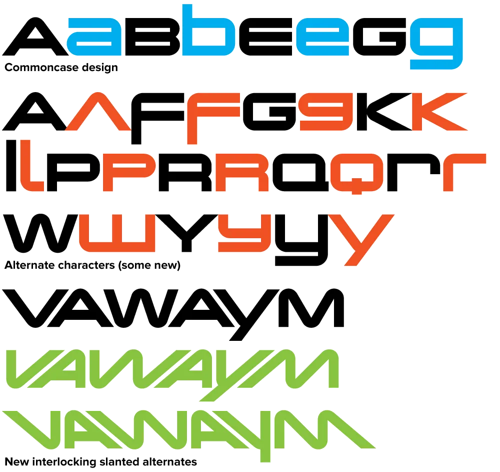
Changeling Neo (2008) builds on this with even more alternate characters (including a few from VGC China I had previously left out), extensive language support, and lots of improvements in fit and finish. Changeling Neo is available exclusively in the OpenType format. Alternate characters are accessed using OpenType Stylistic Alternates and Stylistic Sets features. Standard characters that were “hijacked” in Changeling (to make room for alternate characters) have been reinstated. Changeling Neo also includes support for fractions, superscript and subscript, as well as tabular figures.
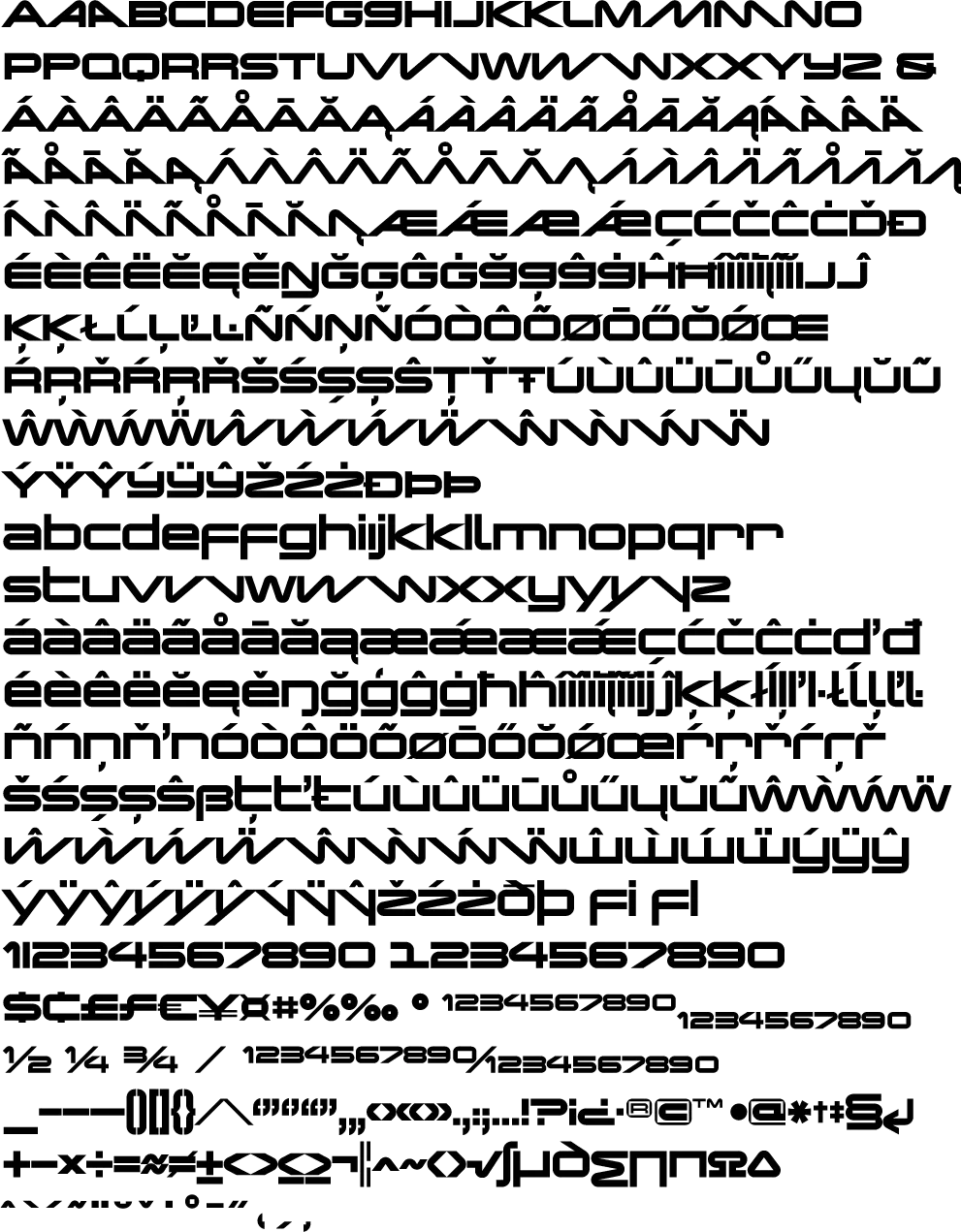
For more information, I’ve made two PDFs you can download:
Changeling Neo is available now.
