Proxima Nova version 2.008 is a major update. I’m in the process of getting it out to my distributors and it should be available from all of them within a couple of weeks.
New styles
Proxima Nova Medium. This is a new weight, available for all widths and styles. It sits between Regular and Semibold. It actually goes back to 2006, less than a year after Proxima Nova’s initial release. It was a custom weight requested by a UK magazine publisher. I’ve finally decided to officially invite it into the family.

For customers who have licensed an “all weights” or “complete” package, you should automatically get the new Medium styles when they become available at your vendor. The addition of Medium increases the size of the Proxima Nova family to 48 fonts in eight weights. Because of this, the prices of the “all weights” and “complete” packages will go up a bit accordingly.
New glyphs
- Prime and double prime, superior to “dumb” quotes for things like minutes, seconds, inches, and feet.
- Interrobangs because, well, why the hell not‽
- Small cap ¿ and ¡, which were mysteriously missing before. Okay, not so mysterious. I just forgot to put them in.
- Indian Rupee, a new currency symbol. Pretty clever and well thought out, as currency symbols go.
- Turkish Lira, another new currency symbol. Not as well thought out, in my opinion.
- Russian Ruble, another new currency symbol. It’s okay.
- Optional tabular figure 1 with serifs. This is used when you enable Tabular Lining Figures plus Stylistic Set 9.
- Capital eszett, (ẞ). Some German speakers think this is a stupid idea, some think it is long overdue. It’s there if you want it.
- A few additional Cyrillic characters used in Uzbekistan, Mongolia, and elsewhere.

Design changes
Making design changes to an existing and widely used font is not something I take lightly. That said, there were a couple of things I felt I had to change.

First, I slightly shortened the stroke at the top of the lowercase f to eliminate the need for ligatures. Unlike some fonts, the ligatures in Proxima Nova don’t connect in any way. Instead, they substitute an alternate f with a slightly shorter stroke at the top to avoid colliding with the i and l. Unfortunately, it is frequently the case that ligatures are not used when fonts are used on the web, and it really bothers me. But rather than try to get everyone to fix their websites, I decided it would be simpler to fix my admittedly problematic design of the f and use the alternate f instead, eliminating the need for ligatures entirely.
Second, I slightly shortened the tail of the lowercase j for similar reasons.
Both of these are cases where the me of today wonders what the me of yesterday was thinking. But they are subtle changes, I hope, and I hesitate to even call attention to them in case someone somewhere prefers the old f or j. I expect most won’t even notice the difference, and Proxima Nova will simply look nicer more of the time.
Other improvements
- Better hinting for Windows users. This is mostly an issue on Windows XP, an operating system released in 2001, for crying out loud. Anyway, on all versions of Windows, Proxima Nova will look better.
- Better cross-platform document sharing between the Windows and Mac versions of Microsoft Office. This is mostly related to the non-standard way that the Mac version identifies fonts. If they followed the standard, this wouldn’t be an issue. In any case, it works now, in spite of it all.
- The “bold” style shortcuts now only work with Regular and Regular Italic, yielding Bold and Bold Italic. In earlier versions, Semibold was the “bold” style of Light, and Extrabold was the “bold” style of Thin. Understandably, some Windows users had trouble finding the Semibold and Extrabold styles, not realizing they were hidden behind the “bold” style shortcut. Semibold and Extrabold now are listed in font menus, which should make Proxima Nova easier to use on Windows.
- **Full character sets for the optional fonts.**Proxima Nova Alt and Proxima Nova ScOsf now include the full Proxima Nova character set and language support (including Greek and Cyrillic), not just basic Western Latin.
- **Descriptive names for Stylistic Sets.**This is not widely supported yet, but when it is, Proxima Nova will be ready. So, instead of the sets being listed as Stylistic Set 1, Stylistic Set 2, Stylistic Set 3, and so on, they will be listed as Schoolbook Style, Geometric Sans Style, Alternate Uppercase G, and so on. Really looking forward to support for this, and you should be, too.
Specimens
You can see the new fonts in more detail in the updated downloadable Proxima Nova specimens:
Proxima Nova Overview. The story of Proxima Nova, basic style showings, full character set and technical information. 12 pages. 622 KB PDF.
Proxima Nova Full Specimen. The overview, plus complete text and display specimen for all styles of Proxima Nova, including the full character sets. 156 pages. 5.2 MB PDF.
When I decided to sell the rights to my library of fonts to The Type Founders in 2021, one of the big reasons for me was the ever-growing burden of maintaining and developing that library.
As a one-person studio, there was only so much I could do. Proxima Nova had become very popular since I released it in 2005, and I regularly got requests to expand its language coverage.
At first, I did this task myself, adding support for Greek and Vietnamese in 2009 and Cyrillic in 2010. Even though I can’t read languages that use these writing systems, they were close enough to the Latin alphabet that I felt sufficiently confident to design them. But I’ve always felt out of my depth as a type designer even thinking about designing non-Latin fonts.
Still, I could see that adding even more language support would make a lot of sense for such a popular type family. Theoretically, I could hire other designers and production people to help, either as employees or as contractors. But that would mean managing those people, something I know I’m not very good at.
I like working by myself, and I would rather spend my time working on new typefaces.
It was around the time I was thinking about these problems back in 2019 that I was approached by Paley Dreier (now Managing Partner of The Type Founders) about selling my font library. It was something I’d never thought about before, but I eventually realized that it would be a neat solution to my problems. I would be relieved of the burden of maintaining and expanding my existing fonts, giving me time to focus on designing and releasing new fonts—which is what I’ve been doing for the last few years, with the release of Proxima Sera, Dreamboat, Proxima Nova Wide and Extra Wide, Viroqua, Cheesecake, Madcap, Gertie, and Skin & Bones. In fact, I’m currently working on a new sans serif family, the first since Proxima Nova, if you don’t count display faces.
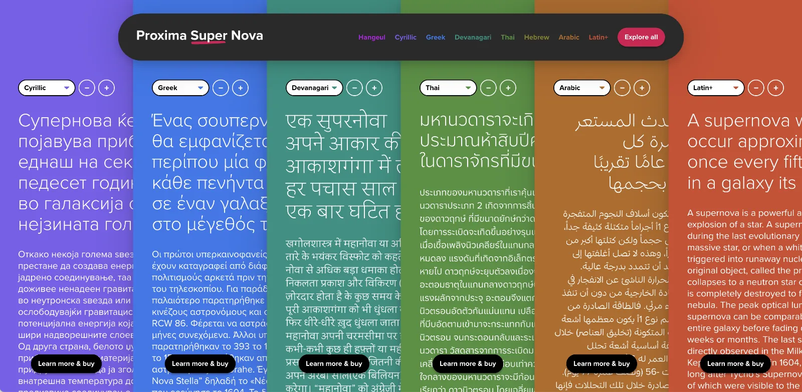
In the meantime, The Type Founders has been working to expand language support for Proxima Nova, with the aid of some really talented type designers from around the world. We’ve dubbed the fruits of this effort Proxima Super Nova.
In addition to most Western and Eastern European Latin, Greek, Vietnamese, and Cyrillic, Proxima Nova now supports Arabic, Devanagari, and Thai (both looped and loopless). More writing systems are in the works, including Hebrew and Hangeul.
Check out the Proxima Super Nova mini-site to find out all about it.
If you have any questions, are interested in extended or enterprise licensing, or need additional language support or customizations, get in touch! Send a note to info@marksimonson.com
A big thanks to the following people:
Proxima Nova Thai: Smich Smanloh of Cadson Demak
Proxima Nova Devanagari: Vaibhav Singh and Alessia Mazzarella of Typeland
Proxima Nova Arabic: Khajag Apelian and Wael Morcos
The mini-site: Elliot Jay Stocks (site design and content development) and Roel Nieskens (site development)
Project management and production support: Glenda Bellarosa and Dyana Weissman
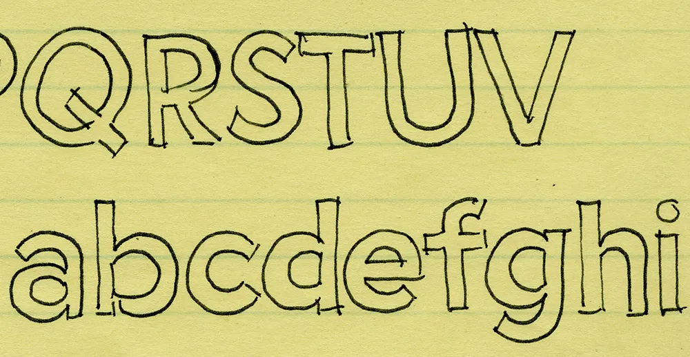
I’ve been working on this font family for almost 25 years. Here’s an early sketch (possibly the first one) from 1981:
Here’s Proxima Nova Bold for comparison:
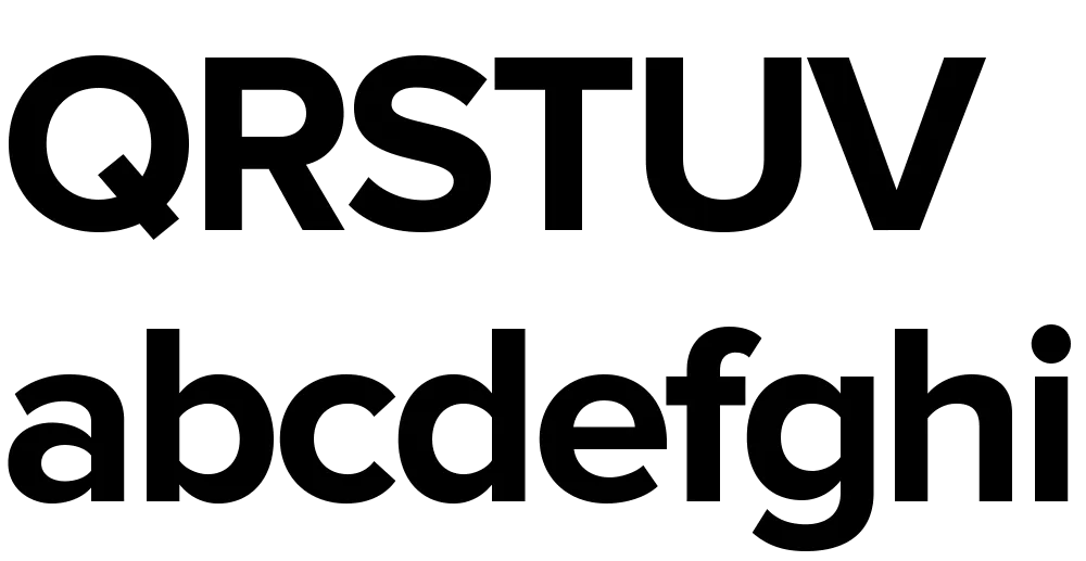
The caps are a bit different from the early concept sketch (they started out with proportions more like Futura), but my concept for the lowercase has remained virtually the same all these years.
Proxima Sans (released in 1994) was my first attempt to realize that concept, and one of the first major fonts I developed. Proxima Nova, just released today, has ten years more thinking and experience behind it. It also fulfills many of the plans and ideas I had for Proxima Sans—small caps, wider range of weights and styles (including Condensed and Extra Condensed), and things I never dreamed of, like extended language support and UniCode.
If you want to know more about this new family of fonts, here are some links:
There is also a comprehensive 93-page PDF sample book. I split it into two parts in case you just want to look at the overview (the first part):
Proxima Nova Overview This nine-page introduction has complete information about the fonts with one-line display samples and a page of text samples. (420k PDF)
Proxima Nova Full Specimen This 84-page comprehensive specimen devotes two pages to each of the 42 Proxima Nova fonts—one with display showings and one with text samples and complete character set. You might want to make sure your printer has enough paper before printing this out. (2.2mb PDF)
Yes, I know. I haven’t been posting a lot on Notebook lately. There’s a good reason for this: Proxima Nova. That’s what I’m tentatively calling the new improved version of my ten-year-old Proxima Sans, one of the most ambitious font projects I’ve ever undertaken. Here’s how it looks so far:
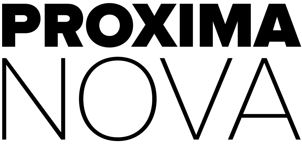
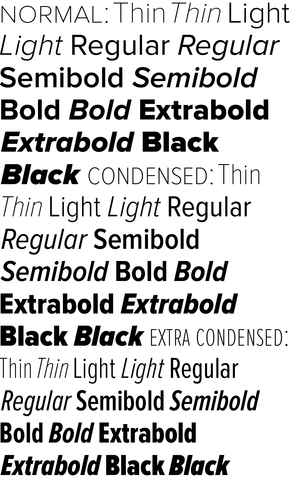
Ever since I released it in 1994, I’ve had in the back of my mind larger plans for Proxima Sans. Small caps. More weights. Condensed styles. After some potential customers asked about such possibilities early last year, I decided it was time.
The new version will have more than new weights and features. I went over every character, refining and retooling the design, adjusting, perfecting, cleaning up. In short, this is completely new set of fonts.
Proxima Sans
Released: 1994
3 weights, 2 styles
6 fonts total
PostScript Type 1, TrueType
Basic Western Latin
245 characters
Proxima Nova
To be released: Soon
7 weights, 2 styles, 3 widths
42 fonts total
OpenType
Extended Latin (including CE)
699 characters
699 characters? You read that right. Take a look:
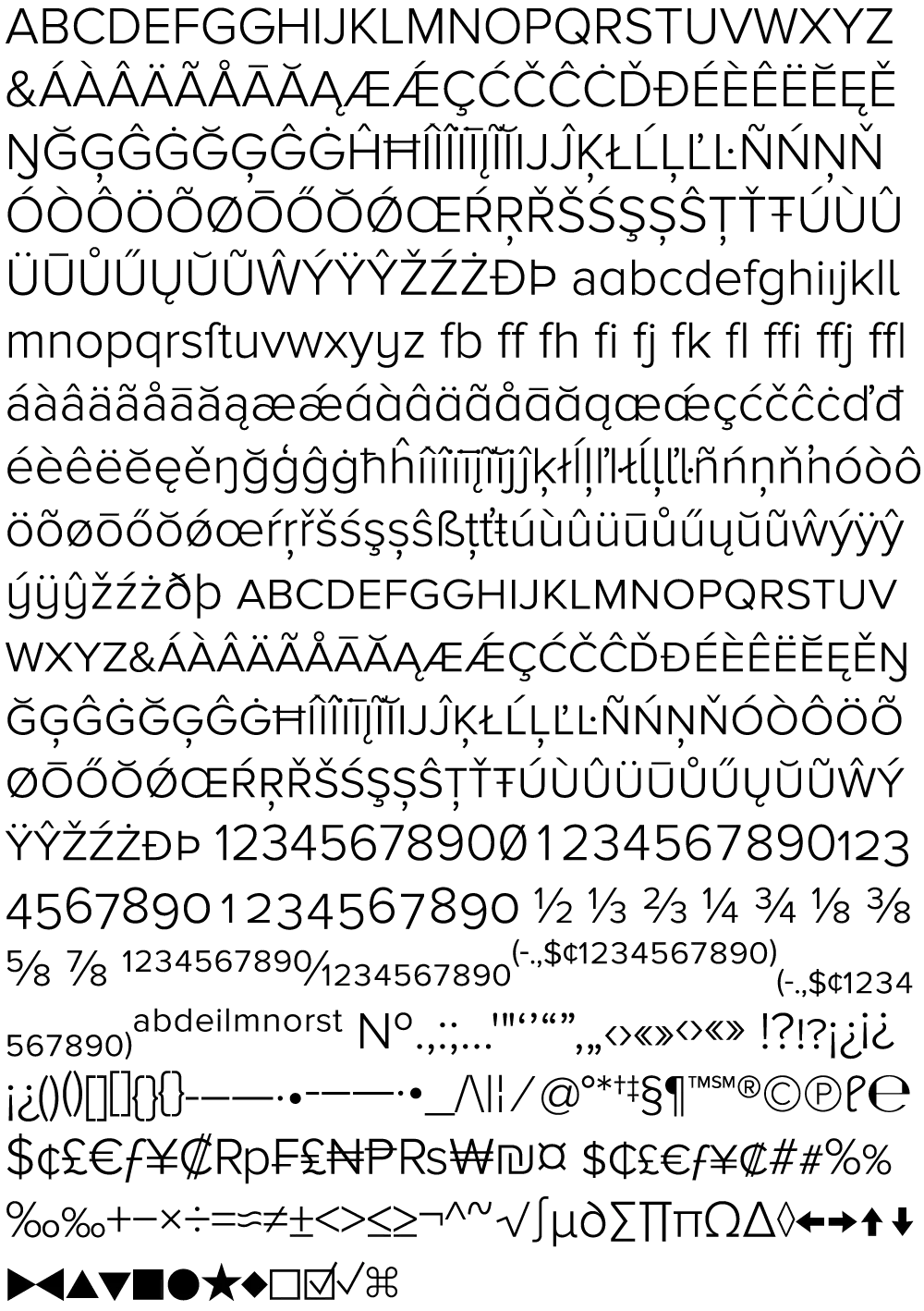
All the characters from Proxima Sans are still there (even the dingbats). But there’s loads of new stuff, and every weight has all this in it, all in one font. No separate “expert” fonts needed.
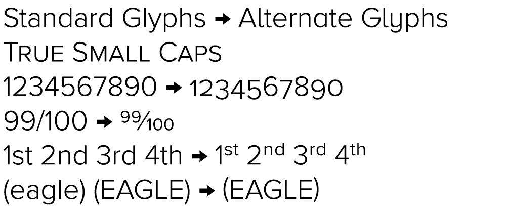
In order to keep these hundreds of characters under control, Proxima Nova will be released in OpenType format. Using popular graphics software like Adobe’s Creative Suite and (real soon now) QuarkXPress, you will be able to tap into sophisticated typographic effects such as:
- True small caps
- Lining and old style numbers
- Proportional and tabular numbers
- Automatic “f” ligatures
- Alternate character designs for some characters
- Automatic fraction creation
- True superscript and subscript characters
- Automatic ordinal formatting (e.g., 1st, 2nd, etc.)
- Case-sensitive alternate forms for parentheses, brackets, etc.
- Alternate forms of certain characters to match small caps and old style numbers
- Cross-platform compatibility
As to how soon Proxima Nova will be available, it’s difficult to say. The roman styles shown here are in the final stages of completion. It mostly depends on how long it takes for me to finish the italics. Sure, I could just hit the “slant” button and be done with it. But, it’s not so simple to do it right. Best guess: Spring 2005.
6/24/05 Update: If all goes as planned, Proxima Nova will be released by the end of June 2005. I’ve updated the graphic above showing the various weights and styles to include the italics. Also, the weight and style names are slightly different than what I originally announced here in March.
6/30/05 Update: It’s available now.
I’ve recently been working on a font for Microsoft called SketchFlow Print. It will be bundled with the next version of Expression Blend, part of Microsoft’s Expression Studio suite. A new feature of the program, called SketchFlow, allows a designer to create a prototype of an application that looks like a sketch, and it comes with fonts to support that look. Christian Schormann, one of the brains behind the app, demoed SketchFlow at MIX09, and you can see SketchFlow Print in use throughout his presentation.
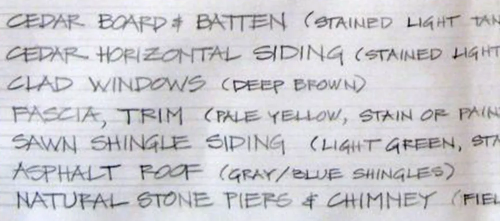
The idea for SketchFlow Print came from Doug Olson at Microsoft, who wanted a typeface in the style of lettering used by architects. There are already many “architect” fonts, but none of them had the natural, lively look he wanted. Doug had worked previously with talented residential architect Michaela Mahady of SALA Architects, Inc., and was taken by her lettering. She agreed to let it be the starting point for SketchFlow Print and provided samples for me to work from.
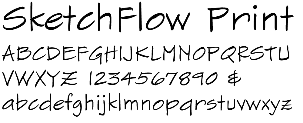
Typefaces based on handwriting can be tricky because typefaces are unnaturally consistent compared to real handwriting. This problem is sometimes overcome by using multiple variations of common letters, which can then be substituted automatically or manually to avoid obvious repetitions. Fortunately, Michaela’s handwriting is quite neat and consistent already, so we decided to keep it simple and just have one version of each letter. The challenge for me was to make subtle changes to minimize conspicuous patterns or disruptions in the overall texture, without resorting to alternates or draining the life out of it. All of us are pretty happy with the way it turned out.
One of my favorite bloggers, Jason Kottke, posted an item and link today about a story on the NPR site about “the longest word in the English language”.
This piqued my interest. When I was a kid I used to watch the Mike Douglas Show every afternoon after school. One time he had some sort of word expert on the show who revealed what the longest word was. I was impressed and taught myself to pronounce it correctly (still can).
Was it still the longest word? Sure enough, it was in the article:

Well… not the longest word anymore, if it ever was.
But then I noticed that all the “long words” in the article were set in one of my fonts—Felt Tip Woman! (My partner, Pat, whose handwriting was the model for Felt Tip Woman, loves words and language, not to mention NPR, and thought this was pretty cool, too.)
So I memorized a word that’s not really as special as I thought it was. On the plus side, NPR is using one of my fonts, so I’m happy anyway.
