I’m known as a type designer—and fonts are pretty much what it’s all about here on my website, and in my life in general. But I haven’t always been making fonts. At various points of my career (which goes back to 1976) I’ve been a graphic designer, art director, web designer, package designer, product designer, lettering artist, and—very early on—illustrator.
Learning to Do Caricatures
My most active period as an illustrator was for Metropolis, a weekly newspaper in Minneapolis (1976-77). Patrick JB Flynn was the art director. Fairly soon after I started working for them, he asked if I could do caricatures. Caricature was something I dabbled in going back to middle school, mostly in a simple cartoon style. My inspiration came mainly from artists like Mort Drucker (Mad) and Rick Meyerowitz (National Lampoon). But I’d never done a full caricature before. Not really. But, I thought, how hard could it be?
And so I started doing caricatures for Metropolis. I wasn’t that good at first, but I got better. I was actually kind of surprised I could pull it off. Caricature is not the easiest skill—even when you can draw well. And some of my caricatures were better than others.
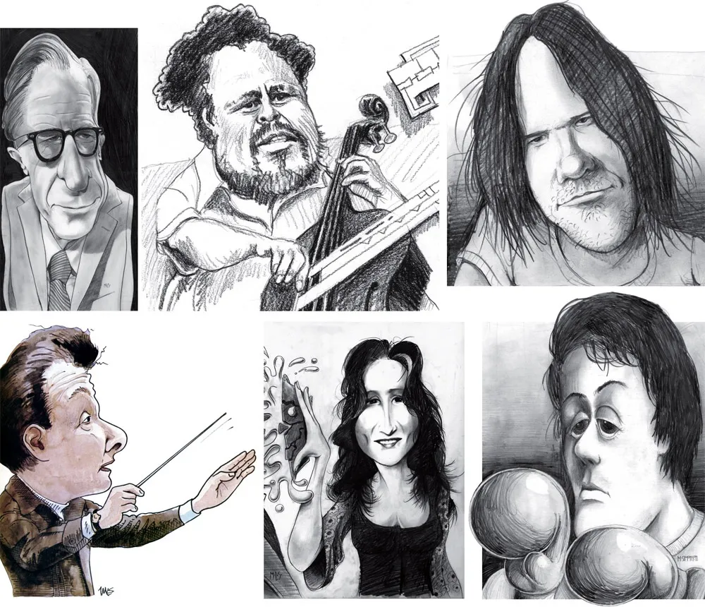
Above, some of my early caricature work. Clockwise f**rom the top left: economist John Kenneth Galbraith, Jr.; jazz bassist Charles Mingus; a “stoned out” Neil Young; Sylvester Stallone as Rocky with “puppy-dog eyes.”; singer Bonnie Raitt; and orchestra conductor Sir Neville Mariner.
After Metropolis, I kind of stopped doing it. I’d also dropped the idea of being an illustrator. It was easier to be an art director, think up the concepts, and let someone else do the drawing. Plus, I didn’t think my caricature style was “in.” It wasn’t the sort of thing I was seeing in the illustration annuals. I associated it with “kid’s stuff” (Mad especially) and felt almost embarrassed by it.
Getting Back Into It
Earlier this year, I made an effort to get back into drawing and other creative pursuits, and get away from staring at a computer screen all day (see my “1979” post from February). I filled up several sketchbooks over the next few months, drawing nearly every day. And then in July, I started doing daily drawings in Procreate on my 12.9” iPad Pro—quick caricature sketches of people I saw on YouTube while watching videos.
Drawing digitally—that is, drawing on a tablet or screen with a stylus—has always been problematic for me, in spite of all the money I’ve spent on Wacom tablets and Cintiqs and iPads over the years. For some reason, I just never took to it, no matter how much I wanted to. It didn’t feel as fluid and natural to me as drawing on paper. So I never did much but doodle, rarely doing a full drawing.
But I had a breakthrough while doing these quick studies. I figured out a technique for doing full caricatures that works for me, like the ones I used to do for Metropolis. In fact, it works even better.
The trick is to keep things really simple. I use the 6B Pencil brush for the line work on one layer, and the Tamar brush—sort of like painting with a sponge—for shading (and color) on a second layer. I’m careful not to change the size of the pencil brush (~60%). I try to draw at actual size as much as possible and stay loose. It all finally clicked for me.
And of course, working digitally is great for drawing caricatures compared to drawing on paper. It’s so easy to fix problems, like when proportions are off or positions of the features aren’t quite right. I’m able to work very quickly, knowing that if I make a mistake, I can immediately fix it. (Although, I might try redoing some of these using analog media now that I’ve worked out the likeness and everything digitally.)
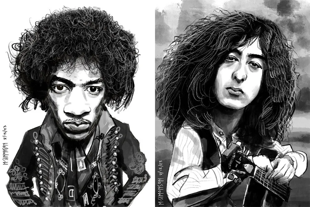
Jimi Hendrix and Jimmy Page.
It takes me anywhere from an hour to three hours to do one of these. I’m working in both black and white and color, depending on the source photo. And, yes, these are based on specific photos, or several photos in some cases. Some of them may be recognizable—even iconic.
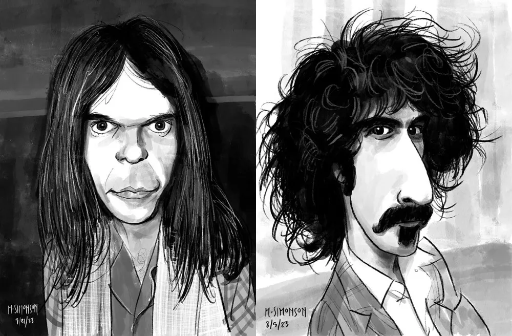
Neil Young and Frank Zappa.
By the end of July, I was doing a full caricature every day. This went on for almost two weeks. Since then, I’ve been doing several a week. I’ve done almost 30 of them now. Mostly rock musicians so far, but I have a long list of possible subjects in other areas, too.
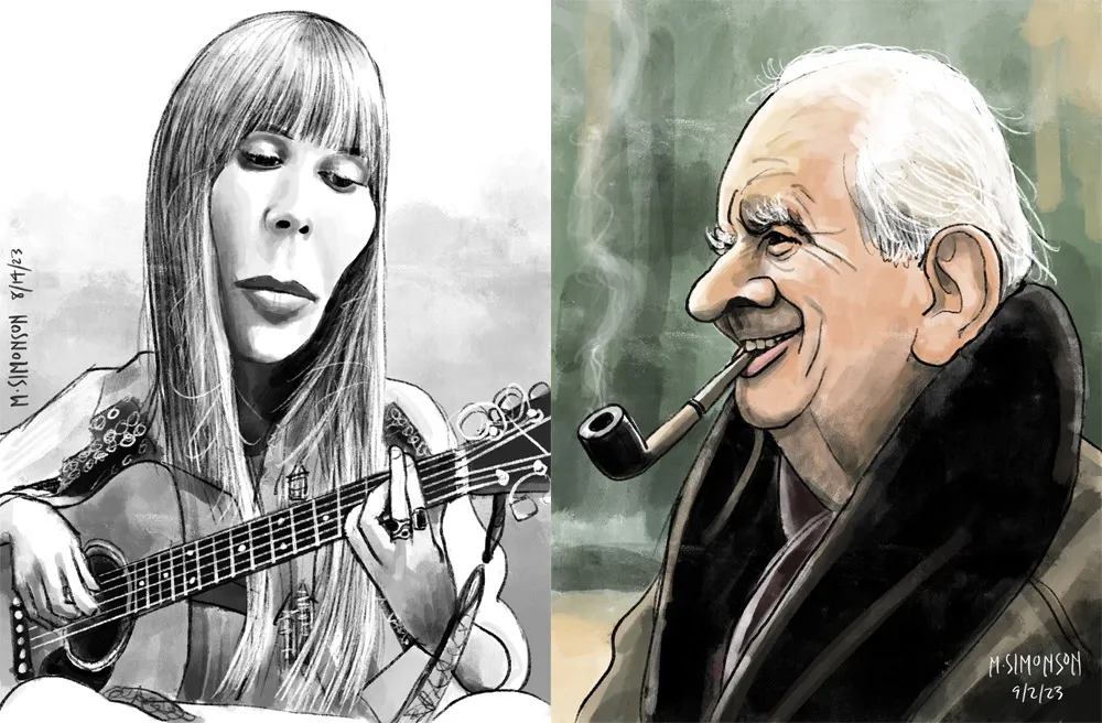
Joni Mitchell and J.R.R. Tolkien.
Rediscovering Myself
I can’t believe how good it feels to reconnect with this. As an artist, knowing that you’re capable of doing something yet not doing it for years—decades even—is painful. It feels like a waste. Of course, I’m doing other things, like making fonts, which is also creatively fulfilling. In fact, I’ve often wondered if getting so busy making fonts was the reason I wasn’t drawing as much. Apparently not.
In my “1979” article, I cast a dim eye on the digital world—the world of screens and pixels—and advocated a return to doing physical things, like drawing on paper. And I have been doing that. But, ironically, getting back into drawing on paper—specifically the habit of drawing daily—led directly to finally getting some use out of my iPad Pro and Apple Pencil. In hindsight, it was all about getting back to drawing, regardless of whether it’s on a screen or not.
Anyway, all of this is a roundabout way of saying that I’m going to start sharing my caricature work online. To be clear: I’m just doing this because I enjoy doing it. It’s a side project. I’m not looking to start a new career or anything like that. Fonts are still my main gig. I just want to share something else I enjoy doing, and I hope others will enjoy seeing it.
If you’re interested, I’ll be posting the work on my secondary Instagram account (not my regular Mark Simonson Studio account, which is for official, font-related stuff). Update: I’ve also created a new website to showcase my non-type-related work: marksimonson.art.
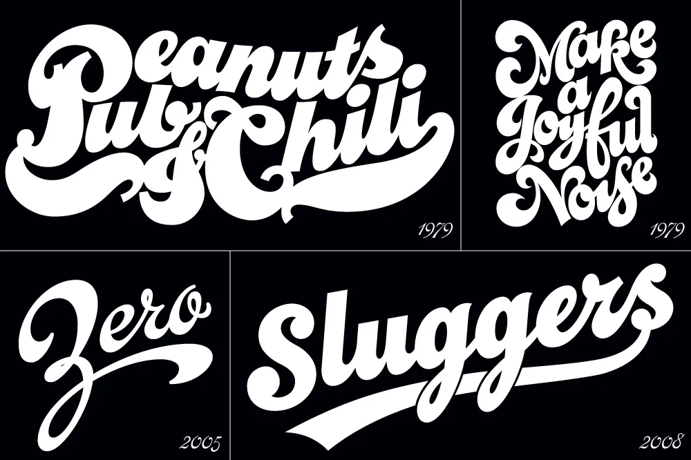
I’ve been interested in the classic script style of the early 20th century for as long as I’ve been drawing letters. It was commonly used in logos and trademarks, meant to convey the idea of a signature. Think: Ford. Coca-Cola. Coors. Blatz. Schlitz. Rainier. Campbells soup. Any number of baseball clubs. The style was revived in the 1960s, sometimes evolving into psychedelic or pop-art forms.
There have been fonts from time to time based on this script style, but quite often they have more of a sixties or seventies look. I decided to try my hand, hoping to get closer to the early 1900s feel.
In 2004, I pitched the concept to House Industries. They liked idea, and we made a deal to develop the script, along with a sans and a serif, all with a “sports” theme.
Working with Ken Barber, I was impressed with his commitment to quality and detail. I thought I was an okay type designer at the time, but my experience with Ken significantly raised my standards on all the fonts I’ve done since then. Unfortunately, the project languished due to other priorities at House and was eventually put on hold.
Around 2012, I decided to resume work on the script on my own. At that point, only the lowercase and a few caps had really been drawn, and I was really itching to design the rest of the caps.
In 2017, I showed Ken what I’d been up to with the script. I asked if he thought House was ever going to get the project going again, and, if not, could we amend the agreement to allow me to release it myself? Long story short, House agreed.
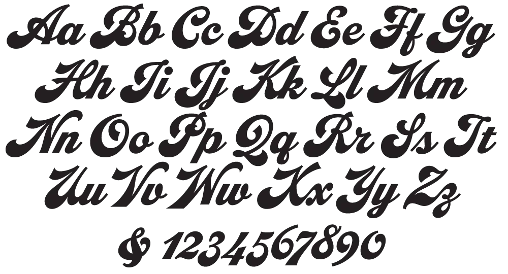
With the script fully in my hands, I stepped up the pace to finish it. Five years later, the result is Dreamboat.

Back when I was working on it with House, there was only a single bold weight. To provide more flexibility for designers, I expanded this to six—Light, Regular, Semibold, Bold, Extrabold, and Black. (Dreamboat might be the only script in its genre with such a wide weight range.)

One of the things that bug me about a lot of script typefaces is lack of a solution to situations where you need to set something in all caps, such as roman numerals or acronyms. For that I added small caps.

There is also a stylistic set which raises the cross-bar of the lowercase “t” and extends it for more of a custom look.

To top it off, Dreamboat includes three styles of tails—an element quite often used with bold scripts.
Check out the User Guide to see how it all works. Tip: Many of my vendors have type testers where you can type your own text and see how it looks. The tails work by typing one or more underscores at the end of a word. Just make sure that ligatures are enabled on the site (sometimes they are not).
I never dreamed when I started that it would take nearly 20 years to finish Dreamboat. But, to be honest, I’m glad it did because it was really beyond my skills when I first started working on it. It’s been one of the most enjoyable typefaces to design, and I’m excited to see what people will do with it.
Dreamboat is available at all the usual places for desktop, web, and other uses.
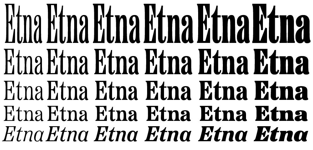
I’m very excited to introduce a brand new typeface family that’s been on my back burner for decades: Etna.
It was inspired mainly by the Aetna style of wood type from the 1880s. Etna tames this quirky Victorian design transforming it into a complete family suitable for modern use, adding a full range of six weights and italics, allowing it to work equally well for both text and display.
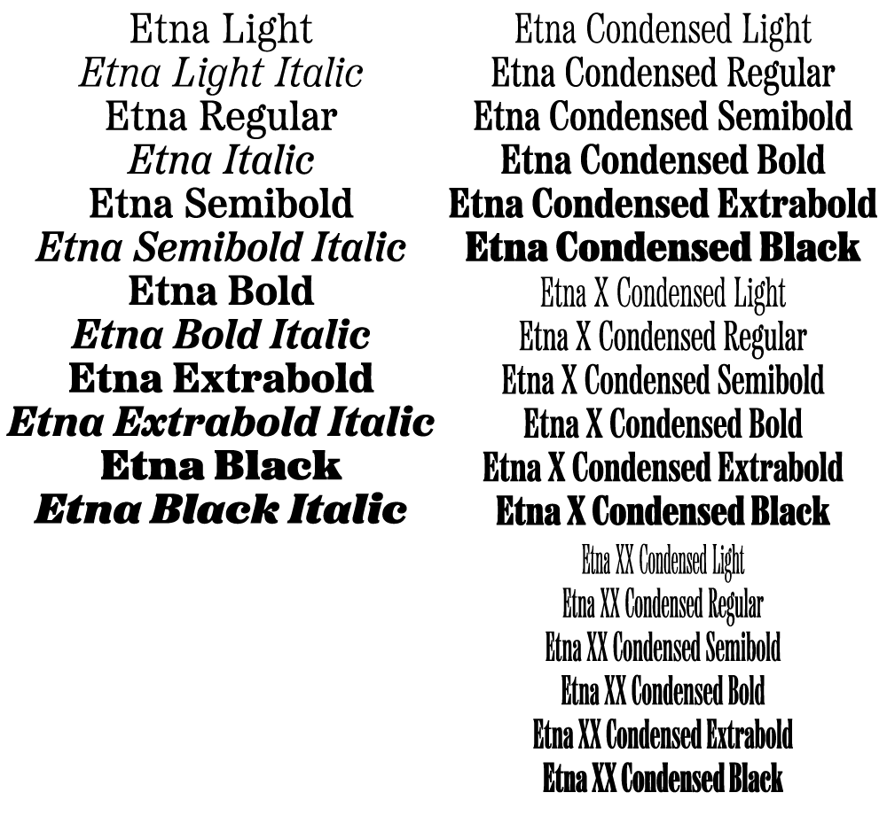
The Etna family also includes three different condensed widths in all six weights intended for display use. These are meant to be used LARGE.
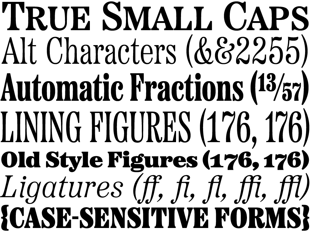
All 30 styles include four different figure styles, alternate characters, true small caps, and a selection of dingbats, including arrows, stars, asterisks, and manicules (pointing hands).

Etna is just rolling out starting today. You’ll find a list of places where you can buy a desktop, web, app, or ebook license on the main Etna page on my site. There is also a nice Etna mini-site that tells the complete story of Etna and the history of the Aetna genre.
Thanks to Nick Sherman for designing and coding the mini-site and to David Shields for writing the history section. Also thanks to Nick for suggesting that I add the manicules and many other features. Finally, thanks to Schriftlabor for technical assistance in developing the fonts.
One of the ideas on my back burner for a long time has been to add wide styles to Proxima Nova. Condensed and Extra Condensed have been there since the very beginning, but it was missing styles wider than the normal width. It was an obvious thing to add and would make the family even more versatile.
I did some rough preliminary work in 2012 and 2015, but didn’t put serious effort into it until last September, after I finished Dreamboat. The good thing about setting a typeface aside is that, when you come back to it, you can see the problems much more clearly. One of the things I learned when I was a graphic design student is that it’s easier to redesign something than to design something, and that was definitely the case with Proxima Nova Wide.
One of the things I changed was to make it even wider so that I could add two wider widths—Wide and Extra Wide, just as there are two narrower widths. Including the italics, this adds 32 new styles to Proxima Nova (16 for each width).

Naturally, the new styles include all the features and characters of the existing styles of Proxima Nova. I’ve also made a few improvements and tweaks to the existing styles. All of this amounts to a major release: Proxima Nova 4.0. It’s currently available for sale here or for activation in Adobe Fonts.
You can find more info, test and license the fonts, and download PDF specimens on the Proxima Nova page.
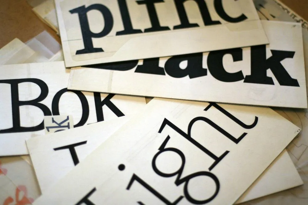
Viroqua’s ancestor, Excalibur, hand inked.
I released Kandal in 1994. It’s one of my earliest typeface designs, going all the way back to an earlier design in 1978, which I submitted it to International Typeface Corporation (ITC) under the name “Excalibur”. It went through a couple of iterations before the one I submitted, variously influenced by the work of Hermann Zapf and Jim Parkinson. I honestly had very little idea what I was doing—a case of overestimating what I knew and underestimating how much was left to know. By a large margin. Excalibur was understandably rejected by ITC. It had lots of problems and I resolved to improve my knowledge and skills before trying to submit something to them again.

Fast-forward to 1990. I never did submit any more typefaces to ITC, but I did have lots of ideas and sketches and practice drawing letters. I also got a Mac in 1984 and Fontographer in 1987 and started trying to make PostScript fonts. One of my ideas was to revisit Excalibur, simplifying the design and addressing its many flaws. This became Kandal. I was also working on Proxima Sans, the predecessor to Proxima Nova, around the same time, and a few other ideas, some of which are still on the drawing board.
Kandal has never been one of my popular typefaces. It’s not surprising, given that it was such an early design, made when I had very little experience making fonts. I probably should have pulled it from my library, but I kept thinking I would come back to it and fix it, like I did with Proxima Sans.
Thirty years later, it’s finally happened. The new version is reworked from the ground up, so I decided to give it a completely different name, instead of something like Kandal Nova. “Kandal” was my paternal grandmother’s maiden name and the town in Norway her family was from. The new name, “Viroqua”, is the town in Southwestern Wisconsin where she was born and raised.

Viroqua is an improvement over Kandal in every way I could think of, while retaining its core design concept: A hybrid combining modern proportions, Jenson-like details, and a bit of slab serif DNA. Nearly every character has been reworked or refined. The original italic especially suffered from my lack of experience as a type designer. I basically started over. I’ve got three more decades of experience and I hope it shows.

Viroqua also has a wider range of weights, seven in all, going from Thin to Black.

Viroqua features many typographical niceties missing from Kandal, such as small caps, old style and lining figures (both proportional and tabular), superscript and subscript figures, fractions, and dingbats. Viroqua also supports most Latin-based Western and Eastern European languages, plus Vietnamese.
Viroqua is available now. More information here.
[ ]
]
Just a note to say, this Friday afternoon, I’ll be pitting my type chops against (with?) fellow type designer Peter Bruhn for a “exhibition” game of Layer Tennis. I expect this to be a friendly match, more improvisational than competitive. But we’ll see.
