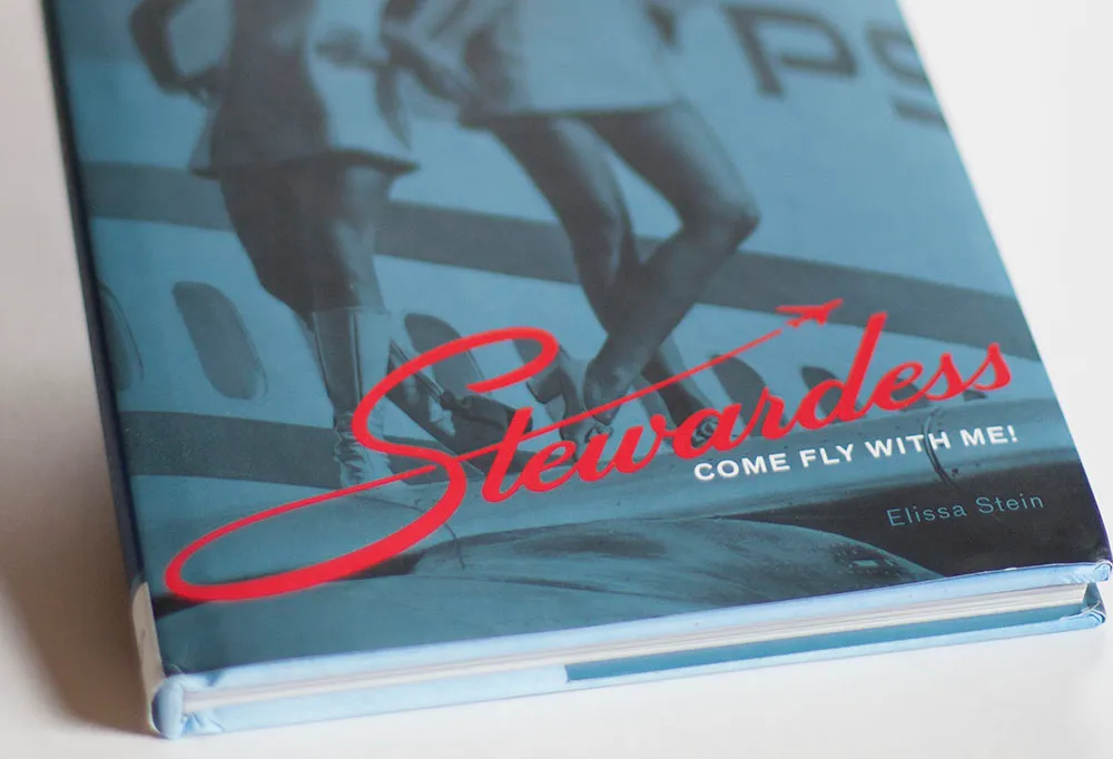
Earlier this year, I completed a lettering assignment for the cover of “Stewardess,” a book by Chronicle Books, which was just published. Designer Ben Shaykin came up with the idea of doing a take off (!) on the old Skyway Luggage logo.
It can be tricky to get things like this to work if you don’t have the right letters, or too many or few letters. It can also be tricky to come up with the letters that didn’t exist in the original logo. In this case, the style was a straightforward script. It would be conceivable to base an entire font on this style, which is not always the case with logos.
I’m happy with the way it turned out. The book itself is a lot of fun to look at (it’s mostly a picture book) and is getting positive reviews.

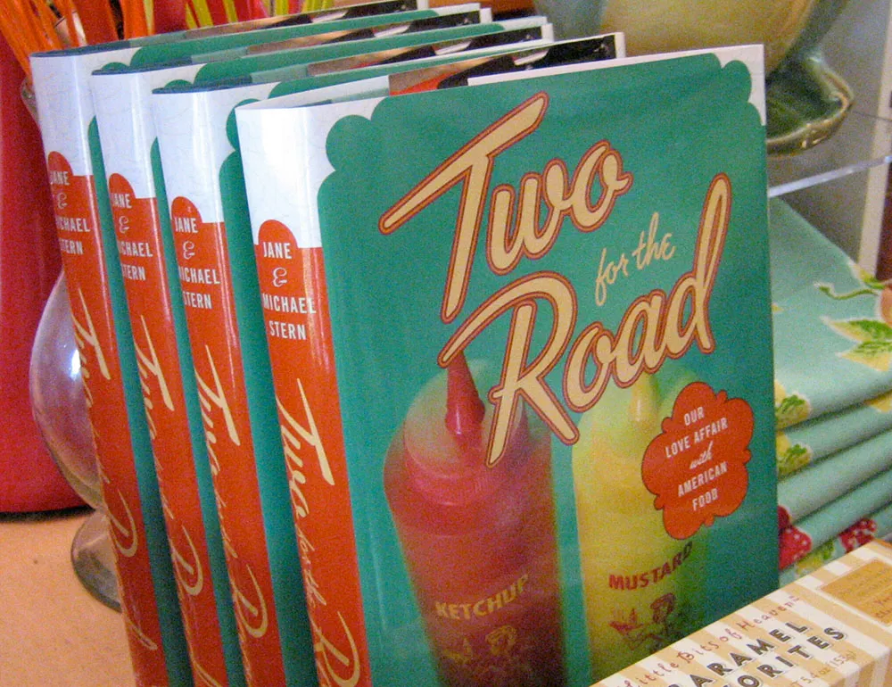
Here’s a fun lettering job I did for the cover of “Two for the Road” by Jane & Michael Stern. The book is a bunch of recipes collected from roadside diners all over the U.S. Art director Martha Kennedy asked me to make the lettering look like something you might see on a sign for a diner. In fact, it’s somewhat based on the sign from a famous diner called Rosie’s.
(This work is actually not that recent, but just I realized that I never posted anything about it here when the book was published last year.)

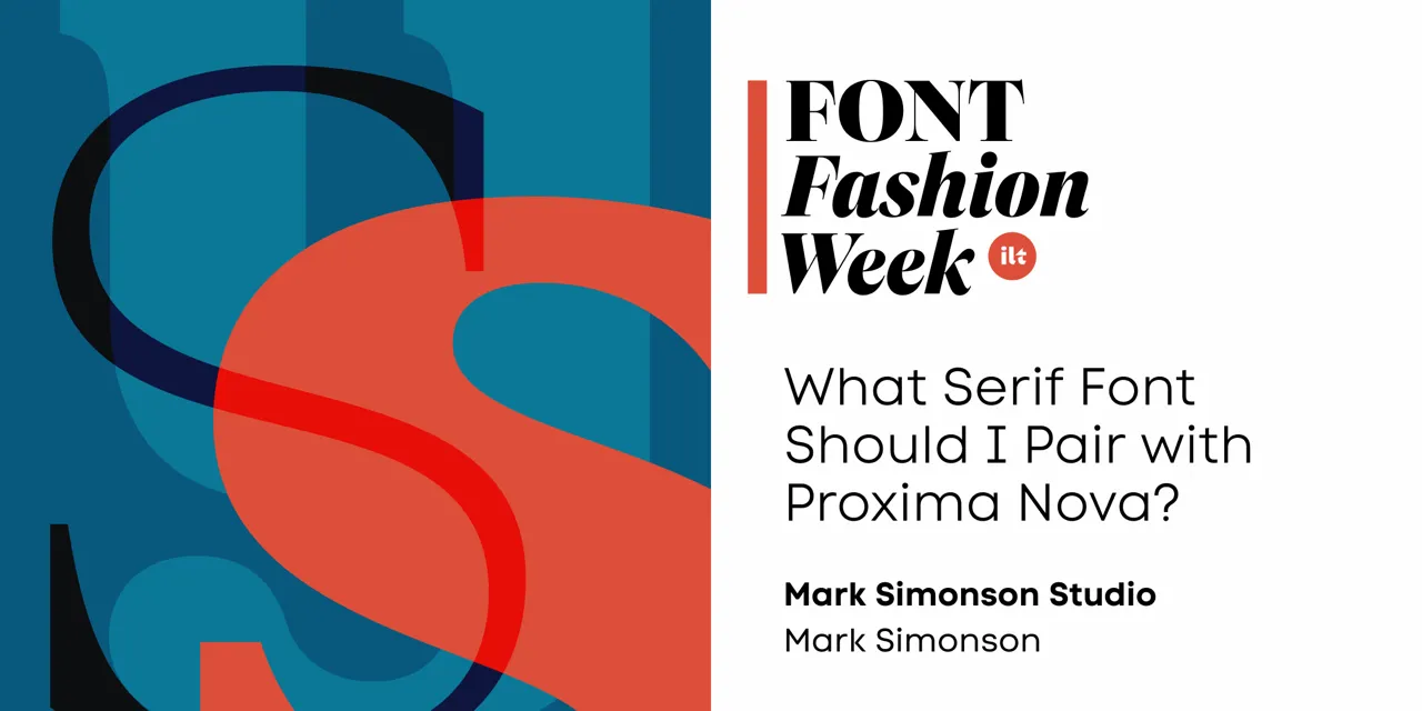
Have you ever wondered what serif font would work best with Proxima Nova? I’ve often been asked this question, and I never really had a good answer.
That’s about to change.
I’ve been working on something new and I’m going to be talking about it for I Love Typography’s inaugural Font Fashion Week which celebrates the latest trends in type design today. I will be giving a 30 minute online talk on April 5, 2022 to showcase what I’ve been working on and the process that went into its creation, and I invite you to attend (click here to attend). The talk is free and you may share this link with friends and colleagues if you think they would be interested.
Hope to see you there!
Update: It’s Proxima Sera. You can watch the talk on Youtube now or read it alongside my slides.
