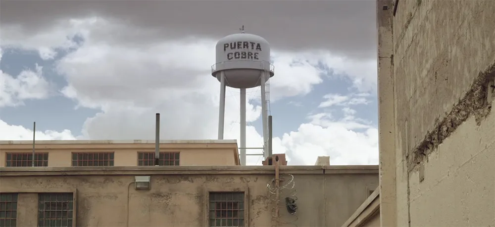
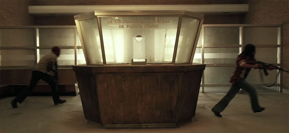
I don’t normally plug movies here, but I had a small part to play in this one as a technical advisor. It’s set in 1972. My job was to advise about typographic details so they would be correct for the period. (See Typecasting and Son of Typecasting.)
I haven’t seen the movie yet, or even all the shots that have typography in them, but you can see some of the results in the trailer. They first contacted me about it in 2008. It’s really cool to see it finally coming to theaters this fall. Congrats to Justin and his crew!
I purposely exempt titles from my nitpicking about anachronistic type in movies. I consider them part of the world in which the film was created, not the world in which the story is set. They may be appropriate or inappropriate, but they can’t be anachronistic.
Nevertheless, it’s one of my favorite parts of watching movies. A friend alerted me to an op-ed in yesterday’s New York Times, Credit Where Credits are Due, about how there ought to be Oscars for movie title sequences. Perhaps, but the lack of an award hasn’t stopped title designers from doing brilliant work.
This reminded me of my favorite site on the topic. The Art of the Title Sequence maintained by a pair of fans, Ian and Alex, who have compiled a growing list of their favorites from movies and TV shows. You can watch most of the sequences in their entirety, some in HD. Many include short articles or interviews with the designers.
The Back to the Future series is a long-time favorite of mine. And they did a good job with their period-specific props—lots of hand-painted signs in the parts set in the 1950s and 1880s, just as there would be. Nary a font in sight where fonts should not be. Or so I thought.
Yves Peters (of Unzipped and elsewhere) was recently watching the third installment in the series on TV when he spotted this and alerted me:
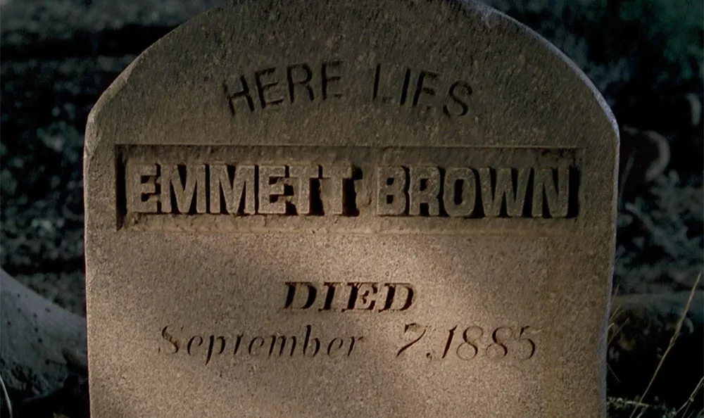
Great Scott!, indeed. It goes by pretty fast and I had to adjust the brightness to see it clearly, but there it is. How did Helvetica (1957, top) and Eurostile (1962, middle) end up on a tombstone in the year 1885? I guess we’ll have to wait for a fourth Back to the Future movie to find out.
I saw the new Star Trek movie this last night and was thrilled to spot one of my fonts, Changeling, in a supporting role. Here are some examples from a couple of high resolution publicity stills for the movie:
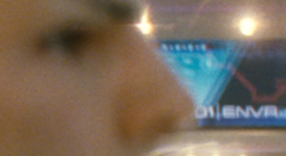
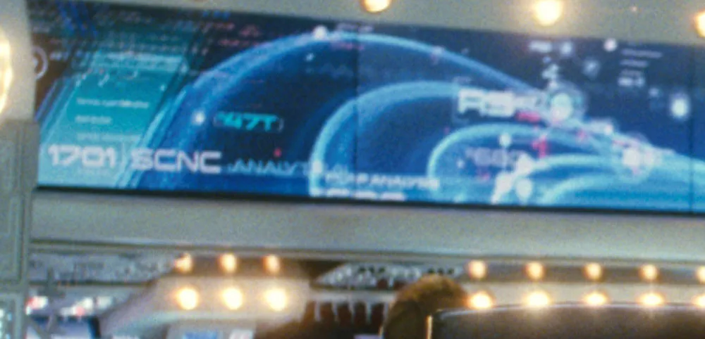
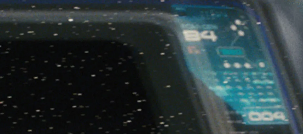
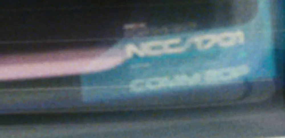
Changeling was a redesign and expansion of an old film font from the seventies called China. I added more weights, more styles, and more characters, as well as modifying the design as I saw fit. One of the more noticeable things I changed was the “4”, which is how I know it’s Changeling that was used in the film.
What’s funny about all this has to do with my choice of the name “Changeling”. It contains all the letters in the name “China” (I added things to it, get it?). A “changeling” refers to something that comes back in a different form, and this was a font coming back in a different form. It’s also the title of an episode from the original Star Trek t.v. show, something I was aware of when I chose the name—the sci-fi connection made me like the name even more, because of the way the font looks. Finally, that particular Star Trek episode was the basis for the first Star Trek movie.
Needless to say, I was in several kinds of geek heaven last night.
I’ve always had a rather vague grasp on the history of New York City. So, before taking a trip there this last summer, I rented Gangs of New York (Miramax, 2002), hoping to learn some of it. I realize the film is not perfectly historically accurate, but I really enjoyed watching it. Scorsese did a wonderful job with the story, the characters, and the setting, making me feel like I had stepped into New York City of the 1860s. However, as I’ve come to expect with Hollywood movies, the typography was a bit off base.
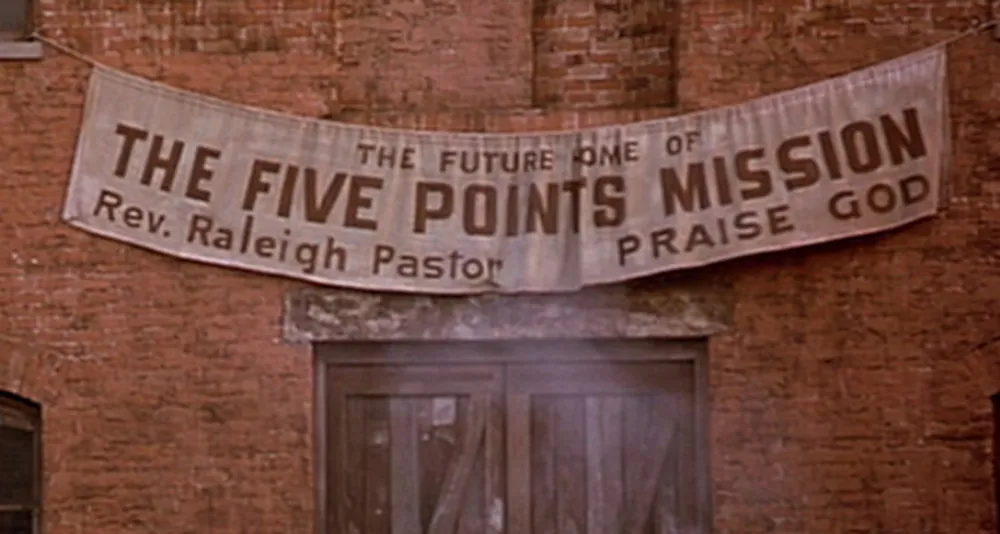
For the most part, the type choices in Gangs of New York are plausible in terms of general feel. In many cases, common 19th century wood type designs are used, especially on posters, appropriately enough, though some of these look a bit too distressed, as if they were enlarged from microfilm copies or something. Most of the signs on buildings were right on the money. I thought this one was pretty good:
On the other hand, the movie is riddled with anachronistic type choices. Here are some examples from posters:
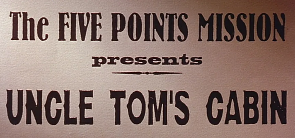
Here we see Bernhard Antique (1937) with two overly-distressed-looking 19th century wood types. Notice the straight apostrophe in the bottom line. Straight apostrophes and quote marks did not exist in typefaces until the advent of digital type in the 1980s. It’s a computer thing, not a typographic thing.
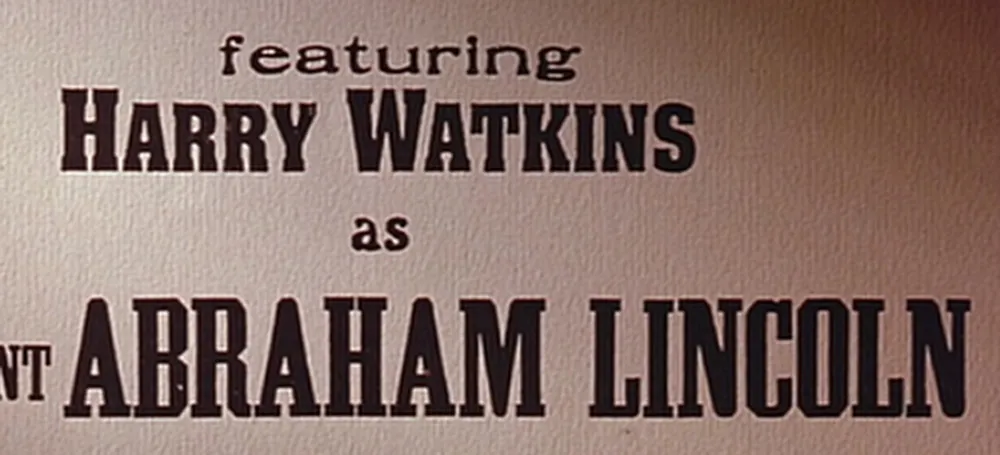
More wood type, but the second line (“Harry Watkins”) is set in Aachen (1969).
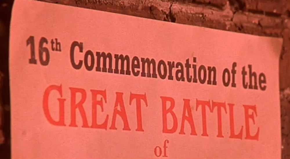
This one is set in URW Egyptienne (1950s) and ITC Benguiat (1977). Benguiat is a particularly poor choice since it is based on the Art Nouveau style of around 1900. Benguiat shows up on a couple more posters in the movie.
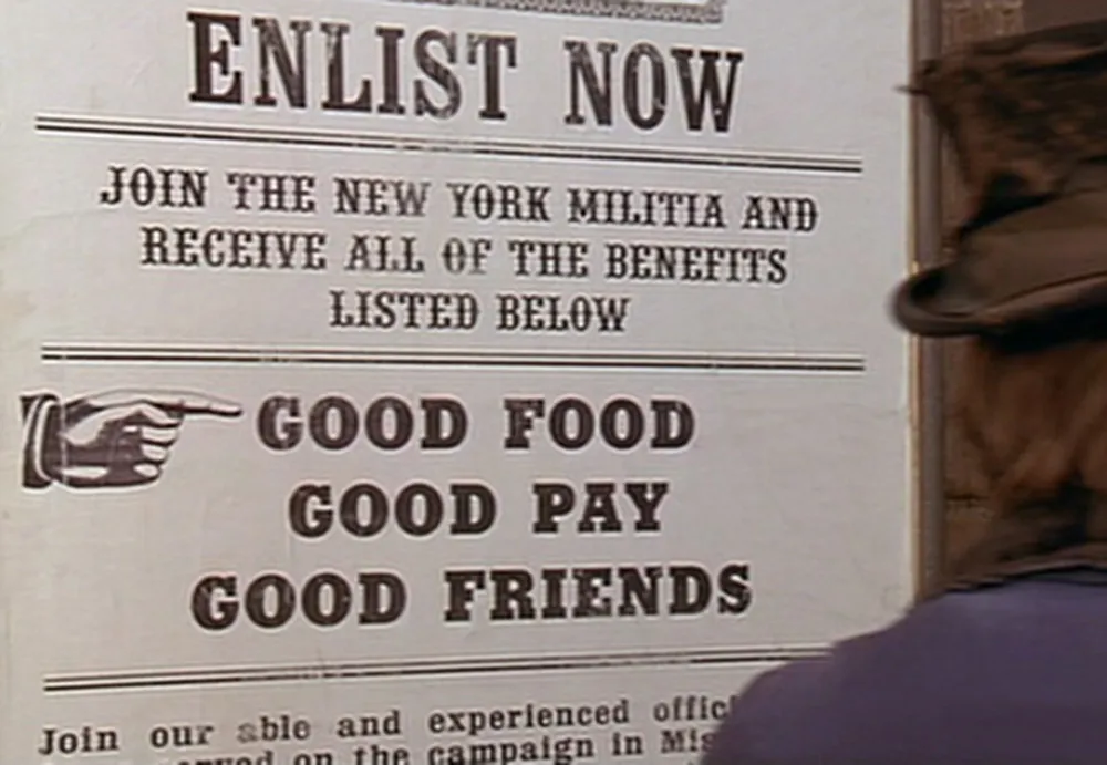
This is better, but not 100% historically correct. The bold font next to the pointing finger is Rockwell (1930s).
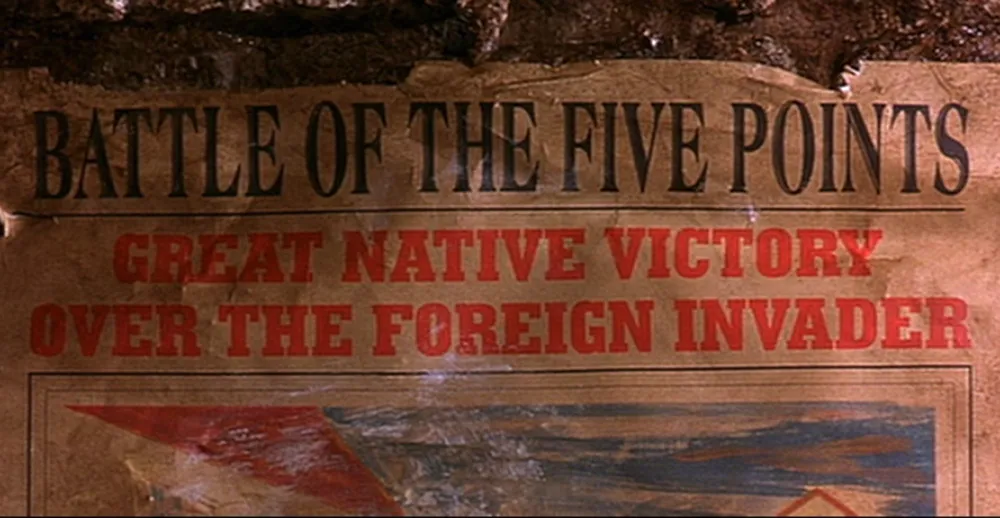
Here we have some artificially condensed Americana (1967) with Memphis (1930s). You couldn’t distort type by condensing it like this back then. It was made of wood or metal, after all.
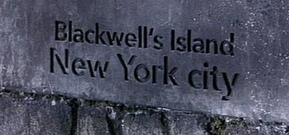
Now this is interesting. Avenir (1988) carved in marble. Few typefaces say “1860s” less than Avenir, which means “future” in French. It would actually be quite an evocative choice for a film set in the early 2000s. It’s very popular these days.
On to the printed ephemera, starting with newspapers:
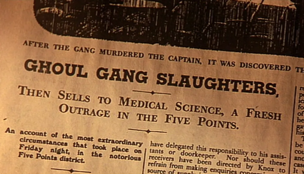
Good old (actually not so old) Memphis, again, paired with Caledonia (1940). I should point out that the way they set the type here looks right; it’s just the font choices that are wrong. There were typefaces back then that looked generally similar to these to the untrained eye, but not exactly like these. (9/5/13 Update: Eagle-eyed reader Anton Sherwood also spots Windsor (1905) in the small bold text on the left.)
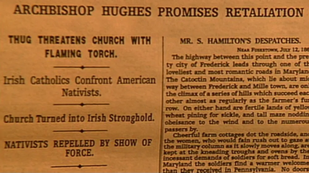
The same comments go for this one. The sans serif is Helvetica (1957) and the serif font is Egyptienne (1956).
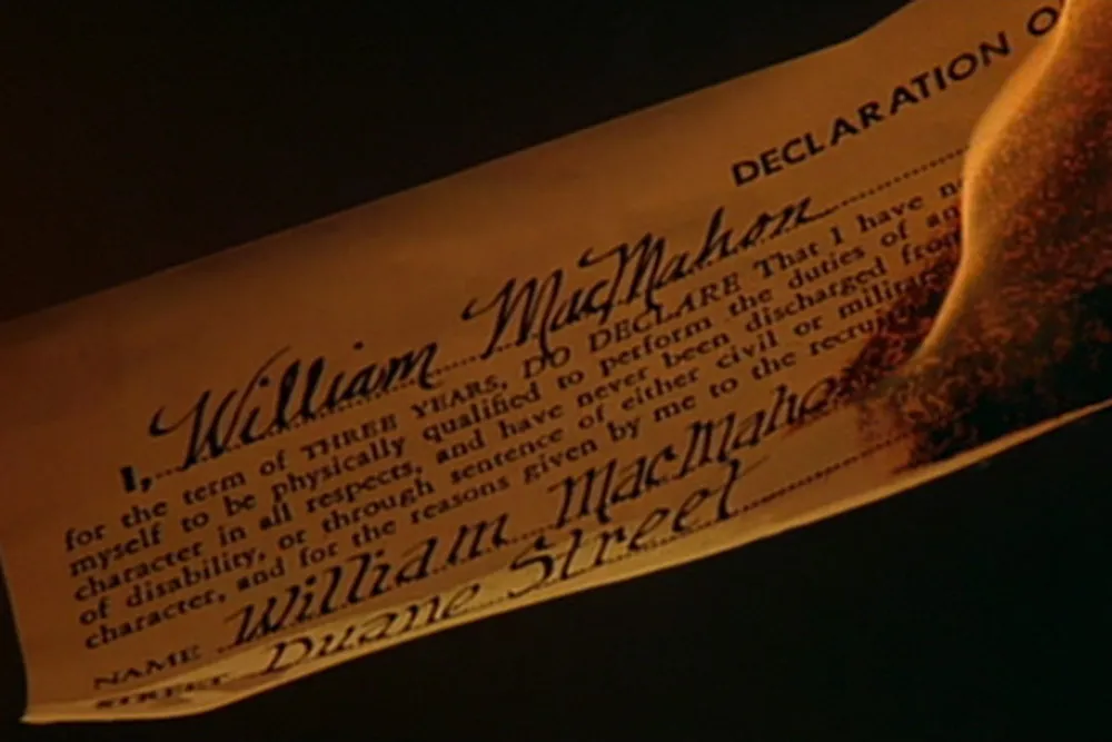
This one I love. It’s a civil war draft registration ticket. The heading is set in Futura (1927) and the text is set in Garamond (c. 1920). Now, you might say Garamond should be okay because the original Garamond types were from the 1500s, which predates the 1860s. The fact is, they were only used in the 1500s and similar types were not seen again until they were revived around 1920. I’m not sure about that handwriting at the bottom, either.
So. A great movie, but a bit flawed in the typographic department. Three out of five stars for use of type.
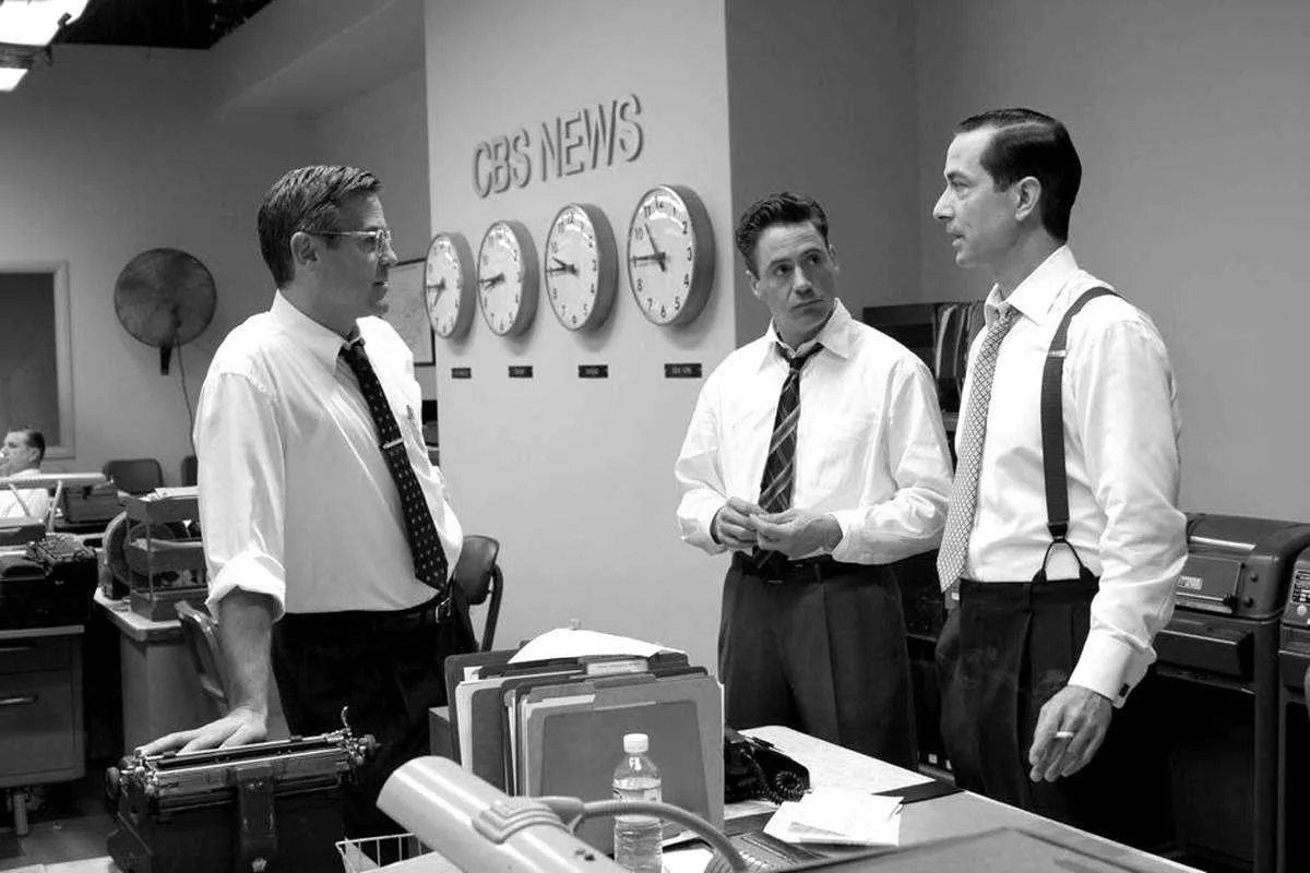
I was very happy to be included in a short article in today’s New York Times Good Film, Shame About the Helvetica about designers who notice anachronistic font choices in films, but I was a bit taken aback when I received an email first thing this morning from the art director of Good Night, And Good Luck. She pointed out that Helvetica was not used in the film, contrary to what was claimed in the article. She said, rather, that the sign shown in the example frame was set in Akzidenz Grotesk, a face which predated (and in fact was the basis for) Helvetica, and that this choice was based on extensive research of CBS’s graphic design during the period depicted in the film.
This is no skin off my nose since I have not made any comments (yet) about the use of type in Good Night, And Good Luck. The comment was made by graphic designer and fellow font flub finder Michael Bierut, who, along with Scott Stowell and myself, is quoted in the article. Judging from the still shown in the article, I might have come to the same conclusion. As it happens, I missed the film when it was in theaters and will have to wait for the DVD release to see for myself.
If what she says is true (and she was very adamant about it), it is very unfortunate that Good Night, And Good Luck was chosen as the lead example in the article. Especially since its art director appears to be one of the rare people working in film who cares about getting the type details right.
Update: Thanks to some detective work by Stephen Coles, as reported at The Design Observer and Typophile.com, it has been confirmed that Good Night, And Good Luck really does use Akzidenz Grotesk.
