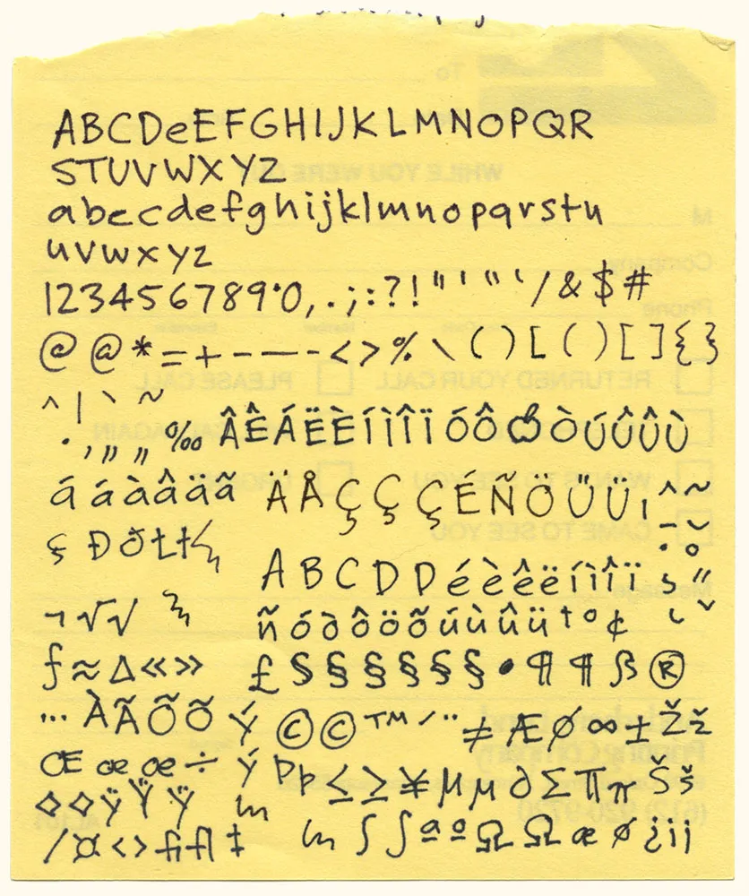
Here it is: The original artwork for one of my most popular fonts, Felt Tip Roman. I scribbled out all the characters needed in a typical font on the back of a phone message pad (about 4.128” x 5”) using a Pilot Razor Point felt pen. I deliberately tried not to be too neat or careful to try to capture the spontaneity of natural handwriting. Whether it would actually work as a font, I had no idea. That it would become a commercially successful font someday would have struck me as absurd at the time. I probably would have been a bit more careful and circumspect if I’d known. But perhaps then it would not have been as popular.

I’ve used the image above to promote Refrigerator, and once in a while I am asked how it was done. Technically it’s called a stereo anaglyph. When you view it using special glasses with a red filter on the left eye and a blue filter on the right eye, the image appears to be three-dimensional. Here’s what the glasses look like:
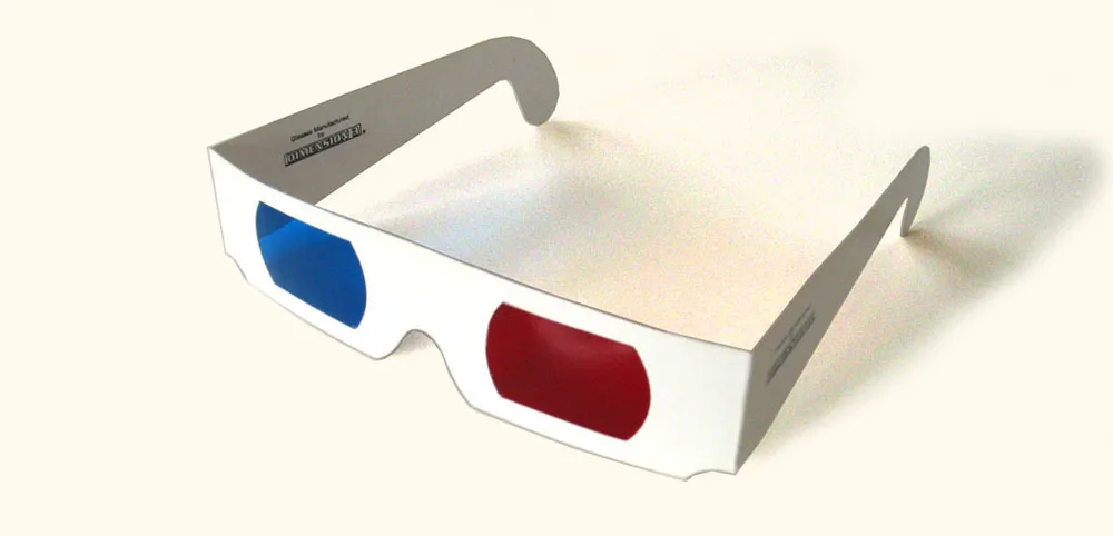
You can get these for free at 3D movies, and sometimes they show up in books or magazines. You can also buy them like this, but you usually can’t buy just one pair. In a pinch, pieces of red and blue clear plastic or cellophane will do.
I’ve seen descriptions of how to make anaglyphic images like this on a computer, but they’re usually presented at a pretty rudimentary level, or make it more complicated than it needs to be. I actually discovered this trick on my own years ago, back when I had a Mac II and the first version of Photoshop. Photoshop was a key since it allowed access to RGB channels separately. (In other software from that time, like PixelPaint or Studio8, you couldn’t do it.)
It’s actually not that hard, once you understand two basic ideas:
1. Your right and left eye see slightly different images. If you alternately shut your left and right eye, you can get a pretty good idea how to the two images differ. For the right eye, closer objects are more to the left and distant objects are more to the right. The opposite is true for the left eye. You can produce these two images lots of different ways including photography, 3D rendering software, or by simply shifting layers in Photoshop. In the case of the fridge, I used a scan of a refrigerator from an old catalog, and did it all in Photoshop by scaling the sides of the fridge either wider or narrower to approximate what each eye would see.
2. The red/blue stereo effect works by overlaying the two images, one in red and the other in cyan. When you put on the glasses, the red lens causes the cyan image to appear in shades of gray and the red image to vanish. The opposite happens with the blue lens. Thus, each of your eyes sees a different image creating the illusion of depth.
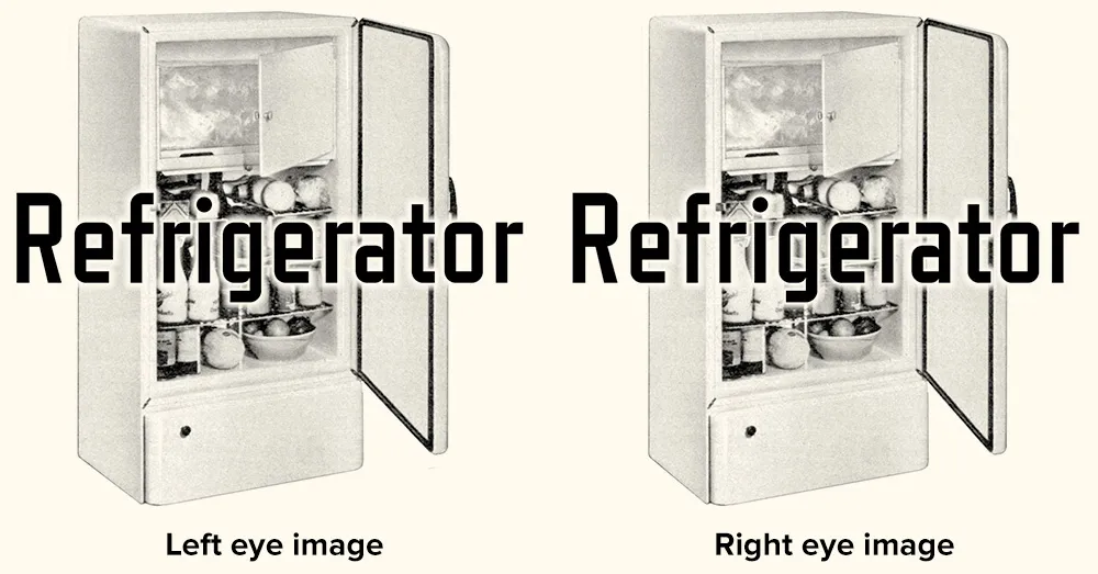
This double red/cyan image can be created easily in Photoshop by starting with the left- and right-eye images as grayscale (like the two above) and a blank RGB image. Paste the left eye image into the red channel and the right eye image into both the blue and green channels. When you view all the channels at once, you will see the overlaid images in a form that will work perfectly with anaglyphic (3D) glasses.
An image created in this way seems to work best when viewed on-screen. Color print-outs don’t work as well. I think this has to do with the way color is produced on a video screen vs. ink on paper. It’s also possible to do full-color images, but they don’t work very well if they have strong colors in them—especially red.
That’s the basic technique. There are lots of little tricks and subtleties of course, but if making anaglyphic images interests you, this should get you started.
I wish there was more need for this kind of image. I’ve sometimes thought about doing a whole 3D website, or seeing if there is a way to get this to work in Flash. Hmm…
[ ]
]
Just a note to say, this Friday afternoon, I’ll be pitting my type chops against (with?) fellow type designer Peter Bruhn for a “exhibition” game of Layer Tennis. I expect this to be a friendly match, more improvisational than competitive. But we’ll see.
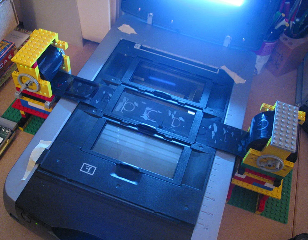
One of the font projects I’m working on is the revival of some of Phil Martin’s display typefaces from the 1970s. These were originally distributed as 2-inch film fonts for the VGC Typositor headline setting machine. The master negatives exist in the form of small spools of 2-inch wide negative film around 50 feet long. They are in very good condition, considering they are up to 35 years old, and I wanted to make sure they stayed that way when it came to scanning them.
The film could pass through a standard film holder on the scanner, but I needed a way to hold up the feed and take-up spools on either side. I pondered this for a long time, and when it came time to actually start scanning, it hit me: Legos!
I am a life-long Lego® fan and, while they are certainly a fun toy, I have sometimes found practical uses for them. As you can see from the photo, I constructed “towers” on either side of the scanner to support the film spools. Gear pieces from an old (and probably collectible) Lego Technics set fit perfectly inside the spools, holding them firmly on axles. Cranks fashioned out of wheel pieces allow the film to be moved back and forth.
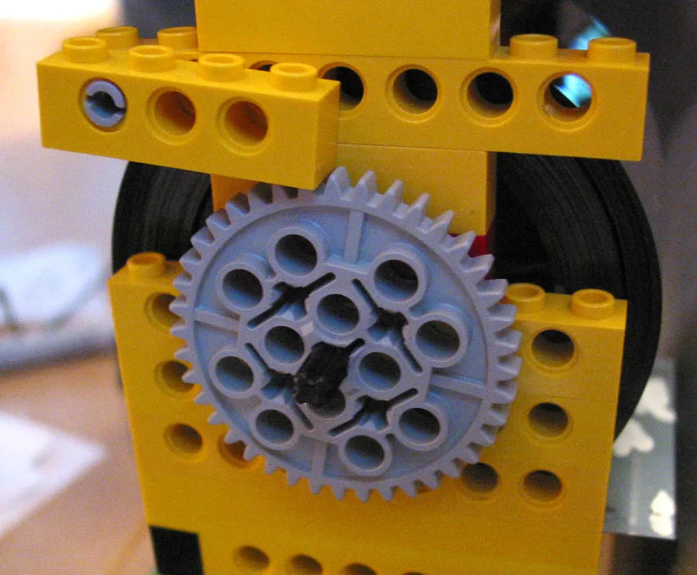
Here’s the really clever bit: To keep the film spools in tension (so they stay where I want them and don’t unravel), I devised a simple ratchet mechanism which allows the spools to turn freely in only one direction—away from the other spool. It can be easily flipped out of the way when I want the spools to roll free.
It could look nicer, but a lot of our Lego pieces are otherwise engaged in other projects built by my daughter and me, so I had to scrounge for pieces among the dregs that met the bare minimum requirements.
It occurs to me that if I had the Lego Mindstorms system, which allows you to add motors, light sensors, etc., I could control the whole thing from my computer and completely automate the process. Sounds fun, but this is simpler and gets the job done.
Now all I have to do is scan all the fonts (only about seven or eight hundred more characters to go) and then I’ll be all set to start building the fonts.
I wonder if I should add mini-figures…?
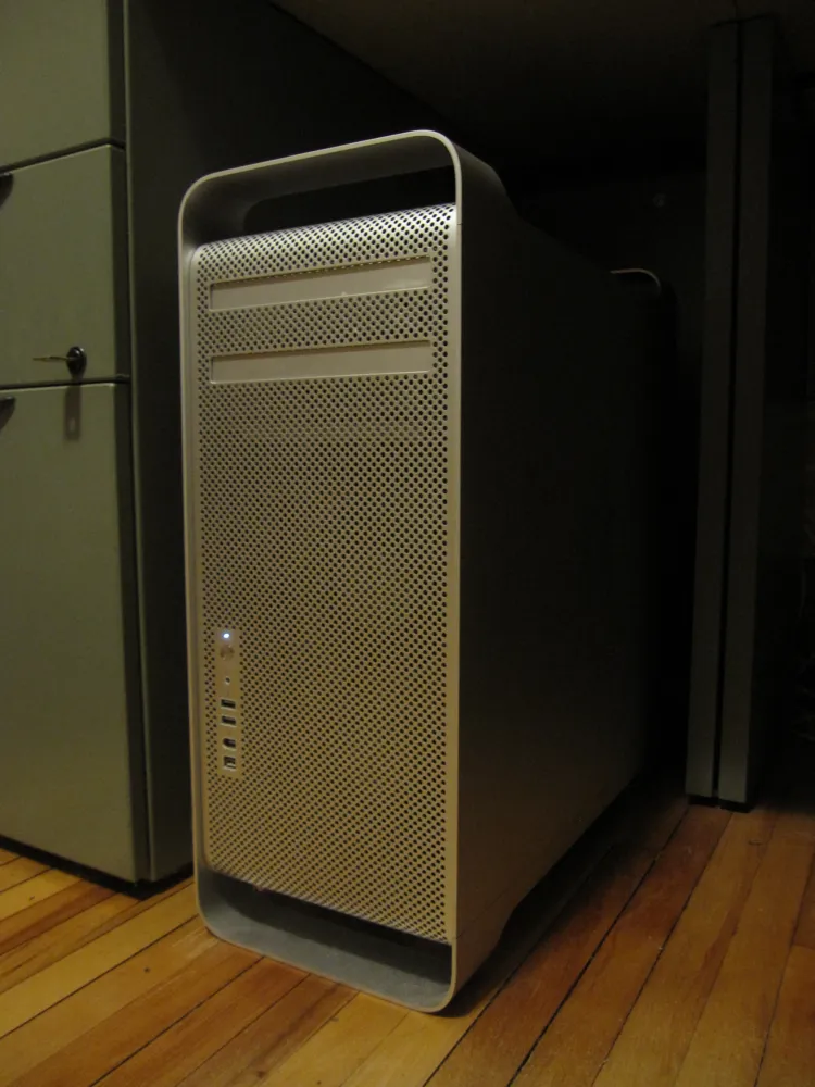
When I bought this computer in 2006, I did’t expect to still be using it in 2012. It hasn’t always been my primary machine, but it’s been in use one way or another all that time.
Apple has used essentially the same case design even longer, going back to the Power Mac G5 in 2003. I had one of those, too, and it was kind of a dog. This one is the first generation Mac Pro, which was released when Apple switched to Intel processors. I chose the mid-range model, with two 2.66 GHz Dual-core Xeon processors, a 250 MB hard drive, and 1 GB of RAM.
It was my main machine for several years, with a 15” MacBook Pro as a secondary machine for taking work on the road. Eventually, having to keep my work sync’d between them was too much trouble and I switched to a 17” MacBook Pro for everything. I retired the Mac Pro to the basement, using it as a server and for watching movies or playing music, and other non-work-type things.
About a year ago, I changed my mind. The 17” was too much of a compromise—not that powerful as a desktop machine, and it rarely left my desk, unless I was traveling. So, I got a MacBook Air and a 27” iMac. What made it possible? In a word: DropBox.
This setup worked great, but recently, the iMac started giving me the worst possible kind of trouble—kernel panics during backups. I still don’t know what the cause is, but I couldn’t trust it as my main machine anymore.
Long story short, I brought my old Mac Pro out of retirement. After upgrading the video card, hard drives, software, display and memory, it’s never run better. It’s smooth and quiet and plenty fast enough for my needs.
One of the things that made me reconsider it was a discussion sometime last year on Hypercritical, John Siracusa’s weekly podcast. Unfortunately, I don’t recall which show it was, but basically Siracusa pointed out one of his reasons for preferring Mac Pros over iMacs and portables: External hard drives usually have cheap power supplies. I can attest to this, having several fail on me over the years. The Mac Pro, however, has a very robust power supply and therefore hard drives you add to it are much more reliable, another thing I can attest to. I had never really thought about this before, and had even tended to use external drives with my Mac Pro. But it made a lot of sense, and now I’m sticking to internal hard drives for everything.
I’m very happy with this setup. I’ve got a really solid desktop machine now, and the MacBook Air is my all-time favorite laptop. And DropBox makes it easy to work with two machines. The most amazing thing to me is that this Mac Pro is so old and yet it has no trouble running the latest software. I’d say it was a pretty good deal.
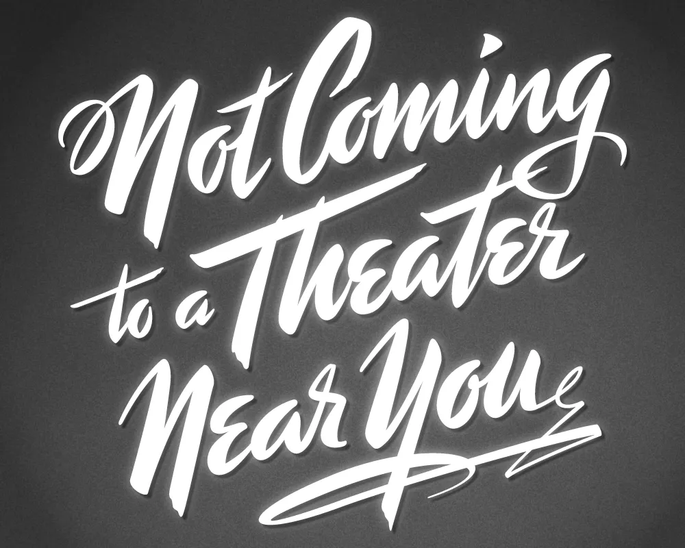
Last year, I did a logo design for Not Coming to A Theater Near You, a website devoted to movies off the beaten path. The designer, Rumsey Taylor, who was redoing the look of the entire site, wanted the logo to look like a title card from a film noire feature. What I came up with is based mainly on the title card from “Mr. Arkadin” (1955).
In spite of appearances, I don’t usually use an actual brush in my lettering designs, but in this case I did. The final art is vector-based, but I worked out the construction of the letters with brush and ink. (I’m not skilled enough at brush lettering to do the final art that way.)
The image above is a “treatment” I did to make it look like an actual title card from an old film, sort of a “serving suggestion.” On the wesite, Rumsey chose a simpler approach. The site redesign looks great, and I was happy to see that he’s using Metallophile Sp8 as a webfont (via Typekit).
