 This is something I’ve been meaning to post for a while.
Last summer, at TypeCon in Boston, Adrian Frutiger was honored with SOTA’s 2006 Typography Award. Mr. Frutiger couldn’t attend, but several SOTA board members travelled to his home in Switzerland to present the award to him. I was among the people who gave a presentation during the ceremony in Boston. The others were Akira Kobayashi, Bruno Steinert (both of Linotype) and Mike Parker (formerly of Linotype), who each shared personal anecdotes; and Tiffany Wardle and Jon Coltz, who shared the stage in a deeply philosophical rhapsody.
I was asked by SOTA to say some words about Mr. Frutiger, even though, unlike Akira, Bruno, or Mike, I had never worked with him, and in fact I’ve never even met him. Even worse, I had never given a talk at a conference before. But Tamye Riggs (from SOTA) pointed out that it only needed to last about ten minutes and that it would be nice to get a perspective from somebody who was not an “insider.” So, I said “okay” and jumped into the deep end.
In spite of my nervousness and minor technical nightmares (“sorry, we can’t change the screen set up to a dual display just so you can read your notes off the laptop on the podium while the presentation plays on the big screen”) it went fine and was well-received.
If you missed it, or want to see it again, I’ve made a PDF from the Keynote document, which can be found here:
Adrian Frutiger: A Personal Perspective
If you have a slow internet connection, please note: The PDF is pretty image-heavy and weighs in at 17.6MB.
About the formatting: The text you see at the bottom of the screens is my actual script—the words I was saying while the image above them was being shown. I formatted it to make it easy for me to read and not mess up the phrasing. I know that some people recommend against using a script when giving presentations, but, having never done it before, I couldn’t take the chance.
Chris Foresman, at Ars Technica, has written a nice, informative piece about WOFF (Web Open Font Format).
Many of the characters in Helvetica and Arial are very similar to each other, although none are quite identical. Other characters are quite a bit different, and they are the key to telling which is which. Here are some of the most obvious ones (Grotesque 215, Arial’s ancestor, has also been included for comparison):

The “a” in Helvetica has a tail; Arial does not. Also, the bowl of the “a” flows into the stem like a backwards “s”; the bowl of Arial’s “a” simply intersects the stem with a slight curve. (Interestingly, the Grotesque “a” has a tail, just like Helvetica. The bolder weights of Helvetica have no tails, an inconsistency that bothers some people. Maybe it bothered Monotype, too.) Arial’s “a” has always seemed a little badly drawn to me, but maybe it’s just me.

The top of the Arial “t” is cut off at an angle; the Helvetica “t” is cut off straight. You can see clearly here how the x-height of Arial matches Helvetica’s. This is one of the main things that make Arial look like Helvetica at first glance, even though the details are different.

The ends of the strokes of letters like “S” and “C” are perfectly horizontal in Helvetica; in Arial and Grotesque they are cut off at a slight angle.

The “G” in Helvetica has a spur at the bottom of the stem on the right side and the curve at the bottom of the “G” flows into the stem; in Arial and Grotesque the “G” has no spur and the curve at the bottom meets the stem at an angle.

The tail of the “R” in Helvetica flows out from the bowl and curves straight down, ending in a slight curve to the right. In Arial, the tail flows down and to the right from near the center of the horizontal bar and straightens out at an angle to the end. It appears to be a compromise between the Helvetica “R” and the Grotesque “R.” This feature is very unusual for a “grotesque” design, and is more typical of “humanist” sans serifs. It feels out of place here and is one of the more awkward design features of Arial.
Here is the same word set in all three typefaces:


In both fonts, the characteristics described here apply to all weights (except, of course, the tail on the Helvetica “a,” which is dropped on the bolder weights).
See also:
Interestingly, Monotype created cheap substitutes for not only Helvetica, but all the other proprietary fonts Adobe has included with PostScript. These were created at the request of Microsoft for inclusion with its PostScript clone, TrueImage, and also included with Windows and Microsoft Office.


Of these other substitutes, Book Antiqua looks nearly identical to Palatino. The designer of Palatino, Herman Zapf, has been known to do off-name versions of his own typefaces for other foundries (notably Bitstream), but in this case he had nothing to do with it, other than being copied. [Interestingly, Microsoft now includes a very good—and fully licensed—version of Palatino with Windows. —MS]


On the other hand, they created substitute fonts for two of his other typefaces, Corsiva for Zapf Chancery and Monotype Sorts for Zapf Dingbats.
As for the others, they are similar to Arial in that they are loosely based on typefaces owned by Monotype reworked to fit the proportions and weight of a specific non-Monotype font.


Century Gothic is Monotype’s Twentieth Century redrawn to match the weight and proportions of ITC Avant Garde Gothic. (Twentieth Century is Monotype’s version of Futura.)


Bookman Oldstyle is the original Bookman (late 19th century, ATF) redrawn to match the weight and proportions of ITC Bookman, including its cursive italic. The original Bookman had a slanted roman for italic.
Century Schoolbook is simply the earlier design upon which New Century Schoolbook is based, which both Monotype and Linotype licensed from American Type Founders. The two are virtually indistinguishable except for the extra weights offered in the Linotype version.
Times New Roman was developed originally by Monotype in the 1930s. Linotype’s Times is actually licensed from Monotype. In this case, the Monotype version is obviously more authentic, though the differences are extremely subtle.
See also:
Tomorrow I’ll be flying out to San Francisco for TypeCon2004, an annual gathering of people involved in or interested in the making of fonts. Although I’m not going to any of the workshops this year, I expect to be enjoying numerous panel discussions and talks, and generally getting to talk to wall-to-wall type people. I had a blast last year and expect the same this year. I have not spent much time in San Francisco (less than a day!), so I’m looking forward to that too.
I’ll have a camera and internet access, so I hope to post a few stories and photos while I’m at the conference.
Stay tuned…

When I decided to sell the rights to my library of fonts to The Type Founders in 2021, one of the big reasons for me was the ever-growing burden of maintaining and developing that library.
As a one-person studio, there was only so much I could do. Proxima Nova had become very popular since I released it in 2005, and I regularly got requests to expand its language coverage.
At first, I did this task myself, adding support for Greek and Vietnamese in 2009 and Cyrillic in 2010. Even though I can’t read languages that use these writing systems, they were close enough to the Latin alphabet that I felt sufficiently confident to design them. But I’ve always felt out of my depth as a type designer even thinking about designing non-Latin fonts.
Still, I could see that adding even more language support would make a lot of sense for such a popular type family. Theoretically, I could hire other designers and production people to help, either as employees or as contractors. But that would mean managing those people, something I know I’m not very good at.
I like working by myself, and I would rather spend my time working on new typefaces.
It was around the time I was thinking about these problems back in 2019 that I was approached by Paley Dreier (now Managing Partner of The Type Founders) about selling my font library. It was something I’d never thought about before, but I eventually realized that it would be a neat solution to my problems. I would be relieved of the burden of maintaining and expanding my existing fonts, giving me time to focus on designing and releasing new fonts—which is what I’ve been doing for the last few years, with the release of Proxima Sera, Dreamboat, Proxima Nova Wide and Extra Wide, Viroqua, Cheesecake, Madcap, Gertie, and Skin & Bones. In fact, I’m currently working on a new sans serif family, the first since Proxima Nova, if you don’t count display faces.
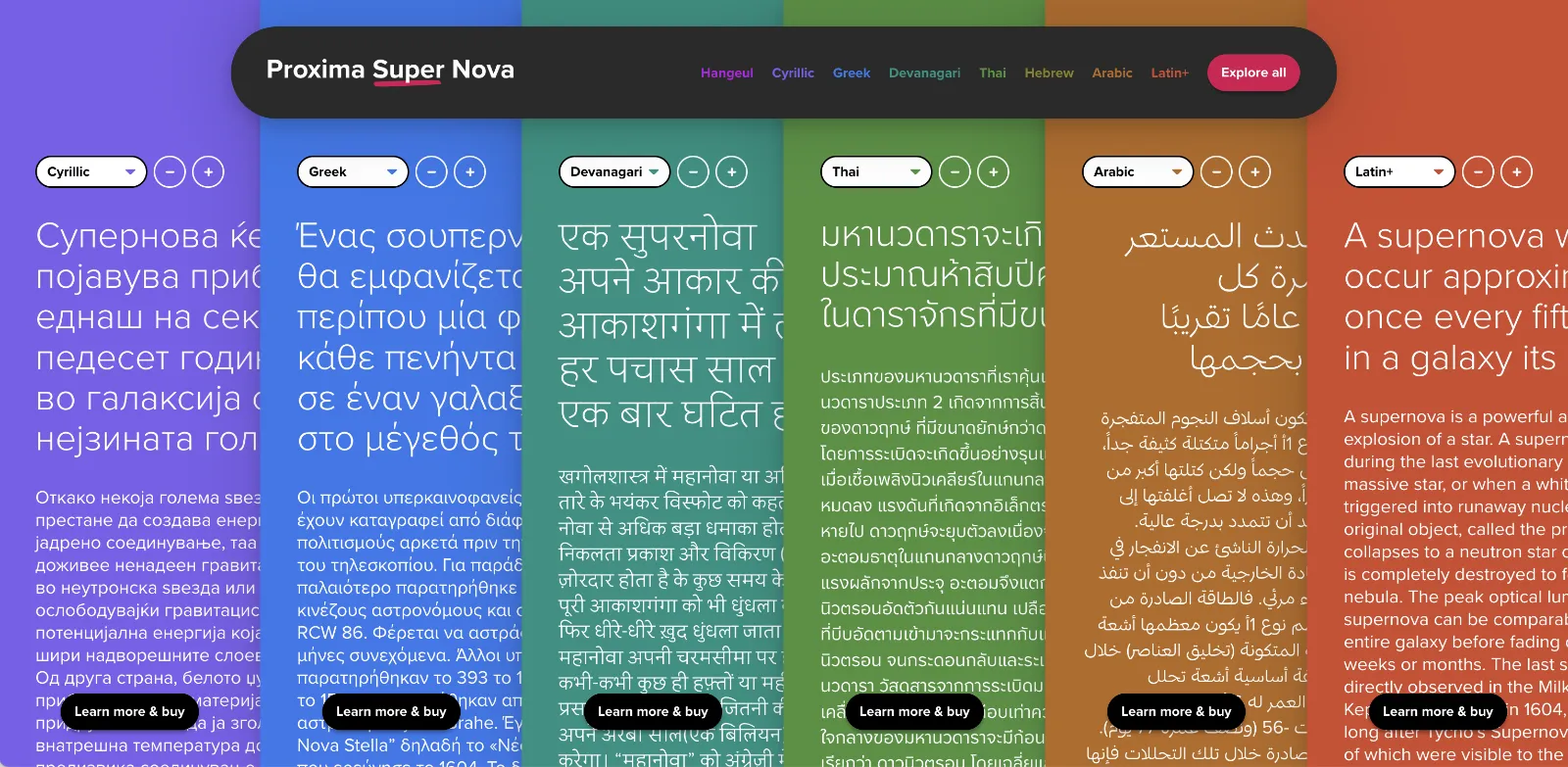
In the meantime, The Type Founders has been working to expand language support for Proxima Nova, with the aid of some really talented type designers from around the world. We’ve dubbed the fruits of this effort Proxima Super Nova.
In addition to most Western and Eastern European Latin, Greek, Vietnamese, and Cyrillic, Proxima Nova now supports Arabic, Devanagari, and Thai (both looped and loopless). More writing systems are in the works, including Hebrew and Hangeul.
Check out the Proxima Super Nova mini-site to find out all about it.
If you have any questions, are interested in extended or enterprise licensing, or need additional language support or customizations, get in touch! Send a note to info@marksimonson.com
A big thanks to the following people:
Proxima Nova Thai: Smich Smanloh of Cadson Demak
Proxima Nova Devanagari: Vaibhav Singh and Alessia Mazzarella of Typeland
Proxima Nova Arabic: Khajag Apelian and Wael Morcos
The mini-site: Elliot Jay Stocks (site design and content development) and Roel Nieskens (site development)
Project management and production support: Glenda Bellarosa and Dyana Weissman
