The New Site

I first launched my website in spring of 2000, offering my services for design, illustration, and lettering. Oh, and I also showed a few fonts I’d made.
I’d just quit my job as a product designer at Rivertown Trading Company, and I had a big plan to do all the things I had long dreamed of doing, but couldn’t because of my “day job”. I wanted to get back into doing illustration. I wanted to try to sell my services as a lettering artist, something I’d only previously done on my own design projects. And I also wanted to get back into making fonts, something I hadn’t really done very much since I released a few fonts through FontHaus in the early nineties.
My website has evolved over the past thirteen years, just as my career has. The illustration thing never really went anywhere. The lettering thing peaked about 2005. But the font thing really took off. My site has changed to reflect this.
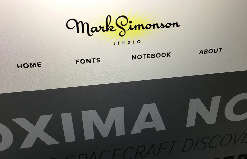
The new design, which I’m launching today, is all about the fonts. Among the changes, I’ve created all-new PDF specimens, added more complete “where to buy” information, and I’m (finally!) using webfonts on my site (Proxima Nova via Typekit). There is a new Licensing FAQ and a new feature called “Evolution of a Typeface” where I go into excruciating detail about the design process that goes into making a font. Plus: A studio tour.
I kept the blog (“Notebook”) intact, and folded my early articles (“The Scourge of Arial” and “Typecasting”) into it. My writing has been sporadic in recent years, but I plan to change that and write more regularly again. I’ve even gone through and replaced all the tiny 350px-wide blog images with big hi-res versions—Notebook: Now available in HD!
The new site is what they call responsive, meaning that the layout changes to fit any screen size, from a 25-inch desktop monitor to a 3.5-inch smartphone. Not only that, it’s all high-dpi-ready, so if you’ve got a “retina” screen, the site will look nice and sharp.
In the past, I did all my own web coding and design. But this time around, I decided to leave that work to the professionals. (You wouldn’t hire a web designer to make a font for you, would you?) The new site was designed by Trent Walton, Dave Rupert, and Reagan Ray at Paravel in Austin, Texas. (Thanks to Jason Santa Maria for recommending them.) The back end stuff was done by Matt Weinberg and his team at Vector Media Group. I’m really happy with the way it turned out (and discovered what a terrible client I can be—I’m not used to being on that side of the fence!) and I look forward to working with the new design for years to come.
