It’s been nearly ten years since I last posted an item under the “typecasting” category here. (Although it’s not like I’ve been posting a lot here in any category recently, other than new font announcements.) To refresh your memory, these were articles and blogposts calling attention to anachronistic use of type and lettering in movies and TV shows.
Today I got an email from Steve Heller alerting me that I was mentioned in an interview he did with Eric Rosenberg, who made the typographic props for the recently released movie Babylon. In it, Eric mentions my criticisms of two movies he worked on, The Hudsucker Proxy and *Almost Famous,*and the email exchange we had about it in 2009.
The props Eric made for Babylon are amazing, and would get five stars if I covered it in a typecasting post. Getting a mention in this interview made me think: Why haven’t I posted a single typecasting item since 2013?
The first thing that comes to mind is that maybe I’ve lost interest in the subject. Maybe I’ve made my point and moved on to other concerns. There’s some truth to this.
But I think the real reason is that it just doesn’t happen as often as it used to. You just don’t see as much anachronistic type and lettering in movies as you did when I first wrote Typecasting: The Use (and Misuse) of Type in Movies in 2001 and later my “Son of Typecasting” blog posts.
I have a theory why that is—and I don’t think it’s because of my article. (Although, I like to think maybe it was, a little.)
The real reason came up in my email exchange with Eric back in 2009.
He pointed out that when prop makers had access to Macs and PCs that could set type in the ’90s, thanks to the desktop publishing revolution, it had detrimental effect on props. In those early days, the selection of fonts was small, especially for period-appropriate ones. You ended up using less appropriate fonts, if only because that’s all there was. The result was a wave of typographic anachronisms that got my attention and led to my article in 2001.
But it wasn’t permanent. Things improved. There are hundreds of times more fonts available now and it’s much easier to find period-appropriate typefaces. It’s not like anachronistic choices don’t happen anymore. It’s just become a lot less common. I happened to have noticed it during its peak in the early 2000s.
Nowadays, I don’t see anachronistic type in movies and TV shows anywhere nearly as much I used to. Which is why I haven’t felt a need to write about it for a while. I don’t think that’s a bad thing. Things just got better. A lot better.
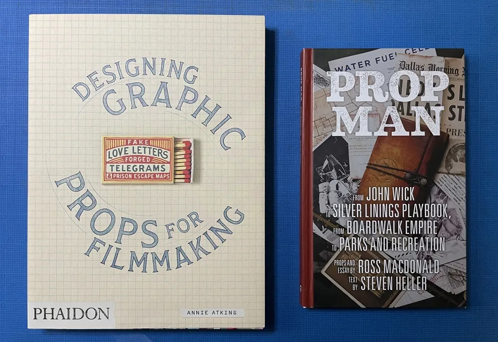
So much so that there are articles and books about people who do this for a living: Annie Atkins’ Fake Love Letters, Forged Telegrams and Prison Escape Maps, which covers in exhaustive and beautiful detail her work on Wes Anderson’s Grand Budapest Hotel, and Prop Man, an overview of the work of illustrator and designer Ross MacDonald with text by Steve Heller.
If anything, we’re witnessing the renaissance of a once overlooked specialty area in filmmaking, replete with superstars.
And anachronistic type in movies? It doesn’t seem to be much of a problem anymore.
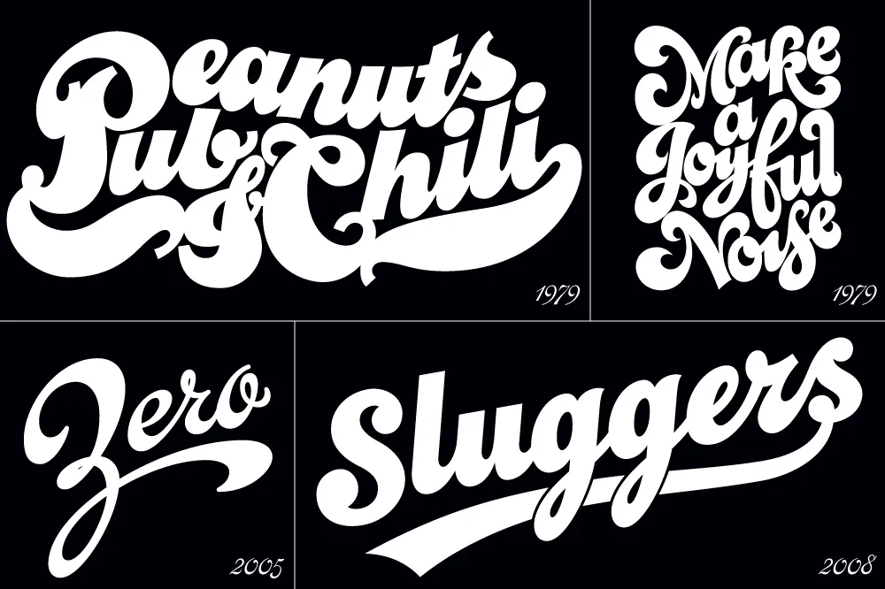
I’ve been interested in the classic script style of the early 20th century for as long as I’ve been drawing letters. It was commonly used in logos and trademarks, meant to convey the idea of a signature. Think: Ford. Coca-Cola. Coors. Blatz. Schlitz. Rainier. Campbells soup. Any number of baseball clubs. The style was revived in the 1960s, sometimes evolving into psychedelic or pop-art forms.
There have been fonts from time to time based on this script style, but quite often they have more of a sixties or seventies look. I decided to try my hand, hoping to get closer to the early 1900s feel.
In 2004, I pitched the concept to House Industries. They liked idea, and we made a deal to develop the script, along with a sans and a serif, all with a “sports” theme.
Working with Ken Barber, I was impressed with his commitment to quality and detail. I thought I was an okay type designer at the time, but my experience with Ken significantly raised my standards on all the fonts I’ve done since then. Unfortunately, the project languished due to other priorities at House and was eventually put on hold.
Around 2012, I decided to resume work on the script on my own. At that point, only the lowercase and a few caps had really been drawn, and I was really itching to design the rest of the caps.
In 2017, I showed Ken what I’d been up to with the script. I asked if he thought House was ever going to get the project going again, and, if not, could we amend the agreement to allow me to release it myself? Long story short, House agreed.

With the script fully in my hands, I stepped up the pace to finish it. Five years later, the result is Dreamboat.

Back when I was working on it with House, there was only a single bold weight. To provide more flexibility for designers, I expanded this to six—Light, Regular, Semibold, Bold, Extrabold, and Black. (Dreamboat might be the only script in its genre with such a wide weight range.)

One of the things that bug me about a lot of script typefaces is lack of a solution to situations where you need to set something in all caps, such as roman numerals or acronyms. For that I added small caps.

There is also a stylistic set which raises the cross-bar of the lowercase “t” and extends it for more of a custom look.

To top it off, Dreamboat includes three styles of tails—an element quite often used with bold scripts.
Check out the User Guide to see how it all works. Tip: Many of my vendors have type testers where you can type your own text and see how it looks. The tails work by typing one or more underscores at the end of a word. Just make sure that ligatures are enabled on the site (sometimes they are not).
I never dreamed when I started that it would take nearly 20 years to finish Dreamboat. But, to be honest, I’m glad it did because it was really beyond my skills when I first started working on it. It’s been one of the most enjoyable typefaces to design, and I’m excited to see what people will do with it.
Dreamboat is available at all the usual places for desktop, web, and other uses.
Not long after I released Proxima Nova in 2005, people started asking me: “What serif font would work best with Proxima Nova?” It’s very common to combine serif and sans serif typefaces, usually a serif face for text and sans serif for larger sizes or for emphasis or change of tone in text. I usually suggested a modern, such as Century Schoolbook, or a slab serif, such as Rockwell. None of my suggestions felt like a satisfying answer to me, so I started thinking about designing a serif sibling to Proxima Nova.
After some false starts over many years, trying to add serifs to Proxima Nova somehow, I decided instead to create a serif companion—a face that is not simply a seriffed version of Proxima Nova, but a serif typeface designed to harmonize with Proxima Nova, while having its own structure and identity, similar to the way that Morris Fuller Benton’s Century faces harmonize with his Franklin Gothic and News Gothic.
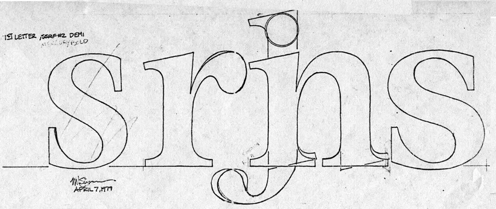
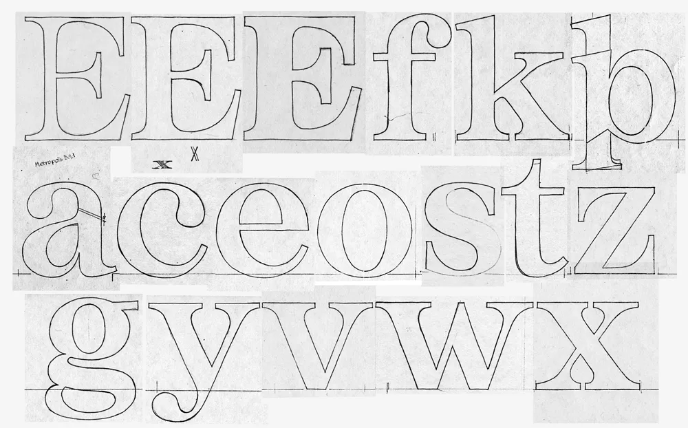
Back in 1979, when I was first dreaming about making typefaces, and around the same time I had the earliest ideas for what would become Proxima Nova, I did some sketches based on the concept of combining the characteristics of several popular serif typefaces—Times, Plantin, Century, and Baskerville—but with proportions similar to Helvetica. The working name was “Metropolis.” Proxima Nova was based on a similar hybrid concept, but with sans serif typefaces. The idea of using something that came out of the same period and the same thinking as my concept for Proxima Nova made sense.

In 2020, I went to work and adapted “Metropolis” as a companion to Proxima Nova, changing some of its details and proportions to harmonize better with its sans serif counterpart. The overall style falls more squarely in the modern category than my 1979 concept, but it retains some old style elements, such as the spurless serifs on the C, G, and S and the structure of the numerals.
The result is Proxima Sera.

Proxima Sera 1.0 contains a subset of the Proxima Nova character set (Greek and Cyrillic are still to come), but it has all the same features—small caps, old style figures, alternate characters, etc. There also is only the regular width. Condensed and Extra Condensed will come later. It has all the same weights, from Thin to Black, plus one more—Extralight.
Proxima Sera works beautifully with Proxima Nova. But, of course, like Proxima Nova, it can stand on its own or play nice with other fonts.
Proxima Sera is available immediately for licensing at most of the usual places.
Have you ever wondered what serif font would work best with Proxima Nova? I’ve often been asked this question, and I never really had a good answer.
That’s about to change.
I’ve been working on something new and I’m going to be talking about it for I Love Typography’s inaugural Font Fashion Week which celebrates the latest trends in type design today. I will be giving a 30 minute online talk on April 5, 2022 to showcase what I’ve been working on and the process that went into its creation, and I invite you to attend (click here to attend). The talk is free and you may share this link with friends and colleagues if you think they would be interested.
Hope to see you there!
Update: It’s Proxima Sera. You can watch the talk on Youtube now or read it alongside my slides.
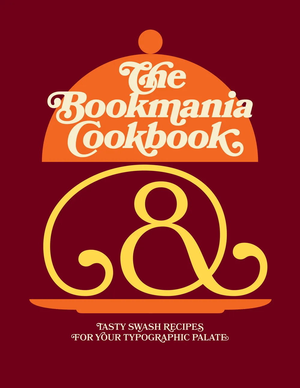
Ten years ago, when I first released Bookmania, I mentioned in the specimen book that there would be a user guide showing how to take advantage of the hundreds of swash and alternate characters. While the concept was clear in my mind from the start, it became one of those projects that were perpetually on the back burner, the kind of project I procrastinate about in order to get other things done.
But recently, after getting yet another email from a user asking how to access Bookmania swashes, I finally found the time and energy to finish The Bookmania Cookbook.
It starts with an overview on how to access swash and alternate characters in desktop apps and in CSS for the web. It then goes over some of the do’s and don’ts of using swashes.
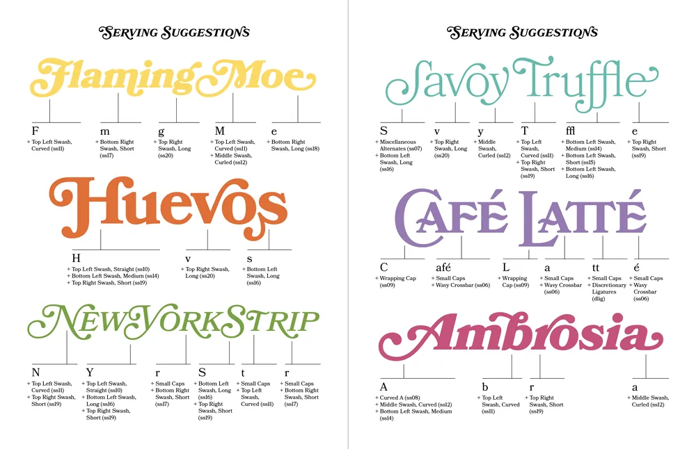
This is followed by a “serving suggestion” section where I prepared over a dozen examples of Bookmania swashes in use to give you some ideas and inspiration for your own designs.
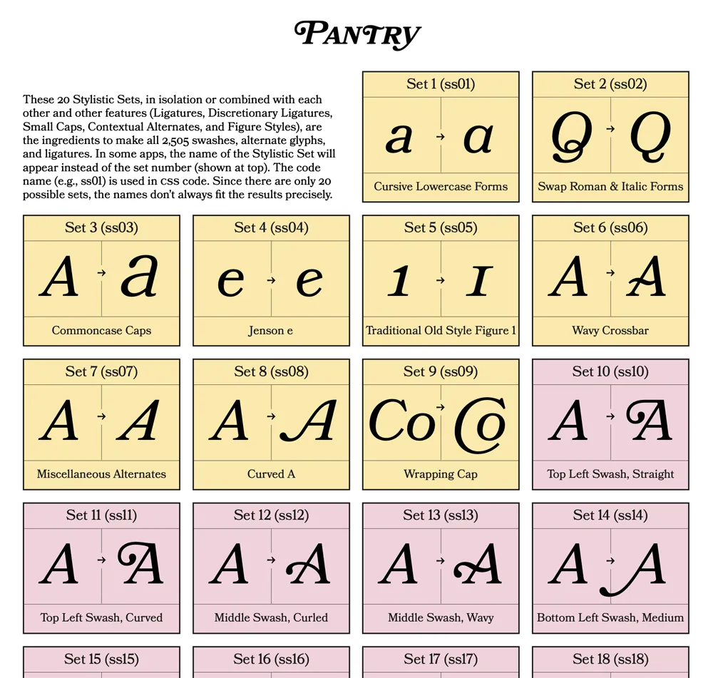
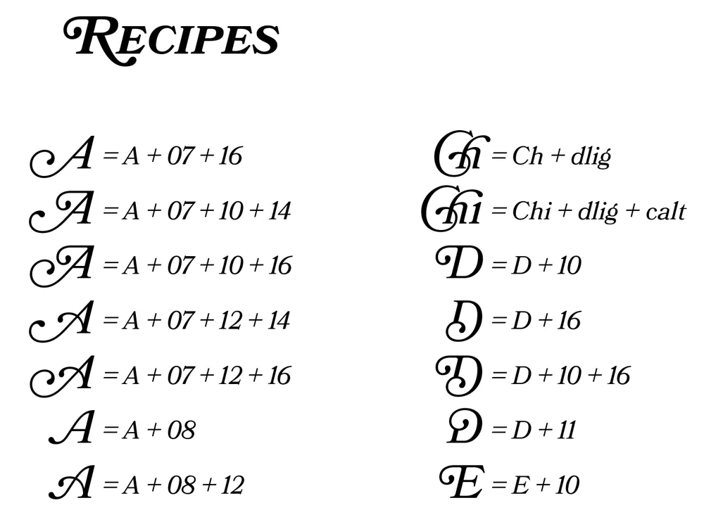
Finally, there is a reference section which includes a table of Stylistic Sets and a complete “recipe” section that shows you how to produce every swash and alternate character using Stylistic Sets and other OpenType features, which is especially useful on the web.
Sorry it took so long to put this together. If you’re a Bookmania user, I hope you will find this “cookbook” helpful. You can download it here.
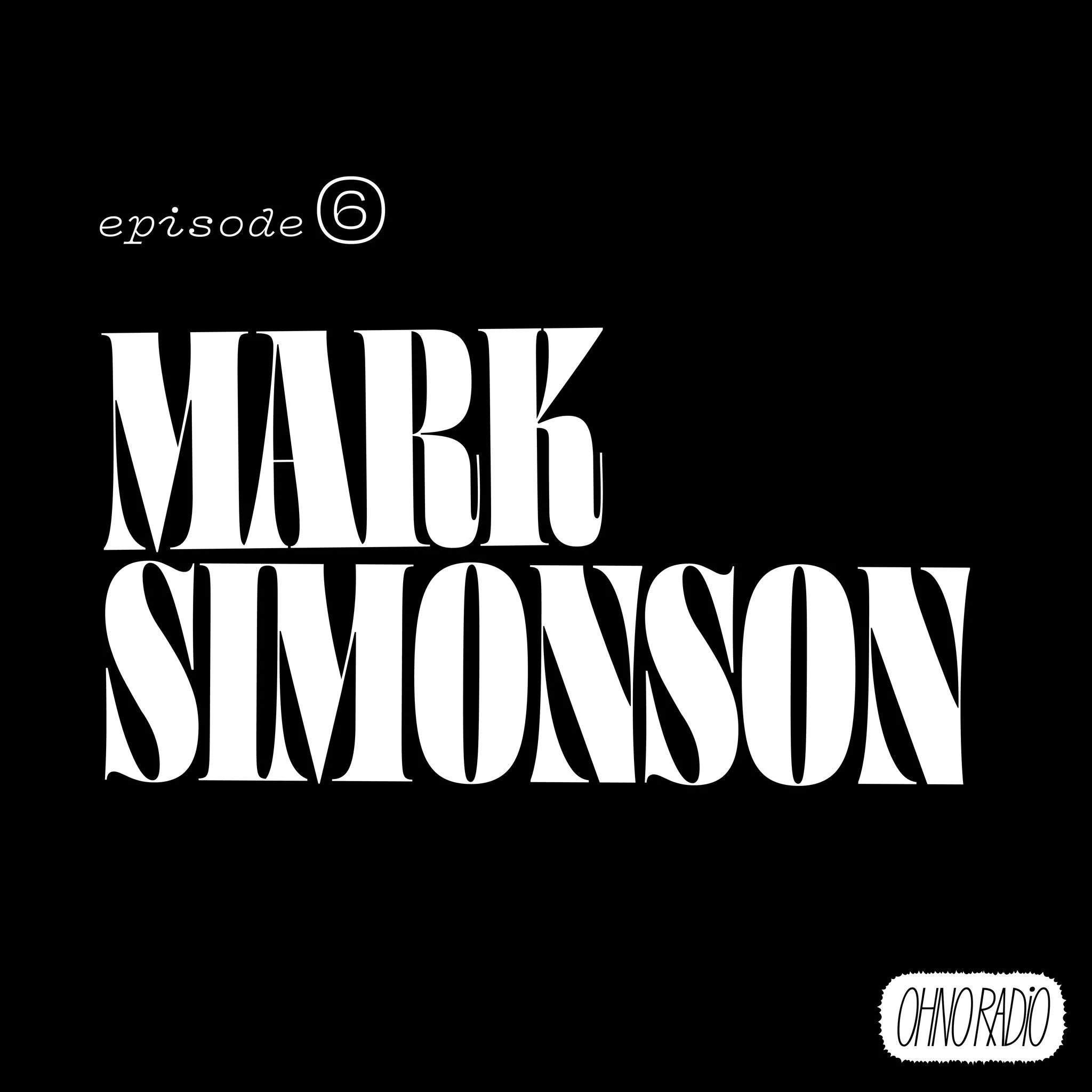
A fellow type designer, the talented James Edmondson (Ohno Type), started doing a podcast recently called Ohno Radio. Like everything James does, it’s very well done. It features interviews with people in the font world and covers font-related topics. Naturally, I was excited when James invited me to be interviewed for the show. He was well prepared and had good questions. It was a lot of fun and we had a great conversation.
You can listen to it here: https://ohno-radio.simplecast.com/episodes/mark-simonson
You can subscribe to the podcast in the usual ways. James also makes fantastic fonts. Both are highly recommended.
