After years without a proper newsletter, I decided it might be a good idea to send out occasional updates. With a bunch of new fonts coming down the pipeline, these emails will keep you up to date with announcements you may have missed on social media.
I don’t plan to send it out very often—no more than about 6 times a year. It’s mostly to announce new font releases. If that’s still too much for you, you can unsubscribe anytime.
The first issue will be out on Tuesday, September 4. A regular feature of Font News will be sneak peeks of the fonts I’m working on next.
You can subscribe here. If you know anyone who might also like to get the newsletter, feel free to send them to the signup page.
September 6, 2018 Note: I originally called this Letter News. Turns out, Jill Bell (lettering artist, type designer, and long-time friend) has been doing an email newsletter also called Letter News for the last ten years. Oops! Sorry about that, Jill! It’s now called Font News.
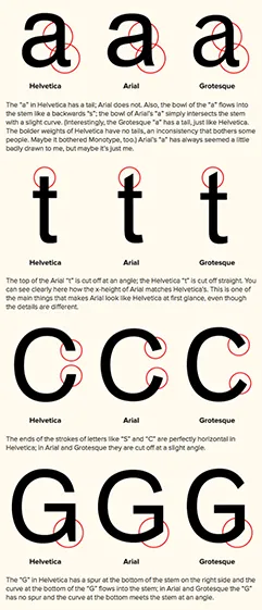
Reader Egemen Sentin wrote to point out an odd coincidence he noticed on the “How to Spot Arial” page: “The first four characters (a, t, c and g) that you chose for distinguishing between fonts Arial, Helvetica and Grotesque are also the first letters of the four bases of DNA, adenine, thymine, cytosine and guanine – proof that fonts have genes!”
A week or so ago, I had a phone call from a guy from St. Petersburg, Russia. It wasn’t clear from his preliminary emails what he had in mind to talk about. I assumed it was something about type, or an iPhone app he was working on, or both.
Turns out, he is a fan of my blog. It was an interview about blogging. Blogging!
I felt a little embarrassed. I’ve posted only eight items here in the last two years. And most of those were to promote something. Some blog.
But talking to him rekindled my interest. I like what I used to do here, and I really want to get it going again.
So, here’s my first post of the year. No promises, but I’m going to try to post at least one item every day from now on. We’ll see.
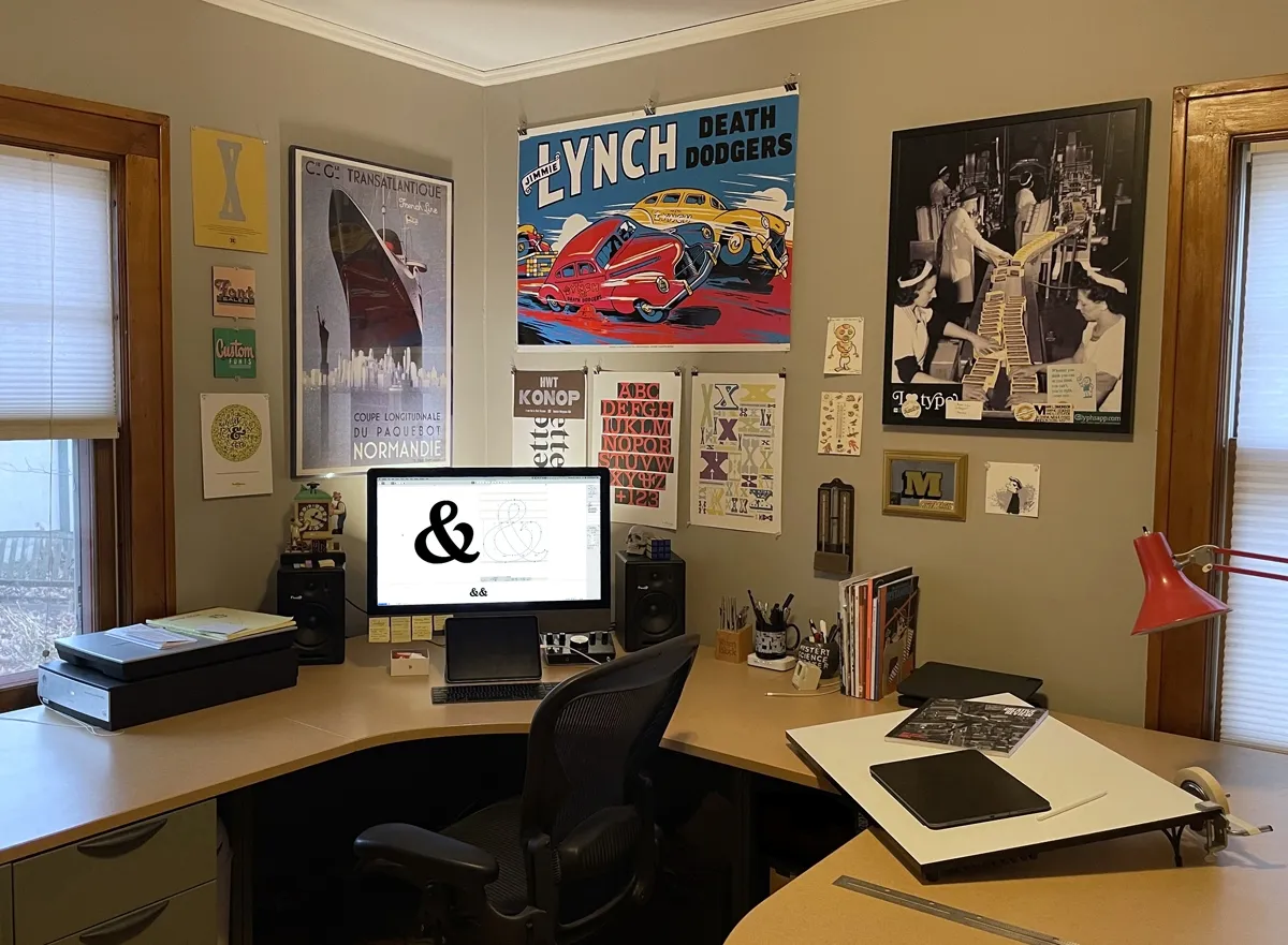
I recently had the ceiling in my studio repaired due to some water damage. While they were at it, I had them give the room a fresh coat of paint. Out with the yellow, in with the warm gray. This was a good opportunity to update my studio tour, which I’d barely touched since I first posted it on the site in March 2013. (Gosh, how time flies!)
Some things have changed: Completely different computer, mostly different things on the walls, some furniture changes. No inkjet printer anymore. (I have a Xerox color laser printer in another part of the house.) And no cats. Sadly, they both passed away a few years ago. Quite a bit is still the same though, like my desk, storage cabinet, and bookcase. The overall arrangement is about the same as it’s been for the last 12 years or so. What can I say? I’m a creature of habit.
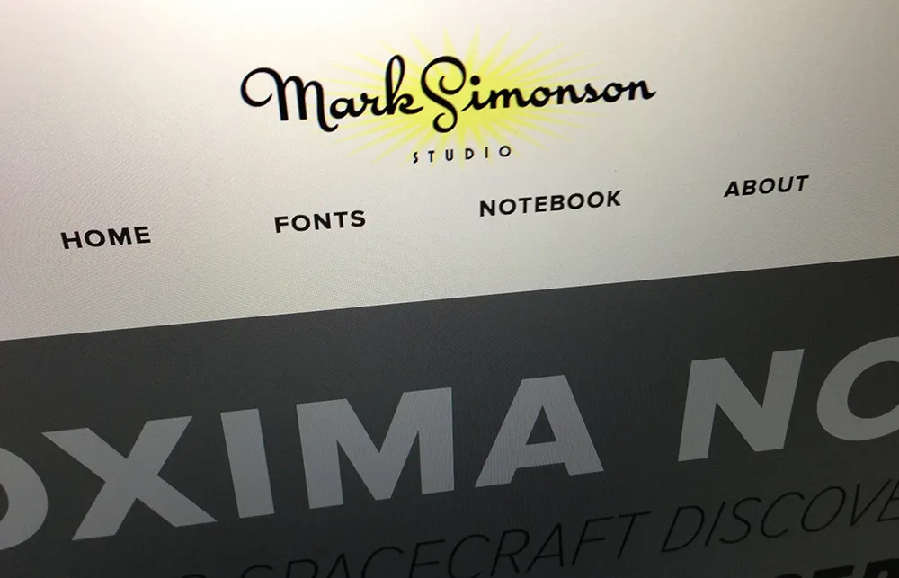
I first launched my website in spring of 2000, offering my services for design, illustration, and lettering. Oh, and I also showed a few fonts I’d made.
I’d just quit my job as a product designer at Rivertown Trading Company, and I had a big plan to do all the things I had long dreamed of doing, but couldn’t because of my “day job”. I wanted to get back into doing illustration. I wanted to try to sell my services as a lettering artist, something I’d only previously done on my own design projects. And I also wanted to get back into making fonts, something I hadn’t really done very much since I released a few fonts through FontHaus in the early nineties.
My website has evolved over the past thirteen years, just as my career has. The illustration thing never really went anywhere. The lettering thing peaked about 2005. But the font thing really took off. My site has changed to reflect this.
The new design, which I’m launching today, is all about the fonts. Among the changes, I’ve created all-new PDF specimens, added more complete “where to buy” information, and I’m (finally!) using webfonts on my site (Proxima Nova via Typekit). There is a new Licensing FAQ and a new feature called “Evolution of a Typeface” where I go into excruciating detail about the design process that goes into making a font. Plus: A studio tour.
I kept the blog (“Notebook”) intact, and folded my early articles (“The Scourge of Arial” and “Typecasting”) into it. My writing has been sporadic in recent years, but I plan to change that and write more regularly again. I’ve even gone through and replaced all the tiny 350px-wide blog images with big hi-res versions—Notebook: Now available in HD!
The new site is what they call responsive, meaning that the layout changes to fit any screen size, from a 25-inch desktop monitor to a 3.5-inch smartphone. Not only that, it’s all high-dpi-ready, so if you’ve got a “retina” screen, the site will look nice and sharp.
In the past, I did all my own web coding and design. But this time around, I decided to leave that work to the professionals. (You wouldn’t hire a web designer to make a font for you, would you?) The new site was designed by Trent Walton, Dave Rupert, and Reagan Ray at Paravel in Austin, Texas. (Thanks to Jason Santa Maria for recommending them.) The back end stuff was done by Matt Weinberg and his team at Vector Media Group. I’m really happy with the way it turned out (and discovered what a terrible client I can be—I’m not used to being on that side of the fence!) and I look forward to working with the new design for years to come.
