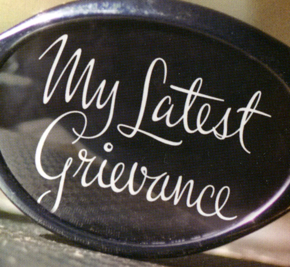
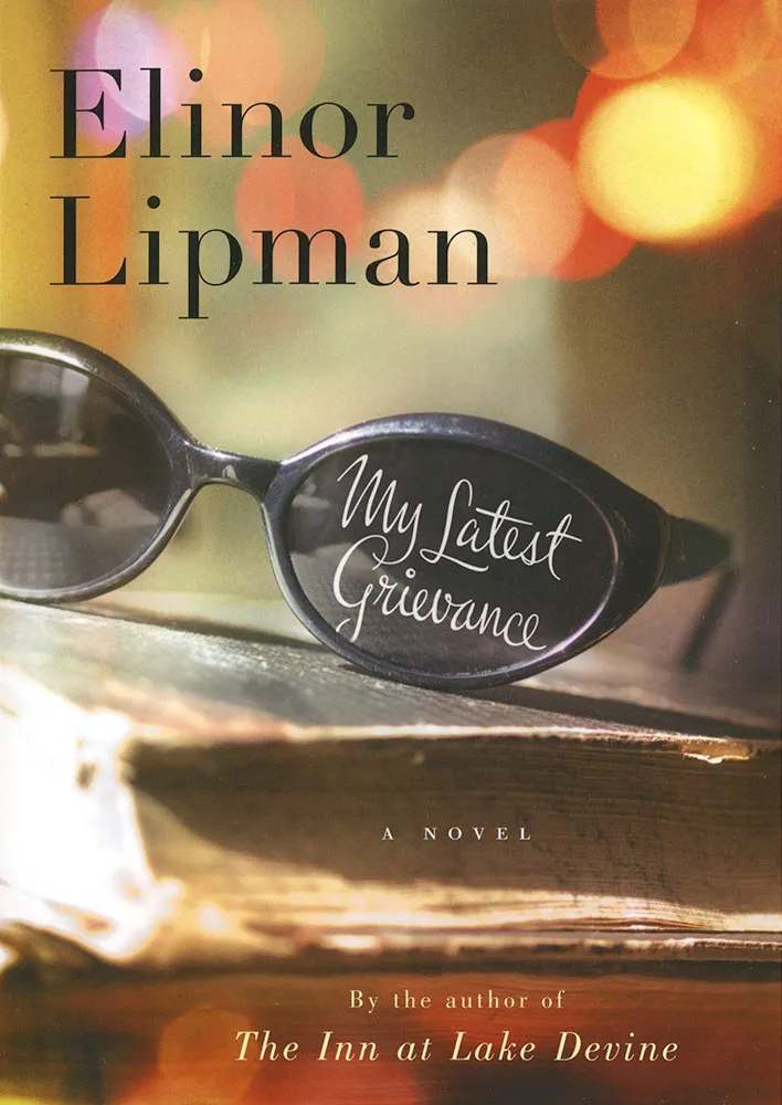
One of my recent lettering jobs was this one for the cover of Elinor Lipman’s new book My Latest Grievance, due out next spring. Houghton Mifflin art director Martha Kennedy wanted something spirited with a handwriting feel. I’m happy with the way it turned out. I’m always a little surprised that I can do this style at all. My actual handwriting is pretty erratic. I know people who can write like this. There must be something about the way their hands work that I just don’t have. Luckily, if I know how I want it to look and take my time, with a little assist from computer technology, I can pull it off. I take heart in the fact that the great lettering artists of the past would have been lost without their photostat cameras and razor blades. These things are never as easy as they look.
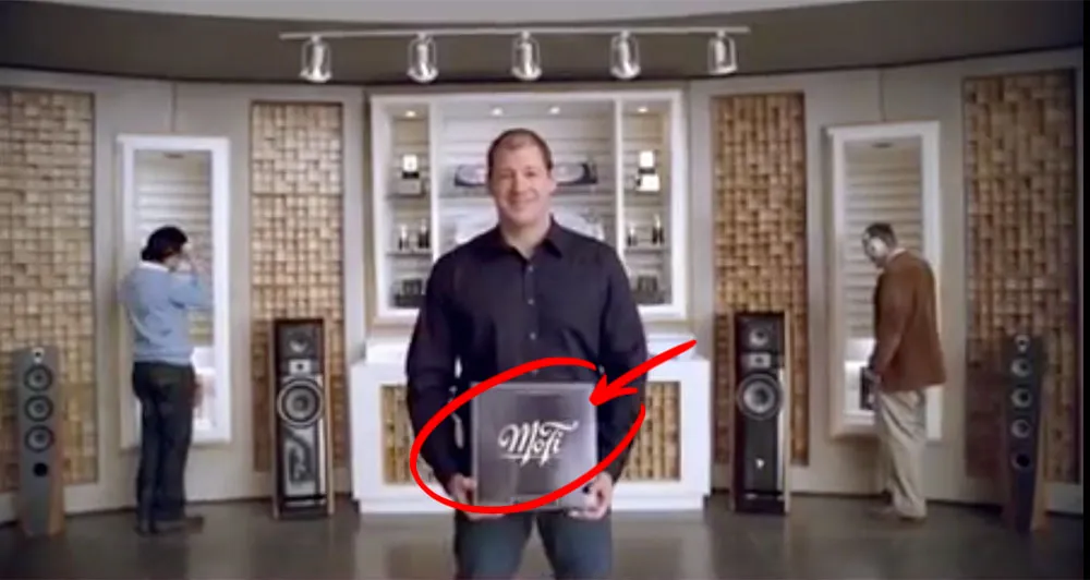
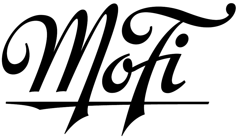
A year or two ago I lettered a logo for a company called Mobile Fidelity — MoFi for short. They do high-end recordings for audiophiles. I got a tip from the designer whom I worked with on the job that MoFi was featured in a recent American Express ad, and that the logo shows up near the end of the ad. Here’s a better look at the logo:
(Thanks to David Collins for the tip.)
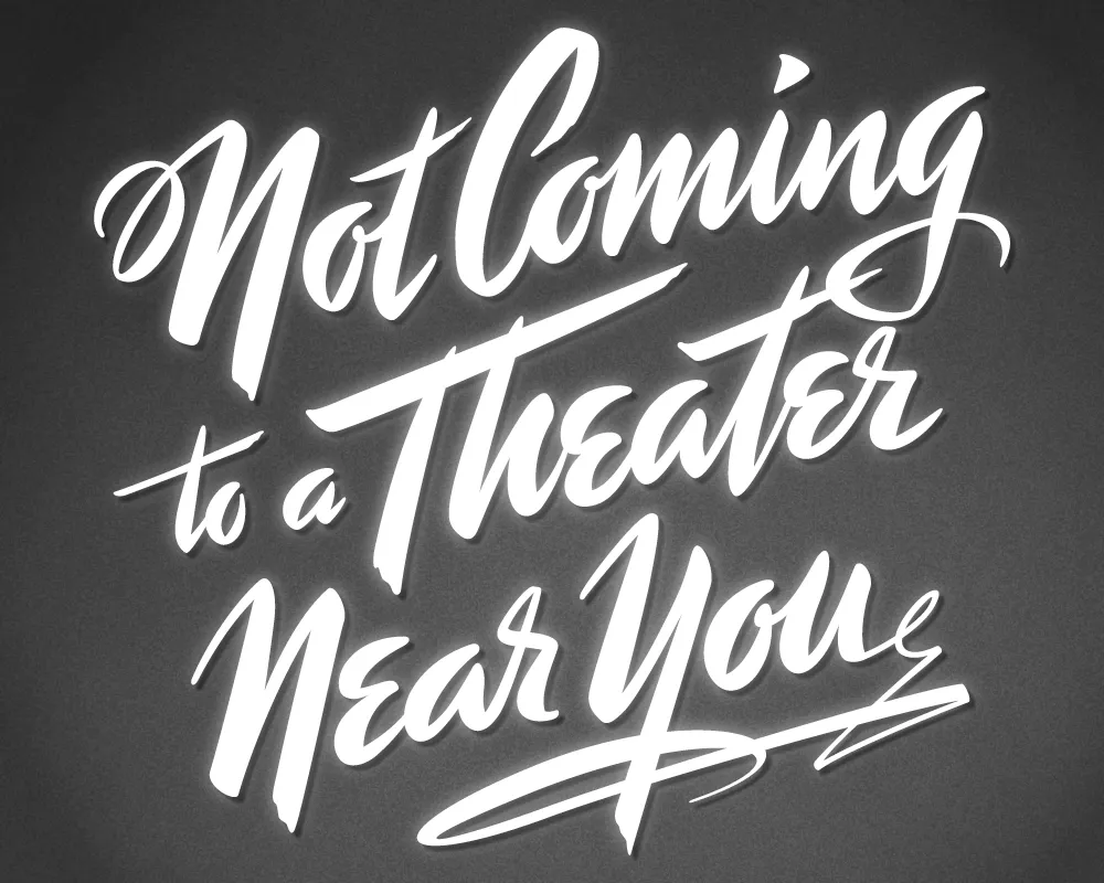
Last year, I did a logo design for Not Coming to A Theater Near You, a website devoted to movies off the beaten path. The designer, Rumsey Taylor, who was redoing the look of the entire site, wanted the logo to look like a title card from a film noire feature. What I came up with is based mainly on the title card from “Mr. Arkadin” (1955).
In spite of appearances, I don’t usually use an actual brush in my lettering designs, but in this case I did. The final art is vector-based, but I worked out the construction of the letters with brush and ink. (I’m not skilled enough at brush lettering to do the final art that way.)
The image above is a “treatment” I did to make it look like an actual title card from an old film, sort of a “serving suggestion.” On the wesite, Rumsey chose a simpler approach. The site redesign looks great, and I was happy to see that he’s using Metallophile Sp8 as a webfont (via Typekit).
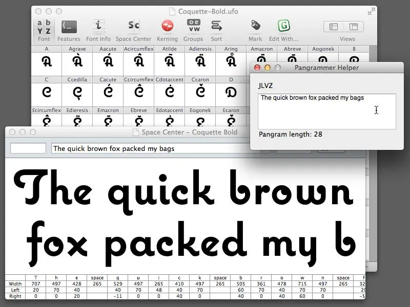
Almost ten years ago, I made a little program called Pangrammer Helper. It’s a little tool to help compose pangrams, which are sentences containing every letter of the alphabet. It was built in Flash and was designed to run in a web browser.
Type designers are especially enamored of pangrams, as you can imagine. Fellow type geek and friend, Craig Eliason, has been using it for several years to compose entries for his Daily Pangram site.
Recently, a new font editing app called RoboFont was released, and I’ve been starting to use it in my work. One of the neat things about it is that it’s fully extendable—that is, if you are willing to do a little Python programming, you can add features to it.
Last week, the Robothon 2012 conference was held in The Hague. It was all about type design and technology. I wasn’t able to attend, but videos of most of the talks have been made available on Vimeo, and I’ve been watching them the last couple days. Two of them in particular, one by Tal Leming about Building Stuff and another by Frederick Berlaen introducing RoboFont, inspired me to rewrite my Pangrammer Helper in Python so it could work inside RoboFont.
It took less than a day to do it, and it works great. You can use it by itself, and it works a lot like the old Flash version (a bit simplified), or, if you have RoboFont’s “Space Center” window open (the window were you work on your font’s spacing), the text also appears there as you compose it.
If you happen to be a RoboFont user, you can download version 1.2 of the script here. Just drop it into your scripts folder and you can run it right from the Extensions menu.
Update: Frank Grießhammer (currently working in Adobe’s type department) has contributed some improvements to my script, mainly adding the ability to add non-ASCII characters (as in “Grießhammer”) and an option for mixed-case pangrams. Thanks, Frank! The download link above will download this version (1.2).
Okay, so I admit it. I bought an iPhone about three hours after they went on sale a month ago. I didn’t have to wait in line or anything. I walked in, bought it, and walked out. Like nearly everyone else who has one, I’m very happy with it.
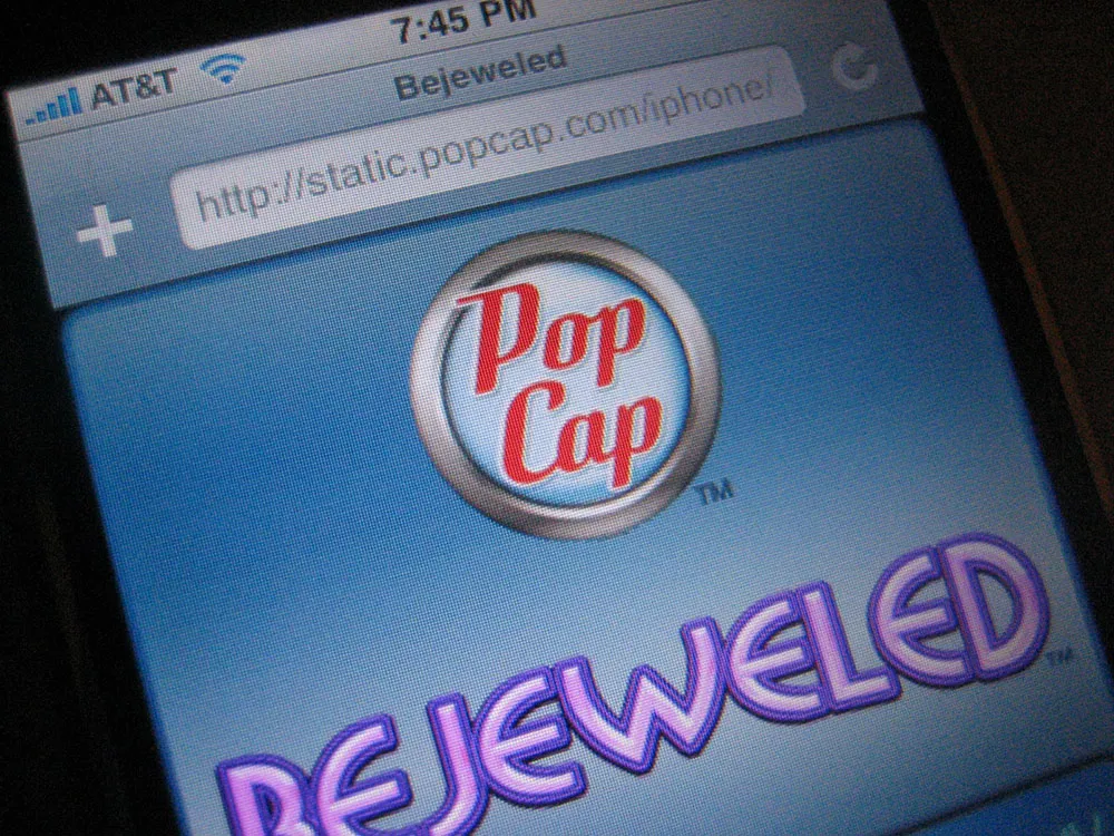
So, I was a bit tickled today when I unexpectedly saw some of my recent work on it: the new PopCap Games logo, which appears on Bejeweled, the first game designed specifically for the iPhone.
I did the job last spring. Here is a comparison of the old version and the new version:
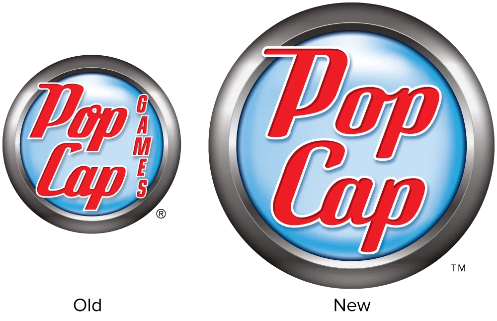
The idea was to make the logo cleaner and smarter without making it noticeably different to PopCap’s customers. Except for the background emblem, practically every detail of the lettering was changed. It would have been fun to completely redo it, but I’m happy with how it turned out.
If you have an iPhone and want to play Bejeweled, fire up Safari and head over the PopCap website. The game will automatically load when you visit the site using an iPhone.
When I decided to sell the rights to my library of fonts to The Type Founders in 2021, one of the big reasons for me was the ever-growing burden of maintaining and developing that library.
As a one-person studio, there was only so much I could do. Proxima Nova had become very popular since I released it in 2005, and I regularly got requests to expand its language coverage.
At first, I did this task myself, adding support for Greek and Vietnamese in 2009 and Cyrillic in 2010. Even though I can’t read languages that use these writing systems, they were close enough to the Latin alphabet that I felt sufficiently confident to design them. But I’ve always felt out of my depth as a type designer even thinking about designing non-Latin fonts.
Still, I could see that adding even more language support would make a lot of sense for such a popular type family. Theoretically, I could hire other designers and production people to help, either as employees or as contractors. But that would mean managing those people, something I know I’m not very good at.
I like working by myself, and I would rather spend my time working on new typefaces.
It was around the time I was thinking about these problems back in 2019 that I was approached by Paley Dreier (now Managing Partner of The Type Founders) about selling my font library. It was something I’d never thought about before, but I eventually realized that it would be a neat solution to my problems. I would be relieved of the burden of maintaining and expanding my existing fonts, giving me time to focus on designing and releasing new fonts—which is what I’ve been doing for the last few years, with the release of Proxima Sera, Dreamboat, Proxima Nova Wide and Extra Wide, Viroqua, Cheesecake, Madcap, Gertie, and Skin & Bones. In fact, I’m currently working on a new sans serif family, the first since Proxima Nova, if you don’t count display faces.
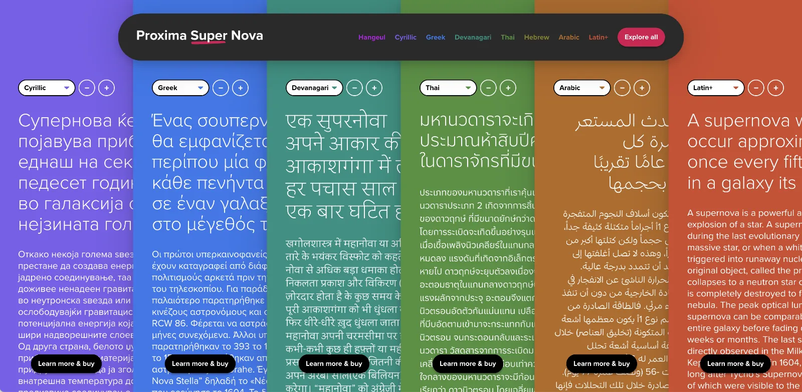
In the meantime, The Type Founders has been working to expand language support for Proxima Nova, with the aid of some really talented type designers from around the world. We’ve dubbed the fruits of this effort Proxima Super Nova.
In addition to most Western and Eastern European Latin, Greek, Vietnamese, and Cyrillic, Proxima Nova now supports Arabic, Devanagari, and Thai (both looped and loopless). More writing systems are in the works, including Hebrew and Hangeul.
Check out the Proxima Super Nova mini-site to find out all about it.
If you have any questions, are interested in extended or enterprise licensing, or need additional language support or customizations, get in touch! Send a note to info@marksimonson.com
A big thanks to the following people:
Proxima Nova Thai: Smich Smanloh of Cadson Demak
Proxima Nova Devanagari: Vaibhav Singh and Alessia Mazzarella of Typeland
Proxima Nova Arabic: Khajag Apelian and Wael Morcos
The mini-site: Elliot Jay Stocks (site design and content development) and Roel Nieskens (site development)
Project management and production support: Glenda Bellarosa and Dyana Weissman
