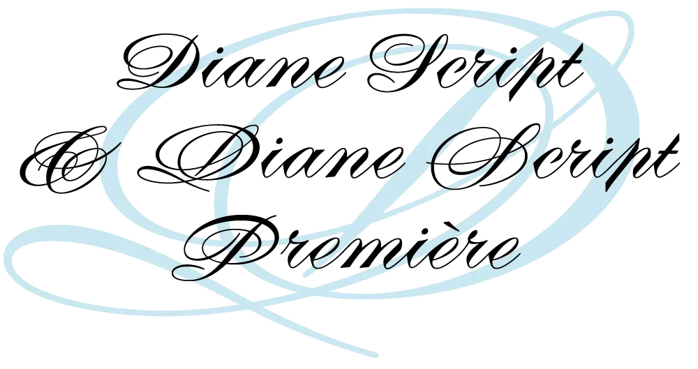
I recently partnered with Mark Solsburg of FontHaus, who has lately become fascinated with twentieth-century French type foundries and type designers, to create a faithful digital revival of Diane, a typeface designed by Roger Excoffon. It was released in 1956, around the same time as his more famous Mistral and Choc. For reasons that aren’t clear to me, Diane seems to have never become as popular as his other faces, especially in the U.S. Finding full specimens of the font turned out to be quite a challenge. In many cases, only the caps and lowercase are shown.
With Mark’s help, I was able to get hold of source material from the University of Groningen in the Netherlands, D. Stempel GmbH metal type services in Frankfurt, Germany, as well as from some type specimen books that I already had in my possession.
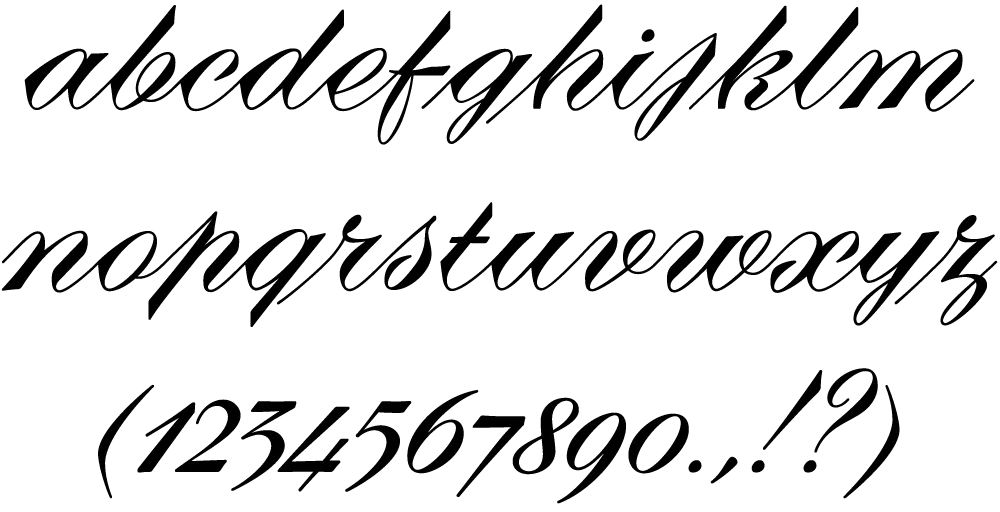
As I researched and studied the face, many curious facts came to light. The caps in earlier specimens of Diane are completely different from specimens published later, suggesting that the face was redesigned at some point, perhaps in the mid-1960s. So we are left with two different sets of caps.
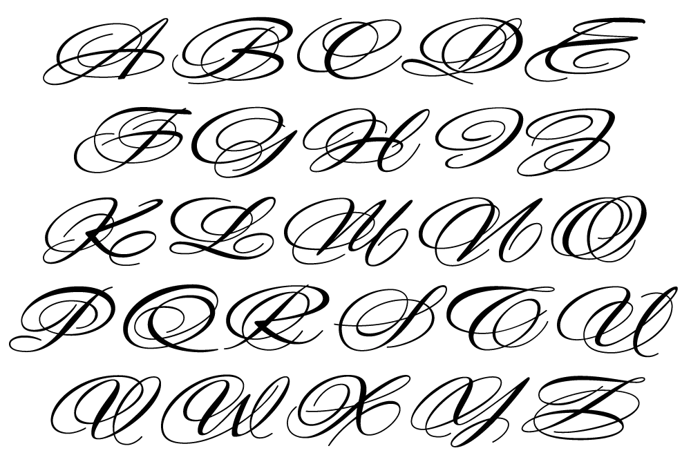
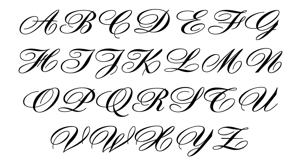
The original had very elaborate, swirly strokes, characteristic of Excoffon’s gestural designs for posters and logos. Later on, these appear to have been replaced by a set of simpler, more traditional script caps. The original caps are criticized in one source I found (“Practical Handbook on Display Typefaces,” 1959) as being “exquisite” but “not highly legible.” Perhaps this is what led to the simpler caps being introduced.
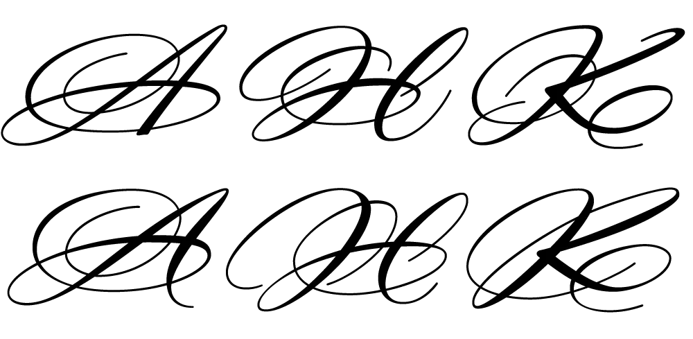
Even more curious, the caps shown in the Olive specimen “3 Scriptes” that accompanied its release in 1956 are noticeably different from the ones found in existing Diane metal fonts. The only conclusion I can make is that Diane, as it was shown in the “3 Scriptes” specimen, was not yet finalized when this was published. (Some of these earlier character designs are included in my revival.)
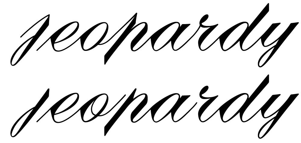
Changes appear to have been made in the lowercase as well. Several characters have non-connecting incoming strokes in the 1956 version. In the later version, the strokes all connect. The lowercase o also differs, with the original “3 Scriptes” specimen showing a loop inside the counter, apparently dropped in the released version.
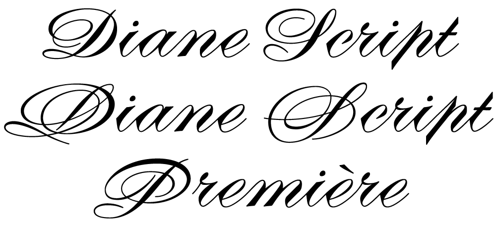
In my digital revival of Diane, I’ve included many of these differences. Diane Script Première includes the beautiful caps from the original version, while Diane Script features the later, simpler caps. Both faces include the non-connecting lowercase characters and the earlier lowercase o as alternate characters. Diane Script Première includes three of the “unfinished” caps from the “3 Scriptes” specimen as alternates.

Of course, metal foundry faces had nowhere near the number of characters that modern digital faces do, so it was necessary to design quite a few new characters to match Excoffon’s original ones. This proved to be a fairly straightforward process, with one exception: the ampersand.
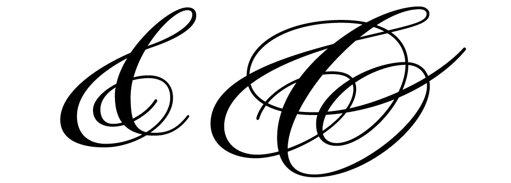
As hard as it is for me to believe, it appears that Diane never had an ampersand. None of the specimens I’ve found so far has shown one. I still hold out the possibility that one exists, and intend to add it if it turns up. In the meantime, I have come up with two that I am satisfied with. The first is a simpler design to go with the simpler caps in Diane Script. In the second, I tried to capture the energy and exuberance of Excoffon’s original caps. Studying Excoffon’s gestural design work was very helpful for this. Diane Script Première includes both ampersands, with the simpler one as an alternate.
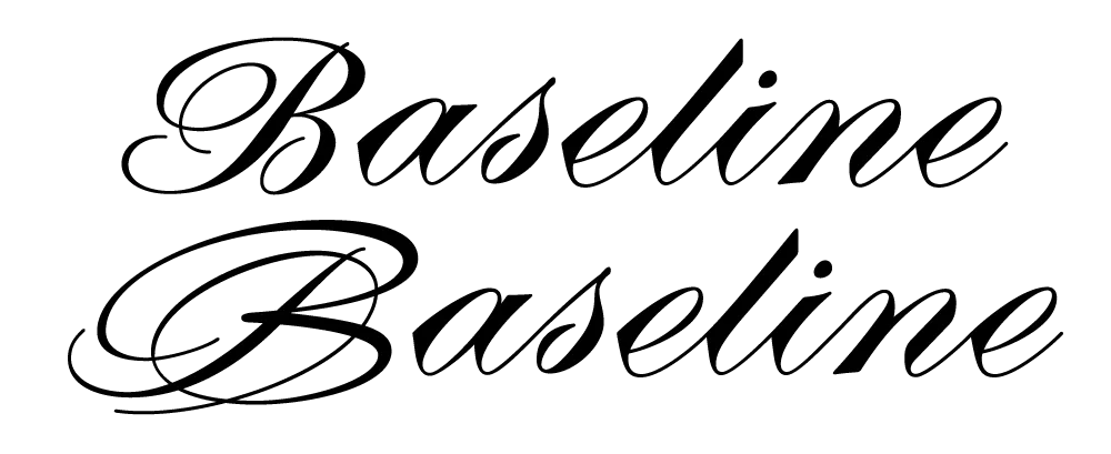
Diane Script and Diane Script Première are not the first attempt to revive Diane digitally. However, in my research, I discovered a detail that previous attempts have gotten wrong: the alignment and spacing of the caps in relation to the lowercase. Unlike most typefaces, Diane’s caps actually sit slightly below the lowercase baseline. The most easily found specimens of Diane show the caps and lowercase separately, so this fact is hidden. Luckily, my source material included a few obscure specimens in which the correct relationship can be seen.
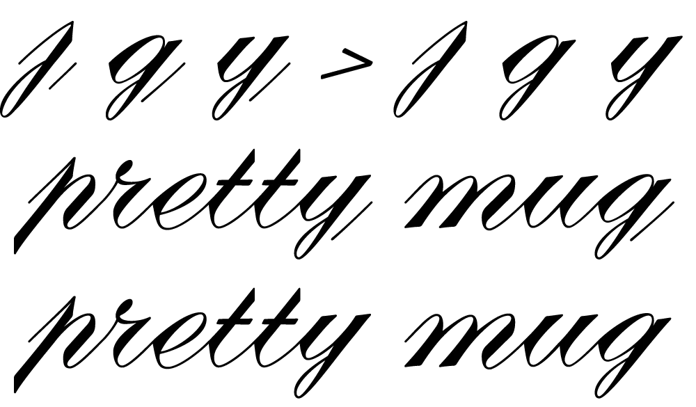
Several of the lowercase letters have disconnected outgoing strokes, intended to connect to the following letter. However, when it falls at the end of a word, the disconnected stroke is conspicuous and unnecessary. In the metal typeface, this was apparently an acceptable compromise. But in OpenType format, we can have it both ways. When such a character falls at the end of a word, the orphaned stroke is omitted automatically. (An OpenType-savvy application and/or operating system is required for this feature to work.)
In reviving Diane, I’ve sometimes felt more like a detective than a type designer. I’m very happy with the way it turned out and hope my efforts will bring new life to Roger Excoffon’s masterpiece.
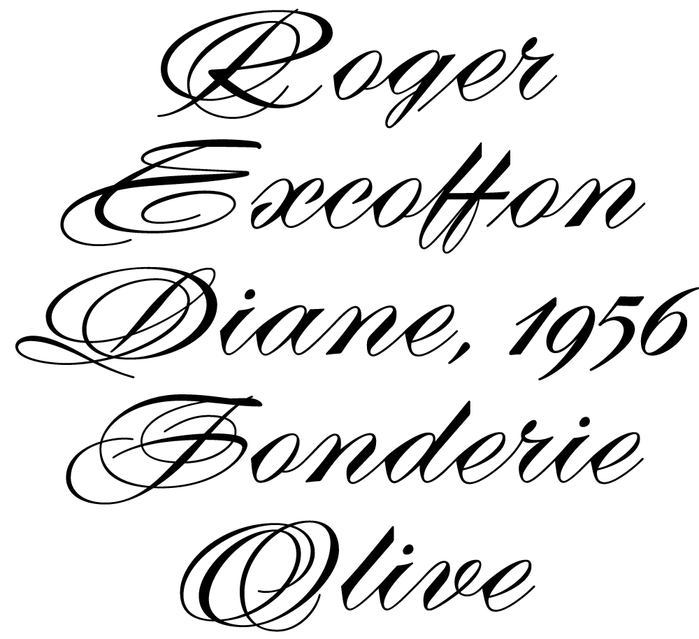
Diane Script and Diane Script Première are available now from FontHaus.
As you may be able to tell by my sporadic Notebook postings of late, I’ve been a very busy guy. Some of the things I’ve been working on I can’t talk about (yet).
One of the things I can talk about is three new fonts I will be releasing in the near future. All three were inspired by hand lettered titles in 1940s films.
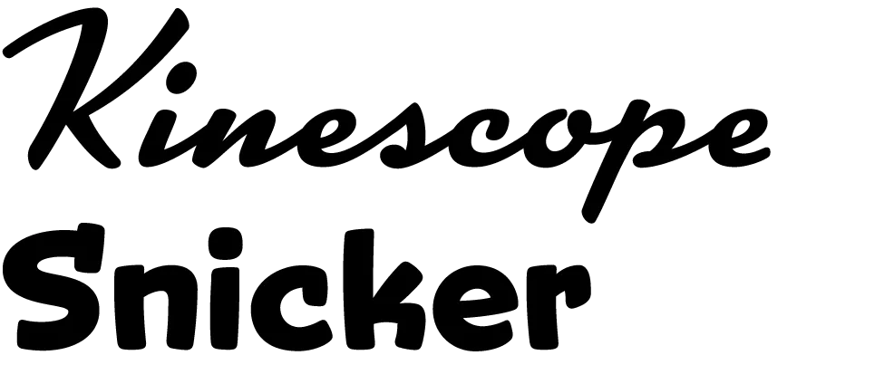
Kinescope and Snicker are loosely based on title lettering in Fleischer Studio’s animated Superman films from the forties.
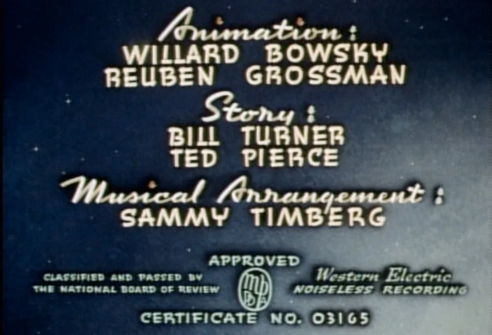
In both fonts I’ve ended up with something a bit different than the source of my inspiration, but I think you can see the resemblance.
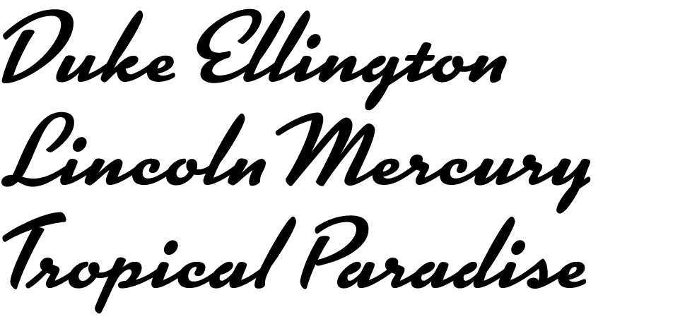
Kinescope will include context-sensitive characters. For example, when a letter falls at the end of a word, the connecting stroke is clipped off. This gives settings a more natural hand-lettered look. Stylistically, Kinescope falls somewhere between Brush Script and Kaufmann Script, but more elegant than either.
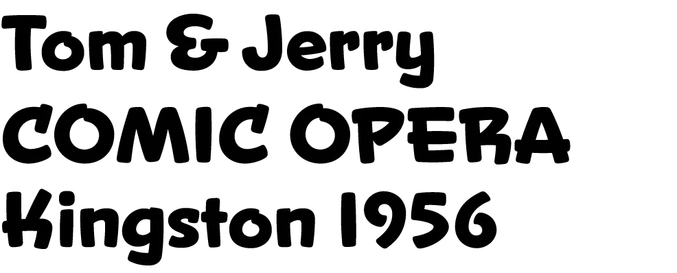
Snicker is a cartoony block letter style. One of the design challenges with Snicker was to come up with a suitable lowercase—the lettering in the Fleischer titles that inspired me only used capitals. Although it is intended for display sizes, it works pretty well for text. Consequently, I’m toying with the idea of adding a lighter weight and italics. It could perhaps become a typographically interesting alternative to Comic Sans…

The third font, Launderette, is based closely on lettering used in the titles of the 1944 Otto Preminger film, Laura:
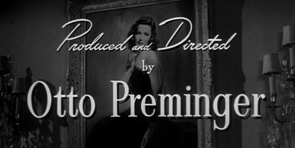
This font was originally commissioned by a filmmaker who wanted to use the same “font” in the titles of his own film. As with most films of that time, the titles were hand-lettered by an artist, not typeset.
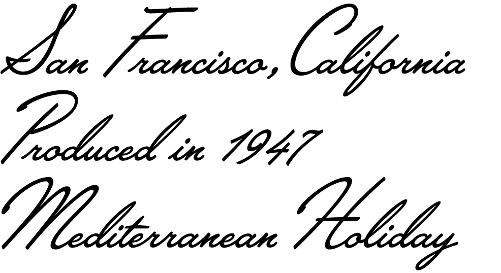
The challenge with this font was that there were very few characters in the source lettering. Most of the characters had to be created from scratch to match the style of the existing ones. Launderette, like Kinescope, will have context-sensitive characters to give it a custom, hand-lettered look.
I hope to release these new fonts by the end of the year.
Update: Kinescope and Snicker have now been released (April 30, 2007). Unfortunately, the name Landerette was already in use (twice!), so I changed it to Lakeside. Lakeside has also been released (February 7, 2008).
I first released Coquette in late 2001. It had three weights: Light, Regular, and Bold. I’ve updated it a few times since then, most significantly in 2010 with the OpenType version and expanded language support.
For a long time, even before the initial release, I’ve wanted to add more weights, especially on the bold end of the range. And there was certainly room for another weight on the light end. I’m therefore very pleased to announce the addition of three new weights to Coquette: Thin, Extrabold, and Black.

I took the opportunity to add a few more features to the family.
First, I’ve filled out some gaps in the character set. Previously, Coquette had only the fi and fl ligatures, a holdover from the pre-OpenType days. Version 2.0 now has a complete set of f-ligatures. You might have also noticed that Coquette was missing all those random math characters that are part of the standard character sets in most fonts. It now has them. I don’t imagine they’ll be of much use (which is why I left them out in the first place), but they are there if you need them now.

I’ve also added some OpenType features that I thought would be useful.
The first is arbitrary fractions. If you type number-slash-number and apply the OpenType Fraction feature, you will get nicely formatted vulgar fractions. (It seems unfair to call them vulgar. I think they look quite tasteful.) As a side effect of adding this feature, Coquette now includes superscript figures.

The second OpenType feature is support for a few alternate characters. Over the years I’ve noticed that sometimes designers don’t seem to like the little blobs I put on some of the characters, such as the b and o, so they remove them. Coquette 2.0 includes these alternate forms. The other modification I’ve seen is with the lowercase s, which has a stylized script form. Coquette 2.0 includes a more conventional lowercase s as an option. All of these have the effect of making Coquette look a bit more plain, but sometimes that’s what you want. (I didn’t make an option to remove all the blobs. It’s just not Coquette otherwise.)

There is also an alternate ampersand. It’s smaller than the default one—about the same height as the figures—and has a simpler design. You can use it anywhere, but it works better than the default when set next to caps.

So, that’s it. I’m really excited about this new release of Coquette. I’ve been wanting to do it for a long time. It should be available from your favorite online font store by the time you read this. More information here.
2. Mostra
3. Coquette
4. Changeling
5. Proxima Sans
6. Refrigerator
7. Goldenbook
8. Kandal
10. Blakely
If you pay close attention, you may notice two additions to the list of fonts over on my site: Diane Script and Filmotype Honey. I’ve been meaning to add these for a while (a long while in the case of Diane Script).
Diane Script (and Diane Script Première) were released in late 2008 through FontHaus, who commissioned me to digitize them. More about Diane here.
Filmotype Honey is my latest contribution to the Filmotype project and was released on the Font Bros site back in February.
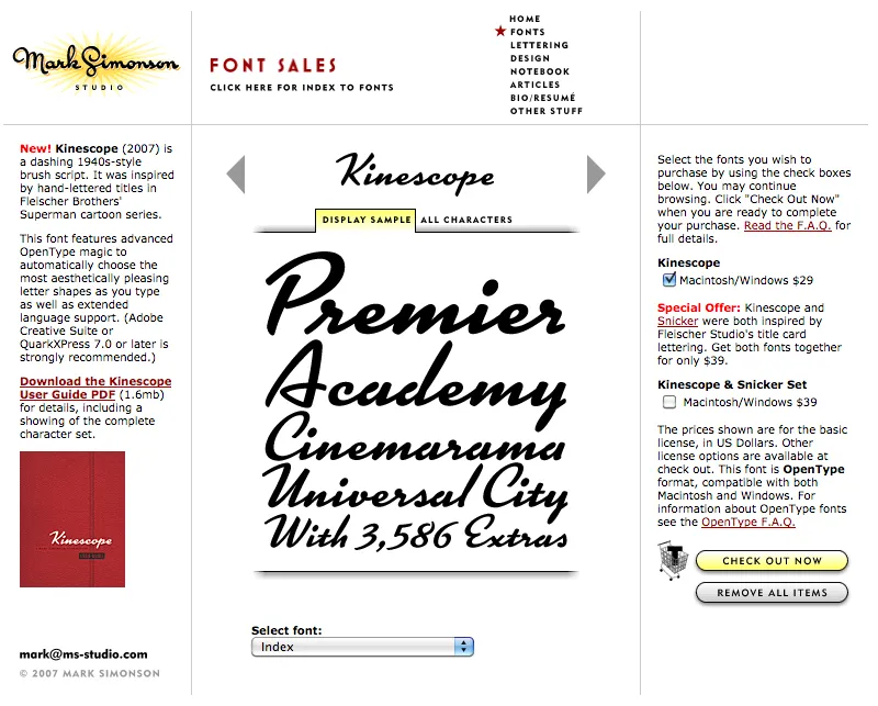
Party like it’s 2007. Note the shopping cart on the right side.
At one time, early in the history of Mark Simonson Studio, I sold fonts directly from my website. This was back in the early 2000s when there weren’t a lot of options.
I started selling fonts on the web in 2000 using third-party sites, first through Makambo (which closed its doors not long after I signed up), followed by MyFonts (2001), FontHaus (2001), Agfa/Monotype (2004), FontShop (2005), and Veer (2005).
In 2004, I decided to also sell fonts directly, using a service called DigiBuy, letting me get a bigger part of the retail font price, but also to simplify the purchasing experience for customers.
It was good while it lasted. Quite often, my site brought in more income than my best distributors for a given month. But in 2007, DigiBuy was shut down. The alternative they offered was tailored for selling shareware software, and was a poor fit for selling fonts. At the time, my distributors were doing well enough for me, so I made the hard decision to stop selling fonts directly and sell only through third parties.
Fortunately, my distributors soon took up the slack. And, to be honest, I was glad to have the burden lifted from my shoulders. When you sell direct, that means doing customer support. As a one-person business, this was taking a lot of my time. The new arrangement let me spend more time working on fonts. It was a fair trade-off.
Fast forward to 2021, and Mark Simonson Studio is now part of The Type Founders. TTF has the resources to bring direct sales back, and that’s just what they’ve done. If you have a favorite vendor, by all means use them. But if you want to get your fonts direct from the source, now you have that option.
The way it works is, each font page has various “buy” buttons. Click on any of these and a slide-over will appear that lets you select license types, term or other options (if applicable), and which fonts you wish to purchase. Note: Click on the styles to add them. Once you’ve made your selection, click on the “Add to cart” button. You can check out immediately or close the slide-over if you want to select other fonts before checking out. Once you’re ready to check out, just follow the instructions.
If you’re not sure what kind of license to choose, this page should help. My standard licenses for desktop, web, and apps can be seen here.
And if the kind of license you want is not one of these standard ones, drop an email to info@marksimonson.com.
Pretty simple. (Well, as simple as it can be.)
But that’s not all: Remember the static style previews I’ve had on my site for the last ten years? Gone, replaced with live, editable font previews for each style. This makes it easy to see if a font will work for, say, a company name or a headline.
Note: A few of the typefaces listed on my site are not available for direct sales, because I did them for another type foundry who own the fonts. These include Diane Script (Fonthaus), the Filmotype fonts, and HWT Konop (Hamilton Wood Type/P22). Links to where you can purchase are provided. And of course, you can’t buy Anonymous Pro because it’s free to use.
Finally, the list of fonts is now in alphabetical order, instead of newest releases first, which should make it easier to find the fonts you’re looking for.
